What’s New in KendoReact with R1 2021

The R1 2021 release of KendoReact is here and it contains eight new UI components for React along with a huge set of new features for existing components.
KendoReact always brings the thunder when it comes to releases and today’s R1 2021 release is no different! We have tons of new components, features, and even support for React 17 to announce today. Keep on reading to discover what is new in KendoReact with R1 2021.
React 17 Support
The React 17 release famously had the “No New Features” statement in its announcement blog post, but that wasn’t necessarily the case for UI component creators like the KendoReact team. Nevertheless, on the official launch day we had day-zero support for React 17 in all KendoReact UI components. While this happened back in October 2020, it certainly is good to reiterate that you can upgrade to the latest and greatest with KendoReact.
New React Components
New Component: TileLayout
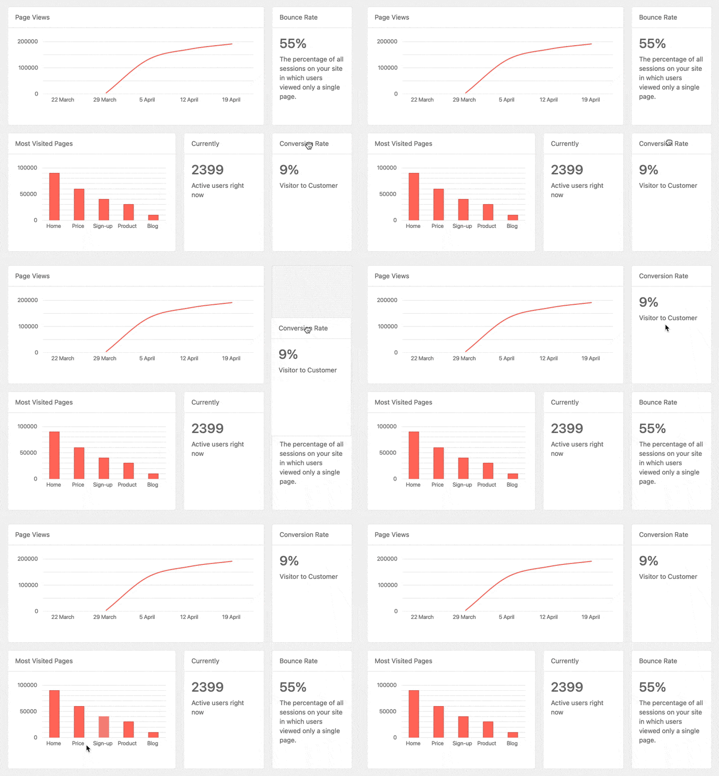
The new KendoReact TileLayout component is the perfect component for creating interactive dashboards using a single UI component with a flexible set of configuration options. Simply define some grid-like metrics (rows and columns) along with a collection of tiles and their dimensions and you’re off to the races.
Once set up, end-users can enjoy the ability to drag around the various KPIs that are displayed in order to end up with their desired layout. Each KPI, or Tile, is completely customizable which means you can build some truly stunning and interactive layouts with this new React component.
Head on over to the KendoReact TileLayout docs and demos section to see more!
New Component: DropDownTree
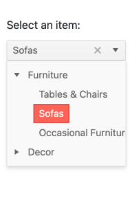
One of the top-requested form components over the last few releases has been a React UI component which combines the TreeView component and a dropdown component, which has lead to the new KendoReact DropDownTree.
The React DropDownTree component is perfect for forms that need to be concise and take up as little real estate as possible while still offering an advanced data structure to select an item from. When users interact with the simple input element, the dropdown opens up to reveal a built-in TreeView with a hierarchical structure. Users can then pick a node and the selected value will appear in the input of the component.
To see how you can take advantage of this already popular component, head on over to the KendoReact DropDownTree.
New Component: MultiColumnComboBox

Adding to the list of popular dropdowns we added in R1 2021, we also have the new KendoReact MultiColumnComboBox. This React UI component takes a drop down and provides a table structure for each item. Items are still shown as a list, but each item can display multiple fields per row, giving that classic table look and feel. Once a user selects an item, a single value will be displayed in the input but the underlying data item of course has all fields available for the developer.
New Component: FloatingActionButton
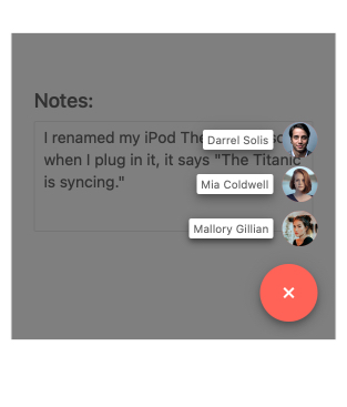
Found in many modern web applications and mobile applications, the new React FloatingActionButton provides a permanent button that appears to be floating above existing content in a predefined area on the screen. This button tends to be responsible for a single action, often contextual to the content on the current page, and has been spotted as the “compose” button in gmail and other email clients.
The look-and-feel of the component can be customized through the available configuration options to make sure the main button fits your overall design. Additionally, the KendoReact FloatingActionButton can feature a “speed dial” set of buttons which will animate out of the main button and provide multiple action buttons to select from. Just like the main button, the look and feel of all of these buttons can all be tweaked to ensure a consistent appearance throughout your applications.
To see more from the React FloatingActionButton, head on over to the KendoReact online demos.
New Component: BottomNavigation
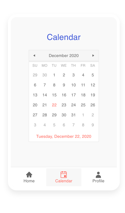
With R1 2021 we also introduced the new KendoReact BottomNavigation component—the perfect navigation UI element for responsive web and mobile applications.
The React BottomNavigation component easily integrates with any routing library so navigating between views is easy as pie, and each navigation item within the component features an icon and associated label to ensure that end-users have the full context around what each navigation will provide.
It may go without saying, but this component is completely responsive and will respond to any changes in the size of the viewport.
You can find out more about the KendoReact BottomNavigation component in our online docs and demos right here.
New Component: ListBox
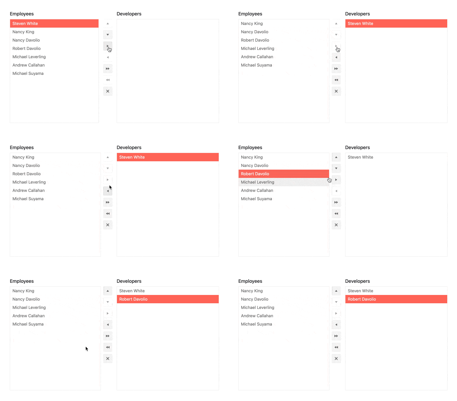
Another highly requested component is the new React ListBox. This component provides an interface for displaying a list of items in a defined area that can be scrolled through. Additionally, several ListBoxes can be combined in order to give a user experience that allows users to move items between lists. When dealing with multiple ListBoxes you also have the option to add buttons that render between the boxes to help manage moving single, or multiple, item(s) between the various ListBox instances.
To see more about the React ListBox component you can refer to the KendoReact ListBox docs and demos.
New Component: Icon & SvgIcon
![]()
To round up our list of new components, with R1 2021 we are also introducing the React Icon and React SVGIcon components. The names kind of give it away, but these UI components are both responsible for displaying icons within your React application. The big difference between the two is that the KendoReact Icon component displays icons as font icons, while the SVGIcon renders all of its icons as SVG elements.
When you add these React UI components to your application you have access to over 400 integrated icons from KendoReact so chances are you’ll find the perfect icon to use for any scenario.
To see more of these icons in action you can find the documentation for the KendoReact Icon here and the documentation for the KendoReact SVGIcon here.
Expanded Component Features
Grid - Built-in Keyboard Navigation
While the KendoReact Grid has supported keyboard navigation for a long time by now, we have let developers determine exactly how to handle said navigation. So, as an example, rather than assume what keyboard shortcuts or interaction requirements you may have we have left it up to the developer to determine exactly what happens when you hit the tab key in the React Data Grid.
While this gives a ton of flexibility, it also comes with additional complexity since now developers have to think about how keyboard navigation should work for them and also write the code to correspond to these rules. In order to make this easier for all developers, with R1 2021 we have added some built-in and opinionated ways for handling keyboard navigation within the KendoReact Data Grid to help alleviate this complexity. This lets developers that just want keyboard navigation taken care of out of the box use a simple set of configuration options instead of spending time figuring out how to write code for every type of interaction.
To see more about this improved keyboard navigation in the KendoReact Data Grid, head on over to this documentation section for the KendoReact Grid.
Grid - Improved Performance in State Management for Data Cells
Everyone loves performance improvements, right? Well, with R1 2021 we took a look at how we could improve the performance of the KendoReact Grid and discovered that we could do some improvements for how state management is done on the cell level.
As you can imagine, the Grid cells are the building blocks of any data grid so improving the performance of an individual cell can have a huge impact across any data grid.
TreeList - Built-in Keyboard Navigation
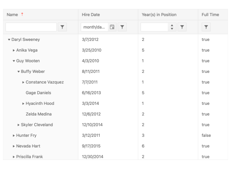
Similar to the Grid improvement mentioning keyboard navigation, with R1 2021 the KendoReact TreeList component has taken a step towards making keyboard navigation simpler to implement for developers. While you can still take full control over exactly how keyboard navigation is handled, now you can also enable a base-level keyboard navigation that handles interactions for you through a few configuration options.
Head on over to this KendoReact TreeList Keyboard Navigation demo to see more.
Gantt: Built-in Keyboard Navigation
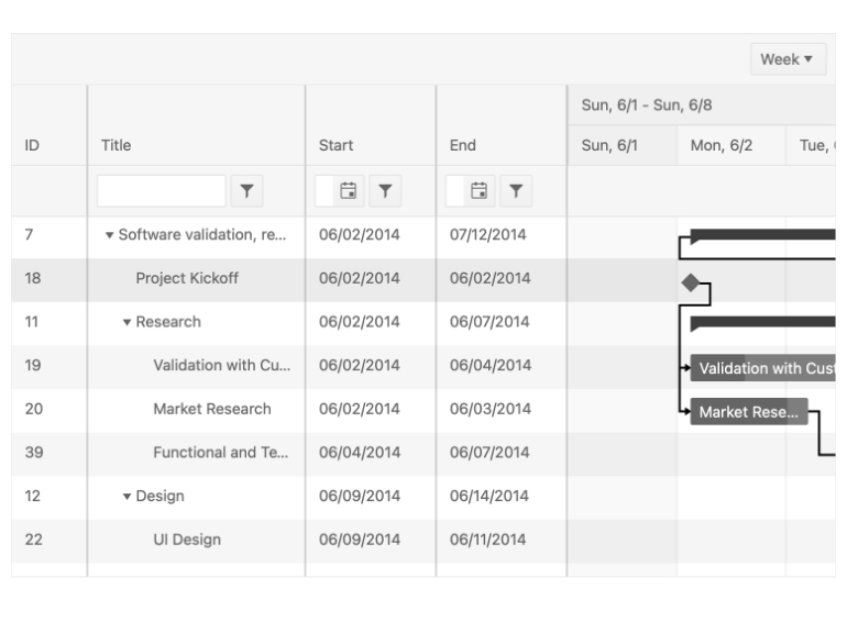
Continuing the story of Keyboard Navigation in our React UI components, the KendoReact Gantt also had built-in keyboard navigation added with R1 2021. This is super helpful to ensure that the Gantt can pass accessibility compliance reviews and makes it super easy to add keyboard navigation. For developers that need a little bit of extra control they can of course take over fully to fit with any keyboard navigation requirements.
To see Keyboard Navigation in the KendoReact Gantt in action you can head on over to this demo.
Gantt: Editing
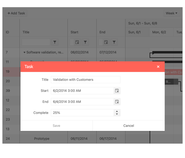
Another React Gantt update that we managed to add in with this release is the built-in editing functionality which can help end-users with modifying and updating tasks found within the Gantt. This moves the KendoReact Gantt component away from just a read-only component and adds a a big feature that many Gantt users will be looking for.
You can see the KendoReact Gantt Editing feature in this online demo.
Editor: Improved Keyboard Navigation
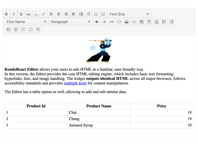
The round up of keyboard navigation improvements for R1 2021 continues, as the KendoReact Editor also added a built-in option for keyboard navigation that avoids needing to define your own keyboard operations with the Editor component. Just like with the other components we added this feature to, enabling keyboard navigation this way makes hitting accessibility goals as easy as pie.
Avatar - New Options and Updated Design
![]()
With R1 2021 the KendoReact Avatar component received several updates to its design as well as additional configuration options to help control the overall look and feel of the component. Without going in to the nitty and gritty details, this update provides React developers with even more flexibility when it comes to customizing the appearance of the React Avatar component.
To see more about the KendoReact Avatar you can check out our online demos!
Scheduler - Custom Form and Form Editor
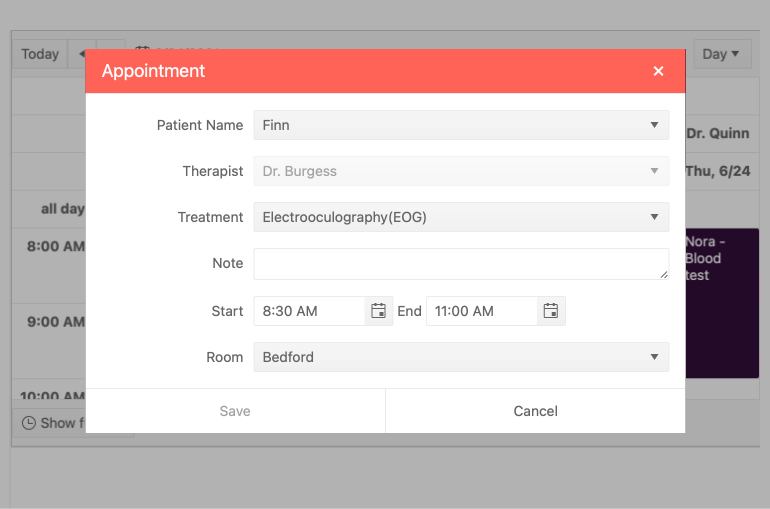
Editing has existed within the KendoReact Scheduler for quite some time, but the form responsible for editing any event has always been a default form that could not be customized—but this has officially changed with R1 2021. With the new Custom Form and Form Editor feature a React developer can pass a custom component to be responsible for the editing of the Scheduler. This gives yet another way to make the Scheduler fit any and all design requirements.
To see how you can create your own Custom Forms with the KendoReact Scheduler you can refer to this demo.
Scheduler - Current Time Marker
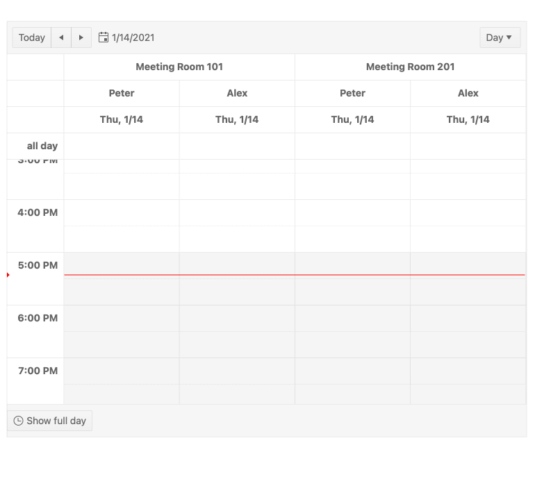
Another update to the KendoReact Scheduler component that landed in R1 2021 is the Current Time Marker. This feature is subtle at first, but it provides an indicator that is constantly displayed within the calendar interface and shows your current time across the displayed events. This feature makes it much easier for end-users to know what events they have scheduled as well as what the current time is without having to cross-reference their clock.
To see the React Scheduler Current Time Marker feature in action, head on over to this docs and demos article.
We Want Your Feedback!
All of the above UI components and features were added thanks to feedback from KendoReact users, which is why I always like to ask: what did we miss with this release? Is there a UI component or feature that you need for your React applications that we haven’t added in yet? We want to hear from you! Feel free to provide a comment in the comment section below, or add your specific request in our KendoReact feedback portal.
Register for our Live R1 2021 Webinar
Interested in seeing these new components and features getting added to our famous ACME React application? Curious to get more information about this release and other React activities we are up to? Or do you just want to take some time to ask myself and the rest of the KendoReact team questions? Well, join us for the Kendo UI R1 2021 Release Webinar on Thursday, January 28th starting at 11:00 AM ET. For more details head on over to our webinar registration page. Seats are limited so don’t forget to snag your spot today!
Join Us on Twitch
Looking for even more? You can also catch us on a special full-day Twitch session from 8am - 5pm ET on January 29th.

Carl Bergenhem
Carl Bergenhem was the Product Manager for Kendo UI.
