
Building a Data Visualization Dashboard Using Kendo UI, Angular and Socket.io

Data visualization is important because it effectively displays the performance of operations. It allows users to see connections between performance and operating conditions. Learn how easy it is to use Kendo UI alongside Angular and Socket.io to set up a reliable data visualization platform.
Kendo UI is a library used for building applications at a faster pace. Kendo UI provides UI components for libraries like jQuery, Angular, React and Vue, and it comes packed with an extensive set of components for creating charts, data tables and drag-and-drop pages.
Kendo UI is customizable, and it provides a set of themes for Material UI, Bootstrap, etc. Kendo UI components are distributed as multiple NPM packages, so there’s no fear of bloating your application with unnecessary components and increasing your build bundle. It offers components for managing large data sets and for easy data visualization. Coupled with Angular, Kendo UI is an unstoppable tool for developing fantastic web applications.
Today, we’ll be creating a data visualization dashboard showing the world’s population. Using components from Kendo UI, we’ll create a grid for displaying population data from countries around the world. We’ll build a minimal server that runs on Express and Socket.io to feed data in our application.
To follow this tutorial, you need a basic understanding of Angular. Ensure that you have Node and NPM installed before you get started.
If you have no prior knowledge of Angular, kindly follow the official tutorial here. You can return to the article when you’re done.
Note: Interested in building a similar dashboard with Vue? Check out that guide here.
We’ll be building the application using the following tools:
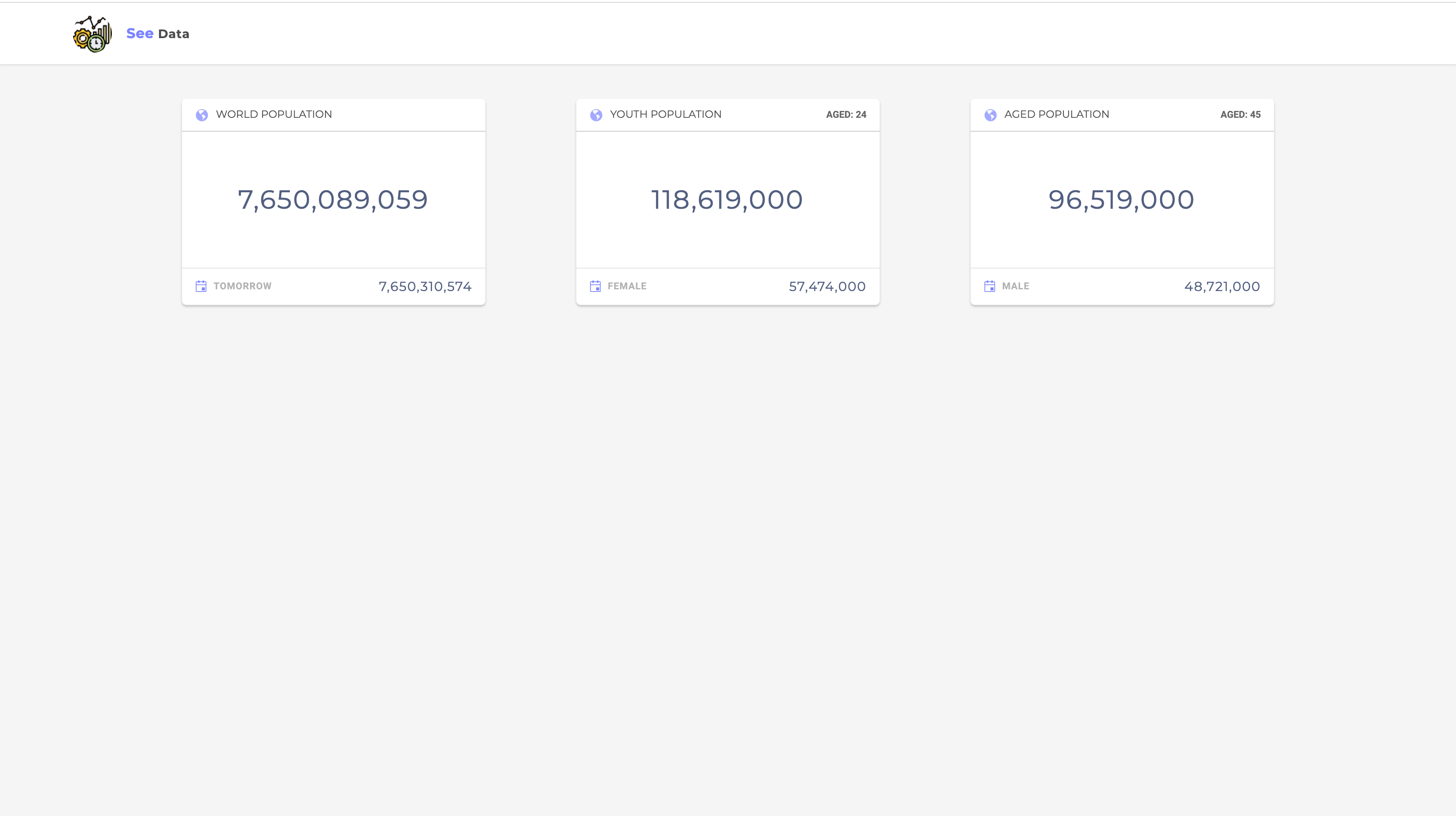
Here’s a screenshot of the application we’ll be building:

Initializing Application and Installing Dependencies
To get started, we will use the CLI (Command Line Interface) provided by the Angular team to initialize our project.
First, install the CLI by running npm install -g @angular/cli. NPM is a package manager used for installing packages. It will be available on your PC if you have Node installed. If not, download Node here.
To create a new Angular project using the CLI, open a terminal and run:
ng new kendo-dashboard --style=scssThis command is used to initialize a new Angular project; the project will be using SCSS as the pre-processor.
Next, run the following command in the root folder of the project to install dependencies:
    ng add @progress/kendo-angular-dropdowns
    ng add @progress/kendo-angular-charts
    ng add @progress/kendo-angular-grid
The command is for adding Kendo UI’s individual components to the project. Next, we’ll install an Angular library for using Socket.io in Angular applications:
npm install ngx-socket-io @progress/kendo-theme-default
For the backend dependencies, we’ll need the following:
npm install express body-parser socket.io axios
We’ll be fetching the population data from an external API. For this purpose, we’ll be using Axios in the project.
Start the Angular development server by running ng serve in a terminal in the root folder of your project.
Building Our Server
We’ll build the server using Express. Express is a fast, unopinionated, minimalist web framework for Node.js. The server is be using Socket.io to communicate with the client, so we’ll integrate the Express server with socket using the HTTP library.
Create a file called server.js in the root of the project and update it with the code snippet below:
    // server.js
    const express = require('express');
    const bodyParser = require('body-parser');
    const app = express();
    const http = require('http').createServer(app);

    const io = require('socket.io')(http);
    const axios = require('axios');

    const port = process.env.PORT || 4000;

    // constants
    const BASE_URL = 'http://api.population.io:80/1.0/population/';
    const COUNTRY = 'World';
The setup here is pretty standard for Express applications using Socket.io. There’s no problem if you have no prior knowledge of Socket.io as we’ll only be making use of two methods: emit for dispatching events, and io.on for listening for events. You can always go through the official tutorial here.
We’re creating a server to listen for events from our application while also dispatching events, so let’s set up listeners and methods for communicating with the client:
    const express = require('express');
    const bodyParser = require('body-parser');

    ...
    ...

    io.on('connection', async (socket) => {
      getWorldPopulation();

      const youthPopulation = await getWorldAgePopulation(24);
      const agedPopulation = await getWorldAgePopulation(45);

      io.emit('youth population', youthPopulation);
      io.emit('aged population', agedPopulation);

      const populationData = await getWorldPopulationLast5Years();
      await getCountriesPopulationData(2019, 24);
      io.emit('population last 5 years', populationData);

      socket.on('fetch population data', ({age, year}) => {
        getCountriesPopulationData(year, age)
      })
    });

    const dateInISO = new Date().toISOString().split('T')[0];
    const years = [
      {year: '2019', date: dateInISO},
      {year: '2018', date: '2018-12-31'},
      {year: '2017', date: '2017-12-31'},
      {year: '2016', date: '2016-12-31'},
      {year: '2015', date: '2015-12-31'},
      {year: '2014', date: '2014-12-31'}];


    async function getWorldPopulationLast5Years() {
      let populationData = [];
      for (let year of years) {
        const {total_population} = await getCountryPopulationForYear(year.date, 'World');
        populationData = populationData.concat({
          year: year.year,
          population: total_population.population,
        })
      }
      return populationData;
    }

    async function getCountriesPopulationData(year, age) {
      const {data} = await axios.get(`${BASE_URL}${year}/aged/${age}/`)
      io.emit('countries population data', data)
    }

    async function getWorldPopulation() {
      const {data} = await axios.get(`${BASE_URL}${COUNTRY}/today-and-tomorrow/`);
      const [today, tomorrow] = data.total_population;
      io.emit('world population', {today, tomorrow})
    }

    async function getWorldAgePopulation(age) {
      const {data} = await axios.get(`${BASE_URL}2019/World/${age}/`);
      return data;
    }

    async function getCountryPopulationForYear(year, country) {
      const {data} = await axios.get(`${BASE_URL}${country}/${year}/`);
      return data;
    }


    http.listen(port, () => {
      console.log(`Server started on port ${port}`);
    });
The first step when working with Socket.io is listening for the connection event from the client. The client sends a connection object that the server can use to listen for events; the object is returned in the connection callback.
There are a couple of functions used in the server for listening and emitting events, and we’ll walk through each one.
First the getWorldPopulation function. This function calls the population API to get the world’s population for the current day and tomorrow, using ${country}/today-and-tomorrow endpoint. You can visit the API dashboard to view sample responses.
The next function, getWorldAgePopulation, takes a single age parameter and calls the API to get population statistics for an age demographic. To get the population for a given year, the function getCountryPopulationForYear is called, and it takes two parameters: year and country. The year parameter is denoted by an ISO date string, and the country is any of the countries listed in the /countries endpoint provided by the API.
The getWorldPopulationLast5Years function loops through an array of dates and uses the getCountryPopulationForYear function to get the population for the given date.
Finally, the getCountriesPopulationData function returns population data for all the world’s countries for an age demographic in a given year. When the connection event is received by the server, it calls the functions listed here to emit data to the client listening for these data.
Run node server in a terminal within the project folder to run the server. The next step is to set up views for the client starting from the home page.
The Home Page
The home page will hold data displayed on cards, charts and tables. The first step is to create components to display all the data. Kendo UI already provides components for charts and tables, so we’ll utilize them. First we’ll create the data-card component for displaying current world population data. We’ll do this by running the following command:
ng generate component data-card
After the command has been run successfully, open the newly created data-card.component.html file and update it:
    <div class="population-stats__world">
      <div class="population-stats__world-header">
        <h4 class="population-stats__world-header__heading"><span class="k-icon k-i-globe"></span>
          {{heading}}</h4>
        <p class="population-stats__world-header__sub-heading">{{subHeading}}</p>
      </div>

      <div class="population-stats__world-body">
        <h3>{{body}}</h3>
      </div>

      <div class="population-stats__world-footer">
        <p><span class="k-icon k-i-calendar"></span> {{footerHeading}}</p>
        <h4>{{footer}}</h4>
      </div>
    </div>
Next, we’ll add some styles to the display component. Open the data-card.component.html file and update it with the styles below:
    .population-stats__world {
      background: white;
      box-shadow: 0 2px 3px 0 rgba(0, 0, 0, 0.2);
      flex: 1 1;
      flex-direction: column;
      width: 350px;
      border-radius: 5px;

      &-header {
        padding: 10px 15px;
        border-bottom: 1px solid rgba(0, 0, 0, 0.2);
        display: flex;
        justify-content: space-between;
        align-items: center;

        &__heading {
          .k-icon {
            color: #7B84FF;
            margin-right: 5px;
            font-size: 16px;
          }

          font-size: 12px;
          font-family: Montserrat, sans-serif;
          text-transform: uppercase;
          font-weight: 400;
          opacity: .7;
          margin: 0;
        }

        &__sub-heading{
          margin: 0;
          font-size: 11px;
          font-weight: bold;
          opacity: 0.6;
          text-transform: uppercase;
        }

      }

      &-body {
        padding: 60px 15px 60px;

        &__changes {
          display: flex;
          justify-content: space-between;
          padding-bottom: 20px;

          p:nth-child(1) {
            font-size: 13px;
            font-weight: 500;
            text-transform: uppercase;
            opacity: 0.5;
          }

          p:nth-child(2) {
            .k-icon {
              color: lightseagreen;
            }

            .k-icon.red{
              color: indianred;
            }

            .k-icon.grey{
              color: coral;
            }

            font-size: 12px;
            font-weight: 600;
            color: rgba(0, 0, 0, 0.4);
          }
        }

        h3 {
          text-align: center;
          font-weight: 400;
          font-size: 30px;
          letter-spacing: 1.5px;
          text-transform: uppercase;
          font-family: 'Montserrat', sans-serif;
          margin: 0;
          color: #525F7F;
        }
      }

      &-footer {
        border-top: 1px solid rgba(0, 0, 0, 0.1);
        padding: 3px 15px;
        display: flex;
        align-items: center;
        justify-content: space-between;

        p {
          .k-icon {
            color: #7B84FF;
            margin-right: 4px;
            font-size: 14px;
          }

          font-size: 11px;
          text-transform: uppercase;
          letter-spacing: 0.6px;
          color: rgba(0, 0, 0, 0.3);
          font-weight: 600;
        }

        h4 {
          margin: 0;
          color: #525F7F;
          font-size: 15px;
          letter-spacing: 1px;
          font-family: 'Montserrat', sans-serif;
          font-weight: 400;
        }
      }
    }
After adding these styles, the look of the component should be on track with the views of our application.
Now let’s declare the variables used in the view template in the component file. Open the data-card.component.html file and update it to take Input from parent components:
    import {Component, Input, OnInit} from '@angular/core';

    @Component({
      selector: 'app-data-card',
      templateUrl: './data-card.component.html',
      styleUrls: ['./data-card.component.scss']
    })
    export class DataCardComponent implements OnInit {

      constructor() {
      }

      @Input() heading = '';
      @Input() subHeading = '';
      @Input() body = '';
      @Input() footer = '';
      @Input() footerHeading = '';

      ngOnInit() {
      }
    }
The component is mainly a display component and relies on data from the parent component. After this change, we’ll render the component in the App component. Open the app.component.html file and render the data-card component:
    <main>
      <!-- app header -->

      <section class="container">
        <div class="population-stats">
          <app-data-card [body]="population?.today?.population | number"
                         [footer]="population?.tomorrow?.population | number" [heading]="'World Population'"
                         [footerHeading]="'Tomorrow'"></app-data-card>
          <app-data-card [body]="youthPopulation?.total | number"
                         [footer]="youthPopulation?.females | number" [heading]="'Youth Population'"
                         [footerHeading]="'Female'"
                         [subHeading]="'Aged: ' + youthPopulation?.age"></app-data-card>
          <app-data-card [body]="agedPopulation?.total | number"
                         [footer]="agedPopulation?.males | number" [heading]="'Aged Population'"
                         [footerHeading]="'Male'"
                         [subHeading]="'Aged: ' + agedPopulation?.age"
          ></app-data-card>
        </div>
        <div class="population-years__comparison">
          <!-- population chart -->
        </div>
        <div class="world-population__data">
          <!-- table grid showing population data for countries -->
        </div>
      </section>
    </main>
In the snippet above, we use the data-card component to display population data gotten from the App component file. The data here is gotten after setting up Socket.io on the client to receive data from the server. The next step is to style the component and declare the properties and methods used in the template before we setup socket.io on the client using ngx-socket-io.
Open the app.component.html file and update it with the styles below:
    .container{
      width: 75%;
      margin: 40px auto;

      .population-stats{
        display: flex;
        justify-content: space-between;
      }
    }
We basically set up the display container for the application and the structure using flexbox.
Open the app.component.ts file and copy the following code below into it:
    import {Component, OnInit} from '@angular/core';
    import {Socket} from 'ngx-socket-io';

    @Component({
      selector: 'app-root',
      templateUrl: './app.component.html',
      styleUrls: ['./app.component.scss']
    })
    export class AppComponent implements OnInit {
      constructor(public socket: Socket) {
      }

      populationSub = this.socket.fromEvent('world population');
      youthSub = this.socket.fromEvent('youth population');
      agedPopulationSub = this.socket.fromEvent('aged population');

      population;
      youthPopulation;
      agedPopulation;

      ngOnInit() {
        this.populationSub.subscribe((data: any) => {
          this.population = data;
        });

        this.youthSub.subscribe((data: any) => {
          const [info] = data;
          this.youthPopulation = info;
        });

        this.agedPopulationSub.subscribe((data: any) => {
          const [info] = data;
          this.agedPopulation = info;
        });
      }
    }
The first thing you’ll notice here is the Socket class imported from the ngx-socket-io library. Using the library’s fromEvent method, we’ll listen for events from the server. The method returns an observable that can be subscribed to. In the OnInit lifecycle, we subscribe to the events and await data from the server.
In its current state, the application won’t be receiving any data. That’s because we haven’t set up Socket to connect to the server. To do this, open the app.module.ts file, import the SocketIoModule and setup the config using the server’s url:
    import {BrowserModule} from '@angular/platform-browser';
    ...
    import {DataCardComponent} from './data-card/data-card.component';
    import {SocketIoModule, SocketIoConfig} from 'ngx-socket-io';


    const socketConfig: SocketIoConfig = {
      url: 'http://localhost:4000',
    };

    @NgModule({
      declarations: [
        ...
      ],
      imports: [
        ...,
        SocketIoModule.forRoot(socketConfig)
      ],
      providers: [],
      bootstrap: [AppComponent],
    })
    export class AppModule {
    }
After setting up the config, we register the SocketIoModule passing in the socketConfig in the forRoot method. Now we should be able to communicate with the server, sending messages back and forth.
Next, we’ll create the header component of the application, but before that we’ll include the link to the external fonts we’ll be using in the project.
Open the index.html file and update it to include the link to the external fonts:
    <!doctype html>
    <html lang="en">
    <head>
      <meta charset="utf-8">
      <title>KendoDashboard</title>
      <base href="/">

      <meta name="viewport" content="width=device-width, initial-scale=1">
      <link rel="icon" type="image/x-icon" href="favicon.ico">
      <link href="https://fonts.googleapis.com/css?family=Montserrat:400,700|Roboto:400,500,700,900" rel="stylesheet">
    </head>
    <body>
      <app-root></app-root>
    </body>
    </html>
Next, we’ll utilize Kendo UI’s customizable theme by updating it to use our application’s theme and also styling some of its components before use. Open the styles.scss file and copy the following styles into it:
    /* You can add global styles to this file, and also import other style files */
    $accent: #7B84FF;
    $accent-light: #DBDDFF;
    $border-radius: 5px;
    $base-text: #525F7F;

    @import "~@progress/kendo-theme-default/scss/grid";
    @import "~@progress/kendo-theme-default/scss/dropdownlist";
    @import "~@progress/kendo-theme-default/scss/dropdowntree";


    body, html {
      margin: 0;
      background: whitesmoke;
      font-family: 'Roboto', sans-serif;
    }

    .k-chart-surface {
      height: 500px;
      font-family: 'Montserrat', sans-serif !important;
    }
Header Component
The header component will display the application logo and very little information. This component is mostly a display component.
Run the following command to create the header component:
ng generate component header
Next, open the src/app/header/header.component.html file and update it to look like the code below:
    <!-- src/app/header/header.component.html -->
    <header>
      <div class="brand">
        <img src="/assets/images/logo.png">
        <h5><span>See</span> Data</h5>
      </div>
    </header>
Note: Image asset used can be found here in the GitHub repository. The logo was gotten https://flaticon.com.
Next, we’ll style the header. Open the header.component.scss file and update it with the snippet below:
    header {
      display: flex;
      background-color: white;
      align-items: center;
      font-family: 'Montserrat', sans-serif;
      margin: 0;
      padding: 13px 5%;
      box-shadow: 0 1px 2px 0 rgba(0, 0, 0, 0.1);

      .brand {
        flex: 1;
        display: flex;
        align-items: center;

        img {
          height: 45px;
          border-radius: 50%;
          margin-right: 17px;
        }

        h5 {
          span{
            color: #7B84FF;
            font-size: 16px;
          }
          font-size: 14px;
          margin: 0;
          text-transform: capitalize;
          letter-spacing: 0.5px;
          font-weight: 600;
          color: rgba(0,0,0,0.7);
        }
      }
    }
Just a couple of styles to beautify the header. Finally, we’ll render the component in the app.component.html file. Open the file and render the header component where the header comment was.
    <main>
      <app-header></app-header>
      <section class="container">
        <div class="population-stats">
          ...
        </div>
        <div class="population-years__comparison">
          <!-- population chart -->
        </div>
        <div class="world-population__data">
          <!-- table grid showing population data for countries -->
        </div>
      </section>
    </main>
If you visit http://localhost:4200, you should see the latest view of the application. The application should be receiving data from the server now. The current population statistics should be visible. Ensure the Angular dev server is running before testing.
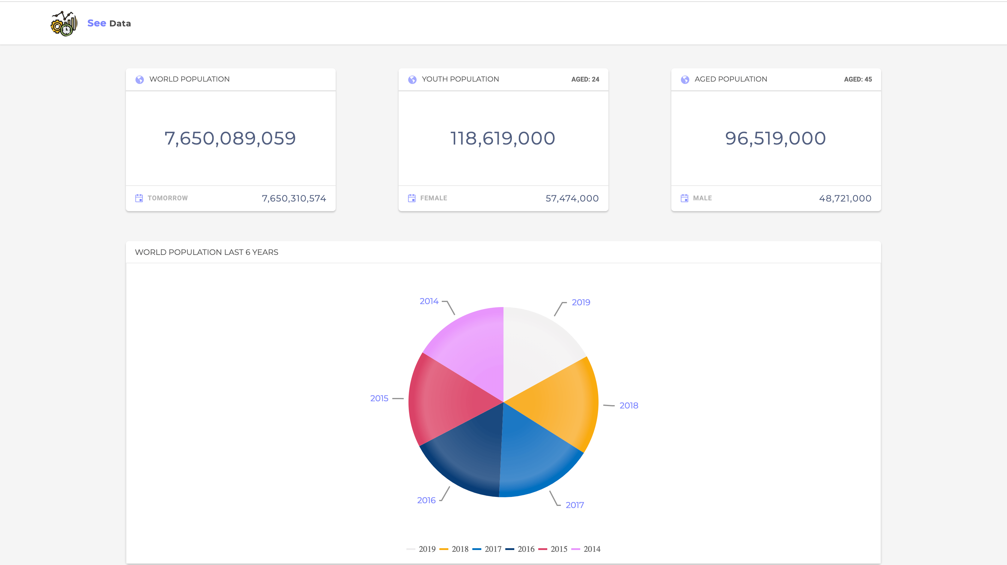
Next, we’ll create components to display the world’s population statistics for the last six years. We’ll use the chart component from Kendo UI to achieve this.
Population Statistics
In this section of the application, we’ll be using the Charts component from Kendo UI to display population statistics of the world in the past four years. More specifically, we’ll be using a pie chart to visualize the data returned. You can read more on Kendo UI charts in the documentation here.
Create the component by running the following command:
ng generate component population-chart
Open the template file population-chart.component.html file and copy the content below into it:
    <section>
      <div class="header">
        <h4>World Population Last 6 years</h4>
      </div>
      <kendo-chart
        [seriesColors]="['rgba(239, 237, 238, 1)', 'rgba(249, 171, 12, 1)', 'rgba(0, 112, 192, 1)', 'rgba(8, 61, 119, 1)', ' rgba(218, 65, 103, 1)', '#E895FC']">
        <kendo-chart-series>
          <kendo-chart-series-item
            type="pie" [data]="populationData"
            categoryField="year" field="population">
            <kendo-chart-series-item-labels
              [content]="labelContent"
              color="#7B84FF" background="white" [font]="'Montserrat'" [style.height]="'500px'">
            </kendo-chart-series-item-labels>
          </kendo-chart-series-item>
        </kendo-chart-series>
        <kendo-chart-legend [visible]="true" position="bottom"></kendo-chart-legend>
      </kendo-chart>
    </section>
In the snippet above, we’re using Kendo UI’s chart setup to display population data. The setup includes components like kendo-chart-series and kendo-chart-series that enable us to select from more than ten chart types to display data. In this example, we’ll be using a pie chart so we’ll pass that to the type directive. The other component is the kendo-chart-series-item-labels component for displaying labels around the selected chart type.
Then there’s the kendo-chart-legend used for displaying a legend to allow users understand the chart easily.
Next, we’ll add some styles to the component to personalize it. Open the population-chart.component.scss file and copy the following styles into it:
    section{
      margin-top: 50px;
      background: white;
      box-shadow: 0 2px 3px 0 rgba(0,0,0,0.2);
      border-radius: 5px;
      .header{
        padding: 10px 15px;

        h4{
          font-size: 13px;
          font-family: 'Montserrat', sans-serif;
          margin: 0;
          font-weight: 400;
          text-transform: uppercase;
          opacity: 0.7;
        }
      }

    }
Then we’ll set up a Socket client in this component to listen for data from the server. Open the population-chart.component.ts and update it to be similar to the snippet below:
    import {Component, OnInit} from '@angular/core';
    import {Socket} from 'ngx-socket-io';

    @Component({
      selector: 'app-population-chart',
      templateUrl: './population-chart.component.html',
      styleUrls: ['./population-chart.component.scss']
    })
    export class PopulationChartComponent implements OnInit {

      populationDataSub = this.socket.fromEvent('population last 5 years');
      populationData = [];

      constructor(private socket: Socket) {
      }

      public labelContent(e: any): string {
        return e.category;
      }

      ngOnInit() {
        this.populationDataSub.subscribe((data: []) => {
          this.populationData = data;
        });
      }

    }
First, we import the Socket class; then we create a property populationDataSub to listen for an event. Within the OnInit lifecyle, we can subscribe to the event and wait for data from the server. When data is returned, we assign it to the populationData property.
After this update, we can render this component in the app.component.html file to see the if the component works as expected:
    <!-- src/app/app.component.html -->

    <main>
      <app-header></app-header>

      <section class="container">
        <div class="population-stats">
          ...
        </div>
        <div class="population-years__comparison">
          <app-population-chart></app-population-chart>
        </div>
        <div class="world-population__data">
          <!-- table grid showing population data for countries -->
        </div>
      </section>
    </main>
Now when you navigate to http://localhost:4200, you should see a view similar to the screenshot below:
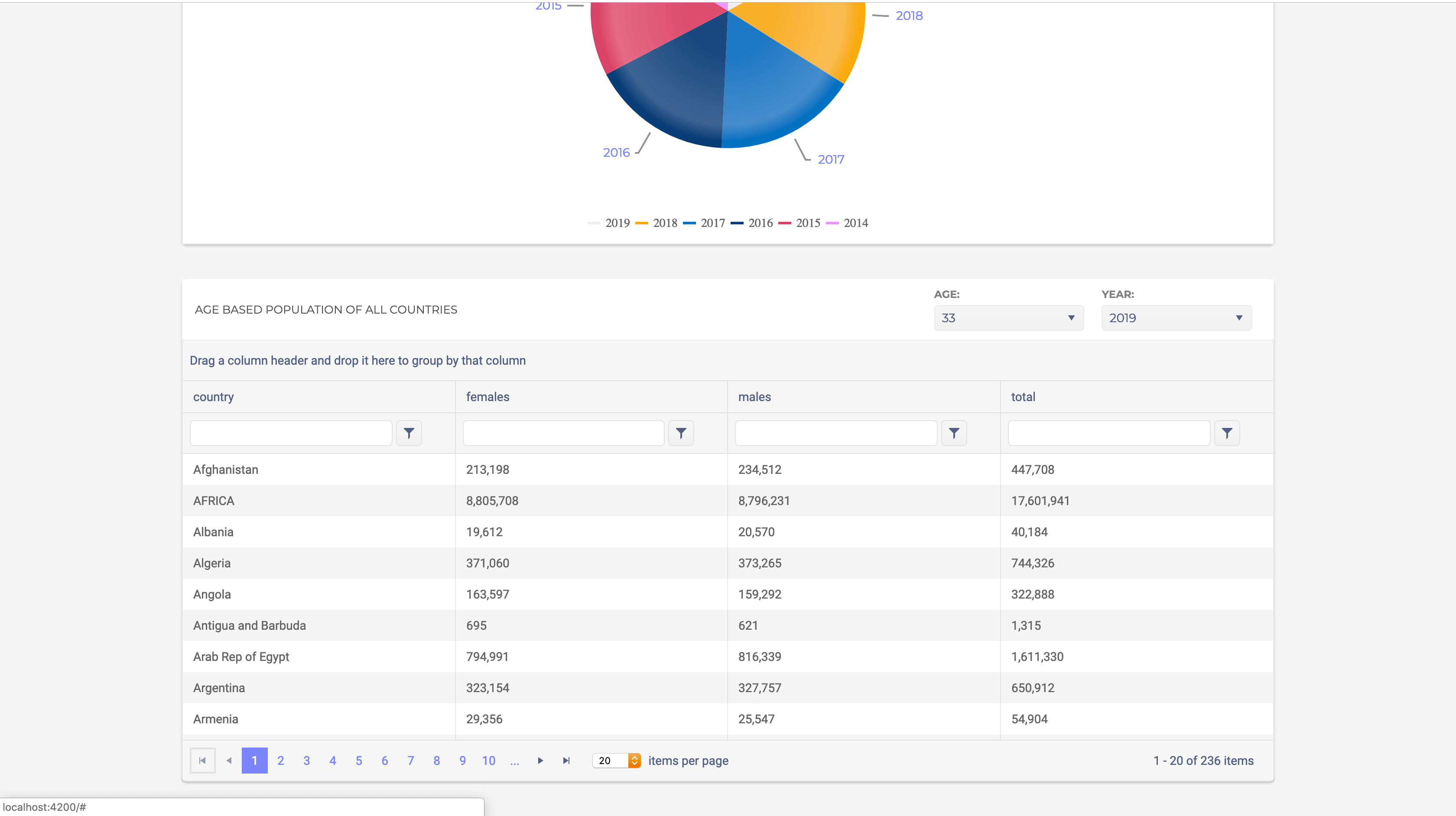
Displaying Population Data for Countries in Table Form
To display the population data for the world’s countries in table form, we’ll use a great component provided by Kendo UI called Grid. This component supports filtering, grouping, sorting and pagination of data in a tabular form. This component is the Swiss army knife of data display — it packages all these functionalities into one component that is well designed and easy to use.
Let’s create a separate component to display grid component by Kendo UI. Run the following command to create a component called population grid:
ng generate component population-grid
Open the newly created populaton-grid.component.html file and update it with the code below:
    <section>
      <div class="header">
        <h4>Age based population of all countries</h4>
        <div class="filter">
          <div class="filter-age">
            <p>Age:</p>
            <kendo-dropdownlist
              [data]="ages"
              [value]="currentAge"
              (valueChange)="onAgeChange($event)"
            >
            </kendo-dropdownlist>
          </div>
          <div class="filter-year">
            <p>Year:</p>
            <kendo-dropdownlist
              [data]="years"
              [value]="currentYear"
              (valueChange)="onYearChange($event)"
            >
            </kendo-dropdownlist>
          </div>
        </div>
      </div>
      <kendo-grid
        [kendoGridBinding]="populationData"
        [height]="410"
        [pageable]="{
          buttonCount: buttonCount,
          info: info,
          type: type,
          pageSizes: [10, 20, 30],
          previousNext: previousNext
        }"
        [sortable]="true"
        [groupable]="true"
        [filterable]="true"
        [pageSize]="10"
      >
        <kendo-grid-column field="country"> </kendo-grid-column>
        <kendo-grid-column field="females">
          <ng-template kendoGridCellTemplate let-dataItem>
            <div>{{ dataItem.females | number }}</div>
          </ng-template>
        </kendo-grid-column>
        <kendo-grid-column field="males">
          <ng-template kendoGridCellTemplate let-dataItem>
            <div>{{ dataItem.males | number }}</div>
          </ng-template>
        </kendo-grid-column>
        <kendo-grid-column field="total">
          <ng-template kendoGridCellTemplate let-dataItem>
            <div>{{ dataItem.total | number }}</div>
          </ng-template>
        </kendo-grid-column>
      </kendo-grid>
    </section>
In the snippet above, to display a huge array of data returned from the server, we enabled the sorting, grouping, filtering, etc. functionalities of the grid by passing Input bindings like sortable, groupable, and filterable to the kendo-grid component. For each column, we pass a field in the data we wish to display. In the first kendo-grid-column, we’re displaying the country property of the row data.
Since most of the data we’re displaying are digits, we’re using the number pipe from Angular to format it according to the locale rules that determine group and sizing separator.
The data we’re displaying is for a certain age demographic in a given year, so we need to allow users update the age demographic and year. For that, we’re making use of the Kendo UI dropdown component. On the component, we’ve attached a valueChange listener for when the value of the dropdown changes.
Next, we’ll attach some styles to the component by updating the population-grid.component.scss file:
    section {
      background: white;
      margin-top: 40px;
      box-shadow: 0 2px 3px 0 rgba(0, 0, 0, 0.2);
      border-radius: 5px;

      .header {
        padding: 10px 15px;
        display: flex;
        justify-content: space-between;
        font-family: 'Montserrat', sans-serif;
        align-items: center;

        h4 {
          font-size: 13px;
          margin: 0;
          font-weight: 400;
          text-transform: uppercase;
          opacity: 0.7;
        }

        .filter {
          display: flex;
          justify-content: space-between;

          div{
            margin: 0 10px;
          }
          p {
            font-size: 12px;
            margin: 0 0 5px;
            font-weight: 600;
            color: rgba(0, 0, 0, 0.5);
            text-transform: uppercase;
          }
        }
      }
    }
This should give the component a more personalized look. Let’s update the component file to create event handlers for the dropdown change events and to subscribe to the data from the server.
Open the population-grid.component.ts file and update it similar to the snippet below:
    import {Component, OnInit} from '@angular/core';
    import {Socket} from 'ngx-socket-io';

    @Component({
      selector: 'app-population-grid',
      templateUrl: './population-grid.component.html',
      styleUrls: ['./population-grid.component.scss']
    })
    export class PopulationGridComponent implements OnInit {

      constructor(private socket: Socket) {
      }

      populationDataSub = this.socket.fromEvent('countries population data');
      populationData;
      years = [2019, 2018, 2017, 2016, 2015, 2014, 2013, 2012, 2011, 2010, 2009];
      ages = [5, 12, 22, 30, 33, 40, 44, 55, 66, 70, 80];
      currentYear = 2019;
      currentAge = 23;

      onAgeChange(age) {
        this.currentAge = age;
        this.socket.emit('fetch population data', {age: this.currentAge, year: this.currentYear});
      }

      onYearChange(year) {
        this.currentYear = year;
        this.socket.emit('fetch population data', {age: this.currentAge, year: this.currentYear});
      }

      ngOnInit() {
        this.populationDataSub.subscribe((data) => {
          this.populationData = data;
        });
      }

    }
In the component file, we declare properties to hold all the years and ages a user can filter through and also subscribe to an event using the fromEvent Socket method. We also set up event handlers for the dropdown change events.
The onAgeChange method assigns the selected age to the currentAge property and then emits an event to the server to get the data matching the updated age. The onYearChange does something similar but for the year filter.
Finally, in the OnInit lifecycle of the component, we subscribe to the event and wait for the update from the server. The returned data is assigned to the populationData property.
Now let’s update the app.component.html file to render this part of the application. Open the app.component.html file and render the population-grid component:
    <main>
      <app-header></app-header>

      <section class="container">
        <div class="population-stats">
          ...
        </div>
        <div class="population-years__comparison">
          <app-population-chart></app-population-chart>
        </div>
        <div class="world-population__data">
          <app-population-grid></app-population-grid>
        </div>
      </section>
    </main>
After this change, if we visit the homepage of the application, we should see the grid component in all its glory working like a well-oiled machine:
Note: Ensure the server is running alongside the Angular dev server before testing.
Takeaways
Data visualization is important because it effectively displays the performance of operations occurring. It allows users to see connections between performance and operating conditions. We’ve seen how easy it is to use Kendo UI alongside Angular and Socket.io to set up a reliable data visualization platform. The components provided by Kendo UI effectively reduce development time and ease development. Kendo UI has an extensive set of Angular components; they also provide components for Vue.JS, React, and jQuery.
You can find the source code for this demo application here.
This blog has been brought to you by Kendo UI
Want to learn more about creating great web apps? It all starts out with Kendo UI - the complete UI component library that allows you to quickly build high-quality, responsive apps. It includes everything you need, from grids and charts to dropdowns and gauges.


Christian Nwamba
Chris Nwamba is a Senior Developer Advocate at AWS focusing on AWS Amplify. He is also a teacher with years of experience building products and communities.
Related Posts
Comments
All articles
Topics
Latest Stories
in Your Inbox
Subscribe to be the first to get our expert-written articles and tutorials for developers!
All fields are required