
Why Designers Should Care About Telerik and Kendo UI Component Libraries

Documentation for everyone, tools that meet you where you prefer to work, and software that makes editing, previewing, sharing and implementing design changes easier than ever before! What’s not to love?
In the same way that many developers make the (incorrect) assumption that there’s nothing useful for them in design software and tooling, many designers also mistakenly assume that there’s nothing of value to them when it comes to developer-focused software and tooling. In truth, both parties will benefit if they’re willing to step outside their comfort zones and explore!
The Progress Telerik and Kendo UI component libraries are a great choice for developers and designers who are looking for ways to create unique and beautiful user interfaces. We offer a vast array of design-focused resources for designers who are either working with one of our Telerik or Kendo UI component libraries themselves or collaborating with a development team who does. From documentation to Figma resources and no-code theming software, let’s take a look at what’s on offer for designers using the Telerik or Kendo UI systems.
Customize and Transform
Many of the designers working with our component libraries are heavily customizing the component UI—and that’s fantastic! Some even take it a step further and integrate a Telerik or Kendo UI component library into their greater design system.
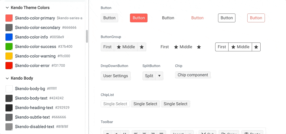
While some other component libraries take a strongly opinionated design approach that makes it challenging to overwrite the UI with custom styles, Telerik and Kendo UI component libraries place a primary focus on supporting unique theming and styling.
We believe that a strong component library is a flexible one—bend as much as you want, we won’t break! Reap the benefits of advanced functionality, tested accessibility and intuitive user experience … combined with a library that’s so easy to completely transform visually, your users will think you built the whole thing from scratch.
Design-Focused Documentation
Of course, a design system doesn’t just magically happen—it takes a lot of research, planning, work and maintenance on the part of the designers. We can’t remove all of that, but we can make it significantly easier with our Progress Design System documentation.
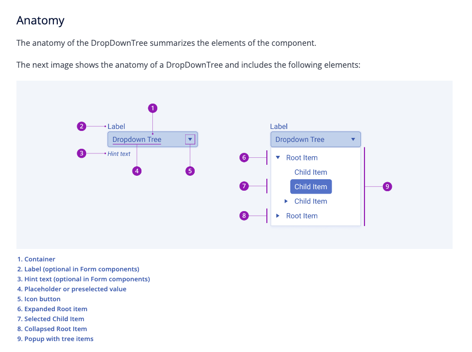
In addition to our framework-specific technical documentation, we also offer documentation that’s intentionally design-focused. From guidelines for creating your own iconography (and then seamlessly exporting it from Figma) to detailed wireframes for component anatomy, you’ll find all the information you need to completely restyle our libraries and blend them seamlessly with your design system.
Figma UI Kits
Of course, what good is an advanced component library on the dev side if design is still having to recreate everything in their primary workspace—Figma? We believe that design and development are two sides of the same coin; tools that benefit one but not the other aren’t worth investing in. A good Figma UI kit enables designers to quickly create mockups, build new custom components or create pixel-perfect prototypes for user testing.
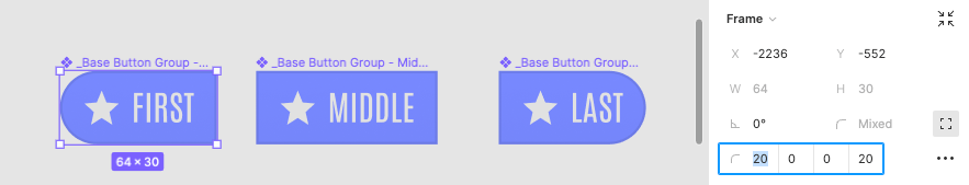
Our Figma UI Kits are built using the atomic design system methodology and using Figma components + auto-layout. This makes them incredibly easy to work with—add layers, change alignments and more. Make changes to the base components and see it automatically versioned out across the whole library!
They also include variants for all component user interaction states, so you don’t have to guess what will happen when users click, expand, hover or tap. And, of course, the design token support to enable a flexible, consistent and easily maintainable design system.
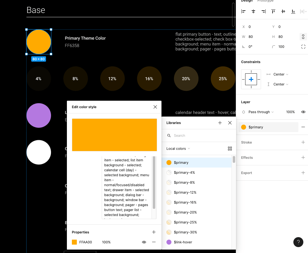
ThemeBuilder
Last, but certainly not least, Progress ThemeBuilder is WYSIWYG styling software that allows designers and developers to collaborate in the same environment—at the same time—to customize components. ThemeBuilder enables teams to style everything from top-level elements to granular adjustments (such as the padding or font size within a specific component).
To make it even more streamlined, design tokens and icons can also be imported into ThemeBuilder from Figma—and CSS / SASS can be exported from ThemeBuilder! Import tokens from the design file, assign the variables and see an immediate visual preview of the new component UI, then export application-ready stylesheets that capture all the changes … without ever writing a single line of code.
What Can Telerik & Kendo UI Do for You?
At Progress, we understand and value the crucial role that designers play in website and application development. Telerik and Kendo UI component libraries combine form and function, offering over 100 intuitive and feature-rich components that are all highly customizable and made with the developer—and designer—experience in mind.
Documentation for everyone, tools that meet you where you prefer to work, and software that makes editing, previewing, sharing and implementing design changes easier than ever before! What’s not to love?
If you aren’t already using a Telerik or Kendo UI component library, you can try one out completely free for 30 days. Same goes for ThemeBuilder—try it free for a week and see just how easy it can be to theme, adjust and export styles. Together, our tools make the perfect team for bridging the gap between design and development!

Kathryn Grayson Nanz
Kathryn Grayson Nanz is a developer advocate at Progress with a passion for React, UI and design and sharing with the community. She started her career as a graphic designer and was told by her Creative Director to never let anyone find out she could code because she’d be stuck doing it forever. She ignored his warning and has never been happier. You can find her writing, blogging, streaming and tweeting about React, design, UI and more. You can find her at @kathryngrayson on Twitter.
Related Posts
Comments
All articles
Topics

Latest Stories
in Your Inbox
Subscribe to be the first to get our expert-written articles and tutorials for developers!
All fields are required