
Implementing the 5 Key Principles for Creating Effective UIs—Part 3
 by Peter Vogel

Summarize with AI:
How to know if your app’s user experience is effective: Do your users know what to do next? Part 3 shows how to organize and test your UIs.
In this series, we’re discussing how to ensure your user experience (UX) is as effective as possible. We’ve targeted five principles to help you create a user interface that your users know how to use:
- Be consistent
- Leverage design patterns
- Support the users’ scenario
- Organize your UIs
- Test your UI … and get your users involved early
In this final post in the series, we’ll cover those last two. Consistency and design patterns were covered in Part 1, and then Part 2 covered how to support the users’ scenario.
The Fourth Principle: Organize Your UIs
Once you’ve ensured that a user can navigate to the UI they need, your responsibility shifts to organizing the elements that make up each UI. Organizing the individual UIs is still driven by the user’s mental model but your goal now is to reduce the user’s cognitive load when interacting with each UI in the user’s scenario. Ideally, your UI matches the user’s mental model so closely that users never consciously think about your application and, instead, can concentrate on achieving their goals.
Reducing your user’s cognitive load comes down to using well known design patterns to implement what your users need at this point in their scenario—which means only implementing what your user needs. This comes back to why “the one screen does everything” design fails: Putting “everything” in the UI actually increases the user’s cognitive load by forcing the user to ignore much of the UI most of the time.
Defining Sections
Once you’ve decided what elements the user needs in their UI, you can further reduce the users’ cognitive load by organizing those elements into sections tied to your user’s mental model. Essentially, each section in the UI corresponds to one of the components that make up your user’s mental model.
In a sales order application, those components might be the customer’s addresses (shipping and billing), information tied to the order as a whole (shipping date, order Id, etc.), the list of products being purchased, and the cost (product-related, shipping-related, tax, discounts, etc.).
You can leverage multiple tools from the psychology of perception to create those sections, but the three most useful ones are:
- Common regions: Elements inside a boundary are seen as a group
- Proximity: Elements that are near to each other are seen as a group
- Similarity: Elements that share formatting are seen as related
These three laws mean that you don’t necessarily have to draw a border around a set of elements for users to the see them as a section. Leveraging proximity, for example, means that if there’s more space around a set of elements than there is between those elements, then those elements will be seen as a group (especially if the elements share a common appearance).
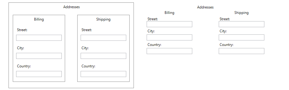
This simple WPF screen demonstrates dividing a UI into sections using both the LayoutPanel component to define common regions and using simple
proximity (along with a similar look and feel).
Relying too much on proximity can create a new problem, however, especially on small screens. When elements are “too close,” users may not be able to reliably select the element they want. This effect is described in Fitt’s law. Putting more space between elements that belong together and creating sections by using borders (i.e., leveraging common regions) might be a better answer when screen space is tight and the user’s selection tool is large. Think of this as the “My Big Fat Thumb” problem.
Supporting Scenario Variations
But, often, not every user needs all of a UI’s sections. In a sales order application, for example, the UI that’s appropriate for the Shipping department isn’t the right one for the Billing department.
The Shipping department doesn’t need to see customer billing information and would describe a UI that includes billing information as “cluttered.” On the other hand, the Billing department is keenly interested in things like the customer’s credit rating and the customer’s payment history, but the only shipping information that Billing wants is the cost. Focusing each department’s UI on the elements the department’s users need reduces the cognitive load for the users.
However, you also need to recognize that users’ needs may vary from one interaction to another—there may be times when Shipping does need to access billing information, for example. Think of these as “variations” on the users’ scenario.
Sections that are hidden by default but can be displayed by the user when the user needs them address these issues. Hidden/displayable sections reduce UI clutter and cognitive load for the typical scenario but let users access information they only need occasionally.
Popout panels are another option for providing information when required while staying out the user’s way the rest of the time.
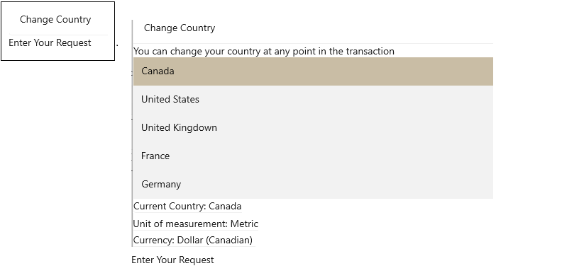
An expander panel (implemented using the Progress Telerik UI for WinUI RadExpander) lets you create a UI that’s initially focused on the user’s goal
(“Enter a Request”) but can be expanded by clicking on “Change Country” when the user needs more options.
An accordion control is another way to enable users to ignore information when they don’t need it but easily access it when they do.
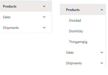
PanelBar and PanelBarItem components from the Progress KendoReact library let you create “accordion” style interfaces with
multiple panels.
Tab-based UIs provide yet another way to create sections. A tab-based design makes sense to users when:
- There’s a lot of related functionality
- At any one time, the user usually only needs some of that functionality
- You can’t predict the order that the user will follow in accessing the functionality
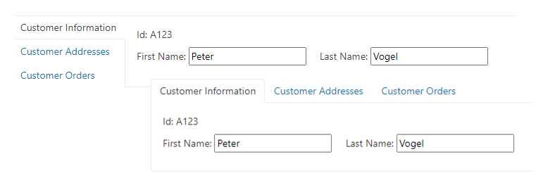
Multiple tabs allow users to switch between related functionality on an “as needed” basis. The Progress Kendo UI for Vue TabStrip shows
tabs in two configurations: on the left and across the top.
Initially, creating sections sounds like it will add to the cost of creating a UI as compared to creating a more static interface. However, sections have the potential to reduce development and maintenance costs by having one screen support multiple scenarios.
You could, for example create multiple UIs for users in Shipping and Billing or for big screen/small screen devices. However, with the appropriate sections in place, you may be able to create a single UI that tailors itself to the needs of particular users/devices by hiding individual sections.
In fact, hiding or moving sections in a UI is the common approach for creating a “responsive user interface” that handles both big-screen and small-screen devices. However, when supporting big and small screens in the same UI, it’s easy to fall into concentrating on “making the screen fit” rather than ensuring that users can always achieve their goals. Organizing your UI into sections based on the users’ mental model positions you to either:
- Eliminate sections that aren’t relevant to the user goals on the small screen device (typically, users of the smartphone version of an app have more focused goals than when using the “big-screen” version)
- Rearrange the sections on the screen without disrupting the users’ mental model (typically moving from a horizontal to a vertical orientation)
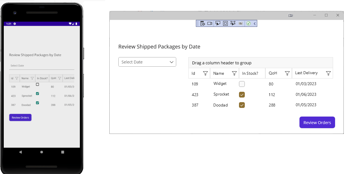
An application using Telerik UI for .NET MAUI components reconfigures its display to fit in both an Android Pixel 9 screen and a Windows
desktop environment.
The Final Principle: Test Your UI … and Get Your Users Involved Early
The only useful criteria for assessing your UX is whether “the user always knows what to do next in order to achieve their goal.” The best way, therefore, to find out if your UX is meeting that criteria is to bring users in to try your UX out. And your users’ input is worth having: Your users are, after all, experts both in using UIs and knowing how to do their job.
You can’t start too early here. If you wait “until you have something” before bringing in your users, then you’re deciding that getting to any answer early is better than finding out what the right answer is, right now.
As soon as you can pull together a paper and pencil (or whiteboard) mock-up, you can do a UI test with some of your users by asking them to try interacting with your mock-up. For these UI tests, you’ll act as the application, pulling up the sheet of paper with the “next UI,” highlighting the active control with a marker, and writing any error messages on the paper “screen” to mimic how your application will interact with the user.
There are two major benefits to getting an early start with users. First, a UI test is the surest way to discover if you actually do understand both your users’ mental model and their goals. Second, the users who are involved in testing will feel they’ve had an impact on your application’s UX. Those users will automatically like the resulting UI better than one that’s inflicted on them without their involvement. If you’re lucky, those users will also act as champions to other users for your application, giving your UX a better initial reception when you roll it out.
While visual design isn’t part of this paper, involving a visual designer can also get you a better initial reception. This is the result of the aesthetic-usability effect, which says that users believe that beautiful things are more likely to be usable.
But creating champions and having an attractive design only helps with user’s initial reaction. In the end it will be your users’ actual experience of working through your UIs that will form your users’ judgment—which is the only one that matters, after all.
Assessing User Feedback
As you gather feedback from your users, be aware that it can be … well, disappointing. You may, for example, just get the deflating comment, “Well, it’s very straightforward.” That may not sound like high praise, but it means your UX matched the user’s mental model so well that users didn’t have to think about how your application works.
Getting the comment that your UX is “intuitive” is more encouraging, though. It also means that you successfully leveraged both design patterns and a well-known theme so that your users always knew what to do next.
The downside of this reality is that the best feedback you’ll ever get for your UX is that your UIs are invisible to your users. And that brings up the peak-end rule. The peak-end rule says that people judge experiences based on two things: the end point and any high or low points (the peaks) along the way. This is the “Well, I loved that piece of music right up until that screeching crescendo at the end which ruined it for me” effect.
If your UX either fails at the end or if something goes very wrong before the end, users will remember those moments and not the “invisible things” in between. You’ll need to recognize that, when you get feedback that only focuses on the end or on a particular peak, it means that the rest of your UX was invisible.
And no feedback at all means your whole UX was invisible to your users—your users were just able to do what they wanted. And that’s what you want.
Try DevCraft Today
Get started with a Progress Telerik DevCraft Trial today! The DevCraft suite is the most powerful collection of Telerik .NET and Kendo UI JavaScript developer tools. It includes modern, feature-rich, professionally designed UI components for web, desktop and mobile applications; embedded reporting and report management solutions; document processing libraries; and automated testing and mocking tools.
DevCraft will arm your developers with everything needed to deliver outstanding applications in less time and with less effort, and with consistent theming across your applications.
With award-winning technical support delivered by the developers who built the products and a ton of resources and trainings, you can rest assured that you have a stable provider to rely on for your everyday challenges along your software development journey.
Peter Vogel
Peter Vogel is both the author of the Coding Azure series and the instructor for Coding Azure in the Classroom. Peter’s company provides full-stack development from UX design through object modeling to database design. Peter holds multiple certifications in Azure administration, architecture, development and security and is a Microsoft Certified Trainer.
Related Posts
Comments
All articles
Topics
Web MobileMobile
Desktop
Design
Productivity
People
