
UI for ASP.NET AJAX
ASP.NET AJAX ColorPicker
- Select any color from the variety of palettes, coming with the ASP.NET AJAX ColorPicker control. Offering both predefined and custom palettes, advanced skinning and more.
- Part of the Telerik UI for ASP.NET AJAX library along with 120+ professionally designed UI components.
- Includes support, documentation, demos, virtual classrooms and more!
-
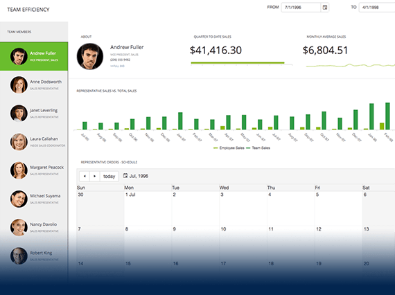
Color Selection
Enable your users to naturally select a color via the various color palettes.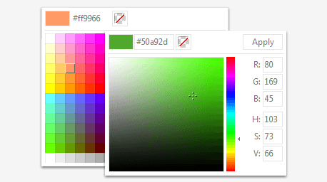
-
Keyboard Support
Interact with the color picker control using easy-to-customize keyboard strokes.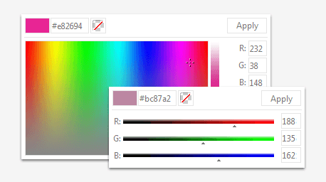
All ASP.NET AJAX Components
Data Management
- Spreadsheet
- DataForm
- ClientDataSource
- TreeList
- PivotGrid
- OData DataSource
- ListView
- ListBox
- Filter
- Data Pager
- Grid
Scheduling
Layout
- Badge
- Avatar
- Card
- Wizard
- Device Detection Framework
- Page Layout
- Window
- ToolTip
- Splitter
- Notification
- MultiView
- Dock
Interactivity & UX
Theming
Media
Editors
Data Visualization
- Pyramid Chart
- Vertical Area Chart
- Vertical Line Chart
- ArcGauge
- CircularGauge
- Timeline
- Map
- Diagram
- Rotator
- Org Chart Updated
- Gauge
- BinaryImage
- Barcode
- Chart (HTML5)
File Upload & Management
Spell Checking
Navigation
- Speech-to-Text Button
- ChipList
- Chip
- Floating Action Button
- Stepper
- SplitButton
- Switch
- Breadcrumb
- Button
- PanelBar
- RibbonBar
- SearchBox Updated
- TabStrip
- ToolBar
- SiteMap Updated
- TreeView
- Menu
Performance
Ajax
Social
SharePoint Web Parts
Mobile Widgets
Document Processing
