
The Role of Frontend Engineers in Design Systems, Part 2

Frontend software engineers play a crucial role in design systems, including attending to accessibility, performance and good documentation in a design system.
Frontend engineers play a crucial role in the creation and maintenance of design systems. In Part 1 of this article series, we explored how frontend developers prepare and maintain coding style guides, component libraries and design tokens when working within a design system. In this article, we’ll continue the discussion by looking at the importance of recognizing accessibility, performance and good documentation in a design system.
Accessibility
Accessibility is a critical aspect of UI design that should not be overlooked. UI components should be accessible to everyone, including those with disabilities. Accessibility guidelines such as Web Content Accessibility Guidelines (WCAG) help provide detailed information on how to create accessible web content.
One important aspect of accessibility is providing alternative text for non-text content such as images, videos and audio. This allows screen readers and other assistive technologies to describe the content to users who may not be able to see or hear it. For images, this can be achieved with the use of the alt attribute which provides a brief description of the image that is used by screen readers and other assistive technologies.
<img src="cat.jpg" alt="A fluffy gray and white cat with green eyes" />
In addition to alternative text, using semantic HTML is also important for accessibility. By using semantic HTML, frontend developers ensure that screen readers and other assistive technologies can understand the content and convey it to users in an accessible way.
<!-- Non-semantic heading -->
<div class="header">
  <div class="logo">Company Logo</div>
  <div class="title">Page Title</div>
</div>

<!-- Semantic heading -->
<header>
  <img src="logo.png" alt="Company Logo" />
  <h1>Page Title</h1>
</header>
In the code example above, we can see the first code block uses a non-semantic heading that consists of a <div> element with two children <div> elements to display a logo and
page title. This is not an ideal structure for accessibility because it doesn’t clearly indicate which element is the main heading of the page.
The second code block, however, uses semantic HTML by wrapping the logo and page title in a <header > element and using the <img> and <h1> elements to render an image and heading respectively.
Among the above points, there are many other practices that can be done to ensure good accessibility in UI components which include:
- Establishing proper contrast between text and background colors. This helps make it easier for users with visual impairments to read the content. Tools like Contrast Checker (by WebAIM) can be used to see if the contrast ratios of text and background colors either pass or fail accessibility standards.
- Providing keyboard navigation for all interactive elements. This allows users who cannot use a mouse or trackpad to navigate and interact with the elements in a design system using only the keyboard.
- Avoiding the use of excessive flashing, blinking content, or rapidly changing colors that can be the cause of seizures in some people.
Performance
Optimizing components for performance is another crucial aspect of maintaining a design system as it directly affects the user experience. The faster a website or application loads, the more likely users are to stay on it and engage with the content. We’ll discuss a few important practices to consider to ensure UI components are built with performance in mind.
Building UI components with lazy loading can help with the overall performance of an app. Lazy loading is a technique that involves only loading resources such as images and videos when they are needed, which can improve the initial load time of a page. By only loading resources as they are needed, the browser can prioritize the loading of the most important content on the page. The concept of lazy loading can also be used with UI components themselves by having components also get loaded only when they are required.
Using responsive images that are optimized for different screen sizes can also improve performance. When building UI components that use (or expect images), we can ensure that provided images are tailored to the screen size of the user’s device. This helps the browser always download the appropriate image size which can reduce the file size and improve the overall load time of an application.
Minimizing the number of HTTP requests made to download assets for UI components can also optimize components for performance. This can be done by combining files such as scripts and stylesheets into a single file which can reduce the number of requests the browser needs to make to the server. Image sprites can also be used to combine multiple images into a single file, which can reduce the number of requests needed to load a large number of images.
Documentation
Finally, frontend developers need to ensure that all UI components in a design system are well-documented. Documentation helps other developers on the team understand how to use and customize the components which can save time and reduce errors.
When it comes to documenting UI components, it’s important to provide clear and concise instructions on how to use each component. This should include details on what props or attributes are available, what they do and how to use them. Additionally, including examples of how the component should be used in different contexts can help other developers on the team understand how to use and customize the components.
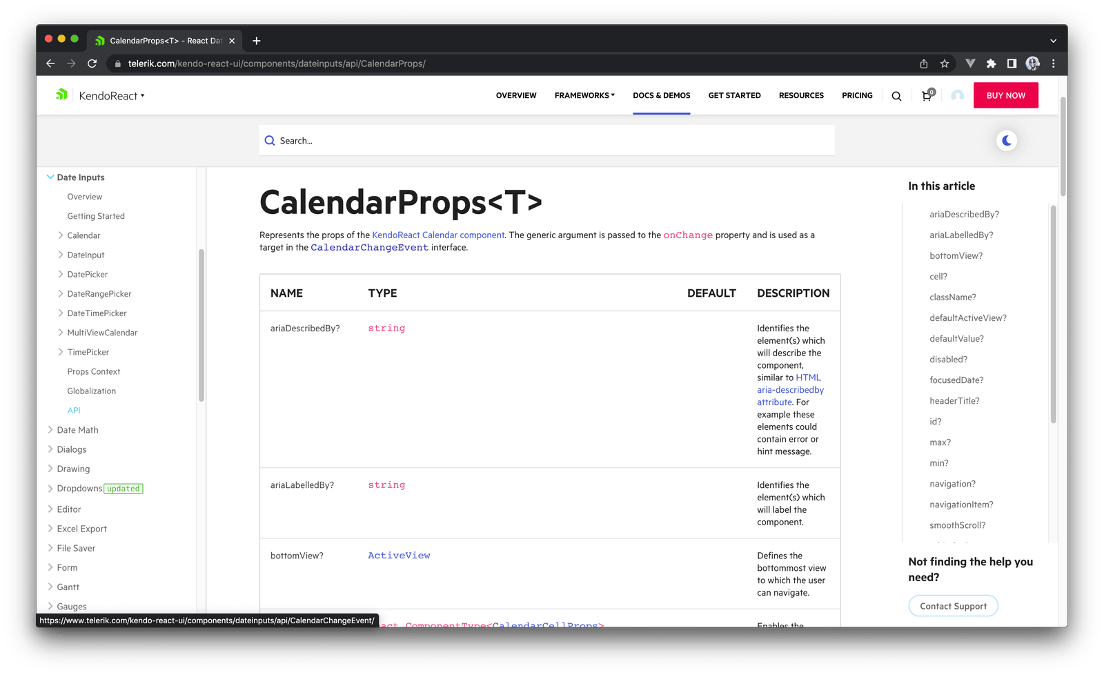
Here’s an example of how the props of a certain component in the KendoReact component library is documented.
Storybook is an open-source tool that can be very helpful in the building and documenting of UI components within a design system. Storybook allows frontend developers to create a visual library of components with various use cases, and provide code snippets, examples and documentation for each component. Storybook also has a built-in development environment, which allows frontend developers to work on the components in isolation and test them in different scenarios.
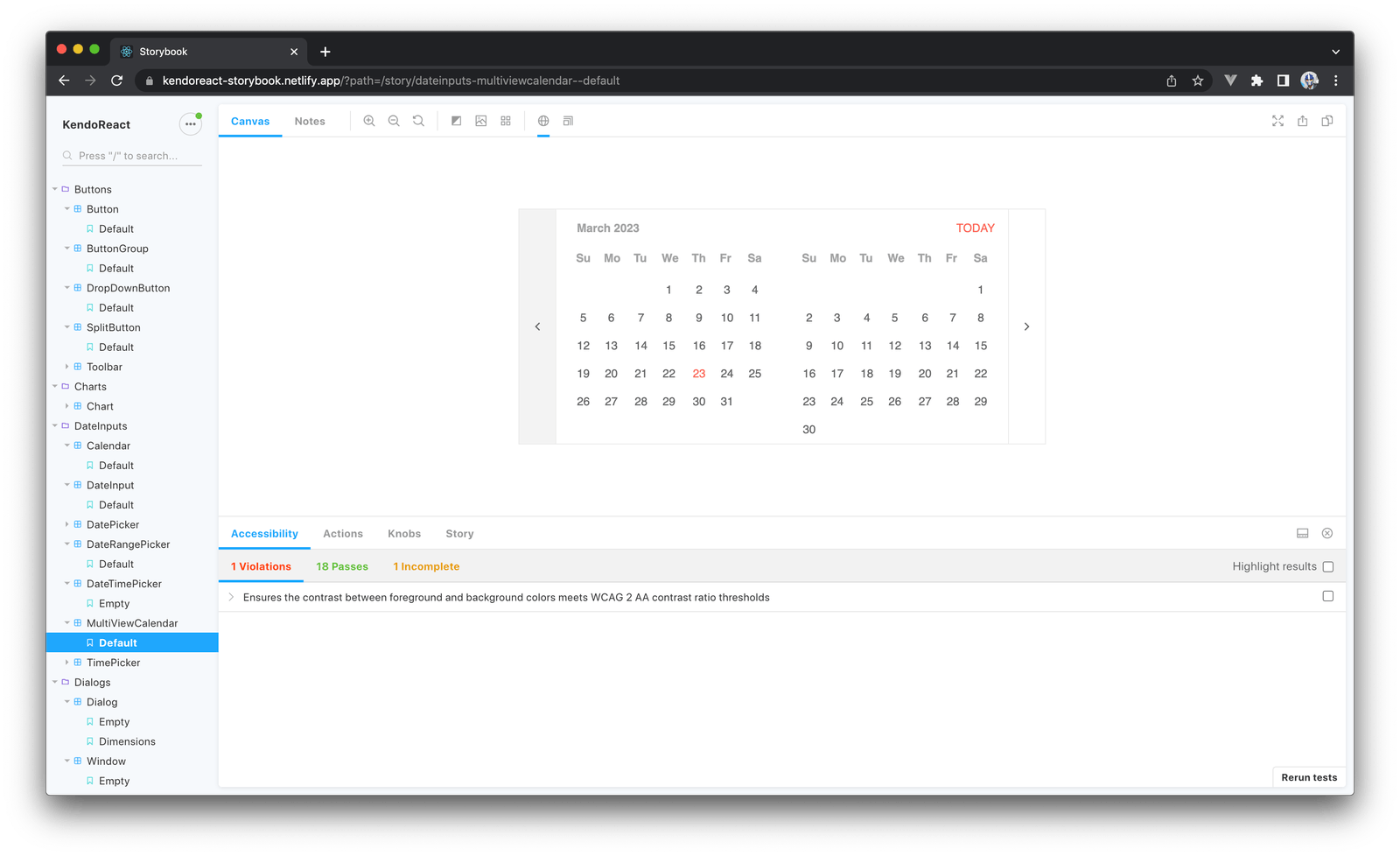
You can see the Storybook for the KendoReact library here.
It’s also important to ensure that component documentation in a design system is up-to-date and reflects any changes or updates made to the component. This can help avoid confusion and errors when using the components, and ensure that everyone on the team is working with the most up-to-date version.
Building a Design System with Kendo UI
Building a design system from scratch can be a daunting and time-consuming task, especially for organizations with limited resources. However, using a UI component library like Progress Kendo UI can significantly simplify the process.
Kendo UI is a comprehensive library of UI components, such as buttons, inputs, grids and charts, that can be used to build web applications. Kendo UI is built with customization in mind making it an excellent starting point for building a design system. And the ThemeBuilder tool is built to help.
By starting with Kendo UI, frontend developers can customize the library to fit their organization’s specific needs. This includes defining design tokens for colors, typography and spacing, as well as creating custom components and styles that adhere to the organization’s brand and design guidelines.
For more details on how this can be done, refer to the article Building a Design System with Kendo UI written by Thomas Findlay.
Wrap-up
In the first article of this series, we discussed the importance of preparing and maintaining coding style guides, design tokens and component libraries within a design system. Accessibility, performance and good documentation are also important aspects that frontend developers need to consider when creating and maintaining a design system. By ensuring that UI components are accessible to everyone, optimized for performance and well-documented, developers can provide a better user experience and help their team save time and reduce errors.

Hassan Djirdeh
Hassan is currently a senior frontend engineer at Doordash. Prior to Doordash, Hassan worked at Instacart and Shopify, where he helped build large production applications at-scale. Hassan is also a published author and course instructor and has helped thousands of students learn in-depth fronted engineering tools like React, Vue, TypeScript and GraphQL. Hassan’s non-work interests range widely and, when not in front of a computer screen, you can find him at the gym, going for walks or running through the six.
Related Posts
Comments
All articles
Topics

Latest Stories
in Your Inbox
Subscribe to be the first to get our expert-written articles and tutorials for developers!
All fields are required