
Modern UI with the WinForms RadToolbarForm

The toolbar form is here, bringing fresh new looks and cool features. It may well be the modern window your app has been waiting for.
What is a Toolbar Form?
The WinForms toolbar form is a window that has usable content in its non-client area. In other words, it gives you the freedom to add UI elements straight to the form’s title bar.
This type of layout is modern, and it may be already familiar to your end users. They’ve likely seen it in other software products—for example, Visual Studio, Outlook, Word and so on. With RadToolbarForm, you can save valuable screen space and extend the area of usable content where you can present the information that really matters.
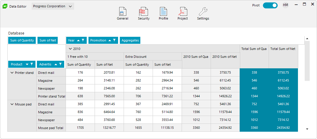
Below is a sample layout that arranges a caption, a dropdown menu, some buttons, a toggle switch and an avatar. All inside the non-client area of the form.
Creating RadToolbarForm
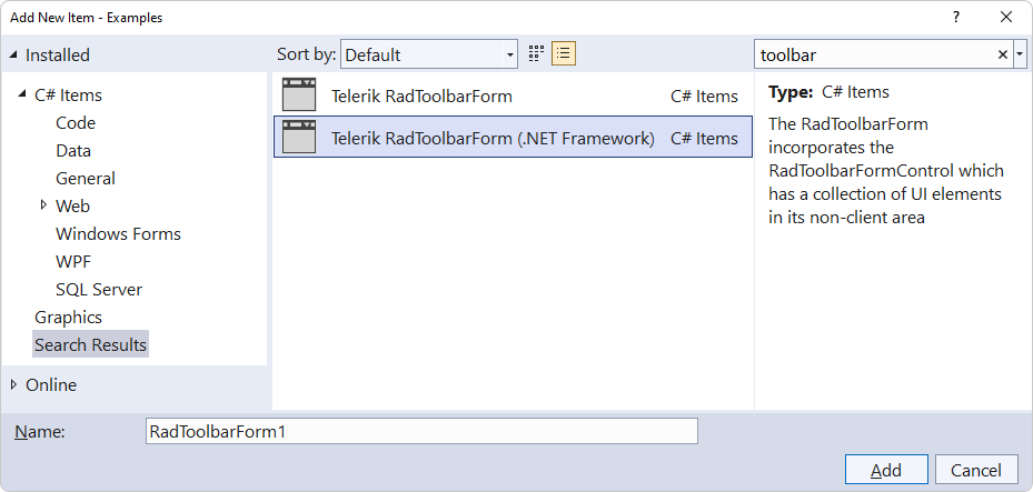
To start using the RadToolbarForm, you will either need to have the Telerik UI for WinForms extension installed or use our mighty RadFormConverter component.
With the extension, you will get all the new item and project templates so you will have the Telerik RadToolbarForm entry available in the Visual Studio Add New Item dialog.
If you go with the RadFormConverter, just drag it from the toolbox inside Visual Studio and convert a standard Microsoft form or any Telerik form to RadToolbarForm.
UI Elements
Now that I’ve shown how to create a toolbar form, let’s discuss the variety of elements that can be added to it. Thanks to the special architecture all our controls have, you can add a whole bunch of UI elements to the title bar area. Anything from buttons, menus, dropdowns, textboxes, toggle switches, track bars and progress bars, or even sparkline charts. Basically, any UI element that inherits the RadItem class can be added as a child inside the title bar. Here you can read more about the TPF architecture and the RadItem element:
Below is a screenshot of a sample layout with menu items, search box, buttons and a dropdown.
Structure and Items
We always aim at creating straightforward APIs so that it’s easy for you to work with our components. In terms of the architecture, the form is wrapping a special RadToolBarFormControl that is dealing with the title bar area and is responsible for arranging the added UI elements.
Let’s call the area of the title bar where we will position the added UI elements “non-client usable area.” We’ve decided to divide that area into three parts: Near (just after the icon element), Center and Far (just before the system buttons).
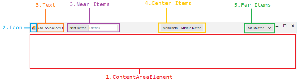
This way it is very easy to add various UI elements and glue them to the near, far or center areas of the title bar. Having divided the non-client usable are into three areas, it becomes natural to also expose NearItems, CenterItems and FarItems collections where you can add the UI elements. It is as simple as this:
this.ToolbarFormControl.ShowIcon = true ;
this.ToolbarFormControl.ShowText = true ;
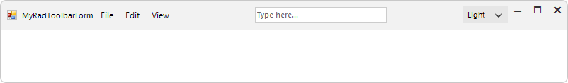
this.ToolbarFormControl.NearItems.Add(new RadToolbarFormMenuItem() { Text = "File"});
this.ToolbarFormControl.NearItems.Add(new RadToolbarFormMenuItem() { Text = "Edit"});
this.ToolbarFormControl.NearItems.Add(new RadToolbarFormMenuItem() { Text = "View" });
this.ToolbarFormControl.CenterItems.Add(new RadToolbarFormTextBoxElement() { Text= "Type here..." });
this.ToolbarFormControl.FarItems.Add(new RadDropDownButtonElement() { Text = "Light" });Here is the result:
It is that easy to deal with the Items collections, just remember that the elements are arranged in the order they are added.
Features
The toolbar form comes with a ton of features, and we’ve tried to cover as many scenarios as possible. While developing the component, one of our main goals was to expose various settings so that you could achieve different layouts according to your needs without having to write custom measure and arrange logic. The window also comes with full right-to-left support.
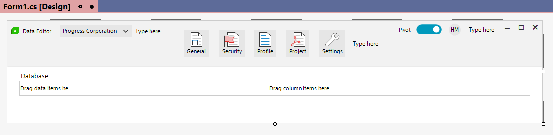
So, first we decided to make the title bar’s height variable. In different scenarios and apps, you might need title bars with different heights. You might not always be pursuing minimalistic and tiny look. In some apps where the screen space is not limited a bigger title bar will serve a different purpose. I may contain various navigation controls or buttons with larger icons. The screenshot at the 🔝 top inside the first paragraph is such an example.
Additionally, we’ve exposed properties controlling the vertical alignment of the elements inside the Near, Center and Far containers. This becomes more visible when you are having an extended title bar height.
We also wanted to make positioning the caption text of the form easy. Sometimes you may want it at the back, while in other forms just before or after the Center area, just think of Word or Visual Studio. The RadToolbarFormControl.TextPosition property comes to the rescue.
Using the code snippet above and the added items, you can play with the discussed in this section properties:
this.ToolbarFormControl.CaptionHeight = 72;
this.ToolbarFormControl.TextPosition = ToolbarTextPosition.CenterAfter;
this.ToolbarFormControl.CenterItemsVerticalAlignment = RadVerticalAlignment.Center;
this.ToolbarFormControl.FarItemsVerticalAlignment = RadVerticalAlignment.Bottom;
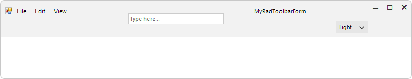
I know that the screenshot is not what your designer is imagining 😁 but it’s good enough to understand the power of all those settings.
Visual Studio Designer
We’ve already seen some of the designer magic with the RadFormConverter component. Now that we have successfully created a RadToolbarForm we can open it in the Visual Studio designer. All the Items collections and settings are exposed there, either in the RadToolbarFormControl’s smart tag or inside the Properties window. It is possible to create a very complex layout only inside the designer of Visual Studio. The UI of the samples in our demo app are all created entirely inside the designer.
Sign up for a Trial
Feel free to sign up for our free 30-day trial, which gives you access to the components as well as our outstanding technical support at zero cost. Just head to the Telerik UI for WinForms overview page or click the button below to sign up for a trial today!
Time For Feedback
Oh, and one more thing. We would be more than happy to hear your thoughts and suggestions once you try the theme and the other release goodies, so please drop us a line in the comments section below or by visiting the Telerik UI for WinForms Feedback Portal.

Hristo Merdjanov
Hristo joined the company in 2014 after graduating from Telerik Academy. He has been part of the WinForms team ever since. Hristo is passionate about the native technologies and WinForms in particular. Besides programming Hristo loves travelling, especially to the beach. He is also a keen tennis player.
Related Posts
Comments
All articles
Topics

Latest Stories
in Your Inbox
Subscribe to be the first to get our expert-written articles and tutorials for developers!
All fields are required