
Creating a Crosstab Report in the Web Report Designer

With just the Web Report Designer’s Crosstab component you can create a report that allows you to scan big-picture data and drill down in the details when you need it. Here’s how to set it up.
Progress Telerik Report Designers let you create your own reports. If you’re using the Web Report Designer embedded in an application, you can also create those reports right where you’ll use them: In your application.
In addition to static reports, the reporting tools will let you create interactive reports that, for example, show you high-level/big-picture data and then let you drill down to detailed data.
There are, at least, two common scenarios where you’ll want to create a report like that:
- Navigating by high-level data. You want to start your report with a compact, big-picture view to show the key data that lets you find what you want before you drill down to the detail you need.
- Flagging issues. You need some initial big-picture data that lets you spot problems/opportunities but then lets you drill down to the detail data that lets you understand the issue.
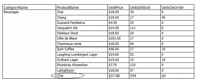
The Web Report Designer’s Crosstab bundles it all up into a single component:
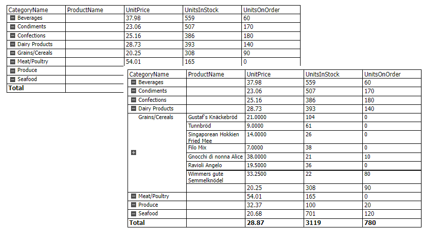
That you also get subtotal and grand total rows thrown into the crosstab is just icing on the cake.
To get that report, you first, of course, need to add a crosstab to your report. I’ll cover that in this post. In my next post, I’ll show how to turn on the interactivity that lets you expand and collapse your detailed data.
Configuring the Data
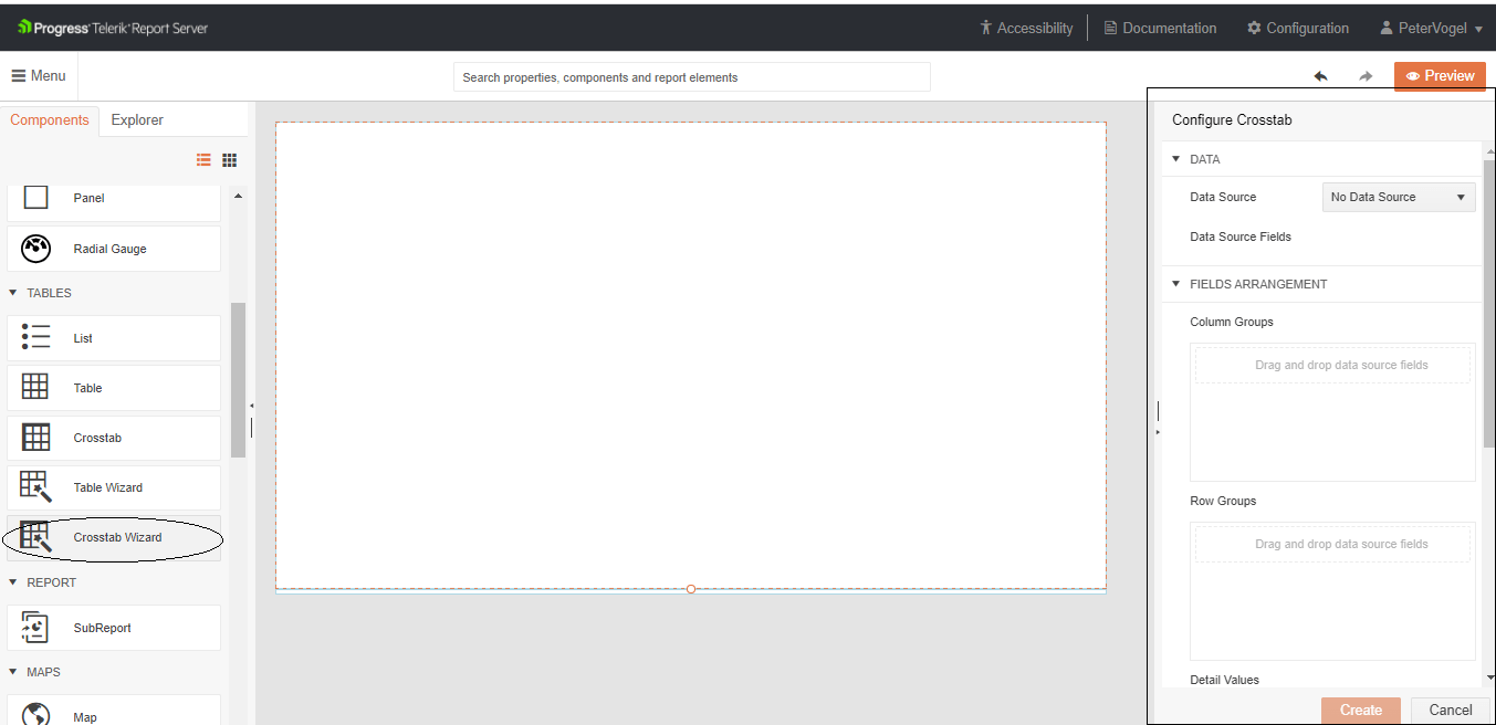
To add a crosstab to your report, select the section where you want to add your crosstab and then select the Crosstab Wizard in the components panel on the left side of the designer. That will open the crosstab wizard (titled “Configure Crosstab”) in the panel on the right side of the designer.
Hint: You probably don’t want the crosstab repeating for every row in your data source, so first add a Report Header Section to your report and then add your crosstab to that section.
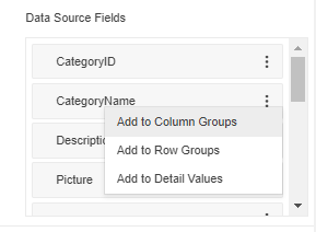
Once the wizard opens in the panel at the right, you’ll find a Data Source dropdown list at the wizard’s top. In that dropdown list, select the data source you want to use (I’ve used Microsoft’s sample Northwind database and a SQL query that joins the database’s Product table to its Categories table). Picking a data source causes the wizard to display, right below the dropdown list, the list of fields from that data source.
Next, you need to distribute the fields you want in your crosstab over three data sections: The crosstab’s Row Groups, Column Groups and Detail Values.
The crosstab’s Row Group section holds the fields that are always displayed down the left side of the crosstab and defines what rows in the data source count as “a group”. Column Group fields perform the same function but are displayed across the top of the crosstab and group columns rather than rows. The crosstab’s Detail Values section holds the body data for that column and that row (i.e., the data that will be displayed when the Column or Row Group is expanded).
Hint: As you define what fields will go in each data section, consider that, when a row group is collapsed, only the subtotals for the group are shown. Similarly, when a column group is collapsed the columns in the group effectively disappear from the display. You should think about what subtotals/columns will either help you find the detail you need or will highlight potential issues that detailed data will help you resolve.
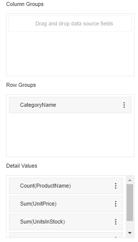
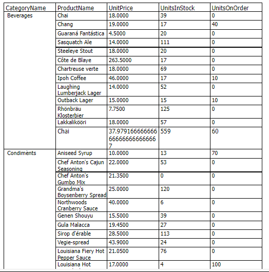
In my sample crosstab, I have put only one field in the row group area (CategoryName) in order to group my detail product data by CategoryName. For my detail data, I selected the ProductName, UnitPrice, UnitsInStock and QuantityOnHand fields. I had so few detail fields that I didn’t bother adding a column group.
Hint: You can add fields to the data section by dragging them to the appropriate section in the wizard. However, unless you have a short list of fields, a tall monitor and a high screen resolution, the field list and the three data sections probably won’t all fit on your screen at once. You may find it easier just to click on the three vertical dots at the right end of each field—that opens a popup menu that will let you assign the field to the Row Group, Column Group or Detail Values sections.
After distributing my fields, my three sections look like this:
Configuring the Display
Your next step is to define how you want your data displayed. In the Details section, for example, you’ll notice that each field has a function assigned to it that summarizes the field’s data to display in the group’s subtotal row.
For the fields I selected for Details area, the default summary functions are going to:
- Count the number of ProductNames.
- Sum the values for UnitPrice, QuantityOnHand and UnitsInStock.
Summing up all the UnitPrice values doesn’t really make much business sense … but displaying the average of all the UnitPrice values does (well, at least to me). As a result, I want to change the default function assigned to the UnitPrice.
To change the default function that’s been applied to any field, just click on the three vertical dots on the right of the field in the Detail Values section. From the popup menu that appears, select Function and, from the submenu that appears, select the function you want to use in summarizing the data. In my case, I selected the Avg (Average) function for the UnitPrice field.
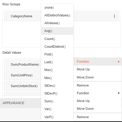
I also don’t want to display the count of ProductNames in my details—I want the actual product name displayed in each row so I can see what product the unit price, quantity on hand and units in stock are tied to. To stop summarizing the ProductName field, I still select the Function option from the field’s top-level menu but, from the list of functions, I’ll select the “(none)” option at the top of the function list.
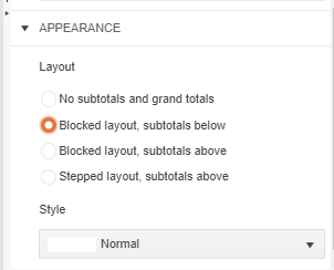
Further down, in the Appearance section, you can select how you want your groups displayed. You can, for example, suppress having subtotals displayed. For my crosstab, however, I want to have the subtotals displayed but, when the group is expanded, I want the subtotals at the bottom of the group. To get that layout, I select the second option in the layout section: Blocked layout, subtotals below.
Below those choices, you can also select from one of the predefined themes in the Style section. Since I’m the only person using this report (and in a bit of a hurry to get back to my job), I skipped using that option and just accepted the default white theme.
When you’re done, click the Create button at the bottom of your wizard and you’ll have your initial crosstab … but you won’t have any interactivity. Instead, you’ll get your Row (or Column) Group expanded with all your Detail Values displayed.
Making it Look Better
There is, of course, more that you could do. The report designer created will let you do almost anything you want because every part of the crosstab is available to you.
For example, the Average function that I’ve used on my UnitPrice field is generating more decimal places than I probably need. I can control that setting the format on the textboxes in the crosstab that are displaying the UnitPrice field.
First, I click on the UnitPrice textbox in the row of the designer that represents the detail row in my crosstab (that’s the first row under the heading row).
Now that I’ve selected the textbox that will display the unit price for each product, in the panel on the right, I can find the Format entry for the textbox and enter “{0:C}”—that sets the first (and only) number in the textbox to the Currency format.
You can pick from more numeric formats (look under the “Default Number Formats” and “Custom Number Format” headings) and date formats (again, look under “Default Number Formats” and “Custom Number Format”). I’ll repeat that formatting for the other two rows (total and subtotal), also.
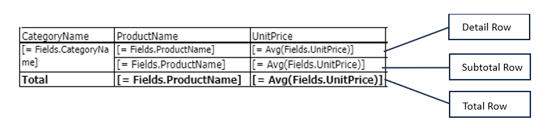
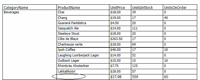
There’s one other problem that the ability to access all the parts of the crosstab lets you address. If you look at the report in Preview mode, you’ll notice that the name of the first product is displayed in the subtotal and total rows.
This is easy to fix: In the designer, just select the textbox for the ProductName in the crosstab’s subtotal row and delete the textbox. I’d also delete the product name in the total row so that the product name is only displayed in the detail rows.
If you wanted, you could even insert a label from the Explorer tab into those cells with the text “Sub Total” or “Total.” However this is, after all, a report that you’ve created for yourself so you may be the only person who ever uses it—it may be time to move on.
But … the report’s appearance is a little, well, boring. In retrospect, I might be sorry that I didn’t select one of the preset styles for my crosstab in the wizard, if only to make my subtotal rows stand out better.
If I have the time, I might try selecting the textboxes in my subtotal row and picking a distinctive background color in the Style section of the panel on the right. This is, however, a place where it would have been easier (and efficient) to pick a style in the wizard than working with the individual textboxes and labels on the page.
And if you want the interactivity that will let you expand and collapse your detail sections, all you have to do is turn it on and set the initial display of your crosstab. I’ll cover that in my next post.
Once again, thanks to Ivan Hriskov for his explanations and patience.
Embedded Reporting?
Progress Telerik Reporting provides all the tools you need to embed the rich, interactive reports your users need in order to analyze and understand their data right into your users’ applications (including letting your users export the results into more than 15 formats, either to distribute or integrate with other analysis tools). Telerik Reporting then lets you go further and empower your users with a fully functional Web Report Designer to create the reports they want without ever leaving the applications where they’ll use their reports.
You can leverage these easy-to-use tools in both any client-side web application environment (HTML5/JS, Angular, React, Vue or Blazor) and any .NET application (web or desktop: ASP.NET Core, ASP.NET MVC, ASP.NET AJAX, WinForms and UWP).
If you still have not tried it, you can start a free trial to take a closer look. A renowned support service and an array of resources will help you along the way.

Peter Vogel
Peter Vogel is a system architect and principal in PH&V Information Services. PH&V provides full-stack consulting from UX design through object modeling to database design. Peter also writes courses and teaches for Learning Tree International.
Related Posts
Comments
All articles
Topics

Latest Stories
in Your Inbox
Subscribe to be the first to get our expert-written articles and tutorials for developers!
All fields are required