
Build a Beautiful Configuration UI for Both Desktop and Mobile with Telerik UI for .NET MAUI Toolbar

Summarize with AI:
Meet the updated Telerik UI for .NET MAUI Toolbar—a flexible control that will enable you to build an intuitive, compact configuration UI that looks great.
A good application is one that enables its end user to do their job easily. Sometimes this means including a generous amount of configuration options in the UI part of the application.
It might sound simple, but building an intuitive, good-looking and at the same time feature-rich UI is no easy task. The Progress Telerik UI for .NET MAUI Toolbar was designed for those scenarios—a flexible control that will enable you to build the functional and compact configuration UI you need.
The updated Telerik UI for .NET MAUI Toolbar allows you to achieve the desired look and feel with its rich built-in collections of buttons and features to customize it:
- Rich collection of toolbar items:
- Label
- Button
- ToggleButton
- DropDownButton
- RadioButton
- ListPickerButton
- SplitButton
- Slider
- OptionsButton
- Group
- Custom item
- Horizontal or vertical orientation
- Overflow button
- Separators and Groups
- Styling options
First Steps
Let’s explore how powerful this component is by demonstrating how to use it.
First, we need to download and Install Telerik UI for .NET MAUI.
Note! Call UseTelerik();
Do not forget to call the UseTelerik() method inside the MauiProgram.cs file of your .NET MAUI project. This is needed for all Telerik UI for .NET MAUI components like UseTelerik() to register
all built-in or additionally created handlers to Telerik components.
When the .NET MAUI application has been set up, you are ready to add a Toolbar control to your page with XAML or C#:
XAML
xmlns:telerik="http://schemas.telerik.com/2022/xaml/maui"
<telerik:RadToolbar x:Name="toolbar" />
or
C#
using Telerik.Maui;
using Telerik.Maui.Controls;
........
RadToolbar toolbar = new RadToolbar();
Once you have the Toolbar defined, it is time to add the types of items you want to be configurable by the user.
Variety of Items to Fit Every Need

The Toolbar comes with 10 pre-built items to choose from when building the right UI for your case.
Let’s review a few of the basic items (Button, Label, Separator, RadioButton, DropDownButton, Slider, Toggle button and List Picker) by simply defining them in XAML or C#.
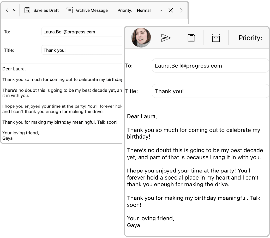
The example below uses the ButtonItem to demonstrate the approach used across all items:
XAML
//example of adding ButtonToolbarItem
<telerik:ButtonToolbarItem  Text="Undo">
  <telerik:ButtonToolbarItem.ImageSource>
    <FontImageSource  Glyph="{x:Static telerik:TelerikFont.IconUndo}"
        FontFamily="{x:Static telerik:TelerikFont.Name}"
        Size="16"  />
  </telerik:ButtonToolbarItem.ImageSource>
</telerik:ButtonToolbarItem>

//example of DropdownButtonToolbarItem
<telerik:DropDownButtonToolbarItem Text="Font Family" >
  <telerik:DropDownButtonToolbarItem.DropDownContentTemplate>
    <ControlTemplate>
      //the content of drop down here
    </ControlTemplate>
  </telerik:DropDownButtonToolbarItem.DropDownContentTemplate>
</telerik:DropDownButtonToolbarItem>
C#
var navButton = new ButtonToolbarItem();
navButton.Text = "Search";
navButton.ImageSource = new FontImageSource() { Glyph = TelerikFont.IconSearch };
toolbar.Items.Add(navButton);
If you want to change the font or to display the value of a Text property instead of the ImageSource or anything else, the way to do that is by setting the Style property. The important part here is that the style should target the “view” type that corresponds to every toolbar item.
For example the style for button will look like this:
XAML
<Style  x:Key="buttonToolbarStyle"  TargetType="telerik:ButtonToolbarItemView">
  <Setter  Property="DisplayOptions"  Value="Text"/>
  <Setter  Property="TextColor"  Value="Black"/>
  <Setter  Property="CornerRadius"  Value="5"/>
  <Setter  Property="BackgroundColor"  Value="LightGray"/>
  <Setter  Property="BorderThickness"  Value="1"/>
  <Setter  Property="BorderColor"  Value="Black"/>
</Style>
C#
var style = new Style(typeof(ButtonToolbarItemView));
style.Setters.Add(new Setter() {
  Property = ButtonToolbarItemView.DisplayOptionsProperty, Value = "Text" });
  //change the display option to Text
navButton.Style = style;
For reference of all items you can use the table below:
| UI Component | Toobar Item Type (all one word) | Respective View Context (all one word) | Visual Representation |
|---|---|---|---|
| Button | ButtonToolbar Item | ButtonToolbar ItemView |  |
| Label | LabelToolbar Item | LableToolbar ItemView |  |
| Separator | SeparatorToolbar Item | SeparatorToolbar ItemView |  |
| Slider | SliderToolbarItem | SliderToolbar ItemView | 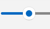 |
| Dropdown Button | DropDownButton ToolbarItem | DropDownButton ToolbarItemView |  |
| RadioButton | RadioButton ToolbarItem | RadioButton ToolbarItemView |  |
| ToggleButton | ToggleButton ToolbarItem | ToggleButton ToolbarItemView |  |
| ListPicker Button | ListPickerButton ToolbarItem | ListPickerButton ToolbarItemView | 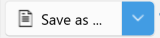 |
Documentation about all items can be found here.
Now, let’s review some of the more complex item types:
Custom Toolbar Item
If the pre-built toolbar items do not fit your needs completely, you can define a basic ToolbarItem and put any UI element in its Control template.
The respective view for its settings is called ToolbarItemView.
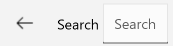
NavigationToolBar Item
If you want to add an item that has built-in navigation features like the ability to go back and forward, the NavigationToolbarItem is perfect for that purpose.
The NavigationToolbarItem has its own Items collection, so you can add any other toolbar item inside it. In fact, these items will represent the UI displayed when the button is clicked together with a built-in back button.
For example, to display a search button that is replaced with a label and an entry when clicked, the code will look like this:
<telerik:NavigationButtonToolbarItem Text="Search" >
  <telerik:NavigationButtonToolbarItem.ImageSource>
    <FontImageSource Glyph="{x:Static telerik:TelerikFont.IconSearch}"
      FontFamily="{x:Static telerik:TelerikFont.Name}"
      Size="16" />
  </telerik:NavigationButtonToolbarItem.ImageSource>
......
</telerik:NavigationButtonToolbarItem>
The result will be:
Initial state
After clicking the button
Next, we want to customize the back button behavior to change its DisplayOptions from Image to Text or display both “Image,Text”. The way to do that is by defining a style targeting telerik:BackNavigationButtonToolbarItemView and setting the BackNavigationButtonStyle property of the RadToolbar instance.
<Style TargetType="telerik:BackNavigationButtonToolbarItemView" x:Key="backNavigationButtonStyle">
  <Setter Property="TextColor" Value="Black"/>
  <Setter Property="Text" Value="Back"/>
  <Setter Property="DisplayOptions" Value="Image"/>
</Style>
<telerik:RadToolbar x:Name="toolbar"
  .........
  BackNavigationButtonStyle="{StaticResource backNavigationButtonStyle}"
  ..">..
</telerik:RadToolbar>
Options Button
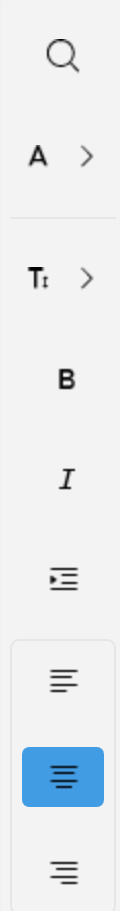
If we want to implement a similar scenario but have the search functionality displayed as an additional option, we can use the OptionsButtonToolbarItem.
Defining OptionsButtonToolbarItem together with an instance of RadToolbarOptionsPanel will give end users even more options.
Note: The important part here is that you need to assign an instance of RadToolbarOptionsPanel to have the options displayed.
Some sample code covering search functionality would look as follows:
<telerik:RadToolbarOptionsPanel x:Name="topPanel" />:
  <telerik:OptionsButtonToolbarItem Text="Additions search"
      OptionsPanel="{x:Reference topPanel}">
    <telerik:OptionsButtonToolbarItem.Style>
      <Style TargetType="telerik:OptionsButtonToolbarItemView">
        <Setter Property="DisplayOptions" Value="Image, Text" />
        <Setter Property="ImagePosition" Value="Left" />
      </Style>
    </telerik:OptionsButtonToolbarItem.Style>
    <telerik:OptionsButtonToolbarItem.ImageSource>
      <FontImageSource Glyph="{x:Static telerik:TelerikFont.IconSearch}"
        FontFamily="{x:Static telerik:TelerikFont.Name}"
        Size="16" />
      </telerik:OptionsButtonToolbarItem.ImageSource>
    <telerik:OptionsButtonToolbarItem.OptionsContentTemplate>
      <ControlTemplate>
        <Grid ColumnDefinitions="Auto, *, Auto, Auto"
            ColumnSpacing="10">
          <Label Grid.Column="0"
            Text="Search"
            VerticalOptions="Center" />
          <Entry Grid.Column="1"
            Placeholder="Search for" />
          <Button Grid.Column="2"
            Text="Next" />
          <Button Grid.Column="3"
            Text="Back" />
        </Grid>
      </ControlTemplate>
    </telerik:OptionsButtonToolbarItem.OptionsContentTemplate>
  </telerik:OptionsButtonToolbarItem>
</telerik:RadToolbar>
The result when the option button is clicked will look like this:

You can read more about the options button here.
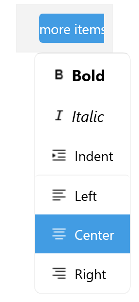
Grouping Items
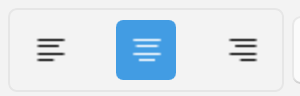
Sometimes you need toolbar items to be grouped to make the UI more intuitive for end users. For that scenario, you can utilize the GroupToolbarItem. Just place the toolbar items that you want to be grouped inside it. An example of grouped radio buttons would look like this:
<telerik:GroupToolbarItem>
  <telerik:RadioButtonToolbarItem Text="Left">
    <telerik:RadioButtonToolbarItem.ImageSource>
      <FontImageSource Glyph="{x:Static telerik:TelerikFont.IconAlignLeft}"
        FontFamily="{x:Static telerik:TelerikFont.Name}"
        Size="16" />
    </telerik:RadioButtonToolbarItem.ImageSource>
  </telerik:RadioButtonToolbarItem>
  <telerik:RadioButtonToolbarItem Text="Center">
  ........
  </telerik:RadioButtonToolbarItem>
  <telerik:RadioButtonToolbarItem Text="Right">
  .....................
  </telerik:RadioButtonToolbarItem>
</telerik:GroupToolbarItem>
You can find ore about groups here.
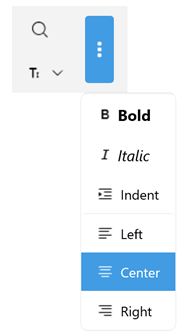
Toolbar Settings: Orientation, Overflow, Item Space
The Toolbar has a lot more to offer when it comes to customization. 😎
Change the Toolbar Orientation According to Your Needs
Horizontal

Vertical
Space Between Items
You can change the space between items from the default 8px to a custom value by setting the ItemSpacing property.
Overflow
When the items cannot fit in the available toolbar space, an Overflow menu is displayed. The way the hidden items are displayed is managed by the OverflowMode property of the component:
- DropDown (the default mode) – When the toolbar items cannot fit in the available space, they are placed in the overflow dropdown menu.
- Scroll – When the toolbar items cannot fit in the available space, they are scrolled horizontally or vertically, based on the orientation of the toolbar.
- Wrap – Wrap the items in the available space and display an overflow button.
Commands & Events
The Toolbar also has a set of built-in commands that you can apply to the Command property of any toolbar item:
- NavigateCommand – Gets a command for navigating to the next level of the toolbar hierarchy. The command accepts a collection of Telerik.Maui.Controls.ToolbarItems as a parameter.
- NavigateBackCommand – Gets a command for navigating back to the previous level of the toolbar hierarchy.
- ScrollForwardCommand – Gets a command for scrolling the contents of the toolbar in forward direction.
- ScrollBackwardCommand – Gets a command for scrolling the contents of the toolbar in backward direction.
More Resources
More examples illustrating the power of the Telerik UI for .NET MAUI Toolbar in different scenarios can be found in the Telerik SDK and Telerik Controls Samples.
More details about the API and using the component can be found in Telerik Documentation.
Ready to Try?
The Toolbar is just one of the dozens powerful and feature-rich components in the Telerik UI for .NET MAUI suite, built to help you develop outstanding cross-platform applications. Try it now, and if there is anything you need—do not hesitate to share your feedback or questions with the Telerik team.

Rossitza Fakalieva
Rossitza Fakalieva is a Technical Manager, Microsoft MVP in Developer Technologies and a Director of the Bulgarian chapter of the global Women Who Code organization. She previously worked on the Telerik engineering team and defines herself as .NET enthusiast. She loves to empower others to grow in their career and in the tech field—by teaching, by delivering courses and presentations, and as part of her daily job.
Related Posts
Comments
All articles
Topics
Web MobileMobile
Desktop
Design
Productivity
People
