Create the Perfect Data Editing Experience for Your App with Telerik’s DataForm for .NET MAUI

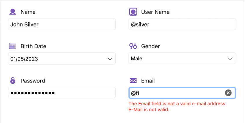
Code your app’s data forms to ensure the best experience for your users regardless of the platform they’re on, with Telerik’s DataForm for .NET MAUI.
Easy, Quick and in Style with Telerik’s DataForm for .NET MAUI

The ability to work with data is one of the must-haves in a good developer’s skill toolbox. CRUD is a magic word that we all know—Create, Read, Update and Delete data. However, this part of the development process isn’t always the most fun one; it’s not a favorite for many of us.
When we talk about cross-platform technology, we mean that we’re trying to write the code once but have a different output per platform. However, representing the data in an intuitive and good-looking way in both mobile and desktop at the same time makes the task of coding even harder. Now add validation, the different type of fields per platform, and we’re already dreaming of a coffee break ☕ before even implementing this part of the application.
If this sounds familiar to you, hold on and read about the new DataForm from Progress Telerik UI for .NET MAUI.
This component is built to save you time and empower you to deliver a good-looking, customizable data editing UI in no time. Telerik DataForm includes all that you need:
- A variety of built-in and customizable editors
- Validation support
- Grouping
- Data annotations support
- Localization
- A rich API to ensure perfect customization for your use case
Sounds great, right? 😊 Now, let’s see how to use it.
Basic Use
First, let’s add the Telerik UI to an already existing .NET MAUI application. If you’re already familiar with the installation process, you can skip the first three steps, as they’re true for every Telerik .NET MAUI component.
Step 0. Download and Install Telerik UI for .NET MAUI
You can download the Telerik UI via Telerik NuGet Server directly from Visual Studio or download it from your account, install the MSI or PKG files and refer to the local bits.
You can find full download instructions here.
Step 1. Call UseTelerik
Don’t forget to call the UseTelerik() method inside the MauiProgram.cs file of your Maui project. You’ll need to do this for all Telerik UI for .NET MAUI components, like UseMAUI().
Register all built-in or additionally created handlers to Telerik components.
Step 2. Add a Telerik Namespace to the Telerik XAML Scheme
This allows access to all Telerik components in XAML:
xmlns:telerik="http://schemas.telerik.com/2022/xaml/maui"
Step 3.Define the DataForm
You can define the dataform in this part of the app wherever you need, both in C# or XAML.
C#
RadDataForm myForm = new RadDataForm();
XAML
<telerik:RadDataForm x:Name="dataForm"/>
Step 4. Set BindingContext
To render a great-looking form, it’s completely sufficient to bind its BindingContext to an instance of your data object like this:
   <telerik:RadDataForm.BindingContext>
                <local:FeedBackFormViewModel/>
  </telerik:RadDataForm.BindingContext>
The FeedbackFormViewModel is an instance of a view model class describing all the fields necessary to send feedback:
public class FeedBackFormViewModel : NotifyPropertyChangedBase
    {
        private string firstName;
        private string lastName;
        private string email;
        private string location;
        private double rating;
        private string comments;
        private bool? willJoinNextTrip = false;

......................................
}
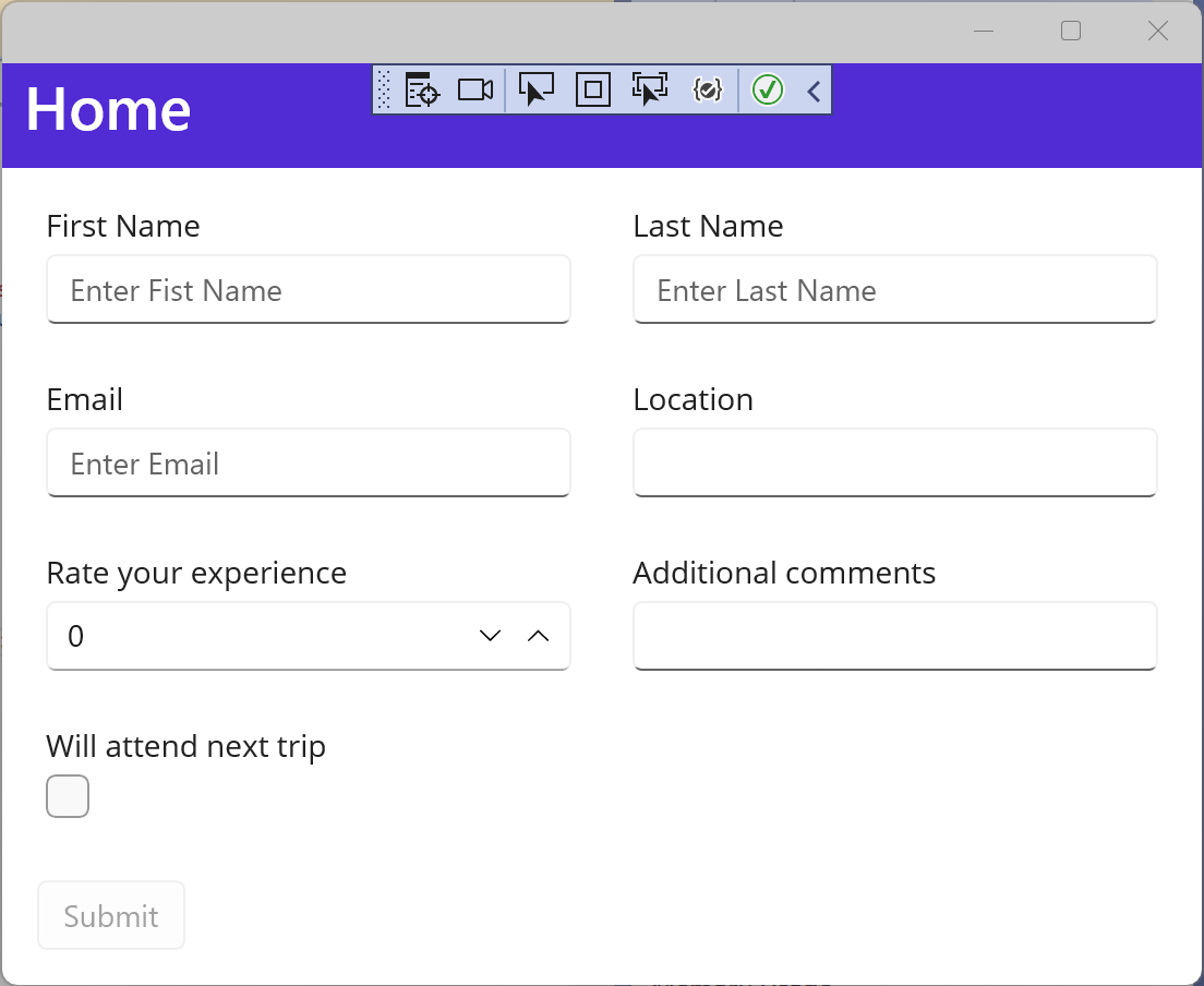
The form will generate its editors and groups automatically! 😊

You can stop here or you can start exploring all the customizable functionality that the controls offer.
Advanced Use—Customize to Fit Your Needs
Telerik DataForm has a rich API when it comes to customizing and configuring the representation of your data. Let’s start configuring our example with this API:
We can use the DataAnotations support to configure which fields are Required, the DisplayedName of the field, and all other common properties supported
by System.ComponentModel.DataAnnotations.
For example, our ViewModel looks like this using DataAnnotations:
public class FeedBackFormViewModel : NotifyPropertyChangedBase
    {
        private string firstName;
        private string lastName;
        private string email;
        private string location;
        private double rating;
        private string comments;
        private bool? willJoinNextTrip = false;

        [Required]
        [Display(Name = "First Name", Prompt = "Enter Fist Name")]
        public string FirstName
        {
            get => this.firstName;
            set => this.UpdateValue(ref this.firstName, value);
        }


        [Required]
        [Display(Name = "Last Name", Prompt = "Enter Last Name")]
        public string LastName
        {
            get => this.lastName;
            set => this.UpdateValue(ref this.lastName, value);
        }


        [Required]
        [EmailAddress]
        [Display(Name = "Email", Prompt = "Enter Email")]
        public string Email
        {
            get => this.email;
            set => this.UpdateValue(ref this.email, value);
        }


        [Required]
        public string Location
        {
            get => this.location;
            set => this.UpdateValue(ref this.location, value);
        }


        [NotMapped]
        public ObservableCollection<string> Locations
        {
            get => this.locations;
            set => this.UpdateValue(ref this.locations, value);
        }

        [Required]
        [Display(Name = "Rate your experience")]
        public double Rating
        {
            get => this.rating;
            set => this.UpdateValue(ref this.rating, value);
        }

        [Display(Name = "Additional comments")]
        public string Comments
        {
            get => this.comments;
            set => this.UpdateValue(ref this.comments, value);
        }

        [Required]
        [Display(Name = "Will attend next trip")]
        public bool? WillJoinNextTrip
        {
            get => this.willJoinNextTrip;
            set => this.UpdateValue(ref this.willJoinNextTrip, value);
        }
    }
For more details and a full list of
DataAnnotations, check out Telerik documentation.
You can also define all editors manually. Set DataForm’s AutoGenerateItems property to False and describe the fields, as follows:
<telerik:RadDataForm x:Name="dataForm"
                             AutoGenerateItems="False"
>
            <telerik:RadDataForm.BindingContext>
                <local:FeedBackFormViewModel/>
            </telerik:RadDataForm.BindingContext>
            <telerik:DataFormRadEntryEditor PropertyName="FirstName"/>
            <telerik:DataFormRadEntryEditor PropertyName="LastName"/>
… </telerik:RadDataForm>
Check out the full list of the 14 built-in editors that Telerik DataForm supports.
If you have a
Xamarin.Formsproject using Telerik DataForm, here’s how to migrate it to Telerik DataForm for .NET MAUI.
While Telerik DataForm offers 14 built-in editors, sometimes we might need a different UI. Fortunately, you can add an editor that’s not built-in by setting DataFormCustomEditor.
To add a custom editor, add DataFormCustomEditor and edit its EditorTemplate property. In our example, we’ll add a RadRating to represent rating
functionality:
 <telerik:DataFormCustomEditor PropertyName="Rating">
                <telerik:DataFormCustomEditor.EditorTemplate>
                    <ControlTemplate>
                        <telerik:RadShapeRating ItemsCount="5"
                                                Value="{Binding Value, Mode=TwoWay, Source={RelativeSource Mode=TemplatedParent}}"/>
                    </ControlTemplate>
                </telerik:DataFormCustomEditor.EditorTemplate>
            </telerik:DataFormCustomEditor>
You can find documentation about custom editors here.
You can also choose a layout, so you can have the best experience per platform. Choose between three values to set the LayoutDefinition property:
VerticalStackLayoutGridLayoutCustomLayout
For our example, I’ll set GridLayout for desktop platforms and VerticalStackLayout for mobile:
<telerik:RadDataForm x:Name="dataForm"
                     AutoGenerateItems="False"                                      			     LayoutDefinition="{OnIdiom Default={StaticResource gridLayout},Phone={StaticResource stackLayout}}">
…</ telerik:RadDataForm>
Note that GridLayout and StackLayout are usefully defined as resources here:
  <telerik:DataFormVerticalStackLayout x:Key="stackLayout" />
  <telerik:DataFormGridLayout x:Key="gridLayout" />
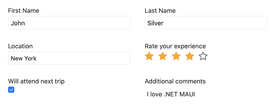
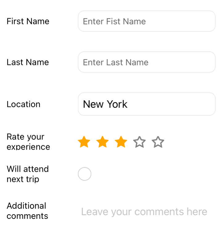
In the following table, you can see the results of all the settings we’ve adjusted to this point:
On desktop

On mobile

If you need other type of layout—for example, WrapLayout, HorizontalStack or something else—you can set an instance of DataFormCustomLayout to the LayoutDefinition property:
<telerik:RadDataForm.LayoutDefinition>
  <telerik:DataFormCustomLayout>
    <telerik:DataFormCustomLayout.LayoutTemplate>
      <DataTemplate>
        <telerik:RadWrapLayout/>
      </DataTemplate>
    </telerik:DataFormCustomLayout.LayoutTemplate>
  </telerik:DataFormCustomLayout>
</telerik:RadDataForm.LayoutDefinition>
You can read more about setting layouts in the Telerik documentation.
The header is also customizable through a bunch of properties, such as:
HeaderTextHeaderPositionHeaderTemplate
Since we want to create the best experience per platform in our example, we’ll use one HeaderPosition for mobile and a different one for desktop:
HeaderPosition="{OnIdiom Default=Above, Phone=Beside}"
You can find a full list of properties here.
Validating and committing data are very important functionalities for this control. Fortunately, Telerik DataForm is designed to facilitate all possible scenarios with its intuitive and rich API. First, you can choose when exactly these actions happen:
- On
LostFocus - Explicitly when the form is submitted
- On
PropertyChanged
The property to control the commit mode is CommitMode, and the property responsible for validation is ValidationMode. You can set these properties to the whole DataForm or to an explicit
field.
<telerik:RadDataForm x:Name="dataForm"
  CommitMode="Explicit"
  ValidationMode="Explicit"
  LayoutDefinition="{OnIdiom Default={StaticResource gridLayout},
    Phone={StaticResource stackLayout}}">...
When we set the mode to Explicit, we may need to call the ValidateChanges() method to execute the validation logic associated with the DataForm control. The method returns true if the validation passes, otherwise
false.
The validation summary and error messages can also be customized by DataForm’s rich API, including Events, Commands and Properties:
ValidateCommand(ICommand)– Gets a command to execute the validation logic of theRadDataForm. This command is mostly useful when DataForm’sValidationModeproperty is set toExplicit.IsValidationSummaryVisible(bool)– Sets property toTrue/False.ErrorImageSource(ImageSource)– Specifies theImageSourceof the image displayed in the error message.ErrorImageStyle(Style)– Specifies the style applied to the image of the error message. The target type of this style is the .NET MAUI Image control.ErrorLabelStyle
Check out the validation support documentation.
The API also supports localization for the error messages. To localize an error message to any language, translate the respective keys following these instructions. (And learn more about the capabilities of Telerik UI for .NET MAUI localization here.)
While DataForm brings a native look and feel that’s in sync with the OS you’re targeting, you can still change its style by playing around with the API settings:
BorderThicknessBackGroundColorBorderColorHeaderStyleValidationSummaryEditorStyle- Group styling
- And many more
As you can see, Telerik’s DataForm is very rich and has all that’s needed to speed up your development process and l deliver the best UX for your end users. Try it now and have a look at the full suite of more than 55 customizable UI components that Telerik UI for .NET MAUI offers.
If there is a component or a feature that you feel is missing or if you have any questions or feedback, don’t hesitate to contact us. Progress Telerik’s mission is to support the .NET developer, no matter what technology stack you’re working with!
You can find the full example and many more illustrations of the power of
RadDataFormfor the Telerik SDK and Telerik Controls Samples.

Rossitza Fakalieva
Rossitza Fakalieva is a Technical Manager, Microsoft MVP in Developer Technologies and a Director of the Bulgarian chapter of the global Women Who Code organization. She previously worked on the Telerik engineering team and defines herself as .NET enthusiast. She loves to empower others to grow in their career and in the tech field—by teaching, by delivering courses and presentations, and as part of her daily job.

