Blazor Basics: Advanced Blazor Form Validation

This article teaches you how to build basic forms within the Blazor framework. When you’re ready, make sure to check out the Telerik Blazor Form Component for richer functionality.
Learn how to get more granular control over how Blazor Forms are generated by manually creating and using the EditContext.
In a previous article in the Blazor Basics series, we learned how to create HTML forms and capture user data. We also learned how to implement basic form data validation with Blazor using .NET data annotations.
In this article, we will explore more advanced form validation techniques.
You can access the code used in this example on GitHub, or recreate it following the code snippets throughout this article.
The User Form
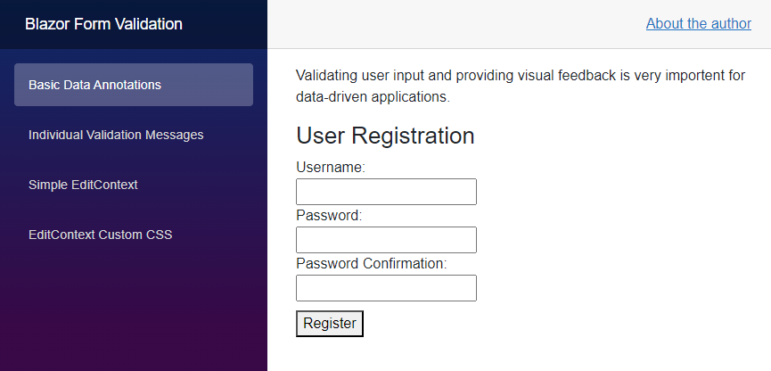
We use the same user form used previously within this Blazor Basic series. It contains a username, a password and a password confirmation field.

More Control Using EditContext
We learned about the built-in EditForm component we can use to create forms and handle form submission and form validation. Behind the scenes, the EditForm component initializes and uses an EditContext. The context contains information shared with input fields.
The built-in InputText (and similar types) components access contextual information, such as the data object provided to the EditForm component’s Model property.
Using the EditForm component, we get a simple component structure and a lot of built-in default behavior. However, when we want to get more granular control over the form, we can manually create the EditContext and provide it to the EditForm component.
Let’s take a look at the following example:
<EditForm EditContext="@EditContext" OnValidSubmit="@Submit">
    @* Input fields omitted *@
</EditForm>

@code {
    public User? UserModel { get; set; }
    public EditContext EditContext { get; set; }

    protected override void OnInitialized()
    {
        UserModel = new User();
        EditContext = new EditContext(UserModel);
    }
}
Similar to using the EditForm component and providing an object to its Model property, we can instead provide an object to its EditContext property.
We create the EditContext within the OnInitialized lifecycle method and provide the UserModel as its sole constructor argument.
So far, the form behaves the same as if we directly provided the Model property. However, we now have a reference to the EditContext object.
We can now enable form validation using data annotations using the EditContext property instead of providing a child component:
EditContext.EnableDataAnnotationsValidation();
Or we can still use the DataAnnotationsValidator component as a child component of the EditForm component.
Implementing Custom Validation
We now want to implement a custom validation for the password confirmation field.
Currently, when a user inputs values into the password and the password confirmation field, the validation based on data annotations will be triggered.
Take a look at the User class attributed with the data annotations.
public class User
{
    [Required]
    [SupportedUsername]
    [StringLength(16, MinimumLength = 4, ErrorMessage = "The username must be between 4 and 16 characters.")]
    public string? Username { get; set; }

    [Required]
    [StringLength(24, MinimumLength = 10, ErrorMessage = "The password must be between 10 and 24 characters.")]
    public string? Password { get; set; }

    [Required]
    [StringLength(24, MinimumLength = 10, ErrorMessage = "The password must be between 10 and 24 characters.")]
    public string? PasswordConfirmation { get; set; }
}
Additionally, to validate the password length, we want to ensure that the password is identical to the value entered in the password confirmation field.
We add an instance of the ValidationMessageStore type to the form component. It will hold the validation messages to display them on the screen.
@code {
    public User? UserModel { get; set; }
    public EditContext? EditContext { get; set; }
    public ValidationMessageStore? MessageStore;

    protected override void OnInitialized()
    {
        UserModel = new User();

        EditContext = new EditContext(UserModel);
        MessageStore = new ValidationMessageStore(EditContext);

        EditContext.OnValidationRequested += HandleValidationRequested;
    }
}
Like any other Blazor form, we first initialize an instance of the model class. Next, we create the EditContext object and provide the data model as its class.
We now create an instance of the ValidationMessageStore type and provide the EditContext as its argument.
We can now add a validation method to the OnValidationRequested event property of the EditContext variable. We add the HandleValidationRequested method that we will implement next.
As stated above, we want to add a custom rule, accessing the two password fields and comparing their values to see if they are equal.
private void HandleValidationRequested(object? sender, ValidationRequestedEventArgs args)
{
    MessageStore?.Clear();

    if (UserModel?.PasswordConfirmation != UserModel?.Password)
    {
        MessageStore?.Add(() => UserModel.PasswordConfirmation, "Passwords do not match.");
        EditContext?.NotifyValidationStateChanged();
    }
}
First of all, we clear the validation messages within the MessageStore. It makes sure that whenever the validation is triggered, the old validation messages are removed from the MessageStore before the validation is executed.
Next, we add the custom validation rule as an if statement. We access the PasswordConfirmation and Password properties on the UserModel property. It contains the values entered into
the form field.
If the value of the password confirmation field doesn’t equal the value within the password field, we add a message to the MessageStore. The first parameter references the field on the UserModel object. The second parameter
contains the message that will be shown to the user.
We also need to call the NotifyValidationStateChanged method on the EditContext to let it know that there are new validation messages.
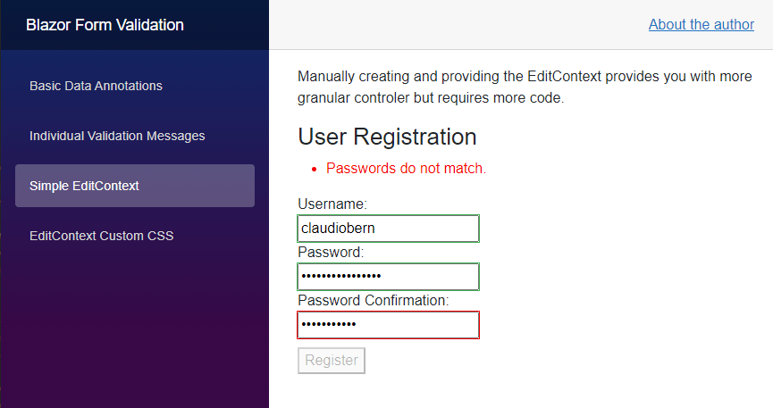
When we start the application and enter different values into the password and the password confirmation fields, we see the “Passwords do not match” text above the form.

It is rendered by the ValidationSummary component that we still use as a child component of the EditForm component.
Validating on Field Changed
Currently, the custom validation method is called when the user submits the form. If you want to validate whenever a field is changed, you can use the OnFieldChanged event instead of the OnValidationRequested event on the EditContext instance.
Be aware that when you use the OnFieldChanged event, you also need to make sure you only validate the password confirmation field when the field contains a value. Otherwise, the validation message will be shown as soon as the user enters
a value in the regular password field.
You could use the following code:
private void HandleFieldChanged(object? sender, FieldChangedEventArgs args)
{
    MessageStore?.Clear();

    if (UserModel?.PasswordConfirmation != UserModel?.Password &&
        UserModel?.PasswordConfirmation?.Length > 0)
    {
        MessageStore?.Add(() => UserModel.PasswordConfirmation, "Passwords do not match.");
        EditContext?.NotifyValidationStateChanged();
    }
}
Notice the additional part in the if statement that checks whether the length of the PasswordConfirmation property is greater than 0.
As stated above, you can register the HandleFieldChanged method to the EditContext by adding the following line in the OnInitialized method:
EditContext.OnFieldChanged += HandleFieldChanged;
Using Custom CSS
The default behavior of the input fields generated using the built-in Input* components provides an error indicator using a red border.
If we want to change the styling of our input fields, we can use the FieldCssClassProvider as the base class for our implementation.
Considering the following code:
public class CustomFieldClassProvider : FieldCssClassProvider
{
    public override string GetFieldCssClass(EditContext editContext, in FieldIdentifier fieldIdentifier)
    {
        var isValid = !editContext.GetValidationMessages(fieldIdentifier).Any();
        return isValid ? "valid-field" : "invalid-field";
    }
}
We create a new CustomFieldClassProvider class inheriting from the built-in FieldCssClassProvider class. We override the GetFieldCssClass method to implement custom code.
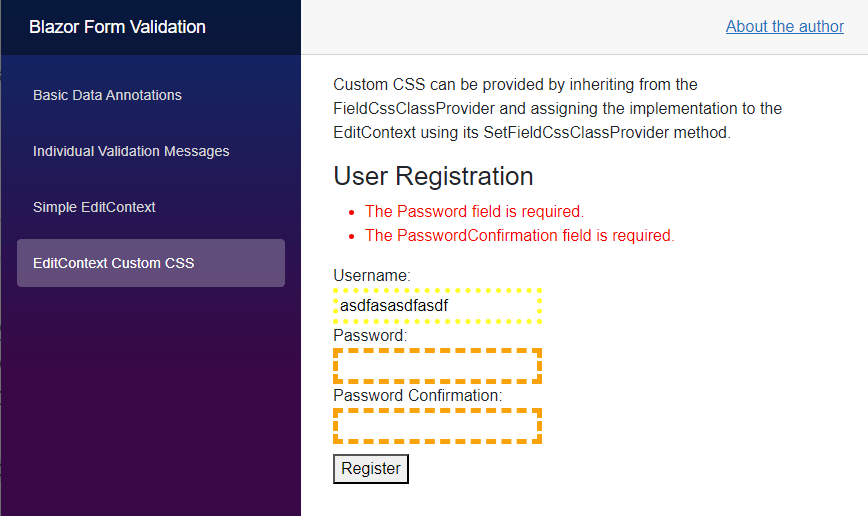
In this example, we check the EditContext for existing validation messages. We then use the result to decide whether to add the valid-field or the invalid-field CSS class to the input component.
Next, we define the CSS classes in the site.css file within the wwwroot/css folder of the project.
.valid-field {
    border: 5px dotted yellow;
}

.invalid-field {
    border: 5px dashed orange;
}
We define a yellow dotted border with a width of 5px as the valid-field CSS class. We also create an invalid-field CSS class that uses a dashed orange border with the same width.
As the final step, we need to assign the CustomFieldClassProvider class to the EditContext. The following code allows us to set a custom field class provider to an EditContext.
EditContext.SetFieldCssClassProvider(new CustomFieldClassProvider());
We add this line at the end of the OnInitialized method in our Blazor component.

When we start the application, we can see the custom CSS classes in action.
Enable/Disable the Submit Button Based on Form Validation
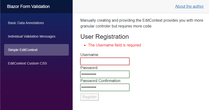
Sometimes, we want the Submit button only to be active when the form is in a valid state.
When we have access to the EditContext, we can implement this behavior directly inside the template code where we define the submit button.
<button type="submit" disabled="@(!EditContext?.Validate())">Register</button>
We use the default HTML disabled attribute and the Validate method on the EditContext to control the behavior.

When we start the application, we can see that the submit button is disabled unless all form fields are valid. As soon as all input fields contain a valid value, the submit button is enabled.
Nested Models, Collection Types and Complex Types
Besides the examples discussed in this article, Blazor also supports nested models, collection types and complex types as a model for the EditForm component.
However, the built-in DataAnnotationsValidator component only validates top-level objects that aren’t collections or complex-types. For those types, we need to use the ObjectGraphDataAnnotationsValidator.
At the time of writing this article, the ObjectGraphDataAnnotationsValidator is part of the experimental NuGet package Microsoft.AspNetCore.Components.DataAnnotations.Validation.
If you want to learn more about validating forms using complex-type properties or collections, I suggest looking into this NuGet package.
Conclusion
In this article, we learned how to manually create and use the EditContext type. It provides us with more granular control over how the HTML form is generated.
We also learned how to implement a custom validation rule that uses the values of multiple form fields to build a validation rule. We registered the validation rule on the EditContext.
By default, a Blazor form created by using the EditForm component validates when the user presses the submit button. However, we learned how to change the behavior to validate when the user changes a field by registering an event callback
method on the OnFieldChanged event on the EditContext.
We also learned that we can implement code to influence the CSS class added to the input fields by implementing a class provided to the SetFieldCssClassProvider property of the EditContext.
Last but not least, we learned how to utilize the EditContext to enable/disable the submit button based on whether the form is valid.
You can access the code used in this example on GitHub.
If you want to learn more about Blazor development, you can watch my free Blazor Crash Course on YouTube. And stay tuned to the Telerik blog for more Blazor Basics.

Claudio Bernasconi
Claudio Bernasconi is a passionate software engineer and content creator writing articles and running a .NET developer YouTube channel. He has more than 10 years of experience as a .NET developer and loves sharing his knowledge about Blazor and other .NET topics with the community.

