Blazor Basics: Validating Form Data with Blazor

Summarize with AI:
We will learn how to validate user input through HTML forms and provide visual feedback in case of a validation error.
In the previous article of this Blazor Basics series, we learned how to create HTML forms and capture user data using Blazor.
In this article, we will learn how to validate user input and provide visual feedback in case of an error.
You can access the code used in this example on GitHub.
Basic Validation Using Data Annotations
The most straightforward approach to implementing basic form validation is using data annotations.
The System.ComponentModel.DataAnnotations namespace is well-known to experienced .NET developers and can also be used to validate Blazor forms.
We create a simple user registration form with three fields: a username, a password and a password confirmation. The two password fields should be input fields of type password and not show the user input on the screen.
Let’s start with the data model class.
public class User
{
    [Required]
    [StringLength(16, MinimumLength = 4,
        ErrorMessage = "The username must be between 4 and 16 characters.")]
    public string? Username { get; set; }

    [Required]
    [StringLength(24, MinimumLength = 10,
        ErrorMessage = "The password must be between 10 and 24 characters.")]
    public string? Password { get; set; }

    [Required]
    [StringLength(24, MinimumLength = 10,
        ErrorMessage = "The password must be between 10 and 24 characters.")]
    public string? PasswordConfirmation { get; set; }
}
We create a class named User and add a property for each information we want to receive from the user. Notice the attributes used on each property definition.
Make sure to add @using System.ComponentModel.DataAnnotations; at the top of your Blazor component to import the required namespace.
We use the Required attribute to mark each property as mandatory. Next, we use the StringLength attribute to limit the number of characters for the Username and Password properties.
We also provide a custom error text as the third argument of the StringLength data annotation that will be displayed if the validation condition is not met.
Next, we define a UserModel property that contains an instance of the data class we defined. It will hold the user input.
public User? UserModel { get; set; }
We override the OnInitialized lifecycle method to create and assign an instance of the User class to the UserModel property.
We also create an empty Submit method that we can bind to the form.
The complete code block of the UserForm component looks like this:
@code {
    public User? UserModel { get; set; }

    protected override void OnInitialized()
    {
        UserModel = new User();
    }

    public void Submit()
    {
    }

    public class User
    {
        [Required]
        [StringLength(16, MinimumLength = 4,
            ErrorMessage = "The username must be between 4 and 16 characters.")]
        public string? Username { get; set; }

        [Required]
        [StringLength(24, MinimumLength = 10,
            ErrorMessage = "The password must be between 10 and 24 characters.")]
        public string? Password { get; set; }

        [Required]
        [StringLength(24, MinimumLength = 10,
            ErrorMessage = "The password must be between 10 and 24 characters.")]
        public string? PasswordConfirmation { get; set; }
    }
}
Next, we create the form using the following Blazor component template code:
<EditForm Model="@UserModel" OnValidSubmit="@Submit">
    <DataAnnotationsValidator />
    <ValidationSummary />
    <InputText @bind-Value="UserModel!.Username" />
    <InputText type="password" @bind-Value="UserModel!.Password" />
    <InputText type="password" @bind-Value="UserModel!.PasswordConfirmation" />
    <button type="submit">Register</button>
</EditForm>
With around a dozen lines of code, we can define a form, bind it to the UserModel property, bind the OnValidSubmit method and show three input fields.
Notice the use of @bind-Value for the InputText component that binds the field to a property defined in the code section of the Blazor component.
We add the DataAnnotationsValidator component within the EditForm component to enable data annotations for form input validation.
The ValidationSummary component below the DataAnnotationsValidator component shows a summary of all validation errors. We will take a look at them shortly. You can place it anywhere within the EditForm component.
The whole component, including a few more divs and CSS to make it look decent, looks like this:
@using System.ComponentModel.DataAnnotations;

<h3>Register User</h3>

<EditForm Model="@UserModel" OnValidSubmit="@Submit">
    <DataAnnotationsValidator />
    <ValidationSummary />
    <div>
        <label style="width: 200px">
            Username:
            <InputText @bind-Value="UserModel!.Username" />
        </label>
    </div>
    <div>
        <label style="width: 200px">
            Password:
            <InputText type="password" @bind-Value="UserModel!.Password" />
        </label>
    </div>
    <div>
        <label style="width: 200px">
            Password Confirmation:
            <InputText type="password" @bind-Value="UserModel!.PasswordConfirmation" />
        </label>
    </div>
    <div style="margin-top: 10px;">
        <button type="submit">Register</button>
    </div>
</EditForm>

@code {
    public User? UserModel { get; set; }

    protected override void OnInitialized()
    {
        UserModel = new User();
    }

    public void Submit()
    {
    }

    public class User
    {
        [Required]
        [StringLength(16, MinimumLength = 4,
            ErrorMessage = "The username must be between 4 and 16 characters.")]
        public string? Username { get; set; }

        [Required]
        [StringLength(24, MinimumLength = 10,
            ErrorMessage = "The password must be between 10 and 24 characters.")]
        public string? Password { get; set; }

        [Required]
        [StringLength(24, MinimumLength = 10,
            ErrorMessage = "The password must be between 10 and 24 characters.")]
        public string? PasswordConfirmation { get; set; }
    }
}
Now, let’s build and run the application and test the form.

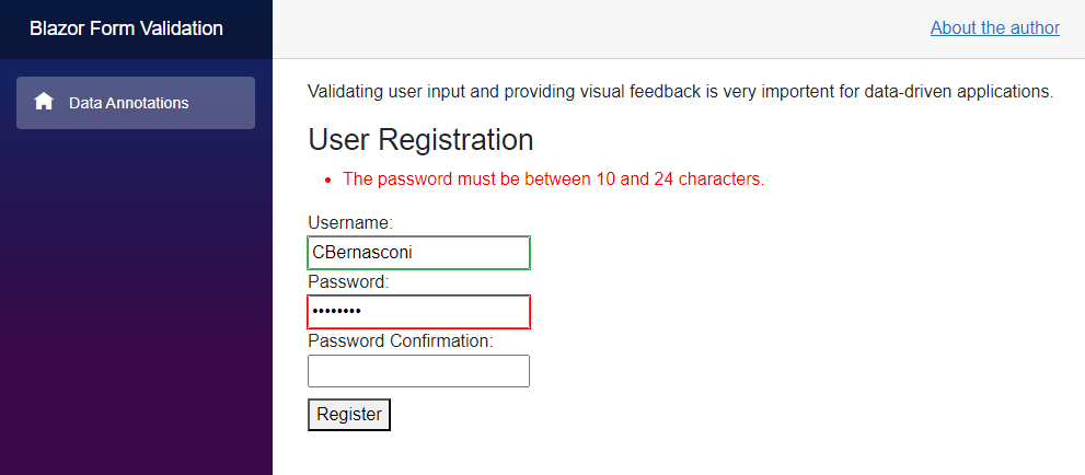
The form contains the three defined input fields for a username, password and password confirmation.
When we enter a username fulfilling the validation requirements, the field turns green. It is a default behavior that we could change in code.
When we enter a too-short password, we get the custom error message defined in the StringLength data annotation attribute for the password field.
The ValidationSummary component doesn’t offer many customizing options. If you prefer a custom behavior, you need to access the EditContext and implement a custom error presenter.
Implementing a Custom Validation Rule
If you want to implement custom validation rules, you can inherit from the ValidationAttribute type in the System.ComponentModel.DataAnnotations namespace and implement its IsValid method.
Consider the following implementation:
using System.ComponentModel.DataAnnotations;

namespace BlazorFormValidation;

public class SupportedUsername : ValidationAttribute
{
    protected override ValidationResult IsValid(object value,
        ValidationContext validationContext)
    {
        var username = (string)value;
        if (username == "Bill Gates")
        {
            return new ValidationResult(
                "You cannot use the reserved username 'Bill Gates'.",
                new[] { validationContext.MemberName });
        }

        return ValidationResult.Success!;
    }
}
We create a class inheriting from the ValidationAttribute class of the System.ComponentModel.DataAnnotations namespace.
Next, we override the IsValid method of the base class. We first cast the value to the string type and assign it to a variable before checking the content for “Bill Gates”.
If the username equals Bill Gates, we return a ValidationResult object, including a custom error message and information to the validated model property.
If the username doesn’t match the rule, we return Validation.Success, which means that the validation rule has passed and no error will be displayed.
We can attach the UsernameSupported attribute to the Username property of the User model class:
[Required]
[SupportedUsername]
[StringLength(16, MinimumLength = 4,
    ErrorMessage = "The username must be between 4 and 16 characters.")]
public string? Username { get; set; }
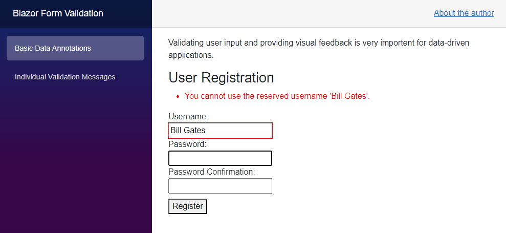
When we enter Bill Gates as the username, the error will be shown.

Hint: You can also inject services registered with the dependency injection container at the startup of the application. However, be aware that you have to use validationContext.GetRequiredService<MyValidationService>(); instead of using constructor injection.
Displaying a Validation Message per Input Field
Sometimes, you want to show all error messages at the same position on the screen. That’s where using the ValidationSummary type makes it very simple.
However, if you prefer displaying validation errors below or adjacent to an input field, you run out of luck with the ValidationSummary component.
However, the ValidationMessage component provides exactly what we need.
Take a look at the following example:
<EditForm Model="@UserModel" OnValidSubmit="@Submit">
    <DataAnnotationsValidator />
    @* <ValidationSummary /> *@
    <div>
        <label style="width: 200px">
            Username:
            <InputText @bind-Value="UserModel!.Username" />
            <ValidationMessage For="@(() => UserModel!.Username)" />
        </label>
    </div>
     @* Code omitted... *@
</EditForm>
We comment or remove the ValidationSummary component and instead use the ValidationMessage component to display the error message for each specific input field.
In this case, we set the For property of the ValidationMessage to an anonymous method, returning the property of the model for which we want to display the error.
The syntax is a bit tricky, but it is required to provide a method because the error message will be evaluated at runtime.
Notice that you can move the component anywhere within the EditForm component. For example, you can have two input fields and display both errors together after those two input fields.
Compared to the ValidationSummary component, the ValidationMessage component provides much more flexibility but requires more code and a more granular definition.
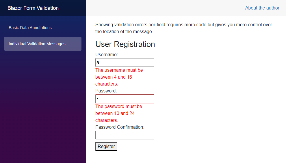
We can see the different validation error output when we build and run the application again.

The validation error messages are now displayed below each input field (according to the location of the ValidationMessage in the component template).
Conclusion
Form input validation is a common and essential developer task when building modern data-driven web applications. Blazor offers many different options to validate a data model.
With data annotations, we have a simple but extendable approach that we used throughout this article. However, you can directly access the EditContext (wrapped by the EditForm component) and gain more control over the validation process.
The Microsoft documentation is a great starting point to learn more about advanced ways to implement custom form validation.
You can access the code used in this example on GitHub.
If you want to learn more about Blazor development, you can watch my free Blazor Crash Course on YouTube. And stay tuned to the Telerik blog for more Blazor Basics.

Claudio Bernasconi
Claudio Bernasconi is a passionate software engineer and content creator writing articles and running a .NET developer YouTube channel. He has more than 10 years of experience as a .NET developer and loves sharing his knowledge about Blazor and other .NET topics with the community.

