Usage Guidelines
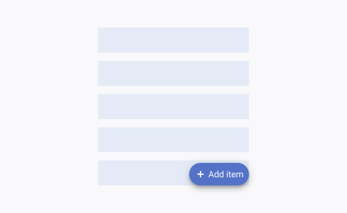
The Telerik and Kendo UI FloatingActionButton requires you to follow some basic principles when using the component.
Importance
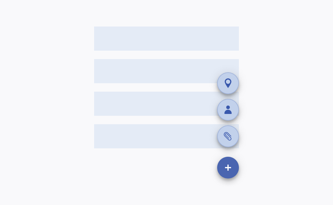
The FloatingActionButton immediately draws the user’s attention. That’s why using it sparingly and wisely is recommended. To allow the user quick access to multiple related actions, use speed dial items.
Placement
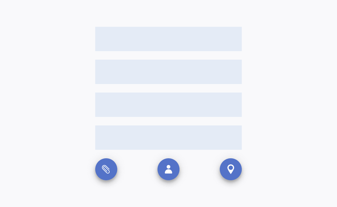
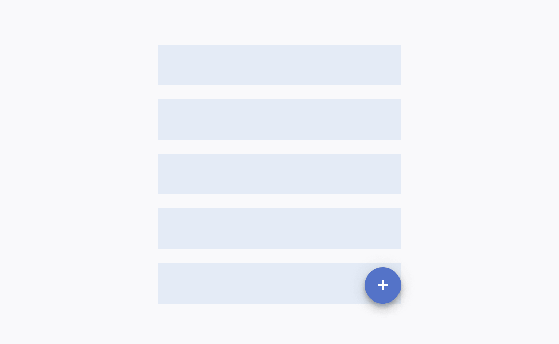
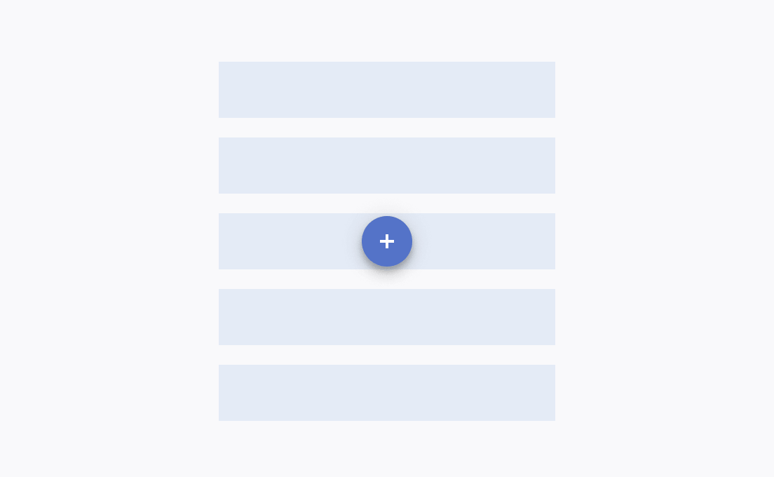
The FloatingActionButton provides built-in options that allow you to modify the position of the component. To find an optimal place for it, consider the content and the page layout. The FloatingActionButton is usually situated at the bottom of the page, the corners, or the center in a way that does not affect the visibility of the content.
Elevation
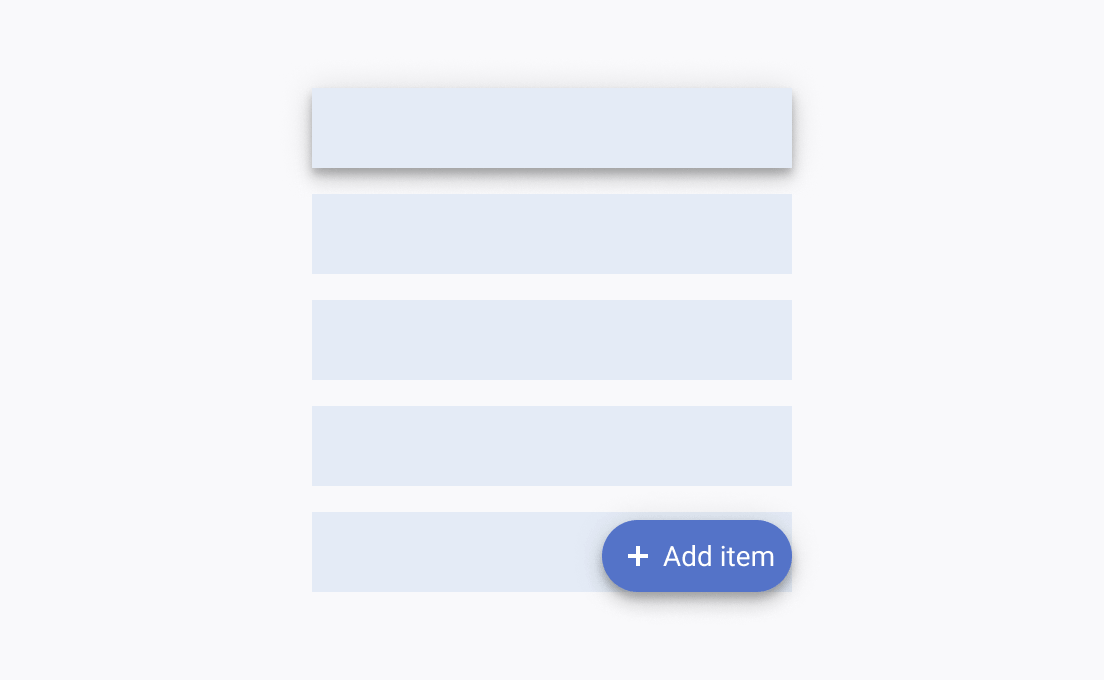
As the FloatingActionButton indicates the primary or the most common action on the page, it must have a greater z-index than any other element on the page.
