


TextArea Overview
A TextArea provides a highly customizable interface for displaying multi-line text and can be integrated in forms or used as a standalone item. Commonly, TextAreas are used for descriptions, comments, messages, and so on.
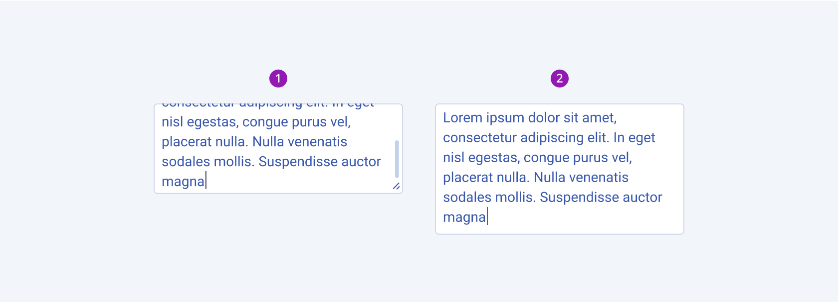
The length of the data string defines the type of the text field. As the TextArea is used for multi-line data, the TextBox is used for single-line data.
Live Demo
Appearance
TextAreas provide built-in styling options that grant visually appealing and flexible rendering experience. Apart from the default vision of the Telerik and Kendo UI TextArea, the component supports alternative styling options which enable you to configure the individual aspects of its appearance.
States
Depending on the action you want to imply through its appearance, the Telerik and Kendo UI TextArea can acquire and can be rendered in the following states:
- A TextArea in its normal state is fully active, but the user is not interacting with it. The component can contain an explanatory placeholder text or an already pre-filled text.
k-hover–The hover state of a TextArea appears when the user is hovering over the component but has not clicked it yet. The mouse pointer changes to indicate that you can type in the component.k-focus–The focus state of the TextArea indicates that the user has navigated to it with the keyboard, by using voice instructions, or has mouse-clicked the component. The focus has to be highlighted well enough to cover all accessibility requirements.k-invalid–The invalid state of the TextArea is displayed when a validation requirement is not matched. It has to alarm the user that an extra input is needed to pass the validation so that the operation gets completed.k-invalid k-focus—The invalid focus state is a result of spotlighting a TextArea whose values or type of input didn’t pass the validation requirements.k-disabled–The disabled state is displayed when a user does not have an interactive permission. The disabled state entirely removes the interactive behavior of the component. Visually, the TextArea is faded out and slightly out of focus to distinguish itself from the active elements on the page.
Anatomy
The anatomy of the TextArea summarizes the elements of the component. Label and hint text options can be configured and added to a TextArea when it is used as a part of Telerik and Kendo UI Form component.
The next image shows the anatomy of a TextArea and includes the following elements:

- Input field
- Label (optional in Form components)
- Placeholder or input text
- Hint text (optional in Form components)
- Character counter (optional in Form components)
- Resize handler
The TextArea provides options both to the user and the developer to control its height. Users can resize the component vertically, horizontally, or in both directions with the resize handler. Developers can automatically adjust the height of the component based on the data input by using the AutoSize configuration option.
Size
The TextArea provides the size configuration option that enables you to control its padding and font size. To avoid inconsistency when using the TextArea in a form, it is recommended that you set the same size to all components within that form.
size provides the following available options:
small—Renders small text areas, which are optimized for compact UI design. The small Telerik and Kendo UI TextArea uses the same typographic style as the medium text area. However, to decrease the height, the small TextArea applies a$kendo-spacing, 0.5spacing value for its vertical padding.medium(default)—Renders a medium text area. The medium Telerik and Kendo UI TextArea uses the same typographic style as the small text area. However, the vertical height of the component is achieved by setting the$kendo-spacing, 1spacing value for its vertical padding.large—Renders large text areas, which are suitable for layouts with a lot of space between the elements to achieve airy UI look and feel. The large TextArea is optimized for adaptive components and mobile UI design and achieves the recommended touch area dimensions both by doubling the value of its vertical padding to$kendo-spacing, 2and by using a different typographic style with a bigger font size and line height.none—Does not set asizeand allows you to add your own, custom value.

- Small
- Medium (default)
- Large
Fill Mode
The TextArea provides the fillMode configuration option that enables you to achieve a certain visual mood in your app. TextAreas also provide options for fill-mode customization.
fillMode provides the following available options:
solid(default)—The solid fill mode focuses on the layout and emphasizes the text field. It can be wrapped in a container with a different background color making the TextArea to stand out.outline—The outline fill mode focuses less on the text field. Outlined TextAreas do not have a background fill and can blend with the surrounding UI environment.flat—The flat fill mode emphasizes less the text field and more the data input. Also, the flat fill mode reduces additional visual noise and focuses on the content.none—Does not set afillModeand allows you to add your own, custom value.

- Solid (default)
- Outline
- Flat
Border Radius
The TextArea provides the rounded option that enables you to control the border radius of the rendered component. The defined value for the border radius significantly affects the look-and-feel of the UI. To avoid inconsistency, it is recommended that you follow a single concept of rounding the element in your UI. The TextArea also supports settings for border-radius customization.
rounded provides the following available options:
small—Renders a border radius of 2 px.medium(default)—Renders a border radius of 4 px.large—Renders a border radius of 6 px.none—Does not set aroundedand allows you to add your own, custom value.

- Small
- Medium (default)
- Large
Framework-Specific Documentation
For specific information about the component, refer to its official product documentation:


