Telerik UI for Blazor 2.3.0 is Here with ComboBox, Grid Column Resizing, 3.1 Preview 2 & More

Check out the latest features and updates in Telerik UI for Blazor, including a new ComboBox, Grid Column Resizing, MultiView Calendar and .NET Core 3.1 Preview 2 Compatibility.
We are continuously evolving the Telerik UI for Blazor suite, and are happy to announce that version 2.3.0 has been just released and is ready for download. We continue to regularly add new components and extend the capabilities of the most used and demanded component - the Grid.
Based on your feedback and requests we added a brand new Blazor ComboBox control, MultiView Calendar and enhanced the Grid with Column Resizing. We have also ensured that Telerik UI for Blazor is compatible with Preview 2 of .NET Core 3.1.
Compatible with ASP.NET Core 3.1 Preview 2 Release
Shortly after Microsoft announced the release of Preview 2 of .NET Core 3.1, we are glad to share that Telerik UI for Blazor 2.3.0 is fully compatible.
NET Core 3.1 is a short release focused on key improvements in the two big additions to .NET Core 3.0. - Blazor and Windows desktop. Microsoft has announced that 3.1 will be a long term support (LTS) release with an expected final ship date of December 2019.
New Blazor ComboBox Component
Whether you need to allow the user to select items from a dropdown list of predefined values, let them enter custom values, or filter the available items - the new Blazor ComboBox component has it all.

ComboBox Data Binding
To add the ComboBox to your Blazor app, simply add the <TelerikComboBox> tag and bind it to data like in the example below:
<TelerikComboBox Data="@ComboBoxData" TextField="ComboTextField" ValueField="ComboValueField" @bind-Value="selectedValue">
</TelerikComboBox>
You can bind the ComboBox to primitive types (like int, string, double), or a data model. Further details can be found in the detailed data binding article.
ComboBox Filtering
To ease the search of values for your users, you can able the Filterable option in the <TelerikComboBox>. To encourage user typing of values when filtering, you can set the Placeholder property with a suitable call to action message.
<TelerikComboBox Data="@ComboBoxData" Filterable="true" Placeholder="Find product by typing part of its name" @bind-Value="@SelectedValue" TextField="ProductName" ValueField="ProductId">
</TelerikComboBox>
ComboBox Custom Values
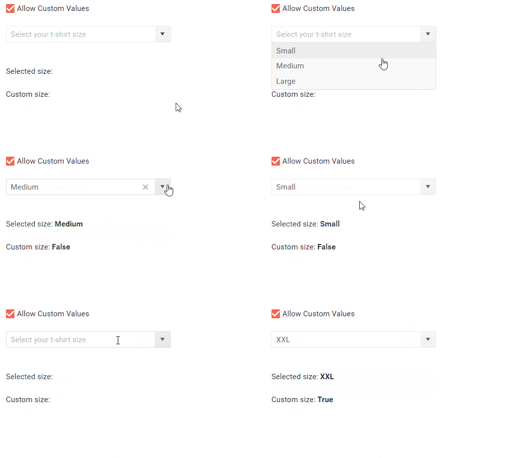
In addition to filtering and selecting values, your application scenario may also require user input with custom values. In this case you have to set the AllowCustom property to true and ensure that the TextField, ValueField and the Value properties are of type string.

ComboBox Customizations and Templates
The ComboBox allows you to control the data, size, and various appearance options. Using templates, you can change rendering and customize items, header and footer. An example of how to customize your ComboBox using templates can be found below:
<TelerikComboBox @bind-Value=@SelectedValue
                 Data="@ComboBoxData"
                 ValueField="ProductId"
                 TextField="ProductName">
<HeaderTemplate>
        <div class="k-header" style="margin-top: 10px; padding-bottom: 10px">Available Products</div>
    </HeaderTemplate>
<ItemTemplate>
        <code>@((context as Product).ProductName) - @(String.Format("{0:C2}", (context as Product).UnitPrice))</code>
    </ItemTemplate>
    <FooterTemplate>
        <div class="k-footer" style="margin-top: 10px">A Total of @ComboBoxData.Count() Products</div>
    </FooterTemplate>
</TelerikComboBox>
ComboBox Events
For capturing and handling the selected and inserted values in the ComboBox, or responding to their changes, you have two events which you can utilize:
ValueChanged- fires upon every change of the user selection.OnChange- fires only when the user presses Enter, or blurs the input (for example, clicks outside of the combo box). Can be used with two-way binding of the Value.
Blazor Grid Column Resizing
With the Telerik UI for Blazor 2.2.0 release we introduced Grid column reordering, and now with the 2.3.0 release we are adding option to resize the columns of your Grid.

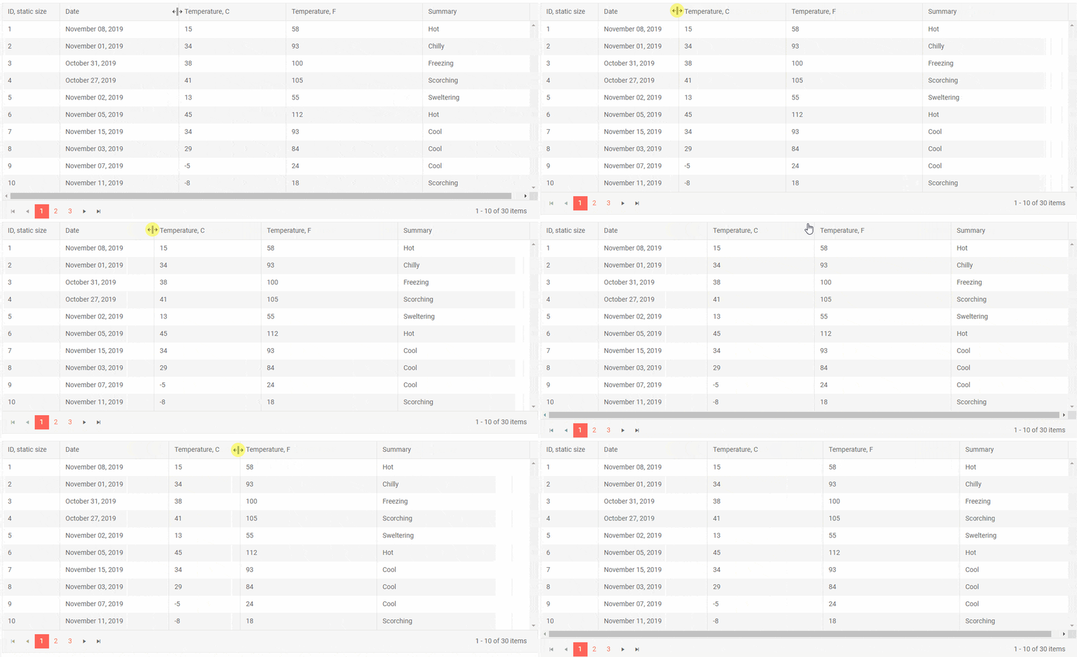
To enable the column resizing, set the Resizable parameter of the grid to true. Resizing is done by users of your applications by simply dragging the borders between their headers.
If for certain columns in the Grid it doesn’t make sense to be resized, set the column parameter Resizable to false. The users will still be able to resize other columns around it.
New Blazor MultiView Calendar
To enable easy browsing through the Calendar dates, we have enabled the option to render multiple instances of the current calendar view next to each other. Using the Views property you can set the desired number of calendars you would like to appear on your page.
<TelerikCalendar Views="3" View="CalendarView.Month"></TelerikCalendar>

Download Telerik UI for Blazor 2.3.0
Download the latest version Telerik UI for Blazor Native Components from the Telerik UI for Blazor overview page and share your feedback with us on the official Telerik UI for Blazor feedback portal.
We Value Your Feedback!
We value your ideas, requests and comments, and we are proud to announce that Telerik UI for Blazor 2.3.0 release is heavily based on feedback items submitted by you – our community of Blazor developers. Check out the Resizable Grid Columns & ComboBox Component feedback items to see how seriously we take into consideration your requests.
Keep helping us shape the future of UI for Blazor in 2020 and beyond!
Happy Blazor Coding!

Maria Ivanova
Maria Ivanova is a Manager of Product Management at Progress, for Telerik and Kendo UI components and developer tooling. She joined the company in 2019 as a Product Manager for Telerik UI web components and is passionate about developing impactful and innovative software products. Maria believes that to create great products, it's important to challenge the status quo, closely collaborate with customers, and embrace a spirit of experimentation.
