SOLID Principles of UX, Part 1: Make Software Understandable

This is the first installment of a five part series by Jessica Engstrom about the SOLID Principles of UX. In this article, Jessica covers how to make software understandable through perceptible, noticeable, and comprehensible elements.
As humans our attention is limited, we can only focus on one thing at a time. We can switch focus very fast, but still on just one thing at a time. What we expect and what our mission or goal is has a great significance to how we focus our attention. So does the UI. How we decide to display the information and choices can make a great impact on the users' understanding of the app or system.
Perceptible & Noticeable Elements
Take Windows 8 as an example. Back in the day we were used to a completely different layout of the operation system. My brother, who is very technical and has been a huge Windows fan all his life of course updated to Windows 8 as soon as it was released.
When my non-technical mom at a much later date switched to Windows 8, my brother came over to install everything. Although he had used Windows 8 for a while by now, he couldn't find where to put in the network information no matter how hard he tried so he said to my mom - "You don't have to sit here to watch me try to find the network settings, they have ruined Windows 8 and this will take a while. You can go and have some coffee in the meantime."
My mother replied - "What, you mean like this?" and swiped from the right side.
What happened was that my brother didn't expect that the settings were in the charms bar (that was hidden) so he could not see it. My mom, who was new to computers in general, had no trouble at all to find the settings. She did the Windows 8 tutorial and remembered that she should swipe from the right side. My brother never took the tutorial since he didn't consider himself as a novice Windows user, so for him the charms bar was an invisible element on the screen.
This is also why it is so important to follow standards. This is what the user has learned, is used to and expects. If you are developing a mobile app and want to release it on multiple platforms, I recommend that you go to the different platform design guidelines to just skim over them, to make sure that you will feel like a part of the ecosystem.
If you do this your users will automatically have more trust in your app, and it might even feel faster and more professional.
All invisible elements are not bad though, I love keyboard shortcuts! But if the user is not a power user or new to the software, they might not have learned the secret handshake just yet. So, if you have keyboard shortcuts make sure that the functionality can be replicated somewhere in the UI as well, this way everyone will be happy.
Comprehensible
Sometimes an element might be visible, but still not attended to. This can be because the user doesn't notice it because they don't expect it to be located there, or because of distractions.
If we use standards and don't have that many distractions it will rarely be a problem. But to make sure, don't test your own UI. You might have heard this before, but you put the button or component in its place, so you expect it to be there and you know what it does.
While on the topic of standards, this is an example from a Learning Management System.

The first time I was going to send a message I had to look twice to understand that the leaf wasn’t a leaf, it was most probably a quill. But it took longer than it should have to just send a message.
I wasn’t expecting a “leaf” therefore I didn’t notice it at first. They later changed it to a more standard symbol.
Feel free to put your own design on all your components, but make sure that they are easy to understand so the user doesn’t have to look for it.
This is again why you should not test your own design, you know what the leaf is supposed to be, you know what it supposed to do and you know where it is.
We tend to group things automatically as humans, which we can and should use in our UIs as well.
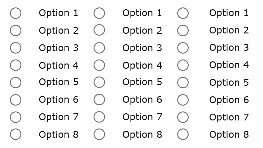
When items are given close proximity, we see them as a unit consisting of individual items. If we don’t think about how we align and group our elements they might not be as clear to the user.

Many of us have seen forms like this. After a few clicks we don’t really know what radio button belongs to what label/text and we must start to count it out.
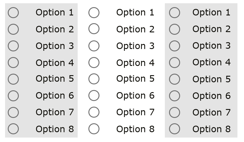
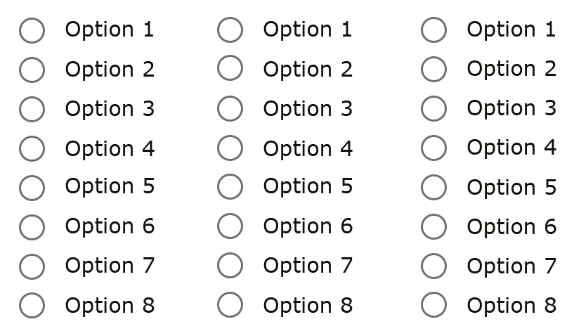
A couple of ways we can clarify groupings is with the help of colors or whitespace.

Grouping with the help of color
 Grouping with the help of whitespace
How we group things is just as important as the language and symbols we use in our software.
The principle of least astonishment is very useful here. M.F Cowlishaw said it well back in 1984; "If a necessary feature has a high astonishment factor, it may be necessary to redesign the feature."
Meaning that the software should behave in a way that most users would expect it to behave, with no surprises or “astonishment.”
Stay tuned for the next post in this series, or for more, feel free to check out the webinar we recently hosted on the topic right here.

Jessica Engstrom
Being a geek shows in all parts of Jessica's life, whether it be organizing hackathons, running a user group and a podcast with her husband, game nights (retro or VR/MR) with friends, just catching the latest superhero movie or speaking internationally at conferences. She's a Windows Development MVP. Together with her husband she runs a company called "Azm dev" which is focused on HoloLens, Windows development, UX and teaching the same.
