
The Power of the Telerik UI for ASP.NET Core Charts

Learn about the types of charts available and how to implement them and integrate with other components when you use Telerik UI for ASP.NET Core.
Charts are a great tool for data representation as they help us to interpret and understand complex data quickly. By using charts, we can easily comprehend, compare and analyze multiple data sets as well as interact with the data. They can improve the overall user experience in our web application by visualizing the data in a more engaging and accessible way. The charts simply bring the data to life!
In this blog post, I am going to show you how to choose the appropriate chart type, and incorporate and use the Telerik UI for ASP.NET Core Charts into your ASP.NET Core application.
Table of Contents
- How to Choose the Appropriate Chart
- Set up the Chart
- Maintain the Chart Appearance and Options at Runtime
- Integrate the Chart into Other UI Components
How to Choose the Appropriate Chart
To choose the right type of chart, you need to determine:
- The type and structure of the data you are working with
- The relationship between the x-axis and y-axis—if the x and y are dependent (i.e., for every x there is only one y value) or if there is no relationship between x and y
- The target audience and its level of familiarity with the data
Generally, the Telerik UI for ASP.NET Core Charts are divided into the following categories:
Categorical Charts – They are suitable for displaying data that represent qualities or characteristics (data that can be divided into categories or groups, like the type of car, education level or brand of computers). Such charts are Line Charts, horizontal and vertical Bar Charts, Area and Box Plot Charts.
Circular Charts – This category of charts uses a circle or pie to represent nominal data (categorical data where each data point belongs to one category only). They are useful for visualizing proportions or percentages (for example, to render data as part of the whole). Circular charts are Pie charts, Donut charts, Polar charts and Radar charts.
Freeform Charts – These charts use different forms to display structured portions of data. They are commonly used to represent numerical data (for example, electricity production per year). Check out the Funnel Chart for an example.
Scatter Charts – These charts are suitable for visualizing data in two dimensions and comparing different numerical data sets or different types of data. An example of a scatter chart is the Bubble Charts.
When you identify the relevant category based on the data type that has to be presented, the next step is to choose the chart type from the entire category. I would recommend exploring the Telerik UI for ASP.NET Core Chart online demos to review the different chart types and what type of data they display.
Set up the Chart
Before configuring the chart elements and options, you need to determine how the chart will bind to the data—locally or remotely. Telerik UI for ASP.NET Core Charts provide the following data binding approaches:
- Passing inline data directly to the data series in the chart’s configuration. This option is useful when working with a small and simple dataset. Check out this example below, where the data series and categories are declared as arrays:
@(Html.Kendo().Chart()
  .Name("chart")
  .Title("Number of sold products through the years")
  .Series(series =>
  {
    series.Line(new  double[] { 21560, 10548, 12548, 47526, 10254 }).Name("Product A");
    series.Line(new  double[] { 10258, 36985, 45287, 23568, 35982 }).Name("Product B");
  })
  .CategoryAxis(axis => axis
    .Categories(new  string[] { "2018", "2019", "2020", "2021", "2022" })
  )
)
- Binding the chart to a supplied Model collection. You can format the data server-side and use a Model to send the data to the View with the chart. The chart accepts the Model collection in its constructor:
@model  IEnumerable<ProductViewModel>

@(Html.Kendo().Chart(Model)
  .Name("chart")
  .Title("Number of sold products through the years")
  .Series(series =>
  {
    series.Line(model => model.Sold)
      .Name("Products").CategoryField("Year"));
  })
)
- Using a DataSource component to bind the chart to remote data. The DataSource sends an AJAX request to the specified remote endpoint to retrieve the data. It is the most flexible approach of data binding, since you can use it for large and complex datasets, send additional parameters through the Read request (for example, authentication tokens, custom variables and etc.), load the data on demand, and more.
@(Html.Kendo().Chart<ProductViewModel>()
  .Name("chart")
  .Title("Number of sold products through the years")
  .DataSource(ds => ds.Read(read => read.Action("GetProductData", "Product")))
  .Series(series => {
    series.Line(model => model.Sold)
      .Name("Products").CategoryField("Year");
    })
)
Required Chart Elements
The next step is to define the basic chart configuration, so you can load the data and see how it is output. Which are the required chart elements?
- The data series that are plotted on the chart. Specify them through the Series(series => series) method and use the SeriesDefaults() option to apply default settings for all series. The series provides a variety of options for customization—labels, data markers and notes (used to display metadata), aggregate functions such as min, max, average, or size, margins, and many more. Also, to change the default series colors, insert an array with the desired color codes or names in the SeriesColors() option.
@(Html.Kendo().Chart()
  .Name("chart")
  .Title("Number of sold products through the years")
  .SeriesDefaults(seriesDefaults =>
    seriesDefaults.Line().Style(ChartSeriesStyle.Smooth)
  )
  .SeriesColors(new  string[] { "#1FD2D5","#F7D455" })

  .Series(series =>
  {
    series.Line(new  double[] { 21560, 10548, 12548, 47526, 10254 }).Name("Product A");
    series.Line(new  double[] { 10258, 36985, 45287, 23568, 35982 }).Name("Product B");
  })
  .CategoryAxis(axis => axis
    .Categories(new  string[] { "2018", "2019", "2020", "2021", "2022" })
  )
)
- The axes. The main axes are the horizontal (x-axis) and the vertical (y-axis). Generally, the x-axis shows the categories in the dataset, so it is known as CategoryAxis. The y-axis, which displays the values along the vertical dimension, is called ValueAxis. An exception are the scatter charts, in which the axes are named XAxis and YAxis. Similar to the series, you can set default options for both axes through the AxisDefaults() method—for example, titles, labels, notes, crosshair options, and more.
@(Html.Kendo().Chart()
  .Name("chart")
  .Title("Number of sold products through the years")
  .Series(series =>
  {
    series.Line(new  double[] { 21560, 10548, 12548, 47526, 10254 }).Name("Product A");
    series.Line(new  double[] { 10258, 36985, 45287, 23568, 35982 }).Name("Product B");
  })
  .AxisDefaults(axis => axis
    .Line(l => l.Visible(true)).Color("#858278"))
  .CategoryAxis(axis => axis
    .Categories(new  string[] { "2018", "2019", "2020", "2021", "2022" })
    .MajorGridLines(lines => lines.Visible(false))
  )
  .ValueAxis(axis => axis
    .Numeric()
    .Line(line => line.Visible(false))
    .AxisCrossingValue(-10)
  )
)
Chart Enhancements
Now, when the chart’s series and axes are defined, it is time to review how the chart represents the data. You can test the code snippet above in the Telerik REPL playground. Open this example and run it to see the result.
It is a basic Line chart, but you can enhance it further based on your needs by adding the following settings:
- The chart legend displays the names of the data series. The user can turn on/off some of the series by clicking on their names in the legend to have a better overview when the chart renders many series. You can control which series to be displayed in the legend and the overall legend appearance, for example, position, orientation, size, the series labels, and many more. Add the Legend() method, and the intellisense will show you all available options.
@(Html.Kendo().Chart()
  .Name("chart")
  .Legend(legend =>
  {
    legend.Align(ChartLegendAlign.Start);
    legend.Position(ChartLegendPosition.Top);
    legend.Background("#DFDDD6");
    legend.Title(title => title.Text("Legend").Color("black"));
    legend.Orientation(ChartLegendOrientation.Horizontal);
    legend.InactiveItems(items => items.Labels(labels => labels.Color("#0E549A")));
  })
    //Other configuration options
    ...
)
- Another useful feature is the chart tooltips. By adding tooltips, you can display more details about each data point when the user hover over it. The tooltips provide a templating option, where you can pipe the value of any property of the Model that binds to the chart. In addition, there is an option to show a shared tooltip, which displays all data points per category. You can set the Tooltip() method in the chart’s configuration and on the series and categories level.
@(Html.Kendo().Chart()
  .Name("chart")
  .Tooltip(tooltip =>
  {
    tooltip.Visible(true);
    tooltip.Shared(true);
    tooltip.Background("#1FD5EA");
    tooltip.Font("20px sans - serif");
    tooltip.Format("{0:n2}");
  })
    //Other configuration options
    ...
)
- The chart consists of a chart area, which is basically the entire visible area of the chart, and a plot area, which holds the series (it is nested in the chart area):
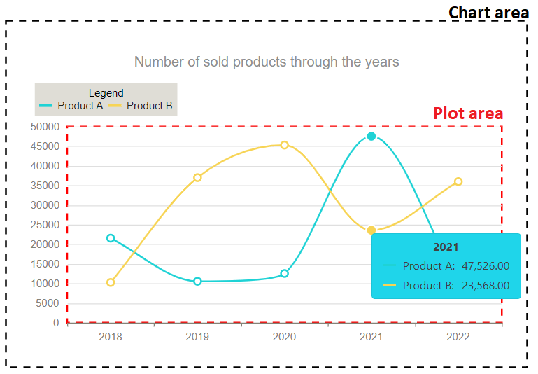
To customize the overall chart appearance in your application, add the ChartArea() and PlotArea() options, which allow you to set width, height, border, color, margin, and many more to each area:
@(Html.Kendo().Chart()
  .Name("chart")
  .PlotArea(plotarea =>
  {
    plotarea.Border(border => border.DashType(ChartDashType.Dash).Width(2).Color("red"));
  })
  .ChartArea(chartarea =>
  {
    chartarea.Background("#ffffff");
    chartarea.Margin(30);
    chartarea.Border(border => border.DashType(ChartDashType.Dash).Width(2).Color("black"));
    chartarea.Width(600);
  })
    //Other configuration options
    ...
)
- The chart looks better with a title and subtitle:
@(Html.Kendo().Chart()
  .Name("chart")
  .Title(title => title.Text("Number of sold products through the years").Align(ChartTextAlignment.Center).Font("18px Helvetica").Border(border => border.Width(2).Color("green")))
  .Subtitle(subtitle => subtitle.Text("Compare Product A and Product B").Font("14px Helvetica"))
  //Other configuration options
  ...
)
- When binding the chart to a large dataset, you can benefit from the pan and zoom functionality. This way, you can navigate through the data series and categories and zoom in/out the plot area. These features are supported out-of-the-box, and you just need to enable them by adding the Pannable() and Zoomable() options.
@(Html.Kendo().Chart()
  .Name("chart")
  .Pannable(true)
  .Zoomable(zoomable => zoomable
  .Mousewheel(mousewheel => mousewheel.Lock(ChartAxisLock.Y)) //Disable the zooming of the Y-axis
  .Selection(selection => selection.Lock(ChartAxisLock.Y)) //The X-axis can be zoomed using selection.
  )
    //Other configuration options
    ...
)
- The charts can be exported in PDF format. Once you enable the PDF export option, handle the “click” event of a button and trigger the client-side saveAsPDF() method of the chart. As a result, the user will export the chart in PDF through a single click.
@(Html.Kendo().Button()
  .Name("export-pdf")
  .HtmlAttributes(new { type = "button" })
  .Content("Export to PDF"))

  @(Html.Kendo().Chart()
    .Name("chart")
    .Pdf(pdf => pdf.FileName("ProductChart").PaperSize("A4").Date(DateTime.Now))
    //Other configuration options
    ...
)
<script>
  $(document).ready( function () {
    $("#export-pdf").click(function () {
      $("#chart").getKendoChart().saveAsPDF();
    });
  });
</script>
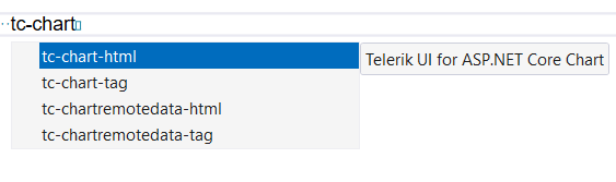
As you can imagine, the Telerik UI for ASP.NET Core Charts have a large collection of options for each chart type. For example, the Donut and Pie charts have a setting to define the start angle of the first Donut/Pie segment, the chart series have options to set target values for the Bullet charts, and so on. However, configuring the charts is quick and easy with snippets. You can access the snippets by installing the Telerik UI for ASP.NET Core Visual Studio productivity extension. Once installed, to declare an HtmlHelper or TagHelper chart, type “tc-chart” and choose the desired configuration.
The same snippets are available for Visual Studio Code, as well.
At this stage, we created a completely functional Line chart bound to inline data. Run this REPL sample and examine it.
Maintain the Chart Appearance and Options at Runtime
In the real world, we often need to customize the chart dynamically based on certain conditions. Luckily, the Telerik UI for ASP.NET Core Charts are fully flexible. You have the freedom to adjust any options after initialization.
I will demonstrate several use case scenarios:
Filter Data
How to filter the data in the chart? The user selects a range of values (for example, years), and the chart’s categories and data series are updated automatically based on the user selection.
- Create a RangeSlider component and handle its Change event:
<label for="slider">Select chart categories:</label>
@(Html.Kendo().RangeSlider()
  .Name("slider")
  .Min(2018)
  .Max(2022)
  .LeftDragHandleTitle("Drag to select start year")
  .RightDragHandleTitle("Drag to select end year")
  .Tooltip(tooltip => tooltip.Format("{0}").Template("Between #=selectionStart# and #=selectionEnd#"))
  .HtmlAttributes(new {style = "width: 300px;" })
  .Events(ev => ev.Change("onYearsRangeChange"))
)
<script>
  function onYearsRangeChange(e) {
    let startValue = e.value[0]; //Get the selected start year
    let endValue = e.value[1];  //Get the selected end year
    let minValue = e.sender.options.min; //Get the minimum value of the RangeSlider
    let maxValue = e.sender.options.max; //Get the maximum value of the RangeSlider
  }
</script>
- Filter the chart’s categories and series collections based on the chosen start/end years and trigger the client-side redraw() method. This way, the chart will be redrawn with the new data.
<script>
  var initialChartSeries = [
    [21560, 10548, 12548, 47526, 10254], //Product A
    [10258, 36985, 45287, 23568, 35982] //Product B
  ];
  var initialChartCategories = ["2018", "2019", "2020", "2021", "2022"];
  function onYearsRangeChange(e) {
    let startValue = e.value[0];
    let endValue = e.value[1];
    let minValue = e.sender.options.min;
    let maxValue = e.sender.options.max;
    let chart = $("#chart").getKendoChart(); //Get a reference to the chart
    let updatedChartSeries = chart.options.series; //Access the current chart’s series
    let updatedCategories = $.grep(initialChartCategories, function(value) { //Filter the current chart’s categories based on the selected years
      return (value >= startValue && value <= endValue);
    });
    for(var i = 0; i < updatedChartSeries.length; i++) { //Loop through the chart series and update them based on the selected years
      let newRangeSeries = $.grep(initialChartSeries[i], function(value,index) {
        return index >= (startValue - minValue) && index < initialChartSeries[i].length - (maxValue - endValue);
      });
      updatedChartSeries[i].data = newRangeSeries;
    }
    chart.options.categoryAxis.categories = updatedCategories; //Set the new categories
    chart.options.series = updatedChartSeries; //Set the new data series
    chart.redraw(); //Redraw the chart with the updated dataset
  }
</script>
Server-Side Data Filtering
When the chart is configured for remote data binding, you can filter the dataset server-side:
- Pass the chosen start/end years as additional parameters of the Read request of the DataSource:
function onYearsRangeChange(e) {
  let startValue = e.value[0];
  let endValue = e.value[1];
  let minValue = e.sender.options.min;
  let maxValue = e.sender.options.max;
  let chart = $("#chart").getKendoChart();
  chart.dataSource.read({ start: startValue, end: endValue }); //The read() method will make a request to the server
}
- Filter the data collection on the server:
[HttpPost]
public IActionResult ReadChartData(int start, int end)
{
  if(start != 0 && end !=0)
  {
    var filteredData = GetChartData().Where(x => x.Year >= start && x.Year <= end);
    return Json(filteredData);
  }
  return Json(GetChartData());
}
As a result, the chart loads the new data received from the server.
Changing Chart Settings at Runtime
How can you change the chart settings at runtime? For example, you can dynamically show/hide the series labels based on the user preferences:
- Create a Switch component and handle its Change event:
<label for="switch">Show/Hide data series labels:</label>
@(Html.Kendo().Switch()
  .Name("switch")
  .Messages(c => c.Checked("Yes").Unchecked("No"))
  .Events(ev => ev.Change("onSwitchChange"))
)
- Get a reference to the initialized chart and enable its series labels by using the setOptions() method:
function onSwitchChange(e) {
  let chart = $("#chart").getKendoChart();
  chart.setOptions({
    seriesDefaults: {
      line: {
        labels: { visible: e.checked }
      }
    }
  });
}
Here is a REPL sample where you can test these examples. In addition, it demonstrates how you can easily change the colors of the data series through ColorPicker editors.
Load New Data
How can you load a totally different dataset in an already rendered chart with a single button click? This scenario can be easily handled with the setDataSource() method:
//View
@(Html.Kendo().Button()
  .Name("setNewDataButton")
  .Content("Load new dataset")
  .Events(ev => ev.Click("onClick"))
)
<script>
  function onClick(e) {
    let chartWidget = $("#chart").data("kendoChart");
    var dataSource = new kendo.data.DataSource( { //Create a the new DataSource component
    transport: {
      read: {
        url: '@Url.Action("GetNewChartData", "Home")',
        dataType: "json"
      }
    }
  });
  chartWidget.setDataSource(dataSource);//Set the new DataSource
}
</script>

//Controller
[HttpPost]
public IActionResult GetNewChartData()
{
  return Json(GetChartData());
}
On top of that, the Telerik UI for ASP.NET Core Chart is fully customizable. You can implement custom visualizations for the chart legend items, axis titles, labels, markers, and series by utilizing the Kendo Drawing library.
Integrate the Chart into Other UI Components
In most cases, you will need to integrate the chart inside other UI components. Depending on the component you would like to embed the chart in, you can declare the chart directly in the component’s configuration. Take the TabStrip, for example:
@(Html.Kendo().TabStrip()
  .Name("tabstrip")
  .Items(tabstrip =>
  {
    tabstrip.Add().Text("Population")
    .Selected(true)
    .Content(@<text>
      @(Html.Kendo().Chart<Kendo.Mvc.Examples.Models.Chart.MarriagesDivorcesData>()
      .Name("chart1")
      .Theme("sass")
      .Legend(false)
      .DataSource(ds => ds.Read(read => read
        .Action("_MarriagesDivorcesStats", "Bubble_Charts")
      ))
      .Series(series => {
        series.Bubble(
          model => model.Marriages,
          model => model.Divorces,
          model => model.Population,
          model => model.State
        );
      })
      .XAxis(axis => axis
        .Numeric()
        .Labels(labels => labels
          .Format("{0:N0}")
        )
        .Title("Marriages per 1,000 population")
      )
      .YAxis(axis => axis
        .Numeric()
        .Labels(labels => labels
          .Format("{0:N0}")
        )
        .Title("Divorces per 1,000 population")
      )
      .Tooltip(tooltip => tooltip
        .Visible(true)
        .Format("{3}: Population {2:N0}")
      )
    )
    </text>);
    tabstrip.Add().Text("Electricity production").Content(…);
  })
)
This REPL sample showcases this example of integration.
Another common integration scenario is using the chart inside layout components—Tilelyout, StackLayout, Splitter, etc.
The example below shows how to integrate a Donut chart in a StackLayout:
@(Html.Kendo().StackLayout()
  .Name("stacklayout")
  .Spacing("15px")
  .Orientation(StackLayoutOrientation.Horizontal)
  .HorizontalAlign(HorizontalAlign.Stretch)
  .VerticalAlign(VerticalAlign.Stretch)
  .Items(i=>{
    i.Add().Content(@<text>
      <div class="k-card k-flex-30">
        <div class="k-card-body">
          @(Html.Kendo().Chart()
          .Name("chart")
          .Title("What is you favourite sport?")
          .Legend(legend => legend
            .Position(ChartLegendPosition.Top)
          )
          .Series(series => {
            series.Donut(new dynamic[] {
              new {category = "Football",value = 35},
              new {category = "Basketball",value = 25},
              new {category = "Volleyball",value = 20},
              new {category = "Rugby",value = 10},
              new {category = "Tennis",value = 10}
            });
          })
          .Tooltip(tooltip => tooltip
            .Visible(true)
            .Template("#= category # - #= kendo.format('{0:P}', percentage) #")
          ))
        </div>
      </div>
    </text>);
  })
)
Run this REPL sample to review the output.
In more complex scenarios, where you need to nest multiple components, a preferable approach is to use a template. Most of the Telerik UI components support templating options that accept inline or external Kendo UI Templates or partial views.
By using templates, you can reuse, for example, a partial view within multiple components and application pages.
@(Html.Kendo().TileLayout()
  .Name("tilelayout")
  .Columns(1)
  .Containers(c =>
  {
    c.Add().Header(h => h.Text("Weather conditions chart"))
    .BodyTemplateView(Html.Partial("../Shared/_ChartView")); //Pass the path to the partial view
  })
.Reorderable()
.Resizable()
)
And you here is the partial view “_ChartView.cshtml” with the nested chart component. Don’t forget to set the .ToClientTemplate() method when defining the chart in a template.
@{
  Layout = null;
}
@(Html.Kendo().Chart()
  .Name("chart")
  .Title("Average Weather Conditions")
  .Series(series =>
  {
    series.RangeColumn(new  double[][] {
      new  double[] {5, 11}, new  double[] {5, 13}, new  double[] {7, 15}, new  double[] {10, 19}, new  double[] {13, 23}, new  double[] {17, 28},
      new  double[] {20, 30}, new  double[] {20, 30}, new  double[] {17, 26}, new  double[] {13, 22}, new  double[] {9, 16}, new  double[] {6, 13}
    });
  })
  .CategoryAxis(axis => axis
    .Categories("January", "February", "March", "April", "May", "June",
      "July", "August", "September", "October", "November", "December")
  )
  .Tooltip(tooltip => tooltip.Visible(true))
  .ToClientTemplate()
)
Try out the Telerik UI for ASP.NET Core Charts Today
Want to start taking advantage of the ASP.NET Core Charts, or any of the other 110+ ready-made components, like the Data Grid or the Scheduler? Start a free trial today and experience for yourself that building rich interactive applications in half the time is not a fairytale.
Sharing is Caring
Once you try the Chart components, don’t forget to share your experience and opinion in the comments sections below or by visiting the Telerik UI for ASP.NET Core’s Feedback Portal. Your input makes a difference!

Mihaela Lukanova
Mihaela Lukanova is a Technical Support Engineer on the Progress Telerik UI for ASP.NET Core team. She is an excellent problem solver who excels at finding efficient and effective solutions to complex tasks. She loves her job since she learns new things every day. Mihaela also has a strong passion for sports—trail running, lifting weights and rhythmic gymnastics.
Related Posts
Comments
All articles
Topics

Latest Stories
in Your Inbox
Subscribe to be the first to get our expert-written articles and tutorials for developers!
All fields are required