How to Create ListView with Groups and Parallax Effect
Summarize with AI:
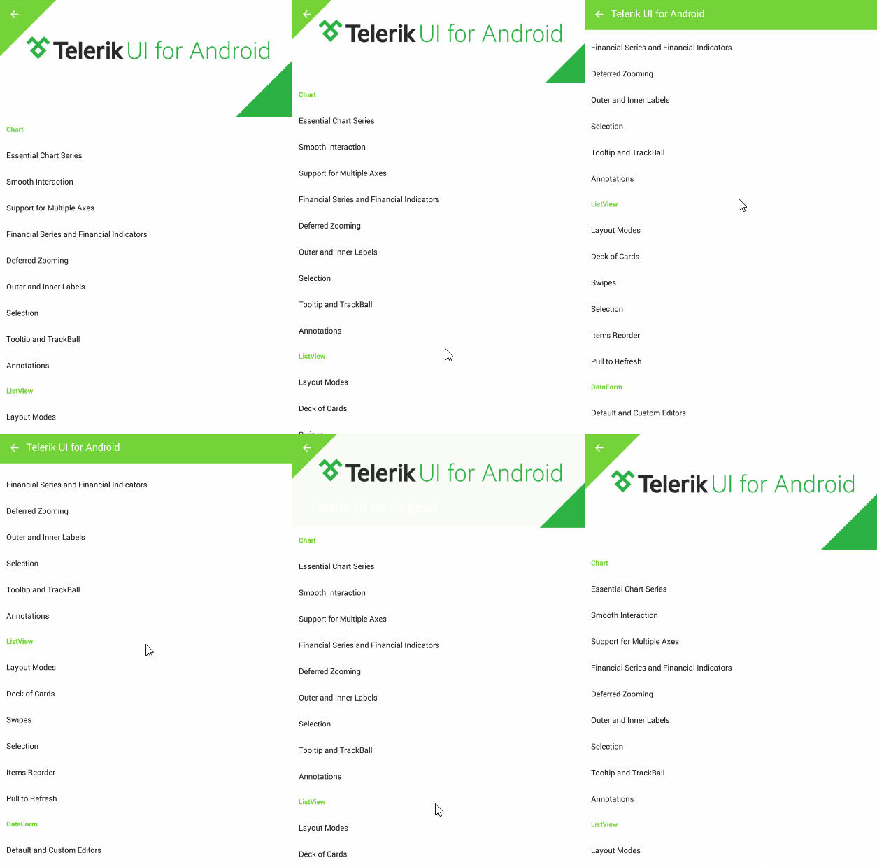
When you view the screen of an app in Google Play, that’s exactly what you see–a meaningful transition from image to app bar, which happens as a response to user input–scrolling down. This particular transition is called a parallax effect, and this blog post will show you how to add it to your application.
The Android 5.0 Lollipop release–the most significant Android release ever–introduced Material Design, which refreshed the entire Android experience. An important part of the Material Design is the Responsive Interaction. It encourages deeper exploration of an app by creating timely, logical and delightful reactions to user input. Another important aspect is the use of meaningful transitions between view states in a way that presents the information according to what is most important for the user right now. One way to do this is by using the parallax effect.
Here, we will demonstrate the Parallax effect using a list of items, shown in groups by Telerik ListView for Android.

We are going to use Android Studio for this post, but the same idea can be applied within your preferred IDE. Create a new app and add the aar files necessary for the ListView, part of Telerik UI for Android, to the libs folder of your application (the files are Common, Data and List). Then, add the following dependencies to your app’s build.gradle file:
compile 'com.android.support:appcompat-v7:22.2.1'compile 'com.android.support:recyclerview-v7:22.2.1'compile 'com.android.support:design:22.2.1'compile(name: 'Common', ext: 'aar')compile(name: 'Data', ext: 'aar')compile(name: 'List', ext: 'aar')The design reference is necessary for the recently introduced Android Design Support Library, which contains a lot of helpful widgets for achieving the expected Material Design behaviors. One of these widgets is the CoordinatorLayout, which provides an additional level of control over touch events between child views. It has to be the first element inside the main layout of your activity:
<android.support.design.widget.CoordinatorLayout xmlns:android="http://schemas.android.com/apk/res/android" xmlns:app="http://schemas.android.com/apk/res-auto" android:layout_width="match_parent" android:layout_height="match_parent" android:fitsSystemWindows="true">…</android.support.design.widget.CoordinatorLayout>For many of the features of material designs app bar concepts, namely scrolling gestures, the Design Library provides the AppBarLayout. It depends heavily on being a direct child of the coordinator layout, so we'll add it as a direct child to the layout that we just added:
…<android.support.design.widget.AppBarLayout android:layout_width="match_parent" android:layout_height="240dp" android:fitsSystemWindows="true" android:theme="@style/ThemeOverlay.AppCompat.Dark.ActionBar">…</android.support.design.widget.AppBarLayout>…The height we have set reflects the maximum height this layout will consume when the image is expanded. Our coordinator layout will have one more child, which will be the scrollable view–in our case, the ListView:
…<com.telerik.widget.list.RadListView android:id="@+id/myList" android:layout_width="match_parent" android:layout_height="match_parent" app:layout_behavior="@string/appbar_scrolling_view_behavior"/>…Pay attention to the layout_behavior attribute we have set. This is also a requirement of the AppBarLayout–to have a sibling whose scrolling it will "listen" to. We are also going to need a Toolbar and an ImageView to collapse when we scroll, but to do the collapsing, we will add a CollapsingToolbarLayout inside the AppBarLayout we already have:
…<android.support.design.widget.CollapsingToolbarLayout android:id="@+id/collapsing_toolbar_layout" android:layout_width="match_parent" android:layout_height="match_parent" android:fitsSystemWindows="true" app:contentScrim="?attr/colorPrimary" app:layout_scrollFlags="scroll|exitUntilCollapsed">…</android.support.design.widget.CollapsingToolbarLayout>…The layout_scrollFlags attribute is a requirement of the AppBarLayout, because it needs to know how to scroll its children, depending on the scroll events it receives. The possible values include scroll (to scroll off screen), enterAlways (downward scrolls return the view), enterAlwaysCollapsed (the view will enter on its minimal height, if declared) and exitUntilCollapsed (the view collapses before it exits). Now we are ready to add the Image and the Toolbar as children of the CollapsingToolbarLayout:
…<ImageView android:contentDescription="@string/content_description" android:layout_width="match_parent" android:layout_height="match_parent" android:fitsSystemWindows="true" android:scaleType="centerCrop" android:src="@drawable/telerik" app:layout_collapseMode="parallax" /><android.support.v7.widget.Toolbar android:id="@+id/toolbar" android:layout_width="match_parent" android:layout_height="?attr/actionBarSize" app:layout_collapseMode="pin" app:popupTheme="@style/ThemeOverlay.AppCompat.Light" />…These views should define their layout_collapseMode-s so they respond in accordance with the CollapsingToolbarLayout’s events. The value pin means the Toolbar will remain pinned, while the parallax value for the ImageView speaks for itself.
Now let’s go the code for the activity using this layout. We will need a few lines to set up the toolbar as a support action bar:
setSupportActionBar((Toolbar) findViewById(R.id.toolbar));ActionBar actionbar = getSupportActionBar();if (actionbar != null) { actionbar.setDisplayHomeAsUpEnabled(true);}And another few lines to set up the ListView with its grouping:
RadListView listView = (RadListView)findViewById(R.id.myList);ListViewDataSourceAdapter adapter = new ListViewDataSourceAdapter(getData());adapter.addGroupDescriptor(new Function<Object, Object>() { @Override public Object apply(Object object) { Entity entity = (Entity)object; return entity.category; }});listView.setAdapter(adapter);The getData method simply returns a populated list of Entity objects. The group descriptor defines grouping for the list by the value of the category of the Entity. And that's it; when you run the app, you should have the behavior from the image in the beginning of the post. Here’s the source code of the app.

Todor Petrov
