
‘How Am I Going to Build That’ Expense Management UI: Telerik UI for Blazor Components

Here are the five components that answer “How do I build that?” when you have to whip up a Blazor app for managing expense reports.
Designing a user-friendly and responsive UI is both a science and an art. It’s about combining aesthetics and functionality to create a seamless experience that guides users effortlessly. As a web developer, you’ve got the technical know-how to make it happen. But when you’re tasked with building a sleek and adaptable UI for expense management without spending excessive time or needing advanced UI skills, a practical question arises: “How Am I Going to Build That?”
Progress Telerik UI for Blazor steps in as your solution. With its user-friendly components, you can quickly build a beautiful and responsive expense management UI, even without extensive UI expertise. It’s your shortcut to crafting an intuitive interface that meets complex business needs without draining time or resources.
By combining the strengths of Grid, Form, Chart, Date Picker and Notification components, we’re on a mission to create a practical platform that makes expense tracking smoother, simplifies approval workflows, offers easy-to-understand analytics and enhances communication. Let’s explore this scenario and see how these components come together to improve expense management.
This is how your end result might look:
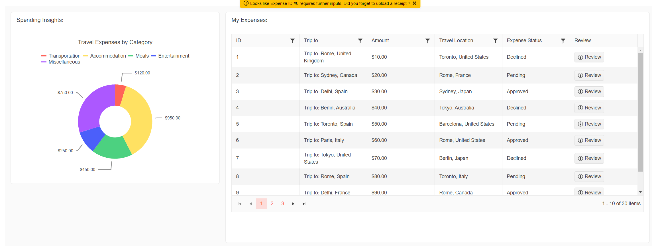
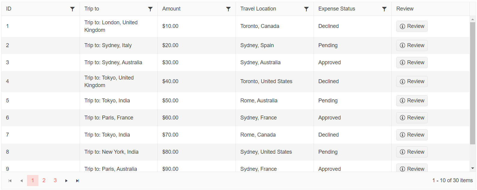
Get a Handle on Expenses with the Grid Component
First up, we have the Blazor Grid component—a powerful tool for keeping track of expenses. With features like filtering, sorting, grouping, paging and editing, it’s easy to search and organize expense data. The Grid also lets you input data seamlessly and provides a clear overview of details like dates, categories, amounts and status. You can review existing transactions all from one place.
The Telerik UI for Blazor Grid is built on native Blazor technology by an experienced company, offering high customization and top-notch speed. This is an example of how you could use the Telerik UI for Blazor Grid as an expenses overview.
Code snippet:
@using System.ComponentModel.DataAnnotations

<TelerikGrid Data=@MyData EditMode="@GridEdit Mode. Incell" Pageable="true" Height="500px"
Sortable="true" FilterMode="Telerik.Blazor.GridFilterMode. FilterMenu" >
  <GridColumns>
    <GridColumn Field=@nameof (Expense. ID) Title="ID" Editable="false" />
    <GridColumn Field=@name of (Expense. ExpenseName) Title="Trip to"
Editable="false"></GridColumn>
    <GridColumn Field=@nameof (Expense. Amount) Title="Amount" DisplayFormat="{0:C2}"
Editable="false" ></GridColumn>
    <GridColumn Field=@nameof (Expense. Date) Title="Date" Format="{0:d}"
Editable="false"></GridColumn>
    <GridColumn Field=@nameof (Expense. TravelDate) Title="Travel Date" Format="{0:d}"
Editable="false"></GridColumn>
    <GridColumn Field=@nameof (Expense. TravelLocation) Title="Travel Location"
Editable="false"></GridColumn>
    <GridColumn Field=@name of (Expense. Status) Title="Expense Status"
Editable="false"></GridColumn>
    <GridColumn Title="Review" Editable="false">
      <Template>
        <TelerikButton Icon="@Svg Icon. InfoCircle"
OnClick="@OnReviewHandler">Review</TelerikButton>
      </Template>
    </GridColumn>
  </GridColumns>
</TelerikGrid>
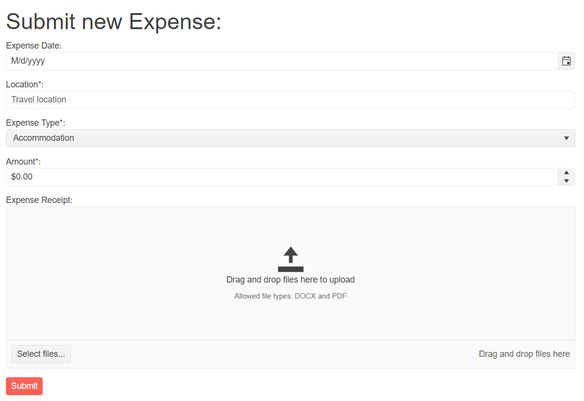
Easy Expense Submission with the Form Component
Next, we introduce the Blazor Form component, which simplifies the process of submitting expenses. You can use it to enter details, attach receipts and choose categories. The Form component helps prevent errors and ensures accurate data entry. Submitting expense requests becomes a breeze, providing all the necessary information for smooth processing.
The Telerik UI for Blazor Form component offers horizontal and vertical orientation modes, model integration and EditContext class support. You can organize layouts into columns using the Columns parameter, benefit from validation options like DataAnnotationsValidator, and group form items efficiently. Customizable templates allow unique content rendering, and you can add buttons using the FormButtons tag, including the default Submit button.
Here’s a quick example of how you can use the Telerik UI for Blazor Form for our expense management scenario.
Code snippet:
<TelerikForm Model="@ExpenseReport"
    OnValidSubmit="@HandleValidSubmit"
    OnInvalidSubmit="@HandleInvalidSubmit">
  <FormValidation>
    <DataAnnotationsValidator></DataAnnotationsValidator>
  </FormValidation>
  <FormItems>
    <FormItem Field="@nameof(ExpenseReport.SelectedDate)">
      <Template>
        <label for="travel-date" class="k-label k-form-label">Expense Date:</label>
        <TelerikDatePicker @bind-Value="@ExpenseReport.SelectedDate"
          Min="@ExpenseReport.MinDate"
          Max="@ExpenseReport.MaxDate"
          DebounceDelay="@ExpenseReport.DebounceDelay"
          ShowWeekNumbers="true"
          Id="travel-date">
        </TelerikDatePicker>
        <TelerikValidationMessage For="@(() => ExpenseReport.SelectedDate)"></TelerikValidationMessage>
      </Template>
    </FormItem>
    <FormItem Field="@nameof(ExpenseReport.Location)">
      <Template>
        <label for="location" class="k-label k-form-label">Location*:</label>
        <TelerikTextBox Id="location" @bind-Value="@ExpenseReport.Location" Placeholder="Travel location"></TelerikTextBox>
        <TelerikValidationMessage For="@(() => ExpenseReport.Location)"></TelerikValidationMessage>
      </Template>
    </FormItem>
    <FormItem Field="@nameof(Expense.ExpenseType)">
      <Template>
        <label for="expenseType" class="k-label k-form-label">Expense Type*:</label>
          <TelerikDropDownList Data="@expenseTypes" TextField="ExpenseTypeName" ValueField="ExpenseTypeId" @bind-Value="selectedValue">
          </TelerikDropDownList>
          <TelerikValidationMessage For="@(() => ExpenseReport.ExpenseType)"></TelerikValidationMessage>
        </Template>
    </FormItem>
    <FormItem Field="@nameof(ExpenseReport.Amount)">
      <Template>
        <label for="amount" class="k-label k-form-label">Amount*:</label>
        <TelerikNumericTextBox Id="amount" @bind-Value="@ExpenseReport.Amount" Format="c2" Placeholder="0.00"></TelerikNumericTextBox>
        <TelerikValidationMessage For="@(() => ExpenseReport.Amount)"></TelerikValidationMessage>
      </Template>
    </FormItem>
    <FormItem>
      <Template>
        <label class="k-label k-form-label">Expense Receipt:</label>
        <TelerikDropZone Id="@ExpenseReport.DropZoneId" NoteText="@ExpenseReport.NoteText" />
        <TelerikFileSelect DropZoneId="@ExpenseReport.DropZoneId" AllowedExtensions="@ExpenseReport.AllowedExtensions" />
      </Template>
    </FormItem>
  </FormItems>
</TelerikForm>
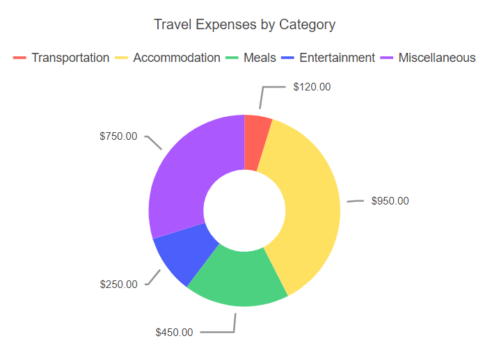
Visualize Expenses with the Chart Component
Let’s talk about the Chart component, which turns expense data into easy-to-understand visualizations. By analyzing expenses, you can gain insights into spending patterns, category distribution and budgets.
The Telerik UI for Blazor Chart component provides a variety of graph types and gives you the ability to fine-tune the component’s appearance, including elements like colors, fonts, paddings, margins and templates.
Check an example implementation of the Telerik UI for Blazor Chart suitable for our expense management application.
Code snippet:
<TelerikChart>
  <ChartTitle Text="Travel Expenses by Category"></ChartTitle>
  <ChartLegend Visible="true" Position="ChartLegendPosition.Top"></ChartLegend>
  <ChartSeriesItems>
    <ChartSeries Type="ChartSeriesType.Donut"
        Data="@ExpenseData"
        Field="@nameof(ExpenseCategory.Amount)"
        CategoryField="@nameof(ExpenseCategory.Category)">
      <ChartSeriesTooltip Visible="true" Context="item">
        <Template>
          @item.Percentage.ToString("P")
        </Template>
      </ChartSeriesTooltip>
      <ChartSeriesLabels Position="ChartSeriesLabelsPosition.OutsideEnd"
          Visible="true"
          Background="transparent"
          Format="{0:C2}" >
      </ChartSeriesLabels>
    </ChartSeries>
  </ChartSeriesItems>
</TelerikChart>
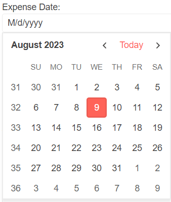
Pick Dates with the DatePicker Component
The [DatePicker]](https://docs.telerik.com/blazor-ui/components/datepicker/overview) component simplifies choosing dates for expense records. You can navigate through calendars and select dates for submissions or search for specific expenses within a timeframe. This component ensures accuracy in date selection, making expense tracking and reporting more efficient.
The Telerik UI for Blazor DatePicker component provides users with the ability to select a date either by interacting with a graphical Gregorian calendar or by manually inputting it into a date-specific field. You have the flexibility to manage the format of the entered date, customize the navigation experience within the calendar, and specify any dates that should be restricted from selection by the user.
Check how the Telerik UI for Blazor DatePicker component, helps with date selection for expense management.
Code snippet:
<TelerikDatePicker  @bind-Value="@ExpenseReport.SelectedDate"
    Min="@ExpenseReport.MinDate"
    Max="@ExpenseReport.MaxDate"
    DebounceDelay="@ExpenseReport.DebounceDelay"
    ShowWeekNumbers="true"
    Id="travel-date">
</TelerikDatePicker>
Stay Informed with the Notification Component
Last but not least, the Notification component keeps everyone in the loop. It notifies users about the status of their expense submissions, whether they’re approved, rejected or need more information. This transparent communication streamlines approval workflows and improves overall expense management.
The Telerik UI for Blazor Notification component displays concise messages to users, conveying information about the progress of a process within the application. Through its configuration options, you can personalize its placement, choose from various animation effects and control its overall rendering behavior.
Don’t lose any important updates in your expense management system—integrate the Telerik UI for Blazor Notification component.

Code snippet:
<div  class="notification-parent">
  <TelerikNotification  @ref="NotificationComponent"
      Class="warning-notification"
      HorizontalPosition="@NotificationHorizontalPosition.Center"
      VerticalPosition="@NotificationVerticalPosition.Top"></TelerikNotification>
</div>
In Conclusion: A Practical Approach to Building Web UIs
In conclusion, Telerik UI for Blazor components come together to simplify building UI for expense management. The Grid helps you stay organized, the Form makes submitting expenses easy, the Chart provides clear insights, the Date Picker ensures accurate date selection, and the Notification keeps communication smooth.
By using these out-of-the-box components, you can reduce the time and effort required to build any web application. Check the Telerik UI for Blazor component library and start building your first Blazor application today!

Lyubomir Atanasov
Lyubomir Atanasov is a Product Manager with a passion for software development, UI design, and design thinking. He excels in creating impactful and innovative software products by challenging the status quo, collaborating closely with customers, and embracing a spirit of experimentation. His dedication to delivering exceptional UI solutions makes him an invaluable asset, providing immense value through his expertise and innovative approach. Follow him on LinkedIn.
Related Posts
Comments
All articles
Topics

Latest Stories
in Your Inbox
Subscribe to be the first to get our expert-written articles and tutorials for developers!
All fields are required