
Elevate Your Application’s Visual Experience with Compact Mode in the WPF Windows 11 Theme

With the recent R2 2023 release, we are excited to announce a game-changing addition to our Windows 11 theme that will elevate your user experience—the new high-density (or Compact) layout option.
Themes are instrumental in enhancing the overall user experience, breathing life into the user interface, and reflecting your product’s branding and style.
Last year, after we launched the Windows 11 theme for Progress Telerik UI for WPF, we heard from many of you who were looking for a sleeker and more compact design. Instead of creating an entirely new theme, we decided to optimize the use of existing resources by utilizing all the colors from the current theme. And let me tell you, the result is truly impressive.
In this blog post, I will introduce to you the Windows11ThemeSizeHelper, a revolutionary way for the Windows 11 theme that empowers you to take your WPF application to new heights of visual appeal and customization.
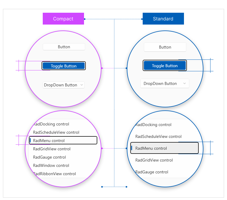
Understanding the Windows11ThemeSizeHelper
Let’s dive into the world of the Windows11ThemeSizeHelper. This powerful and innovative helper is specifically designed for our Windows 11 theme. Its primary function is to switch between two distinct layouts using the IsInCompactMode property. By leveraging this property, the helper combines various
resources, adapting the sizes to provide larger dimensions tailored for Windows 11 Standard, and effortlessly transitioning to more compact dimensions for Windows 11 Compact.
Easy Implementation
Integrating themes into your applications can be challenging for the developers sometimes. That’s why we’ve made it our mission to create a streamlined and straightforward process. With just one line of code, you’ll be able to apply Windows 11 Compact Mode and witness an instant transformation in the look and feel of your entire application:
Windows11ThemeSizeHelper.Helper.IsInCompactMode = true;Customizing the Dimensions
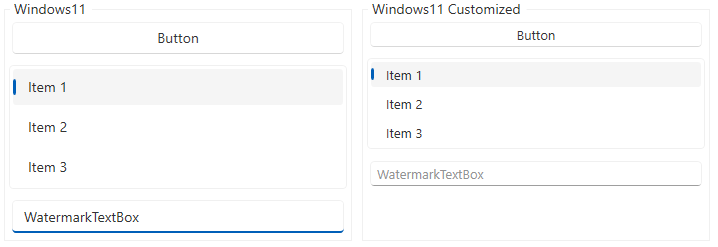
But wait, there’s more! I thought it would be nice of me to also show you a way of customizing the dimensions of the Windows 11 theme. Let’s consider a practical example where we create two StackPanels—one using the Standard Windows11 layout and another where we’ll modify specific resources within the StackPanel scope. The possibilities for customization are truly endless!
<StackPanel Orientation="Horizontal">
    <telerik:GroupBox Header="Windows11" HorizontalAlignment="Left" Width="350">
        <StackPanel>
            <telerik:RadButton Content="Button"/>
            <telerik:RadListBox Margin="0 8">
                <telerik:RadListBoxItem>Item 1</telerik:RadListBoxItem>
                <telerik:RadListBoxItem>Item 2</telerik:RadListBoxItem>
                <telerik:RadListBoxItem>Item 3</telerik:RadListBoxItem>
            </telerik:RadListBox>
            <telerik:RadWatermarkTextBox Text="WatermarkTextBox"/>
        </StackPanel>
    </telerik:GroupBox>
    <telerik:GroupBox Header="Windows11 Customized" HorizontalAlignment="Left" Width="350" Margin="8 0 0 0">
        <StackPanel>
            <StackPanel.Resources>
                <!-- Customized Windows 11 resources with ThemeSizeHelper  -->
                <sys:Double x:Key="{x:Static telerik:Windows11ResourceKey.DefaultControlMinHeight}">25</sys:Double>
                <sys:Double x:Key="{x:Static telerik:Windows11ResourceKey.DefaultItemMinHeight}">24</sys:Double>
                <sys:Double x:Key="{x:Static telerik:Windows11ResourceKey.FontSize}">13</sys:Double>
                <Thickness  x:Key="{x:Static telerik:Windows11ResourceKey.DefaultControlPadding}">8 0</Thickness>
                <Thickness  x:Key="{x:Static telerik:Windows11ResourceKey.NestedButtonMargin}">0 0 8 0</Thickness>
                <Thickness  x:Key="{x:Static telerik:Windows11ResourceKey.InputPadding}">4 1 4 1</Thickness>
            </StackPanel.Resources>
            <telerik:RadButton Content="Button"/>
            <telerik:RadListBox Margin="0 8" >
                <telerik:RadListBoxItem>Item 1</telerik:RadListBoxItem>
                <telerik:RadListBoxItem>Item 2</telerik:RadListBoxItem>
                <telerik:RadListBoxItem>Item 3</telerik:RadListBoxItem>
            </telerik:RadListBox>
            <telerik:RadWatermarkTextBox Text="WatermarkTextBox"/>
        </StackPanel>
    </telerik:GroupBox>
</StackPanel>
And voilà! Feast your eyes on the result:
Finding the Resources Values
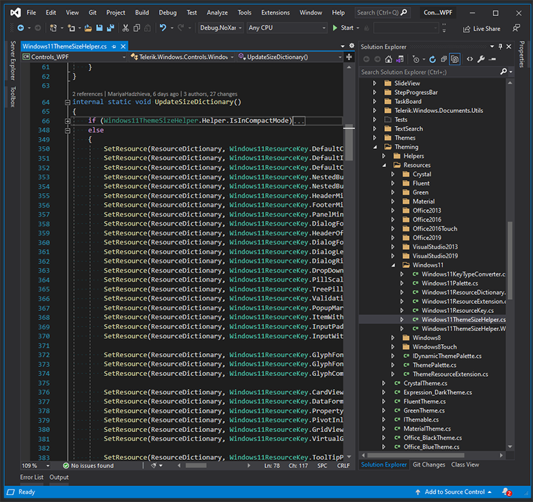
Now, you might be wondering where to find the desired resource values. Look no further! Simply navigate to the Windows11ThemeSizeHelper class in the Telerik.Windows.Controls.dll assembly.
In this file, you’ll discover the resource names corresponding to the Windows 11 Standard and Compact themes.
Alternatively, you can download the resource files from the PaletteResourcesExtractor SDK example.
Don’t miss out! Head over to our online documentation, where you can find everything you need to know about the captivating Windows 11 theme.
Revitalize Your App’s Appearance
Check out our awesome Color Theme Generator! It’s a super cool tool that lets you play around with different colors and customize your theme palette in real time. You can try out all sorts of shades, mix and match them however you like, and see the changes instantly. And the best part? Once you’re done experimenting and creating the perfect look, you can simply export it and make it yours. It’s your chance to unleash your creativity and make your theme truly unique.
Conclusion
The Windows 11 Compact mode holds out an entire world of opportunities to modernize your WPF applications. It simplifies the process of integrating visually captivating themes, offers customization options to align with your branding, and saves development time.
Try out the latest version of Telerik UI for WPF to see what I am talking about!
Once you do, you will not need to thank me! Just enjoy it and keep elevating the look and feel of your application, engaging the end users with stunning visuals, and leaving a lasting impression.
And don’t forget to stay tuned for more exciting updates and features as we continue to enhance your WPF development journey.
Happy theming! 🎨
Maria Hadzhieva
Maria Hadzhieva is a front-end developer on the Progress Telerik team.
Related Posts
Comments
All articles
Topics

Latest Stories
in Your Inbox
Subscribe to be the first to get our expert-written articles and tutorials for developers!
All fields are required