
Developer Experience Hub
Explore documentation, code samples, tutorials and connect with the community that builds with Progress.
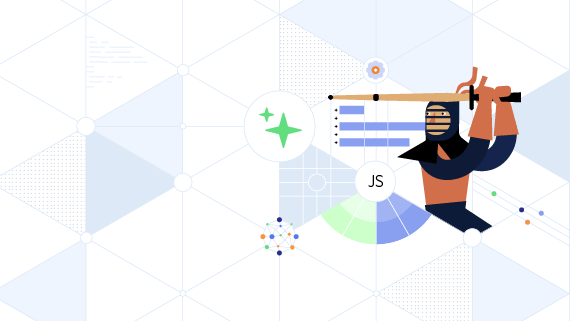
Webinar
Kendo UI 2025 Q4 Release Webinar
Highlights: Agentic UI Generator, IDE-integrated AI Coding Assistants, Prompt-Driven Data Grid, AI-enhanced Chat UI, Workflow Diagram
Discord Event
What We've Learned Designing Dev Tools in the Age of AI
AI is changing how we build and trust software. Join Alyssa Nicoll, Ed Charbeneau, and Kathryn Grayson Nanz to explore what’s working, what’s not, and what comes next.
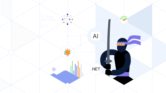
Webinar
Telerik Reporting and Fiddler 2025 Q4 Release Webinar
Highlights: Fiddler MCP Integration, Debugging Assistant, IDE-integrated AI Coding Assistants, Enhanced GenAI-powered Reporting Insights, Day-Zero .NET 10 Support.
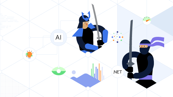
Progress Labs
Supercharging AI-Powered Applications
Mashup: Progress® Agentic RAG + Progress® KendoReact™
Build stunning, intuitive applications powered by enterprise-grade AI retrieval and precision data context. Progress Agentic RAG and KendoReact combine seamless generative search with rich UI components, accelerating development and unlocking real business outcomes.

Resources
Learn through hands-on tutorials, demos and workshops designed to enhance your development skills.

Blog
Angular 22: The Evolution of Modern Angular
Signals, OnPush, declarative async resources: Angular 22 makes standard several features that help developers build better apps.

Blog
Advanced Form Validation in Blazor 10
These new validation features available in Blazor as of .NET 10 help manage forms with nested objects and lists, plus perform complex and cross-field validations.

Blog
How a 6-Person Team Shipped an AI-First Platform with KendoReact
For teams building AI-driven applications with complex workflows, treating the UI layer as infrastructure can dramatically reduce friction as the product evolves. For Icanpreneur, KendoReact became that foundation.
Community
Connect With Fellow Developers, Share Knowledge and Stay Updated on the Latest Developments.
Discord Channels
Events
Become a Progress Champion
Join an elite community of developers who shape the future of Progress technologies in these in three easy steps and inspire others.
Apply
Submit your application showcasing your accomplishments
Review
Our team reviews applications and selects champions based on impact and engagement
Champion
Join the elite community and start making an impact while enjoying exclusive benefits
The Perks of Being a Champion
Exclusive Swag & Rewards
Limited edition merchandise, branded gear and special recognition items.
Direct Access to Product Teams
Private channels with engineers, product managers, and leadership.
Speaking Opportunities
Conference speaking slots, webinar hosting, and thought leadership platforms.
Recognition & public promotion
Celebrate your achievements with global visibility and be recognized as a valued Progress advocate.
Annual Champion Summit
Exclusive event with networking and advanced training.