
When to Design with Gestures vs. Buttons

Why button-less design is a big deal right now and when and how you should adopt this trend for your mobile apps.
It used to be that we had buttons on everything. But as devices like the iPhone X and Alexa have demonstrated, buttons are no longer a necessity for engagement.
Which begs the question:
As our physical devices and appliances develop button-less designs, and consumers become more comfortable and confident in interacting this way, is this something we should consider for more apps?
Before you tackle the design and development of your next app, take some time to weigh the pros and cons of using gestures over buttons.
The Pros of Designing App Interactions as Gestures
You need your users to engage with the apps you develop, which is why so much time is dedicated to designing the perfect buttons for them.
- Are they big enough?
- Are they in the thumb zone?
- Does the color draw enough attention to it?
- Does the button look enough like a clickable button?
- Is it labeled clearly enough?
You can find tons of case studies and guides dedicated to the subject of button design. Considering what a seemingly complicated matter it’s been for designers, should we be breathing a sigh of relief now that users have become better acquainted with app gestures?
Consider the following benefits:
Design a Clearer Interface
When you build an app that’s solely dependent on gestures, you can clear up all of the real estate that would otherwise be occupied by navigation bars and other extraneous icons and links.
Take the game Life Is Strange, for example:
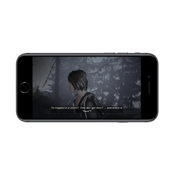
The gameplay is 100% based on gestures:
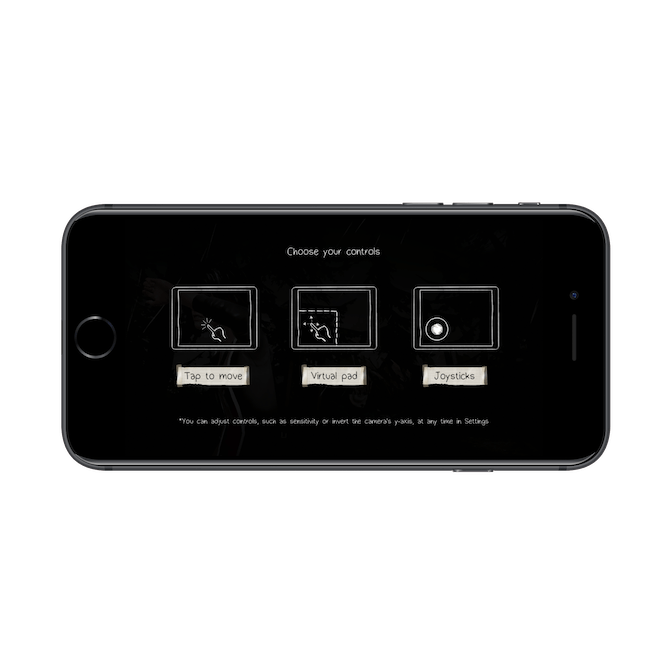
Although the above screen temporarily pops up at the start of the game, the remainder of the cues and reminders don’t get in the way as a navigation bar might. For instance:
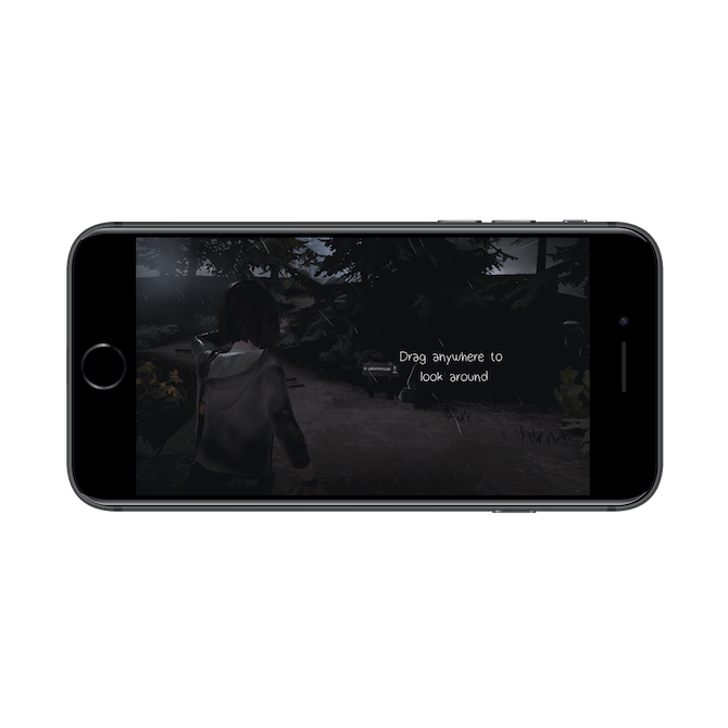
While you might not be able to design a non-gaming app that’s 100% gesture-based, you can see the value of being able to hide the navigation at times.
Make It Easier to Execute Actions
Have you ever watched your mobile app users struggle to tap their target and wondered how you could fix the problem without creating oversized buttons? Gestures might make more sense, as they don’t always such exact touch-precision.
Let’s use the example of Instagram:

Users can like, comment on, share, or bookmark posts by clicking on the corresponding buttons. But, as you can see, there’s not a lot of space between the options, especially for users with larger fingers.
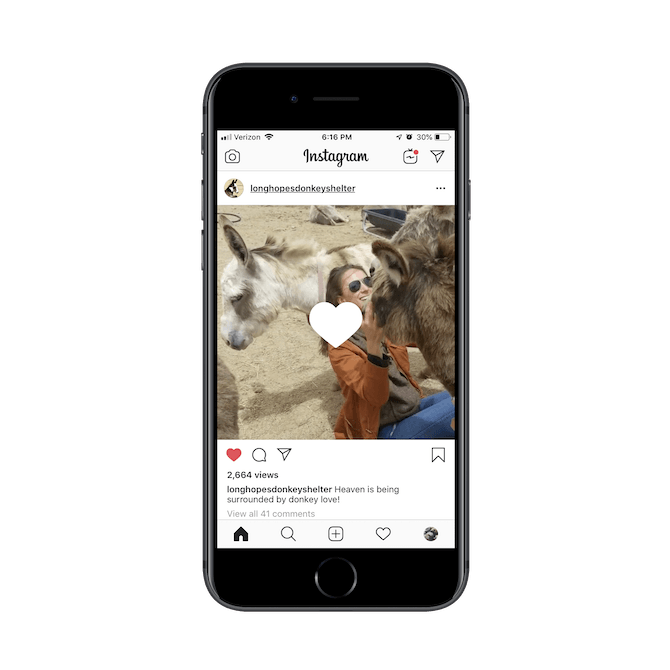
Instagram, however, has adopted a double-tap gesture for likes. That way, the user simply has to have their finger somewhere over the image or video in order to interact with it.
Apps Become More Exciting to Interact With
Although buttons can be animated to provide users with feedback when a click has been properly executed, there is something special about the way that gestures invite users to engage with an app.
Take Flipboard, for instance.

This is how news stories are displayed on Flipboard. It’s a beautiful way to show off headlines and featured images.
To get to the next headline, users then “flip” (slide up) the card like this:

The gesture actually mimics how something (say, a page of a newspaper) might flip in the real world.
Allow Users to Engage More Quickly
Communication apps, in particular, give users a lot of options to choose from.
At the highest level, they might have to choose from channels and folders. On the next level, they have to sort through a list of messages. Further on, they have to decide which option to take for each one.
Many communications apps — email and chat — have solved this navigational problem in a similar manner.
This is what happens when you swipe right on a WhatsApp message:

This is what happens when you swipe left:

Rather than force users to tap once to get to messages, tap a second time to open a message, and tap a third time to take action on it, the swipe handles it in one fell swoop.
Create a More Unique UX
If you’ve ever felt like mobile apps all kind of look the same and it’s hard to create something totally unique with how little you have to work with, gestures might be the differentiator your UI needs.
Let’s look at Boomerang for Gmail for this example:

There’s nothing out of the ordinary at first glance. However, when users put the swipe gesture to use, this is what they see:

Similar to how WhatsApp uses a swipe to allow for quick-action options, Boomerang for Gmail does, too. However, the key difference is in how the gesture plays out, with each option fanned out for the user to see and swipe toward.
The Cons of Designing App Interactions as Gestures
In general, you have to be very careful about which gestures you use and how you use them in your mobile app. What might seem like a way to improve the UX can quickly become an unnecessary and unwanted friction on the part of your users.
Here are some things to think about:
User Familiarity
At this point, gestures like the double-tap and swipe are fairly intuitive choices. However, what about ones like:
- Spread?
- Pinch?
- Drag?
- Shake?
- Tilt?
If the gestures aren’t common enough, is it even worth building them into your app? Sure, you could add reminders the way Life Is Strange does… but is the interruption to the experience worth it? I suspect users will get frustrated if gestures are too difficult to remember and there’s no easy way to take the traditional button route instead.
Gesture Imperfection
Buttons are certainly not perfect, especially when too many of them are grouped together in a small space. However, gestures can be imperfect in terms of execution, too.
Just look at the example of Boomerang by Gmail. The swipe-and-sort gesture is really cool to see and engage with. However, that extra creativity might not be worth the frustration users experience when they swipe too quickly or accidentally take the wrong action and end up having to click the “Undo” button anyway.
Consistency and Expectations
I don’t expect that developers will have a hard time with maintaining consistency in how they apply gestures throughout an app. But think about what your choice to alter a gesture that users are already familiar with from a popular app might do to the user experience.
You can see this problem in many dating apps.
Let’s compare the two most popular ones: Tinder and Bumble.
The Tinder left swipe says “Nope” to a potential match:
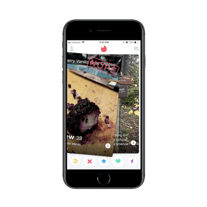
So does Bumble:
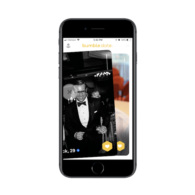
The Tinder right swipe says “Yes” to a potential match:

So does Bumble:
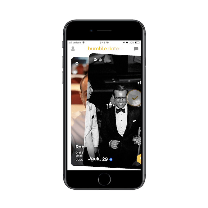
This is where they differ:
The up swipe on Tinder says “I reallllllly like this one” to a potential match:

Bumble asks users to click a button in the bottom-right corner to take that action (it’s also a paid feature on Bumble). Instead, the up swipe on Bumble says, “I want to learn more about this guy/gal”:

In order to see more of a Tinder match’s profile, users have to either click on the right or left side of the image to see more photos or click where the name is to reveal the bio.
For users that switch between the two apps on a regular basis, this variation in design could create errors in action where there really shouldn’t be if the gestures had remained consistent.
Sometimes Gestures Just Don’t Make Sense
If you’re sitting there wondering how you’re going to make a gesture work for your app, but are coming up short, it’s probably because there’s no room for them. And that’s fine. There are plenty of apps that don’t use them — like the booking app for Amtrak:

There’s really no reason to add a gesture to an app like this. If you need to get a very clear confirmation from a user, a button is the best solution, even if it requires more work on their part.
That said, don’t forget that you can combine gestures and buttons. You can see an example of how this works with Uber:
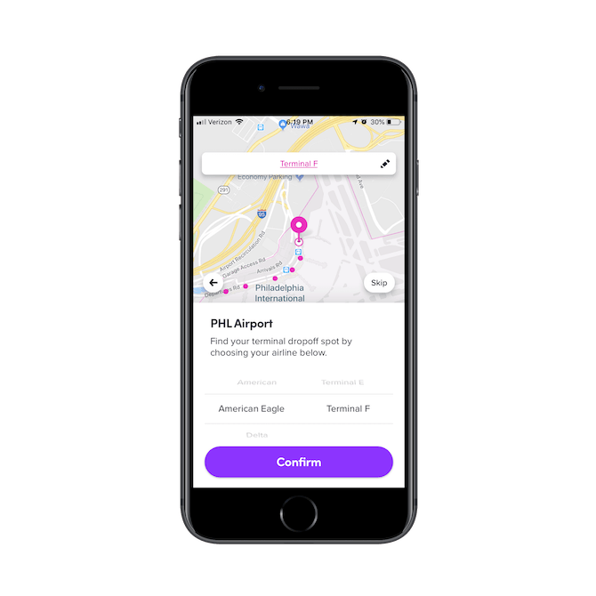
Users can slide and toggle pickup options, but are ultimately asked to confirm with a click of a button. In this case, both the button and gesture make sense in the context of the app.
Really, what you need to do is ask yourself:
- Can this interaction be simplified with a gesture?
- Will the gesture be easy to remember and become intuitive for users?
- Do I need to supplement the gesture with a button?
And if you’re still unsure, use heatmaps and user testing prior to launch to see how well your choices go over. Are there certain gestures that are more commonly used over others? What’s the first gesture your users go to? What’s the last gesture they use and does it lead to conversion or dropoff?
The point isn’t to adopt gestures for the sake of doing something that’s trendy or that works for others. The point is to adopt them to improve the experience. So, give it some thought.

Suzanne Scacca
A former project manager and web design agency manager, Suzanne Scacca now writes about the changing landscape of design, development and software.
Comments
All articles
Topics

Latest Stories
in Your Inbox
Subscribe to be the first to get our expert-written articles and tutorials for developers!
All fields are required