New 3D Chart in UI for WPF
Present deeper and more engaging data with the new 3D charts in UI for WPF. Learn all about this new feature, just released with R3 2016 of UI for WPF.
3D movies and 3D printers are becoming more and more popular. So is our RadChartView. This is why we with the R3 2016 release of UI for WPF we decided to go 3D—and the results are outstanding!

The RadCartesianChart3D (currently in CTP) is a new addition to the RadChartView set and is the first control in the set to visualize data in a three dimensional manner. The chart uses the WPF API for 3D rendering so you do not need to worry about including third party libraries.
While this is a brand new control, it has an API very similar to the one in the other charts in the set. So, if you have already used our charts—you will find setting up the new control to be very easy. If you have not yet used our charts, well, what are you waiting for?
There are plenty of application scenarios, such as business, financial, scientific, statistical or other types of apps, which may need to display three dimensional data to better present a case. Another fit might be for some modern topics such as Machine Learning and AI, or even manifold learning.
Getting Started
Here is a quick tutorial on how to set up the new chart:- Add three axes (X, Y, Z). Choose between categorical and linear.
- Add at least one series. You can either add data points in XAML for a quick test, or you can data bind the series to an items source.
- Add a camera behavior in the Behaviors collection. This will allow you to rotate and zoom the chart via mouse and touch.
- Add a grid, so that you can see grid lines and strip lines.
Let's see some code:
<telerik:RadCartesianChart3D> <telerik:RadCartesianChart3D.XAxis> <telerik:CategoricalAxis3D /> </telerik:RadCartesianChart3D.XAxis> <telerik:RadCartesianChart3D.YAxis> <telerik:CategoricalAxis3D /> </telerik:RadCartesianChart3D.YAxis> <telerik:RadCartesianChart3D.ZAxis> <telerik:LinearAxis3D /> </telerik:RadCartesianChart3D.ZAxis> <telerik:RadCartesianChart3D.Series> <telerik:BarSeries3D> <telerik:BarSeries3D.DataPoints> <telerik:XyzDataPoint3D XValue="2015" YValue="Jan" ZValue="11" /> <telerik:XyzDataPoint3D XValue="2015" YValue="Feb" ZValue="15" /> <telerik:XyzDataPoint3D XValue="2015" YValue="Mar" ZValue="19" /> <telerik:XyzDataPoint3D XValue="2016" YValue="Jan" ZValue="13" /> <telerik:XyzDataPoint3D XValue="2016" YValue="Feb" ZValue="17" /> <telerik:XyzDataPoint3D XValue="2016" YValue="Mar" ZValue="21" /> </telerik:BarSeries3D.DataPoints> </telerik:BarSeries3D> </telerik:RadCartesianChart3D.Series> <telerik:RadCartesianChart3D.Grid> <telerik:CartesianChart3DGrid /> </telerik:RadCartesianChart3D.Grid> <telerik:RadCartesianChart3D.Behaviors> <telerik:Chart3DCameraBehavior /> </telerik:RadCartesianChart3D.Behaviors></telerik:RadCartesianChart3D>
But What's In It?
Even though the chart was just introduced as a CTP, it comes with a very powerful set of features covering plenty of application scenarios. Let's dive into some of the key new features.
Series Types
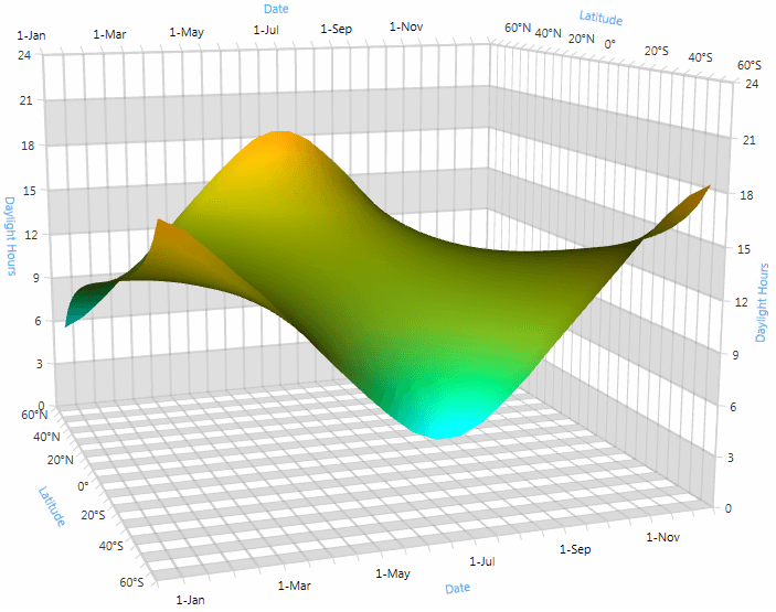
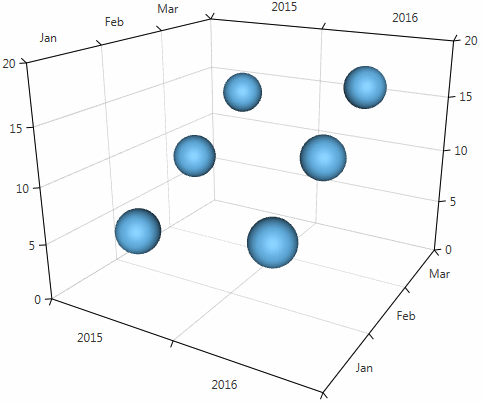
There are three built-in series—surface series, point series, and bar series (a.k.a. Manhattan chart).
Appearance
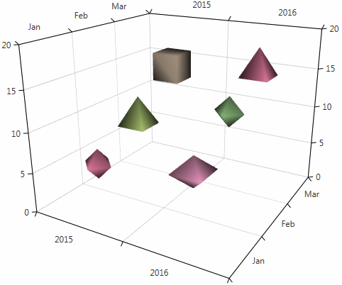
You can control the appearance of the data point visuals. You can set custom materials, which allow you to determine what color the 3D elements get, how glossy and shiny they are, and so on. You can set custom geometries, which allow you to determine the shape of the visuals. All three series expose material and geometry selector functionality so that each point can look differently.

Behaviors
We have introduced a camera behavior and a tooltip behavior. The camera behavior will allow you to rotate the camera around the center of the chart and move it towards or away from this center. This creates the illusion that the chart is being spun and zoomed in and out. The tooltip behavior shows information about hovered data point visuals.
Advanced
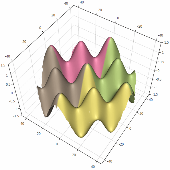
Each series has its own features, too. The point series allows you to choose a point size. The bar series lets you to choose a display direction. The surface series exposes many advanced features such as different color modes and custom triangulation abilities.
We have prepared two built-in colorizers. One colorizes the surface in accordance to its display direction, and the other colorizes each point with color depending on the underlying data item (a.k.a. 4D surface chart). You can use the TriangleIndices property to show a more complex surface, for example data that does not come from a tabular (two-dimensional) items source.

Play with a 3D Chart Demo
Take a look at our Demo application for more examples, our SDK samples, and online documentation. Let us know in the comments below or in our Feedback Portal how you like things so far and what features you want to see next.

Petar Marchev
Petar Marchev is a developer in the Telerik XAML Team. Petar has a passion for desktop and mobile application development, code optimizations and multithreaded programming. He is an audiophile and enjoys music from his full range speakers and tube amp.
