Most Common Mistakes in Report Authoring

Looking at a particularly guilty real-life example found in public, we’ll explore some common mistakes in report design and tips for how to do better in your own reports.
While preparing to write this post, I went through a significant number of definitions for the term “report” used in the context of data presentations. One of the better ones roughly says the following:
“The report is a concise summary from a larger set of data presented in an organized and comprehensive manner and targeted to a specific audience.”
This sentence sums up pretty much everything you need to know about the final product when it comes to creating reports.
However, to make sure you’ll get to that result with fewer bumps and bruises, I’d suggest focusing on two major questions that need to be answered right from the start. These questions are: “What am I trying to show?” and “To whom will I show it?” Keep repeating these questions during the whole process of report authoring, and you’ll be done with the hardest part of the task—creating simple, clean and easy-to-understand data presentations.
A Picture Is Worth a Thousand Words
After we’ve established the basic principles, let’s see one particularly fine real-life example of how to break them altogether. On my route to work, I often pass by a large print that shows the “increasing share of subway ridership in city transportation” (or at least it says so on the top). It never ceases to amaze me just how wrong this report is, so I decided to show it here for your viewing pleasure without almost any modification, just with English-translated titles and labels.
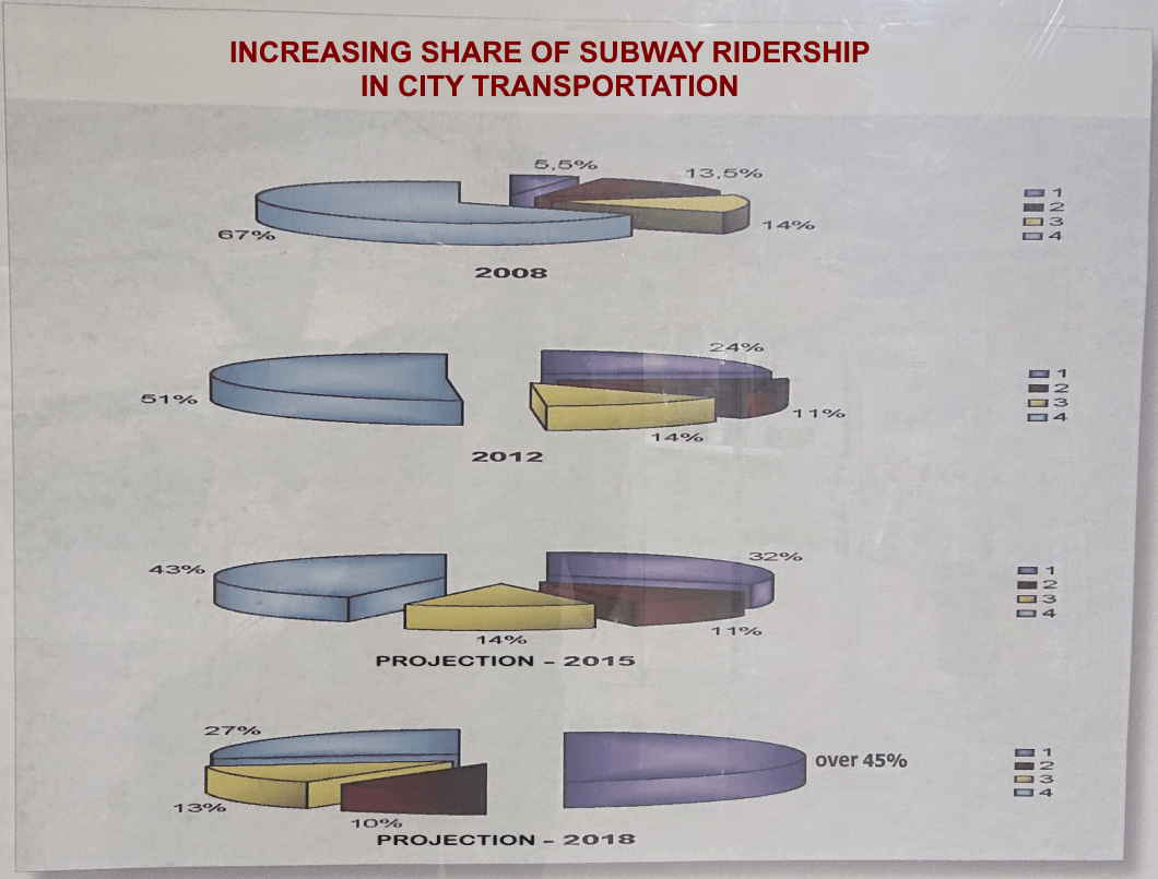
Have a look again at the definition I started with, and try ticking the boxes: Is it concise? Well, yes. Is it organized? Well, kinda. Is it targeted at a specific audience? You bet. Is it presented “in a comprehensive manner”? Hmm, where do I start …
I decided to use this image as a supportive argument for some of the most common mistakes that can be made when presenting information in a report—so we’ll reference this report multiple in this post, as well as explore a few other examples.
Although I work with the Telerik Reporting team and I’m used to working with our product, the ideas I’ll share are relevant to report authoring in general. In some places, I will get into details specific to our toolset, but these features should be fairly common in most modern reporting products.
Let’s take a moment to consider what the author of the report above wanted to present here. The answer to the “What am I trying to show?” question most certainly is: “How the percentage of some subway-related (‘tube-related’ for our UK friends) value will change over time.” In this particular case, a graphical representation would be the best choice indeed, but for other scenarios, the data might be easily perceived if it’s displayed in another way. This is the decision you have to start with—what will be the representation form of your report?
Form Should Follow Function
The data in the report can be displayed in three ways: textual (free-form), tabular and graphical, and all of them can be combined in a single document.
Textual Form
The textual form is the simplest one and it is just a piece of text being laid out in a container. That’s pretty basic functionality and it is not something to worry about—every decent reporting tool supports horizontal and vertical text alignment, different font sizes and colors, etc.
The problem might appear if the text uses some kind of markup, which is not or partially not supported by the reporting engine. As an example, we are constantly seeing requests to increase the number of supported HTML tags in our HTMLTextBox because the data that will be displayed in the report comes in HTML format. We are aware of this limitation of our product (promptly mentioned in the documentation) and we aim to fix it in a future release, although it can be considered as a word processing functionality, which does not belong to data presentation. However, the issue here is in the assumption that a reporting engine will be capable of rendering the HTML the same way a browser would.
Tabular Form
The tabular form is a very neat way of showing detailed and aggregated values in rows and columns. Tables are especially useful when a bunch of numbers must be aggregated and displayed—usually as subtotals and totals. The data can also be organized in groups, forming a hierarchy, which will determine the layout of the table. One of the major problems here would be to choose a design that will preserve the desired layout regardless of the incoming data.
Consider the following example: In 2019 you’re given the task to create a single-page report showing the number of European-made EV cars for the current year. Since they aren’t many, you can decide to create a crosstab and set a column grouping by the brand name, which will dynamically create as many columns as there are unique brand names. Here’s what it could look like:

Initially, the table would look nice—the columns fit into the page width, and everyone is happy, but when Skoda, Peugeot and Mercedes add their new models in 2020, no one might ever notice, because the table would grow to the right, accommodating all the group members, effectively moving the new content on the second page. Now, I totally agree this is a far-fetched example, but it shows how important it is to make sure you have selected the right form of presenting your data. Such a problem would not exist if the data were displayed in a graphical form, e.g., in a chart.
Graphical Form
The graphical form for presenting data is especially useful when the data needs to be perceived quickly. The standard set of graphical data representations provides a variety of different chart types, tailored for specific scenarios. The most common mistakes here are related to the configuration of the chart/graph components. If you’re showing a value changing over time, your best bet would be an X-axis that represents a continuous domain like a DateTime scale. If you need to show how a signal fluctuates during time intervals, use a Line chart to draw it, but if you have plenty of data, consider choosing a Scatter chart for performance reasons.
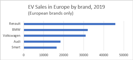
The graphical form is superior to the tabular form in terms of faster understanding and easy comparison of the displayed data. If we want to know exactly how many cars Audi has sold in 2019, the table from the previous example will do fine, but if we want to have an approximate idea of the sales and also compare them with the other brands, a chart will serve better:
Since both tabular and graphical forms do the job of presenting your data, choosing one of them depends on the answer to the question “To whom will I show it?” In the example about the city transportation, the report is printed and displayed in a public place, obviously in an attempt to target a broader audience (although one might argue that people interested in 14-year-old transportation data are, in fact, a very tight audience). In this case, the charts will prove your statement better. However, if the report was supposed to be included in a dedicated presentation for finance specialists and other Excel aficionados, the tabular form would have been a better choice.
After you’ve established the presentation form that will be used in your report, it’s time to select the correct visualization for your data. Most of the mistakes made here are done when the data is shown graphically, so the next section is dedicated to them.
Visualize It Wisely
The abundance of known chart types makes this approach suitable for visualizing any data. Some charts are very popular and understandable for the average viewer—bar, pie and line charts can be seen even in popular media like TV ads, while others like choropleth, funnel and “rose” charts are not that common and require a bit more attention.
Naturally, the complexity of the chart and the volume of the target audience have an inverse relationship—if you want to show your data to the world, it’s better to resort to the most popular chart types, and vice versa.
Still, even the basic chart types can be done wrong, as our example report demonstrates. Our subway report shows some common mistakes that we can examine to understand how to make our own reports better:
A pie chart is not the best visualization for showing quantitative measures, although its main purpose is to compare parts of the whole.
Pies are frowned upon by some of the most prominent names in scientific data presentation. W. Cleveland in his “The Elements of Graphing Data” explains why:
Pie charts […] do not provide efficient detection of geometric objects that convey information about differences of values.
He’s right, of course—the pie chart often fails in its primary task: to make us understand which pie slice represents a higher value (which has a longer arc). This gets especially harder when the pie chart consists of more than five series. Ultimately, the bar chart performs way better in such scenarios, as we can see below:
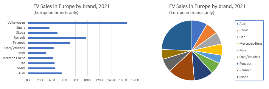
When looking at the bar chart, we can see that Fiat has sold more units than Mercedes-Benz even without looking at the X-axis, but it’s almost impossible to understand that by looking at the pie chart on the right. True, we can add labels that will show the values, but most certainly this would affect the chart readability.
While still on the topic of bar charts, it’s important to understand their limitations. Don’t use a column or a bar chart to show more than 10-12 groups. This makes the chart hard to read and the visual comparison between groups gets harder. In such scenarios, the bar chart is still preferable because it allows fitting more labels on the Y-axis. However, if you need to show more than one series per group, the bar chart might seem unreadable.
This is easily understandable with the following pair of charts:
They represent the same data and have the same size, but the final result is different. The column chart (left) makes it easy to compare the quantitative measure (sales on the Y-axis) between groups, but the labels of the groups are not easy to read. On the opposite, the bar chart (right) makes it easy to read the group labels, but the series values require some staring at. In this case, I would seriously consider splitting the data between a few consecutive charts rather than putting all of them together.
Exploded pie slices decrease reading accuracy.
In their paper Judgment Error in Pie Chart Variations, Robert Kosara and Drew Skau from Tableau Research proved that exploded pie slices, larger slices and other variations of the basic pie chart lead to a higher error rate when reading the presented data.
In addition, an exploded pie slice is usually used to distinguish the series with a special meaning, attracting the viewer’s attention, but in our example of the subway report, the report author didn’t hesitate to “explode” all the pie slices, making the reading of the chart really challenging.
Using a 3D-like layout makes it even worse.
This doesn’t apply only to pie charts, but also to bar and area charts—not only because the series might start overlapping each other, but also because the viewer’s perception can be deceived to read the presented value incorrectly.
A perfect example of why we shouldn’t use 3D in our charts is the image below. It is taken from the Steve Jobs’ MacWorld presentation in 2008 and shows the share of Apple devices sold in the U.S.:
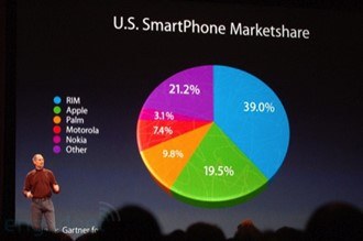
Did you see it? Due to the perspective, the pie slice that represents Apple’s 19.5% doesn’t look like half of the RIM’s share and definitely looks bigger than the “Other” share, although the numbers show the opposite.
Have comprehensive and correct labels.
This might sound like common sense, but it’s easy to omit, as demonstrated in the real-life subway example. The most serious problem I see in this example report is that I actually don’t know what I’m looking at. The legends of the charts just enumerate the series from 1 to 4, without explaining what they represent. If there were the “10 Commandments of the Charts,” this one should be on the top of the list: “Don’t make me guess.”

For extra confusion, the purple series in the last of the subway charts has a very obscure label (using a different font), saying “over 45%.” I can’t even fathom why the author decided to label it this way, instead of simply leaving it as “50%”—because, you know, one would expect the sum of all percentages to add up to 100.
How it could be done better.
At this point you probably see me as an armchair critic, ranting about other people’s efforts to create something meaningful. On the contrary—I believe it’s not hard to replace that rather confusing report and create a simple yet better chart conveying the same message. Mind you, I have no idea what any of the series means, so I just used the same values and colors, set some titles, and hoped for the best:
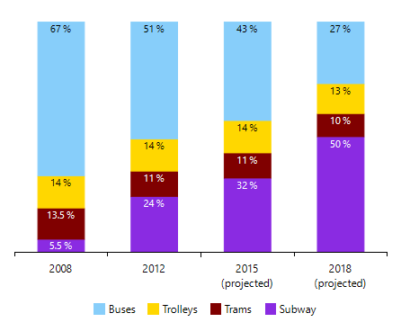
Here the trends are immediately visible: The subway is expected to increase its share, while the bus transport will reduce theirs. The trolleys and trams will keep their share almost intact. All bars have dedicated slots per year and the projected ones are clearly labeled. The legend, although probably incorrect, at least indicates what we’re looking at.
It took me ~20 minutes to create it, and I spent half that time looking (quite unsuccessfully, though) for some statistical data that would support my assumptions for the series legend.
As demonstrated in the examples above, picking the right visualization and configuring it properly might be a challenging task. The science behind data visualization is a subject of many research studies and books like The Encyclopedia of Human-Computer Interaction: Data Visualization for Human Perception and Elements of Graphing Data. They delve into great detail on the problem of picking the correct report form, chart type and configuration for each scenario. Although most of the common problems are visible in the final document, sometimes mistakes can be made at an earlier stage: with the creation of the report definition.
Definition of (Properly) Done
The report definition is the model that contains the whole description of how the report will look and behave when processed. This definition may contain the rules for items hierarchy and layout, the connection settings for the database where the data will be fetched from, and even parameters for the rendering engine.
Based on the experience our support engineers have gained through the years, here are the places where most of the users get confused:
Use a report-designing tool.
Most reporting solutions (Telerik Reporting is no exception) provide two ways of creating the report definitions: programmatically or using dedicated designing tools (named also report designers or report builders). Often the reporting products have a variety of report designers for different environments—embedded in Microsoft Visual Studio, running as a standalone application or distributed as a component that can be integrated into an application.
As a rule of thumb, you should always go with the report designer—it’s a WYSIWYG editor that does the heavy lifting on configuring the report items through a convenient UI—responsive design surface, live preview of your data, customized dialogs and dedicated wizards.
The programmatic creation of reports should be used in very rare cases which are not supported by the report designers. In such a scenario, I’d strongly advise reaching out to the team that develops the product and describing the missing functionality to them. Chances are they will suggest a workaround and will log the missing feature for an implementation.
Avoid explicit stylization.
This is often a neglected part of the report design but can be a time-saver if you need to change the whole look of a report. Try not to set the styling properties (e.g., font size, color, borders, etc.) on each report item individually. Such “inline” stylization overburdens the report definition, but the bigger problem is that it makes the style modifications difficult. Each report item should get its styles propagated from its parent in the report’s hierarchy, when possible.
We at Telerik Reporting have an excellent solution—you can use CSS-like style rules to set the look of the whole report. These style rules are grouped in style sheets and are referenced by name in the report items. This approach effortlessly allows changing the whole color scheme and font sizes of a report, for example, when needed to meet certain accessibility requirements.
Another advantage of this approach is that it makes it extremely easy to redesign a set of reports that are using common style sheets through the External StyleSheets functionality.
Don’t store sensitive information in the report.
By “sensitive information” I mean any credentials that are used to connect to a database server or a web service. That data should be obtained via the application configuration file or report parameters. This also allows for quick switching between test and production environments without modifying the report definition.
Ensure you’re using the performance-critical properties correctly.
Ok, this one is a bit technical and concerns specific techniques in Telerik Reporting, but we see it often in user reports and I’d like to have it explained. Our tool allows achieving a certain effect in more than one way: for example, the TextBox’s BackgroundColor can be changed at runtime using three approaches:
- In the report definition using ConditionalFormatting
- In the report definition using Bindings
- Programmatically in the ItemDataBinding event handler
The correct way to do it is in the report definition through the ConditionalFormatting rules, because the programmatic approach is not available in declarative report definitions, and Bindings work through reflection, which causes a performance hit. As a general rule, if you’re not sure how to achieve something, check the docs—or even better, ask the support engineers which one is the correct approach.
Now, after we made it through the process of picking the correct report form, visualization type and definition configuration, we get to the final part—showing the report to the audience.
It’s Alive!
When it comes to presenting your report to the world, answering the question “To whom will I show it?” is of utter importance. Some decisions, taken in previous stages of report authoring, might be reconsidered based on the behavior of the report, displayed in an application. That’s expected because while designing the report, you’ll probably be working in a test environment with a small-size data set and aware of how the report is supposed to be used.
When the report goes live, chances are it will be viewed by people who don’t know how to configure its parameters and do not expect to wait long minutes because the company database server is heavily loaded at the moment. Let’s go through the most important things that need to be addressed before letting your report into the wild:
Avoid showing reports with hundreds of pages to the user.
It’s rarely useful to do so and it affects the user experience because longer reports take a longer time to render. In general, users expect to have the summarized information in as few pages as possible. If they need detailed data, they should be able to download it in a convenient format—e.g., as an Excel worksheet. A nice solution for such scenarios is to prepare two reports—one with a summarized view and one with details and leave the user to decide which one to see.
If it’s mandatory to generate a report with a large number of pages, consider exporting it programmatically to the appropriate format, without showing it in the report viewer. Usually, such data-dump reports are used for storage purposes or for machine processing (that’s also a valid answer to the “To whom will I show it?” question). Exporting the report without even bothering the viewers with it will be faster and frustration-free, because, frankly, no one would gladly browse through a pile of pages, pretending to be reading them.
Provide default values for report parameters where possible.
Do not force the report users to fill a dozen of parameters before they get to the rendered report. Try to provide default values for all the parameters, keeping the user interaction to a minimum. A good approach to improve the user experience when dealing with lots of parameter values is to use cascading parameters and filter them either on the client machine or on the data source level.
Select the correct preview mode.
This is especially valid for longer reports that produce many pages when previewed for printing. The difference between both modes (in our product they’re named Interactive and Print Preview layouts) is that the Interactive mode does not respect the page size and usually will render the report contents on a single, very long page. Our engine fetches and shows the first report page as long as it is ready, so in the Print Preview mode, the users will see the first report page faster.
Communication Is Key
The last common mistake I’d like to mention is the one that we constantly see at each stage of the report authoring process. This is the “I can do it better myself” approach, which has caused a lot of trouble for you, our users. Report authoring should be easy, period. If you think that something is more difficult than it should be, or you are not certain how to approach a particular task, please do not hesitate to ask our support team. This will save you time, effort and lots of facepalms down the road. Of course, I’m not saying that we’ll do your homework, but we’ll be happy to point you in the right direction, so next time you’ll do it even better.
I hope this rather long document has helped you recognize the common mistakes we all make when creating our reports. I also hope it demonstrated how to avoid them in the future so you can produce better, prettier and more useful reports—because the world doesn’t need more reports like the one I used as an example at the beginning of this article.
Oh, and I checked their predictions for 2015 and 2018—they are wrong, too.
Tools and Sources
Sample data: https://carsalesbase.com/
Charting tools: Progress Telerik Reporting, Microsoft Excel 365
References:
- Stephen Few, “The Encyclopedia of Human-Computer Interaction,” 2nd edition, 35. Data Visualization for Human Perception
- William Cleveland, “Elements of Graphing Data”
- Robert Kosara, Drew Skau, “Judgment Error in Pie Chart Variations”
- Robert Kosara, Drew Skau, “Arcs, Angles, or Areas: Individual Data Encodings in Pie and Donut Charts”
Want To Try Telerik Reporting?
Telerik Reporting is a complete, easy-to-use, and powerful .NET embedded reporting tool for web and desktop applications that supports: Blazor, ASP.NET Core, ASP.NET MVC, ASP.NET AJAX, HTML5/JS, Angular, React, Vue, WPF, WinForms and UWP.
Also available as a part of our Telerik DevCraft bundle, Telerik Reporting allows you to create, style, view and export rich, interactive, and reusable reports to attractively present analytical and any business data. Add reports to any business application through report viewer controls. Export the ready reports to more than 15 formats.
If you still have not tried it, you can start a free trial to take a closer look. We also provide a support service we are proud of and resources that will help you along the way.

Ivan Hristov
Ivan Hristov has been a software developer in the Telerik Reporting division since 2013.
When not at work, he might be seen biking/skiing with his daughter, reading or discussing influential movies with friends. Feel free to reach out to him through LinkedIn.


