Kendo UI at Any Screen Size

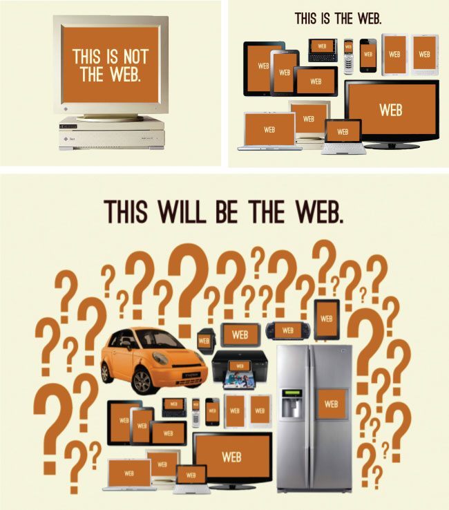
You’ll need a strategy. Which multi-thing strategy should you implement? Well, that is a very complicated question. After all, you could adopt any one, or more, of the following broad strategies.
Five broad multi-thing development strategies:
- Build a responsive (RWD) web site/app for all things.
- Build a RESS (responsive web design with server-side components) web site/app for all things.
- Build an adaptive/progressively enhanced web site/app for all things.
- Build a website/web app/native app/hybrid native app for each individual thing or a grouping of things.
- Attempt to retrofit something you have already built using bits and parts from strategies 1, 2 or 3. This could be as simple as sprinkling in some screen-size agnostic UI parts or attempting to fully support other things with the entire UI.
How Kendo UI Framework Can Aid Your Multi-thing Strategy
To be exact, the goal of this article is to educate managers, designers and developers about the parts from the Kendo UI toolkit that can help them achieve a multi-thing strategy. In other words, I’m going to explain all the relevant Kendo UI parts and widget features that can be used by designers and developers when building a UI for more than one type of screen-size and thing.
Part 1. Kendo UI widgets can be re-sized
If the HTML element a widget is instantiated on has a CSS width and height of 100-percent, the widget will automatically adjust itself to fill the container it’s contained within. This allows for widgets to auto-resize when the parent element containing the widget changes dimensions.
In the code example below, I set the width of the <div> the calendar is instantiated on to 100 percent.
<div style="width:100%;" id="calendar"></div>
Because of this inline CSS, the calendar widget will fill the parent container 100 percent ( the <body> element) and auto-adjust as that <body> container changes widths. Adjusting the jsbin windows below will demonstrate the resizing.
However, not all widgets will auto resize when the dimensions of the parent element change. The widgets listed below do not support auto resizing.
- All DataViz Widgets
- Mobile Actionsheet
- Mobile ListView
- Mobile ScrollView
- MobileSwitch
- Grid
- Scheduler
- Slider
- Splitter
- Window
In order to adjust the size of non-auto resizing widgets when the parent element size changes the .resize() widget method or kendo.resize() function will need to be called to inform the above widget(s) that a resize has occurred. For example, in the code below the chart widget is responding to container resizes by calling the .resize() method when the browser resize event is fired.
Simply stated, not all widgets adjust using CSS percents alone. When a layout changes, you’ll have to notify the previously mentioned widgets so that they can be re-drawn.
When a design relies on widget resizing, here are a couple of things you should keep in mind:
- Auto resizing or manually resizing widgets mostly pertains to the resizing of a widget’s width. Some widgets can respond favorably to height adjustments (for example, the Grid widget) but not all widgets are intended to expand 100 percent both vertically and horizontally.
- An undocumented method,
getSize()is inherited by all widgets that will return an object containing the height and width of the wrapper element containing the widget. - The ResponsivePanel, Grid, Scheduler, TreeList, Charts, Editor and Toolbar widgets all contain their own unique screen sizing configurations and auto adjusting features (in other words, adaptable widgets) that come into play when a widget is created with the intention of having them adjust to screen size.
Part 2. Kendo UI framework’s offers a re-sizable splitter widget
The Kendo UI Splitter widget provides a dynamic layout engine of re-sizable and collapsible panes (including nested panels). This widget can be used to create layouts that will adjust to differing screen sizes.
For example, if you create a Splitter widget configuring each panel to be non-resizable on a <div> without a fixed CSS width, you get panels that will adjust as the <div> adjusts. Adjust the jsbin windows below to see this in action.
Notice that the percentages we set for the two side panels (20 percent) are honored as you adjust the view port/screen-size and the panel we did not set a percent on (middle panel) fills the remaining width. This type of layout however is reminiscent of older fluid layouts (note the 100-percent height as well).
A more common situation today is you’d like a completely different layout depending upon fixed widths. Because the Splitter widgets offers methods like.size(), .collapse(), and .expand() we can adjust the splitter depending upon the size of the viewport.
In the code example below, I am throttling a function that is triggered on page load and every time the browser resize event fires. This function will adjust the panels in the Splitter widget according to the size of the browser window/viewport.
Notice in the code how I can change from percents to pixels using the.size() method.
var splitter = $("#splitter").kendoSplitter({
   //array of panes, order by HTML, applying configs 1st pane
  panes: [{ collapsible: true, resizable: false }]
}).getKendoSplitter();

$(window).resize(kendo.throttle(function(){

  var width = $(window).width();

  if(width < 480){
	splitter.size('.k-pane:first','50%');
	splitter.collapse('.k-pane:first');
  }

  if(width < 1024 && width > 480){
	splitter.size('.k-pane:first','100px');
	splitter.expand('.k-pane:first');
  }

  if(width > 1024){
	splitter.size('.k-pane:first','300px');
	splitter.expand('.k-pane:first');
  }

},250)).trigger('resize');
Part 3. Several Kendo UI widgets have screen-adaptable features
As previously mentioned, most Kendo UI widgets will auto resize by default when used in a fluid web page layout, for example, when a widget’s parent container is re-sized. This makes a good deal of the Kendo UI widgets drop-in ready when dealing with multiple screen sizes and changing layouts.
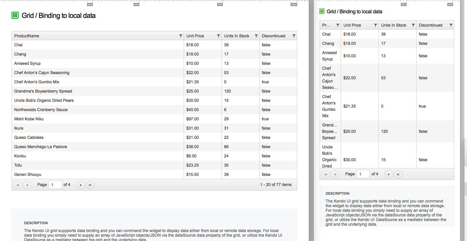
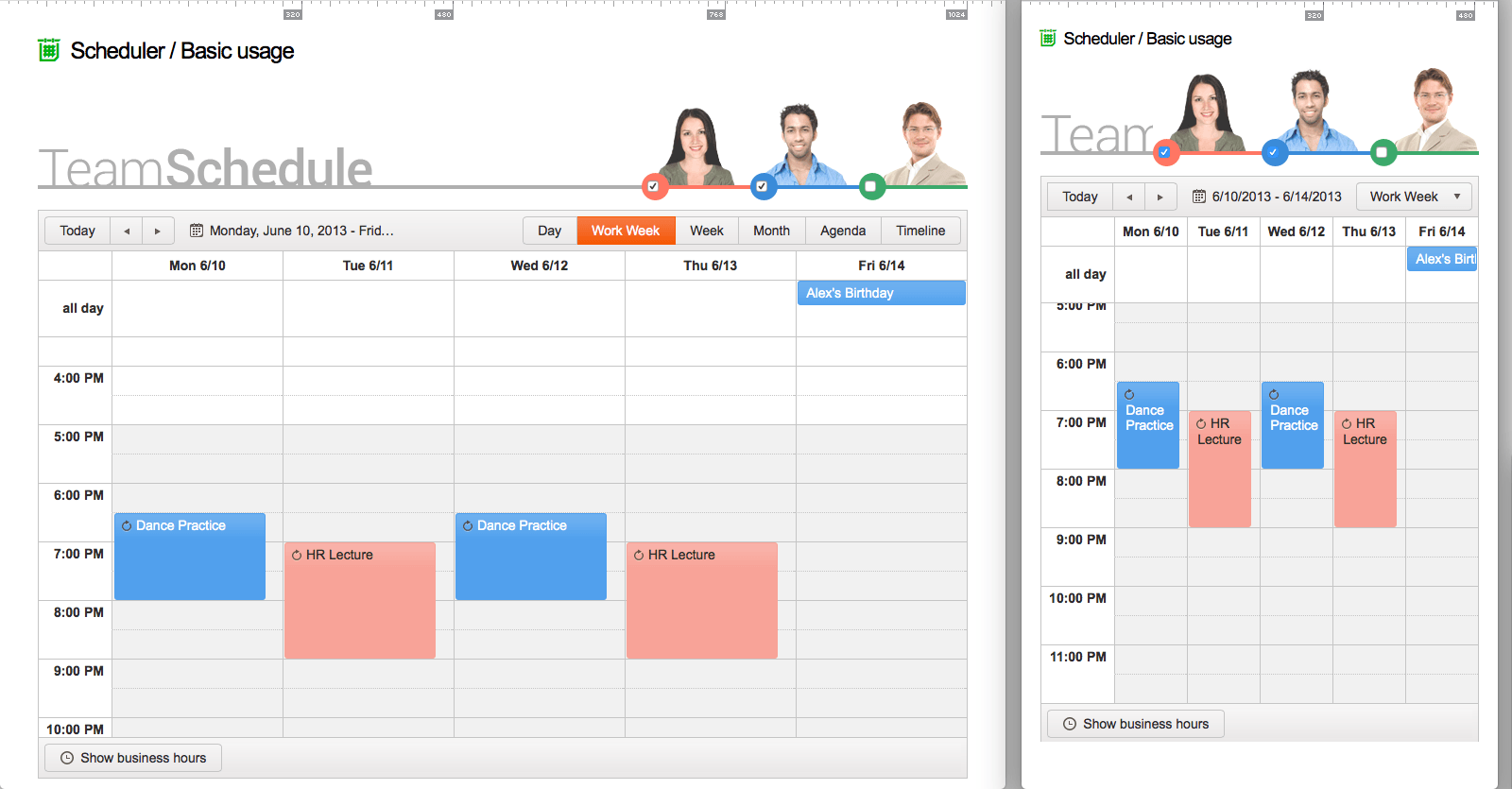
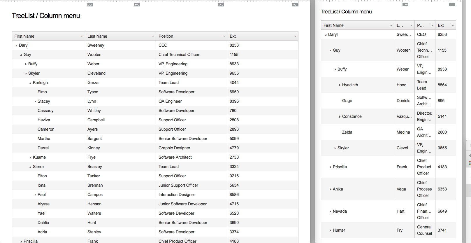
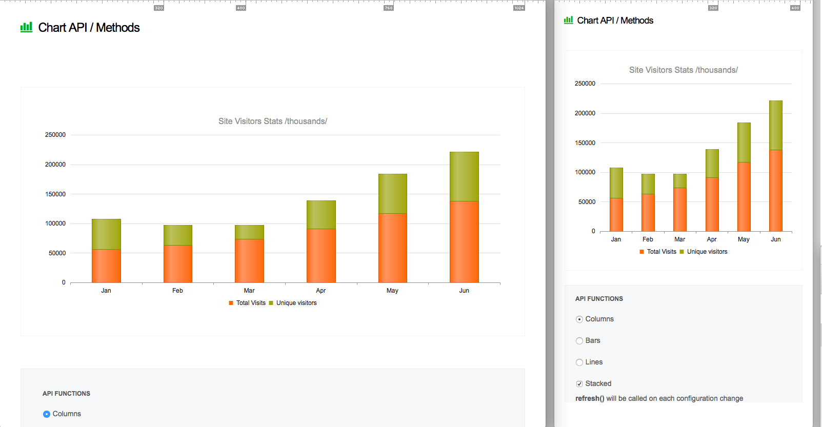
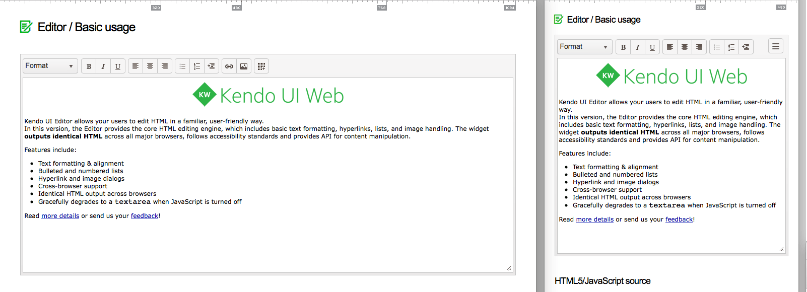
In addition to height and width resizing, some widgets will automatically adapt (changes to actual UI, not just width) to differing screen-sizes and view-ports. The list below showcases which widgets have adaptable features and shows an image contrasting the adaptations.
Grid & TreeList
Scheduler
TreeList
Charts
Editor
Toolbar

Part 4. Kendo UI framework offers a responsive panel widget
The ResponsivePanel widget is offered specifically for the purpose of hiding content on smaller screens. The content being hidden is still available but must be expanded into the screen for viewing. A great real-world example of the ResponsivePanel can be found on the Kendo UI demos page. Notice below that when the screen size changes the responsive panel takes over.
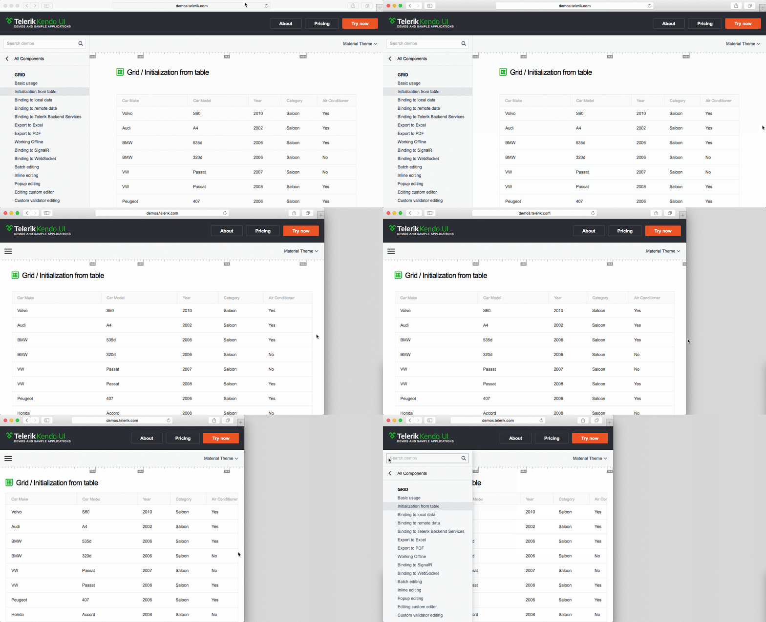
Using the ResponsivePanel widget, you can can specify the page width when the content will become hidden via the
breakpoint configuration option, and the placement of the expandable content via the orientation configuration option. Below, I show a very simple example of the ResponsivePanel using both of those configuration options.Part 5. Kendo UI framework seamlessly integrates with Bootstrap (a responsive mobile first CSS framework)
Considering that Kendo UI widgets are designed from the ground up to be re-sized, they will work well with most mobile-first CSS frameworks. Given that Kendo UI framework offers a Bootstrap theme, Kendo UI tools and Bootstrap seamlessly integrate with each other.
Bootstrap plus Kendo UI tools (using the bootstrap theme) is the perfect combination for creating multi-thing interfaces. Just consider a few of Bootstrap’s responsive features that can help you build screen-agnostic UIs with Kendo UI widgets.
- Includes a responsive, mobile first fluid grid system
- Responsive CSS classes utilities for toggling content across viewport breakpoints
- Responsive images
- Responsive tables
- Responsive embed
- Generally, screen agnostic CSS components and jQuery component plugins
Part 6. Kendo UI contains mobile-specific widgets
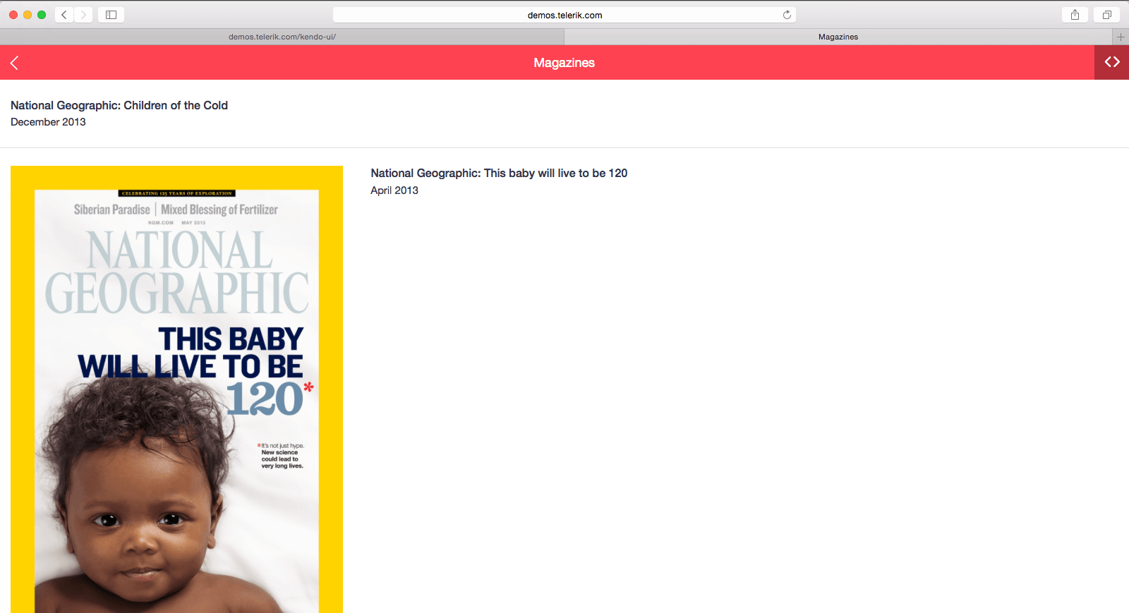
Kendo UI framework contains a set of widgets (mobile widgets) and application tools (mobile framework) designed specifically for development that targets tablet/phone browsers and webviews (creating hybrid mobile applications).
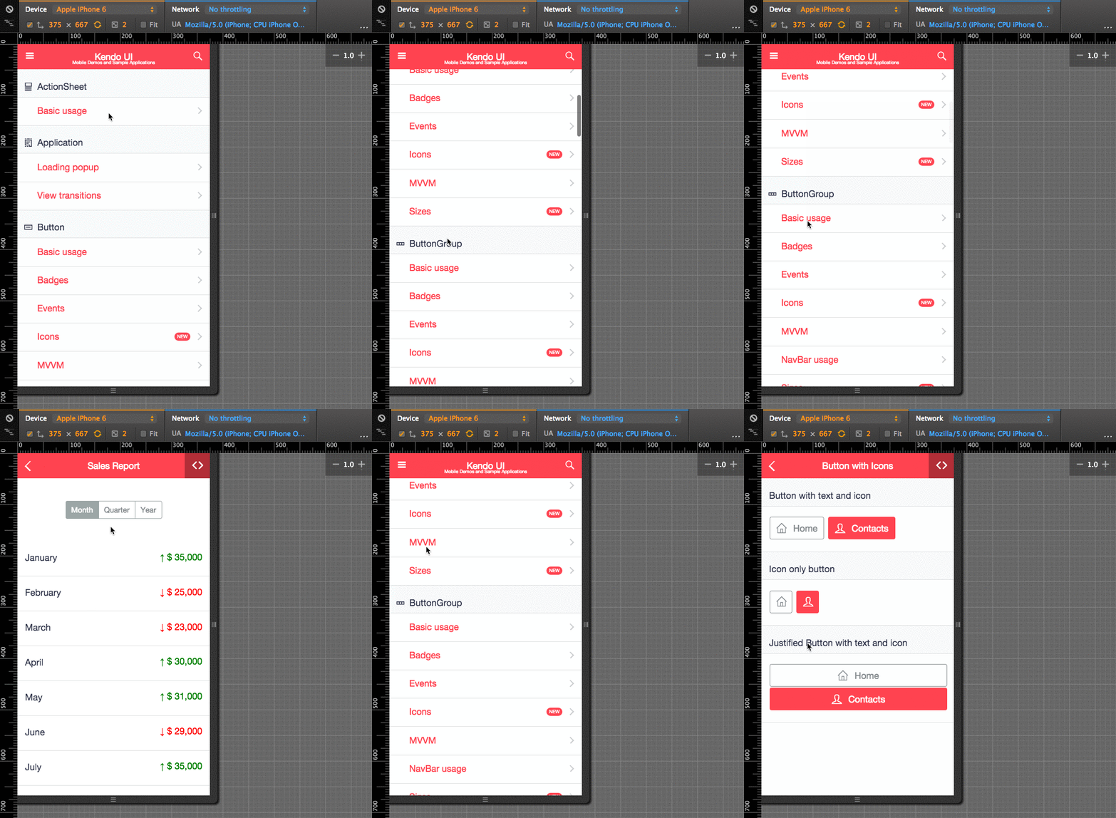
Kendo UI mobile widgets can also be implemented individually, outside of the mobile framework, in most browsers. In other words, mobile widgets run just fine on a desktop computer with a 27-inch monitor. This facet of the mobile widgets make them ideal candidates for a mobile-first design strategy.
Also, you should be aware, Kendo UI mobile widgets and tools are part of Kendo UI core, which make them open source tools and free for anyone to use for anything. You can go right now and get the widgets from GitHub and put them to use for free.
And don’t worry, if you intend on mingling mobile widgets with Web and DataViz widgets, their are mobile themes match up with the Web and DataViz themes. For example, if you wanted to use the Silver theme for both web widgets and mobile widgets, you can do that.
<link href="styles/kendo.common.min.css" rel="stylesheet" type="text/css" />
<link href="styles/kendo.silver.min.css" rel="stylesheet" type="text/css" />
<link href="styles/kendo.silver.mobile.min.css" rel="stylesheet" type="text/css" />
Part 7. All Kendo UI widgets work on touch-driven devices
You might not be aware, but Kendo UI framework is divided into three categories of widgets:
- Web widgets
- DataViz widgets
- Mobile widgets
You should know that all of these widgets will function on either a mouse-driven interface or a touch-driven interface. This makes it possible for Web and DataViz widgets to run on a mobile phone browser and for mobile widgets to run in a desktop browser. Mingling widgets together for multiple devices and computers isn’t an issue with Kendo UI framework. Widgets just work regardless of a click or a touch.
A Webinar and Some Relevant Q2 Updates Are Coming
That sums up the Kendo UI multi-thing/multi-screen offerings. For more details on any of the offered parts make sure you refer to the documentation and API reference. Also, if this article has been helpful, I recommend that you join us for the next Kendo UI release webinar on July 22, 2015. The webinar, titled “Build Responsive or Bust,” will further investigate and demonstrate the content found in this article. If you need tools for a multi-thing strategy, you should certainly join this webinar!

Lastly, I want to mention two multidevice-relevant items that will be released at the end of July (i.e. Q2 2015 Kendo UI release).
First, all of the online demos have been updated for viewing on multiple devices and screen-sizes. Go to the demos and adjust your browser to see this in action.
Second, a new modern mobile theme called, “nova” (used with mobile widgets) will be released. Eventually, this theme will also be available for all widgets (for example web and DataViz widgets). This will allow for the mingling of any type of widget (mobile, web and DataViz) together under the new “nova” theme.
That’s it. See you on July 22.

Cody Lindley
Cody Lindley is a front-end developer working as a developer advocate for Telerik focused on the Kendo UI tools. He lives in Boise, ID with his wife and three children. You can read more about Cody on his site or follow him on Twitter at @codylindley.
