Introducing MultiColumnComboBox in Telerik UI for WPF

I'd like to introduce you to the new MultiColumnComboBox in Telerik UI for WPF. This powerful control helps you show your users more information and can easily be sorted and filtered.
The newest addition to Telerik UI for WPF, the MultiColumnComboBox is a combination of the RadComboBox and RadGridView. It was designed to let you display more information to your users than a standard ComboBox, and comes with out-of-the-box filtering and sorting so that users can easily select the desired items.
Let’s say, for example, that you want to choose the best employee to handle a certain order that must be processed. You can easily bind the control to any IEnumerable by providing it with an implementation of the abstract ItemsSourceProvider class.
User-defined Columns
By using the GridViewItemsSourceProvider in addition to specifying the Columns collection, you can also apply a number of customizations such as enabling footers and defining custom styles for the grid’s rows.
<telerik:RadMultiColumnComboBox DisplayMemberPath="LastName" NullText="Select employee to handle the order..." Width="300" DropDownWidth="530" DropDownHeight="255"> <telerik:RadMultiColumnComboBox.ItemsSourceProvider> <telerik:GridViewItemsSourceProvider AutoGenerateColumns="False" ItemsSource="{Binding Employees}" > <telerik:GridViewItemsSourceProvider.Columns> <telerik:GridViewDataColumn Header="First Name" DataMemberBinding="{Binding FirstName}" /> <telerik:GridViewDataColumn Header="Last Name" DataMemberBinding="{Binding LastName}" /> <telerik:GridViewDataColumn DataMemberBinding="{Binding City}" /> <telerik:GridViewDataColumn Header="Hire Date" DataMemberBinding="{Binding HireDate}" /> <telerik:GridViewDataColumn Header="Orders Count" DataMemberBinding="{Binding Orders.Count}" /> </telerik:GridViewItemsSourceProvider.Columns> </telerik:GridViewItemsSourceProvider> </telerik:RadMultiColumnComboBox.ItemsSourceProvider></telerik:RadMultiColumnComboBox>The following figure illustrates the result from the code snippet above.
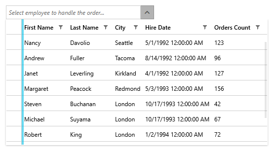
You can use any of the column types you would use in an ordinary RadGridView control as well as define custom cell templates for them. This makes the number of possibilities for displaying your data practically infinite.
Just as with the other controls in our Telerik UI for WPF suite, the RadMultiColumnComboBox is highly customizable. It offers options for setting its watermark text, choosing which property of the bound objects should be displayed when items are selected, as well as the possibility of sizing its dropdown, to name a few.
Filtering
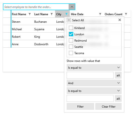
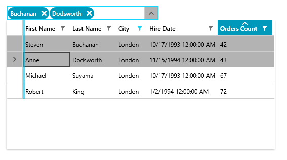
Now that you’ve displayed the data that is relevant for your users, they will also have the ability to filter the items based on their custom criteria. For the purpose of this blog post, let’s assume you want to display only the employees who have marked London as their city of residence. RadGridView’s familiar filtering control makes this filtering as easy as clicking on a checkbox.
Sorting
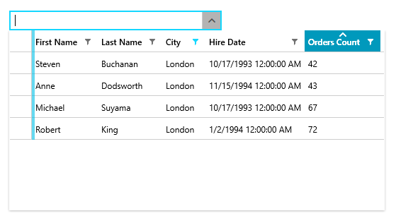
What if you want to choose the London employee who has the least amount of current orders to handle the order? A simple click on the “Orders Count” column sorts the RadGridView by the underlying integer property so that you can do just that.
Multiple Selection
And what happens if the order that needs to be handled requires multiple employees to work in collaboration? Luckily, the RadMultiColumnComboBox supports multiple selection. You only need to set its SelectionMode to Multiple.
Autocomplete
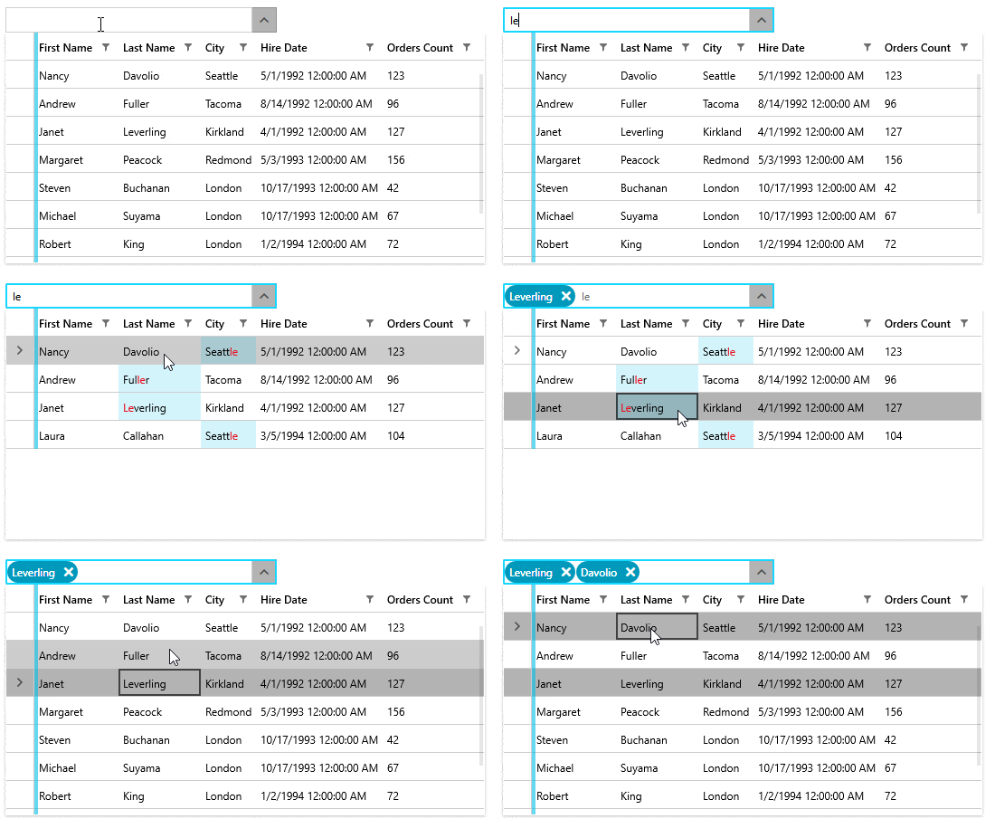
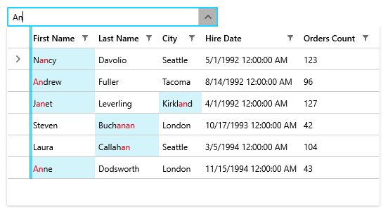
Last but not least, the control comes with 4 different autocomplete modes so that your users can easily find the data they’re looking for. Even if there are thousands of employees in your database, with only a few keystrokes you can find just the one you’re looking for.
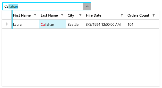
The image above demonstrates the default SuggestAppend mode. With it, when typing in a value the RadGridView will be filtered to display only items containing the searched value in one of the columns. The comparison is made using the StartsWith operator. In addition, if there is only one matching item, the text in the input box will be autocompleted to the matching value.
The Suggest and Append modes, in turn, offer only filtering of the items or autocompletion, respectively.
The Search mode, on the other hand, filters and highlights the data. There are two differences between this mode and the SuggestAppend mode. The first one is that the matched text is not appended to the input. Additionally, the Contains operator is used for the comparison of string properties while the IsEqualTo operator is used for comparing all other types as opposed to the StartsWith operator used in all other three autocomplete modes.
Share Your Feedback
To sum up, the RadMultiColumnComboBox makes selecting items from a large data source an easy task. Even though the control is in a beta version, you can already start using it to improve your users’ experience. If you have any questions or suggestions, don’t hesitate to contact us. You can post on our forum, propose improvements in our feedback portal, or just reach out in the comments below.
Feel free to check out our documentation to learn more about what the control can do. If you're new to Telerik UI for WPF, you can check out the suite here or jump right into a free 30 day trial today.

Dilyan Traykov
Dilyan Traykov was a technical support engineer on the Telerik UI for WPF & Silverlight team.
