How to Communicate More Effectively in Fintech Design with Visuals

Use visuals to simplify the concepts behind your fintech product. Here’s how to use custom product animations, interactive calculators, social proof pop-ups and comparison tables to make your product more easier to understand—visually.
When you’re designing digital products for complex, technical or even mundane concepts, you have to think about the best way to communicate with prospects and users. Because if the subject matter is too difficult to grasp, you’re going to have a hard time educating or engaging with them. The same thing will happen if your messaging is too jargon-filled or marketing focused.
So how do you close this communication gap?
While it’s crucial to have writers who have a firm grasp on your product and its features, you can’t solely rely on content to connect with users. Your visuals should do a lot of the heavy lifting for you as well.
In this post, we’re going to take a look at various ways to use visuals in fintech design to more effectively communicate with users.
Bridging the Fintech Communication Barrier with Visuals
You know what they say about pictures—they’re worth a thousand words. That’s good because they’re going to come in handy when building digital products for the financial services and technology spaces.
It’s not just imagery that will enable you to more effectively communicate with prospects and users. It’s the UI design and features which you incorporate into your digital products. Below we’ll check out various ways to do this.
Note: I’ll mainly be taking screenshots from fintech websites since I’m unable to create accounts with most of these solutions. However, the tips and strategies below are just as relevant when designing interfaces for websites and apps, as well as when communicating with prospects, new users as well as existing users.
1. Custom Product Demonstrations
Many times what you see on fintech product websites or the app onboarding screens are static screenshots from inside the app. These visuals are meant to show off the fintech solution and the key features.
Not everyone is going to get what your fintech product does and how it’s going to make their life easier until they see it for themselves. Even then, if they don’t have a good understanding of how it works or how to make it work for them, static screenshots might not mean a whole lot to them.
While you don’t want to overwhelm users with too many videos or animations, one custom product demonstration on the most important pages of the site (or during onboarding) will be effective.
Let’s start with an example from Plaid. The main headline at the top of the site reads:
“The safer way for your users to link financial accounts”
The rest of the homepage explains a bit more about the API-powered tool that enables developers to connect digital products to thousands of financial institutions. But it’s not just the secure connection that developers are going to be concerned with. They’re also going to wonder how Plaid ends up looking on the frontend of the product they spent so long designing.
The custom GIF that appears below the fold will show them.
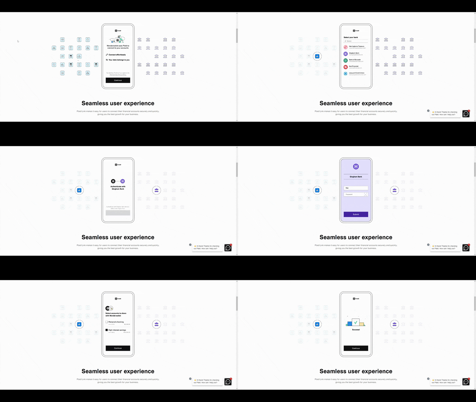
The GIF demonstrates how the minimally branded interface helps customers connect their financial institution in just a few steps to their app. This is just a simulation, but it’s more or less what it looks like in action.
Square is another company that uses motion graphics to demonstrate how its products work. The top of the homepage reads:
“Powering all the ways you do business.”
It’s a vague statement. When paired with the images beside it, visitors will probably be able to piece together what it is that Square is selling. If they don’t completely understand how the tech works, the section below the fold provides an interesting video demonstration.
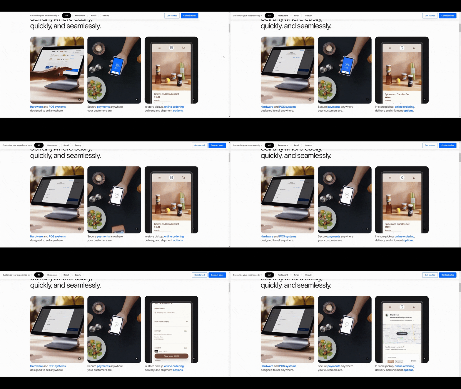
At first, it looks like the typical features section containing three side-by-side blocks. However, these aren’t static images.
The first one plays out, demonstrating how Square’s point-of-sale (POS) system works. Shortly thereafter the second one begins to play and shows how to use a smartphone as a tableside POS. It’s followed by the third video that shows a customer using Square payment processing to check out on a mobile website.
The staggering of the video snippets is a cool way to draw attention to this section and to ensure that visitors get to see the main products in action. No words should be needed after they see this. At least not when it comes to figuring out what products Square sells.
2. Interactive Calculators
Seeing is the best way to get users to believe in the fintech product you’ve built and in the promise you’re selling.
Animated graphics and videos are one way to convey what your product does and what its key features are. Another option is to incorporate calculators into your sales pitch.
Calculators are always an effective tool as they give users hands-on experience with your website or app. They’re also memorable since so many digital products lack in tactile experiences these days.
Most of the time, users are passive observers, occasionally clicking a button or link to move to the next page or section. But a calculator forces them to stay where they are and to engage for their own benefit.
You’ll find a good example of this on the homepage of the Acorns website. For anyone wondering what the benefits are of making small investments into a 401K or savings account, this calculator will show them.
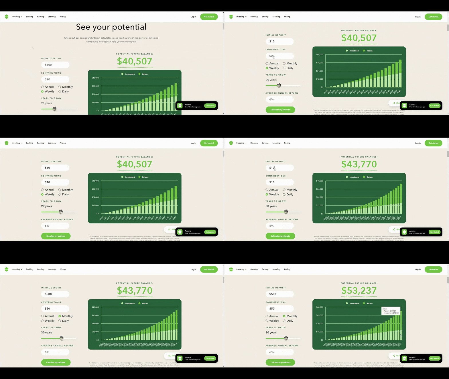
Visitors can play around with the calculator settings on the left to see how much interest they’ll accrue on their investments over time. They can also hover over the chart on the right to see how much of their account is made up of investments and how much of returns.
It’s a highly effective way to demonstrate how savings and interest can add up over time.
Mint is another fintech company that uses calculators to offer a more tactile demonstration of the point being made. For example, there’s a blog post called How Much Your Monthly Food Budget Should Be and it comes with its own calculator.
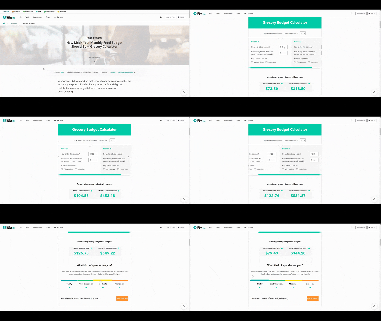
Whether the reader is a Mint user or someone who stumbled upon the blog while researching grocery budgets, this calculator is going to come in handy. They can adjust it for multi-person households, age-related needs, as well as diets. They can also see a range of monthly budget expectations based on how much they’re willing to spend.
These calculators are mostly found in the blog. That’s a smart move as it gives readers the option to read through the entire post and try to digest as much as they can from the advice given. The other option is to pause, play around with the calculator, and get a good grasp of what’s being discussed before diving in (if they even feel they need to at that point).
3. Social Proof Pop-ups
One of the problems writers face when creating copy for fintech companies is that there’s very limited space to get the point across. You need to tell users what’s in it for them, usually in the space of 10 words if we’re talking about the homepage hero or the app onboarding screen. But fintech solutions usually aren’t that simple to explain.
For instance, if you were to see this tagline:
“Take control of your finances”
What would you assume the app does?
Can you get a loan to consolidate your debt? Can you balance your budget? Can you manage your various credit cards and financial accounts from a single place? There are a lot of ways to take control of your finances.
Two companies, in particular, have found a creative way to let prospects know exactly how their app works. And they’ve done it by using social proof (or an element that resembles social proof).
Social proof like customer testimonials is a great way to help a company sell products. That’s because social proof comes from real customers and often explains the genuine pros and cons of what they bought. Marketing and sales lingo can sometimes be hard to decipher, but real customer words and case studies usually aren’t.
Here’s how the designer of the Rocket Money app incorporated social proof into the splash screen.
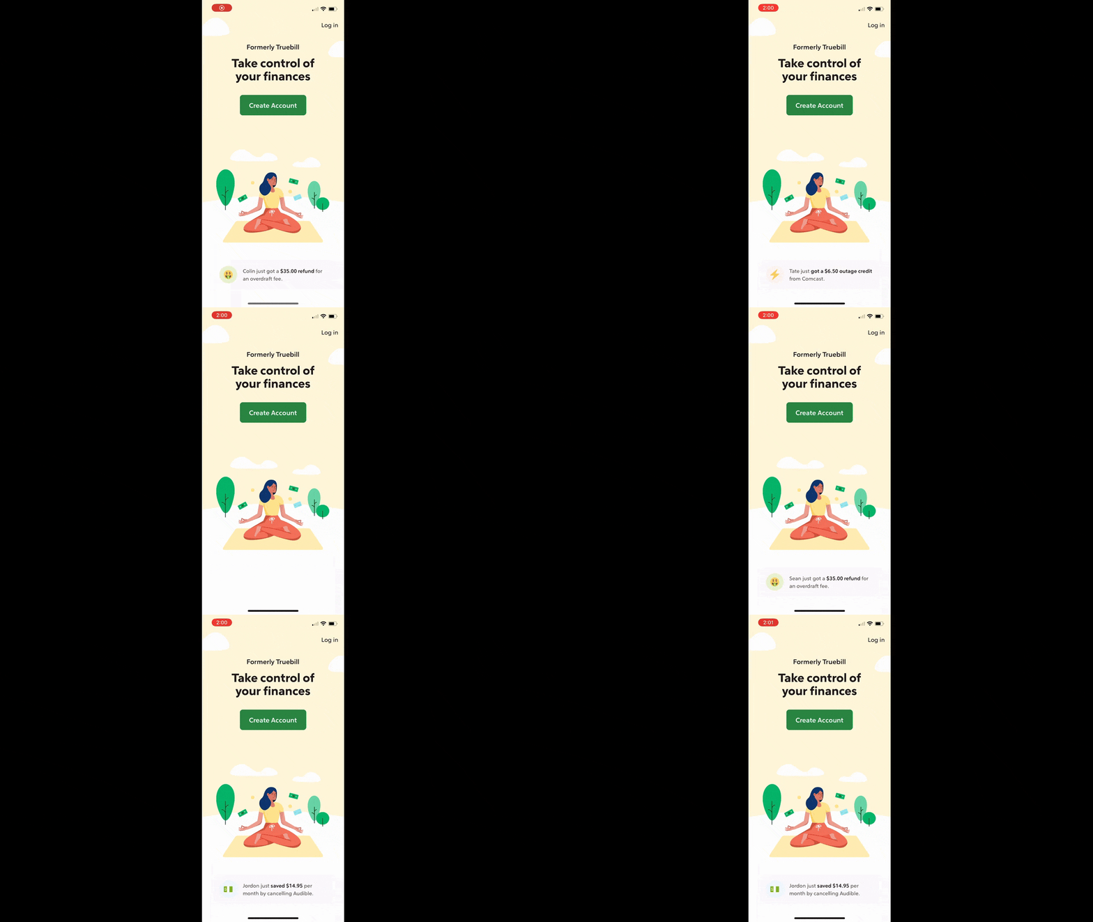
This is where the aforementioned “Take control of your finances” tagline appears. Like I said, it’s a pretty generic selling point and explanation. However, the animated social proof at the bottom provides more details. Users will be able to see how Rocket Money helps them save money by spending less on bills, getting rid of overdraft fees and canceling unused services.
The design of this feature is well done. It’s reminiscent of the push notifications that appear on your smartphone screen when you’re using it.
Tally has done something similar with its app.
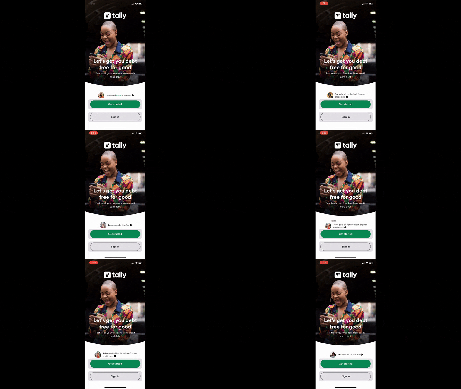
Just above the “Get started” button, new notifications roll in. They provide specific examples of how Tally can help users get out of debt—like helping to avoid late fees, reducing interest and paying off credit card bills.
The website displays this social proof as well. However, its design has been modified for larger screens.
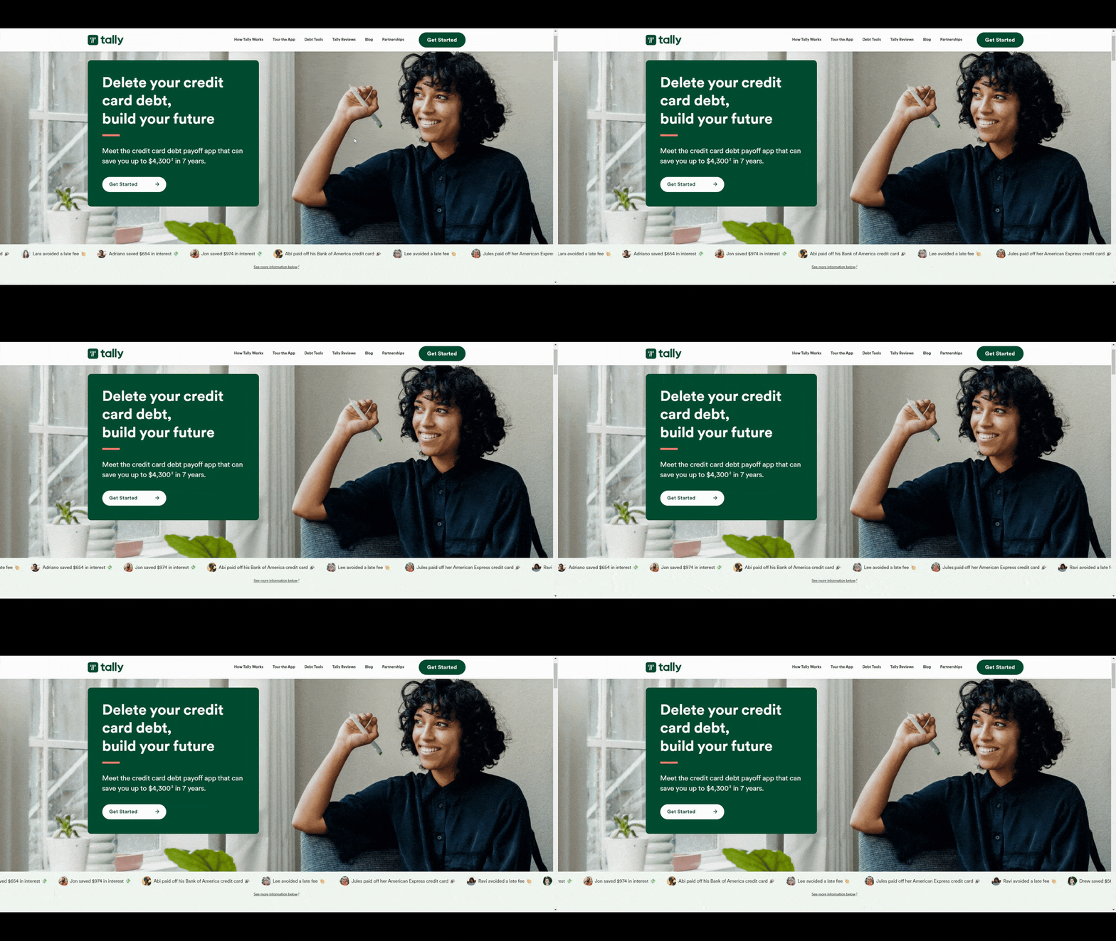
Here we see that same string of user wins. However, they’re displayed in a scrolling horizontal line beneath the hero image.
Regardless of where or how they appear, they provide extra context so that prospective users can feel more confident taking that next step. While the initial promise of deleting debt or controlling finances is nice, seeing exactly how that happens with real user examples is more effective.
4. Comparison Tables
There are different ways to use data visualizations in fintech design. Charts and graphs are common. Enlarged statistics are as well. But those aren’t the only ways to make data easier for users to grasp.
When it comes to fintech, it’s not just financial data you can optimize with visualizations. You should also be looking at ways to improve users’ comprehension of the product’s own selling points. And comparison tables are the best way to do that.
We see this all the time with physical products like smartphones and computers. We also see it with software.
So why not use these tables to compare your app against comparable solutions?
You’ll find a comparison table on the Chime online banking page. It compares the Chime app against Chase and Wells Fargo.
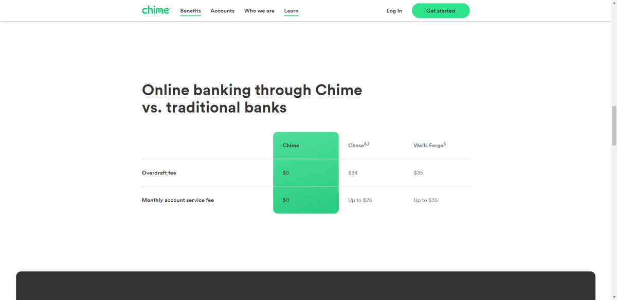
The three are compared on just two points:
- Overdraft fee
- Monthly account service fee
Even though there are only two points of comparison, the table makes a convincing enough argument as to why you should bank with Chime vs. a traditional bank.
Empower takes a similar approach on its cash advance page. The table compares “Us Vs Them.” Instead of going after banks, it compares its cash advance services against credit cards, payday loans and even friends and family.
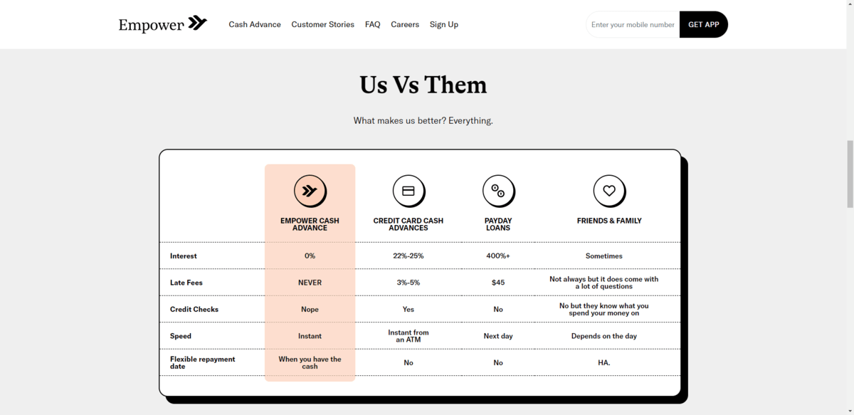
The design of this comparison table is great. It sticks out beautifully on the page and the color added to the Empower column is a nice way to pull attention to the most important part.
If you’re trying to help users make up their minds about your fintech app vs. the alternatives, visuals will help you explain all kinds of benefits—including ones related to the usage of the app itself (not just the financial benefits).
Wrap-up
While writers could easily come up with hundreds or thousands of words to help sell a fintech solution’s features and benefits to users, sometimes well-worded arguments aren’t enough.
Visual communication is an important part of fintech design—just as much while promoting it as well as when designing the product itself. It enables you to instantly capture the attention of your users and generate enough interest from them to look into it further. Plus, in some cases, visuals can be easier for your users to understand than a flashy headline or a couple paragraphs full of technical or financial jargon.

Suzanne Scacca
A former project manager and web design agency manager, Suzanne Scacca now writes about the changing landscape of design, development and software.

