
Fluent Theme Magic in Telerik UI for ASP.NET Core

See how the Fluent theme compares to Material and Bootstrap in Telerik UI for ASP.NET Core. Maybe this theme is right for your next project?
All Telerik UI frameworks offer themes and customization! Today we bring to your aim the Fluent theme for ASP.NET Core.
I asked ChatGPT-3 about the history of Fluent Design:
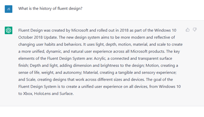
But its history started earlier with the Metro Design Language created for Windows 8 and Windows 8 Phone.
“Telerik’s Fluent theme is driven by Microsoft’s Fluent UI, which debuted in 2017. Fluent is an open-source project that has evolved from Microsoft’s earlier Metro Design Language.”
— Unifying Your UIs with Telerik Fluent Theme (another great blog post to read!)
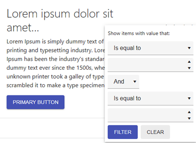
The Progress Telerik Fluent theme has a minimalist, pleasant look and feel and a modern design for your solutions. Your customers (end users) and internal clients of your company with love it!
You can design a WinForms .NET 4/5/6/7 app using Progress Telerik UI for WinForms for the back office team and web apps using Progress Telerik UI for ASP.NET Core with Fluent Theme. Using the same theme for all apps will cause less stress for the team. And you can use the ThemeBuilder tool to custom style your components.
In this post, I’ll demonstrate the Fluent theme compared with classic Telerik themes, Material and Bootstrap.
It’s a kind of magic how themes work, and you will love to present them to your public.
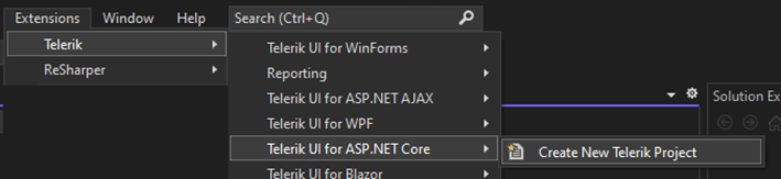
How to Set up a New Project Using Telerik
- Download the Telerik DevCraft license from https://www.telerik.com/try/devcraft-ultimate.
- After installing, create a new project from the Visual Studio Extension menu:
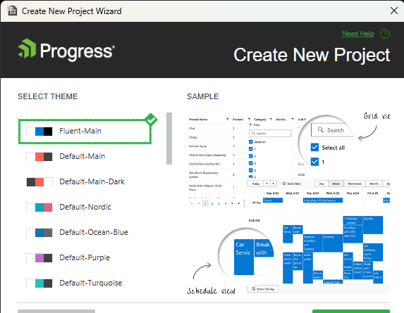
- Follow the steps, and select Fluent theme.
Samples of Controls with a Fluent Theme
First, look at the differences.
Fluent-main – the design is clean, elegant and objective:
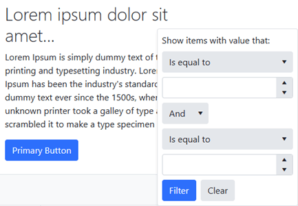
Material-main – the Material theme is, like we know it, more intense with uppercase text commands:
Bootstrap-main – this theme has primary colors:
Deep Comparison Between Components
I chose Fluent as my solution for clarity and objectivity and—of course, because it is modern—the focus is on the data. Any ASP.NET Core theme is an excellent choice if you are developing web apps to present to administrative workers. The Fluent theme may be the right one for you.
To choose the best solution for your product, I suggest you use this post’s comparison and let your team choose—any of them will be a good choice!
Let’s start with the TextBox component, probably the most common input solution.
TextBox
You can compare it with OS Windows 11!
Fluent – Put the whole focus on the input:

Progress Telerik ASP.NET Core UI OS Windows 11:

Material – Minimalist input:

Bootstrap – Gradient focus:

How does it work? Just add your components, and the theme will be automatically applied. Here is the code for this sample:
@(Html.Kendo().TextBox()
  .Name("textbox")
  .Label(l => l.Content("Set value"))
  .Placeholder("Name...")
  .HtmlAttributes(new { style = "width: 100%" })
)
Calendar
You can compare with OS Windows 11, the same aspect for the current day!
Fluent – Modern and up-to-date with the current design:

Progress Telerik ASP.NET Core UI OS Windows 11:

Material – Minimalist focus on the current day number:

Bootstrap – Classic calendar:

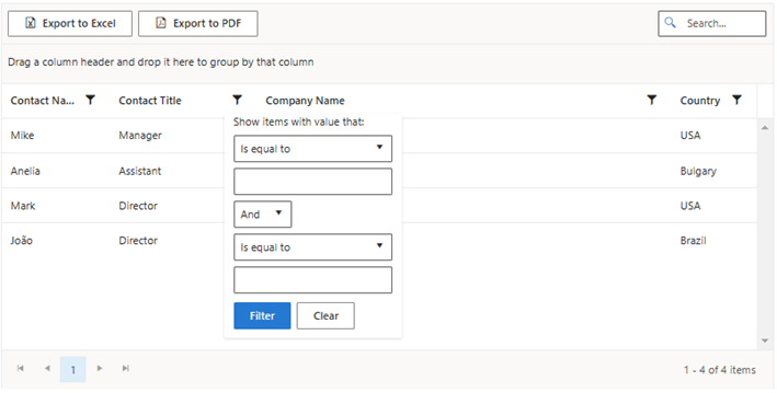
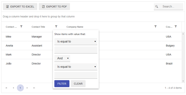
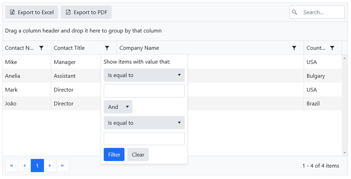
Grid
Another very popular component is the Grid. Here you have a good sample of clarity!
Fluent – Clean with minimal contrasts:
Material – Heavy color and background inputs:
Bootstrap – Basic colors:
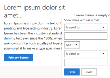
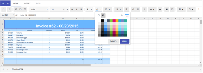
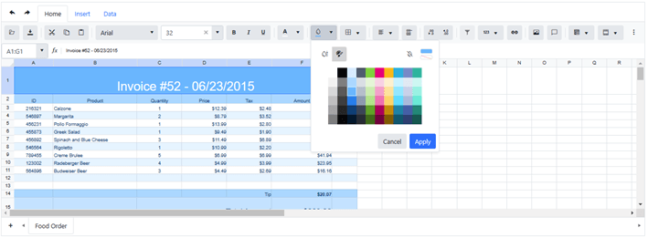
Spreadsheet
The main focus here is on the tools for this component.
Fluent – Focus on inputs with border:
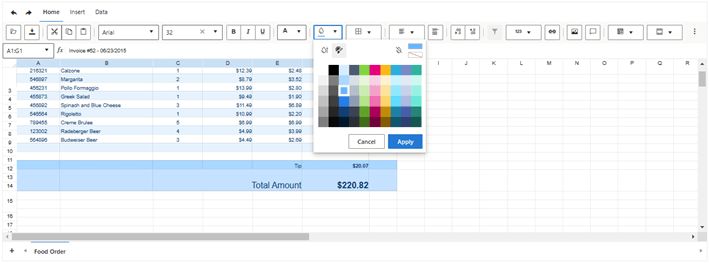
Material – Classic material theme:
Bootstrap – Gray backgrounds:
Access the REPL playground to try these on your own.
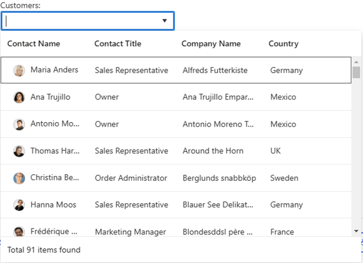
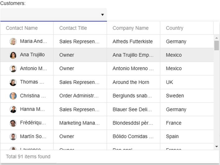
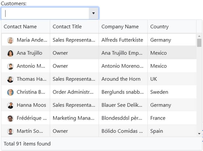
MultiColumnComboBox
MultiColumnComboBox is everything for relational data!
Fluent – Focus on selection and clarity:
Material – Minimalist input and a gray line for the grid columns:
Bootstrap – Alternating colors in rows grid:
Access the REPL playground to view these in more detail.
Changing Existing Themes
If you already have a project using another theme from Telerik UI for ASP.NET Core, you can change only one line in your project’s “_Layout.cshtml” file.
For example, from any existing style like:
<link href=[https://kendo.cdn.telerik.com/themes/6.3.0/material/material-main.css](https://kendo.cdn.telerik.com/themes/6.3.0/material/material-main.css) rel="stylesheet" />
To Fluent:
<link href=[https://kendo.cdn.telerik.com/themes/6.3.0/fluent/fluent-main.css](https://kendo.cdn.telerik.com/themes/6.3.0/fluent/fluent-main.css) rel="stylesheet" />
Trick: You can add multi-theming for your solution, create a page and let the end user choose between the themes you allow in your solution, and you can load this link for each user dynamically. In one of my solutions, I used a dark theme on the page when it was a cold case.
Another suggestion is to change the theme according to the version of your product—for example, Basic, Pro and Advanced. It’s up to you and your marketing team.
The Progress Telerik license is perpetual; you can upgrade anytime to use another new Telerik component. The best buys are the DevCraft (UI, Complete and Ultimate) packs. With DevCraft UI, you have 10 support tickets; DevCraft Complete, unlimited support incidents with 24-hour response, SLA and Reporting; and DevCraft Ultimate, remote support assistance and Telerik Report Server. For a complete list of what each DevCraft offers, access https://www.telerik.com/purchase.aspx.
Additionally, with DevCraft packs, you can use Fluent theme in your web apps and desktop WinForms or .NET MAUI applications. No matter what you choose, you can ask in the Telerik Forums for help.
Figma Kits and ThemeBuilder

Are you or your team using Figma? That’s great. Progress Telerik has a pack for Figma, and you’ll find all these themes there!
Or check out the ThemeBuilder tool that helps you style your Telerik and Kendo UI web components without the need to write complex CSS rules.
Setting the Theme is Just the Beginning
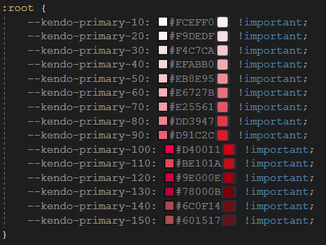
Oops, blue is not your color? Is it red or something else?
Add this to the head tag of your “_Layout.cshtml” file if you like red colors.
<style>
:root {
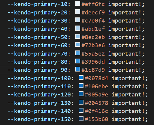
--kendo-primary-10: #FCEFF0 !important;
--kendo-primary-20: #F9DEDF !important;
--kendo-primary-30: #F4C7CA !important;
--kendo-primary-40: #EFABB0 !important;
--kendo-primary-50: #EB8E95 !important;
--kendo-primary-60: #E6727B !important;
--kendo-primary-70: #E25561 !important;
--kendo-primary-80: #DD3947 !important;
--kendo-primary-90: #D91C2C !important;
--kendo-primary-100: #D40011 !important;
--kendo-primary-110: #BE101A !important;
--kendo-primary-120: #9E000E !important;
--kendo-primary-130: #78000B !important;
--kendo-primary-140: #6C0F14 !important;
--kendo-primary-150: #601517 !important;
}
</style>
Visual Studio will show the colors like this:
So, all blue items in your solution will be replaced by red spectrum and look like this:


Do you like another color?
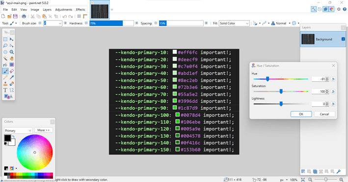
I will show you how to customize your Fluent theme!
(Here comes the magic!)
- Save and open this image below on the free app, Paint.NET:
- Change the “Hue / Saturation” as you like from the menu Adjustment:
- Select the web color one by one:
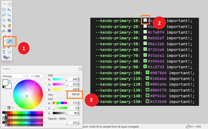
- And replace it in this template:
<style>
  :root {
    --kendo-primary-10: #F0FCEF !important;
    --kendo-primary-20: #F9DEDF !important;
    --kendo-primary-30: #F4C7CA !important;
    --kendo-primary-40: #EFABB0 !important;
    --kendo-primary-50: #EB8E95 !important;
    --kendo-primary-60: #E6727B !important;
    --kendo-primary-70: #E25561 !important;
    --kendo-primary-80: #DD3947 !important;
    --kendo-primary-90: #D91C2C !important;
    --kendo-primary-100: #D40011 !important;
    --kendo-primary-110: #BE101A !important;
    --kendo-primary-120: #9E000E !important;
    --kendo-primary-130: #78000B !important;
    --kendo-primary-140: #6C0F14 !important;
    --kendo-primary-150: #601517 !important;
  }
</style>
- Finally, add it to the head tag of your “_Layout.cshtml” file.
The Fluent theme is beautiful and modern, and you can customize it to your needs.
Save your time! The Progress Telerik frameworks are the best way to get a quick professional start in your solutions. Start your free trial now.

Jefferson S. Motta
Jefferson S. Motta is a senior software developer, IT consultant and system analyst from Brazil, developing in the .NET platform since 2011. Creator of www.Advocati.NET, since 1997, a CRM for Brazilian Law Firms. He enjoys being with family and petting his cats in his free time. You can follow him on LinkedIn and GitHub.
Related Posts
Comments
All articles
Topics

Latest Stories
in Your Inbox
Subscribe to be the first to get our expert-written articles and tutorials for developers!
All fields are required