# .NET MAUI Calendar Templates

If the default look how the days, months, years and decades are presented in the <a href="https://www.telerik.com/maui-ui/calendar" target="_blank">.NET MAUI Calendar</a> do not match your use case, you can define custom templates. The available templates for customizing are:

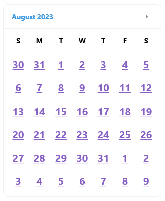
* `DayTemplate `(`DataTemplate`)—Specifies the content templates for the days in the month view of the Calendar.
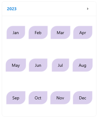
* `MonthTemplate `(`DataTemplate`)—Specifies the content templates for the months in the year view of the Calendar.
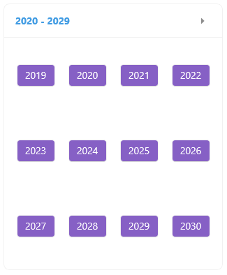
* `YearTemplate `(`DataTemplate`)—Specifies the content templates for the years in the decade view of the Calendar.
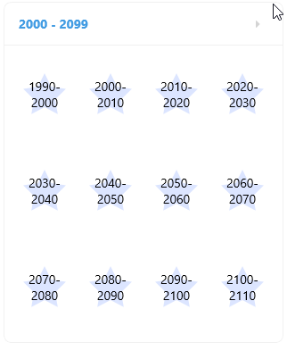
* `DecadeTemplate `(`DataTemplate`)—Specifies the content templates for the decades in the century view of the Calendar.

## Day Template

```XAML
<telerik:RadCalendar DisplayMode="Month" DayTemplate="{StaticResource DayLabelTemplate}" />
```

Here is a sample day template definition for customizing the days in the `MonthView`.

```XAML
<ContentView.Resources>
    <DataTemplate x:Key="DayLabelTemplate">
        <telerik:RadBorder>
            <Label TextColor="#8660C5"
                   TextDecorations="Underline"
                   Text="{Binding Text}"
                   HorizontalTextAlignment="Center"
                   VerticalTextAlignment="Center"
                   FontSize="20"
                   FontAttributes="Bold"/>
        </telerik:RadBorder>
    </DataTemplate>
</ContentView.Resources>
```

![Telerik UI for .NET MAUI Calendar custom DayTemplate displaying underlined date cells](https://www.telerik.com/maui-ui/documentation/assets/0b891c195ce2d968a945e045652250e7/calendar-day-template.png)

## Month Template

```XAML
<telerik:RadCalendar DisplayMode="Year" MonthTemplate="{StaticResource MonthLabelTemplate}" />
```

Here is a sample month template definition for customizing the months in the `YearView`.

```XAML
<ContentView.Resources>
    <DataTemplate x:Key="MonthLabelTemplate">
        <Grid>
            <Border StrokeShape="RoundRectangle 20,0,0,20"
                    Background="#4D8660C5"
                    HorizontalOptions="Center"
                    VerticalOptions="Center"
                    Padding="16, 8">
                <Label Text="{Binding Text}"
                       Padding="{OnPlatform Default=0, WinUI=4}" />
            </Border>
        </Grid>
    </DataTemplate>
</ContentView.Resources>
```

![Telerik UI for .NET MAUI Calendar custom MonthTemplate displaying rounded month cells](https://www.telerik.com/maui-ui/documentation/assets/34b987a64403c8d68827fca23d648ff0/calendar-month-template.png)

## Year Template

```XAML
<telerik:RadCalendar DisplayMode="Decade" YearTemplate="{StaticResource YearLabelTemplate}" />
```

Here is a sample year template definition for customizing the years in the `DecadeView`.

```XAML
<ContentView.Resources>
    <DataTemplate x:Key="YearLabelTemplate">
        <Grid>
            <Button BackgroundColor="#8660C5"
                    TextColor="White"
                    Text="{Binding Text}"
                    HorizontalOptions="Center"
                    VerticalOptions="Center" />
        </Grid>
    </DataTemplate>
</ContentView.Resources>
```

![Telerik UI for .NET MAUI Calendar custom YearTemplate displaying purple year buttons](https://www.telerik.com/maui-ui/documentation/assets/9346cc6bf6cccbd2fac3da103571909d/calendar-year-template.png)

## Decade Template

```XAML
<telerik:RadCalendar DisplayMode="Century" DecadeTemplate="{StaticResource DecadeLabelTemplate}" />
```

Here is a sample decade template definition for customizing the decades in the `CenturyView`.

```XAML
<ContentView.Resources>
    <DataTemplate x:Key="DecadeLabelTemplate">
        <Grid>
            <telerik:RadPath Fill="#4D8AAAFF"
                             Geometry="{x:Static telerik:RadGeometry.Star}"
                             WidthRequest="48"
                             HeightRequest="48" />
            <Label Text="{Binding Text}"
                   HorizontalTextAlignment="Center"
                   VerticalTextAlignment="Center" />
        </Grid>
    </DataTemplate>
</ContentView.Resources>
```

![Telerik UI for .NET MAUI Calendar custom DecadeTemplate displaying decade ranges inside star-shaped cells](https://www.telerik.com/maui-ui/documentation/assets/23e54d64d3a3d482515d5ac27bebeaee/calendar-decade-template.png)

## Template Selectors

You can apply a template selector the calendar templates as they are of type `DataTemplate`.

The following example demonstrates a `DayTemplate` that uses a Template Selector.

```XAML
<telerik:RadCalendar DisplayMode="Month" DayTemplate="{StaticResource SpecialDayTemplateSelector}" />
```

And the template selectors definition

```XAML
<ContentView.Resources>
    <local:SpecialDayTemplateSelector x:Key="SpecialDayTemplateSelector">
        <local:SpecialDayTemplateSelector.SpecialDayTemplate>
            <DataTemplate>
                <Grid>
                    <Label FontFamily="TelerikFontExamples"
                           Text="&#xe830;" 
                           FontSize="12"
                           TextColor="#8660C5"
                           HorizontalOptions="End"
                           VerticalOptions="Start"
                           Margin="0, 2, 2, 0" />
                    <Label Text="{Binding Text}"
                           TextColor="#8660C5"
                           FontAttributes="Bold"
                           HorizontalTextAlignment="Center"
                           VerticalTextAlignment="Center" />
                    <telerik:RadBorder IsVisible="{Binding IsSelected}"
                                       BorderThickness="2"
                                       BorderColor="#8660C5" />
                </Grid>
            </DataTemplate>
        </local:SpecialDayTemplateSelector.SpecialDayTemplate>
        <local:SpecialDayTemplateSelector.NormalDayTemplate>
            <DataTemplate>
                <Grid>
                    <Label Text="{Binding Text}"
                           TextColor="#FFAC3E"
                           BackgroundColor="#19FFAC3E"
                           HorizontalTextAlignment="Center"
                           VerticalTextAlignment="Center" />
                    <telerik:RadBorder IsVisible="{Binding IsSelected}"
                                       BorderThickness="2"
                                       BorderColor="#FFAC3E" />
                </Grid>
            </DataTemplate>
        </local:SpecialDayTemplateSelector.NormalDayTemplate>
    </local:SpecialDayTemplateSelector>
</ContentView.Resources>
```

And the Template Selector logic:

```C#
public class SpecialDayTemplateSelector : DataTemplateSelector
{
    public DataTemplate NormalDayTemplate { get; set; }

    public DataTemplate SpecialDayTemplate { get; set; }

    protected override DataTemplate OnSelectTemplate(object item, BindableObject container)
    {
        var node = item as CalendarNode;
        var date = node.Date;
        if (date == null)
        {
            return null;
        }

        if (date.Value.Day % 3 == 0 || date.Value.Day % 5 == 0)
        {
            return this.SpecialDayTemplate;
        }

        return this.NormalDayTemplate;
    }
}
```
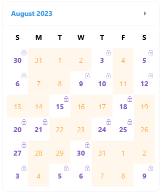
![Telerik UI for .NET MAUI Calendar Template Selector applying custom colors, underlines, and lock icons to day cells](https://www.telerik.com/maui-ui/documentation/assets/eb4cc920c4b2902146bd780e786a8f28/calendar-template-selector.png)

> important For the Calendar Templates examples refer to the [SDKBrowser Demo Application](https://www.telerik.com/maui-ui/documentation/demos-and-sample-apps/sdkbrowser-app) Calendar -> Templates category.

## See Also

* [Navigation Between the Different Views](https://www.telerik.com/maui-ui/documentation/controls/calendar/navigation)
* [Specify the Formatting](https://www.telerik.com/maui-ui/documentation/controls/calendar/formatting)
* [Selection modes](https://www.telerik.com/maui-ui/documentation/controls/calendar/selection)
* [Use the exposed Commands](https://www.telerik.com/maui-ui/documentation/controls/calendar/commands)
* [Calendar Header Styling](https://www.telerik.com/maui-ui/documentation/controls/calendar/styling/header-styling)