
ThemeBuilder
What's New
Smart Code Editor
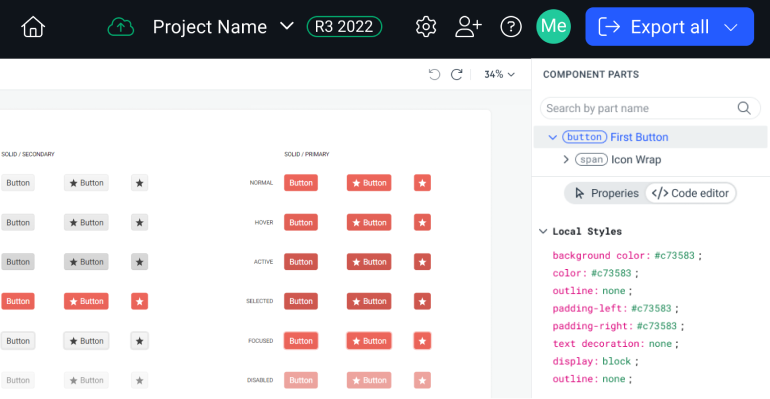
Improve your productivity when working on custom styling with the new Smart Code Editor—our most requested feature this quarter. Power users writing complex styles can now not only edit the CSS directly inside ThemeBuilder, but also view both the default theme styles and any customizations side-by-side. This premium addition makes it easier to customize components to match your theme or design system. Streamline your styling process with smart options such as setting typography with a single variable (instead of a string of CSS rules), two-way binding between the property grid and the CSS code and effects.
We’ll keep upgrading this handy editor, so become a part of its DNA and share your experience with us.
See the ThemeBuilder Smart Code Editor documentation
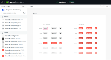
Support for Styling Component Appearance Options
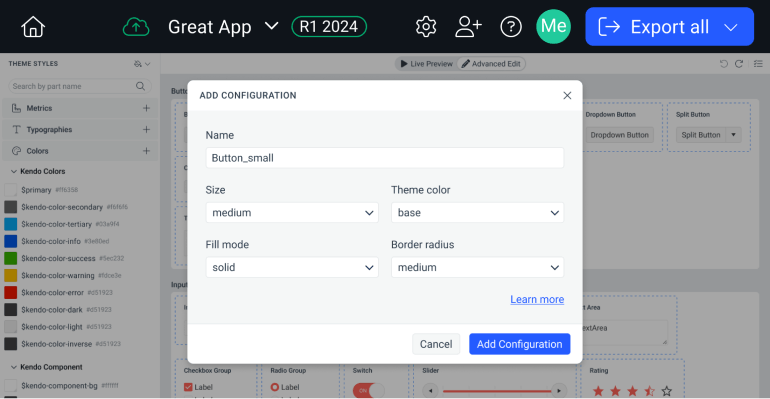
Did you know that in our UI libraries there exist 400 possible combinations between the different button types? While this ensures you have the flexibility of choice, it can get hard to navigate when it comes to styling. With this new implementation, ThemeBuilder now supports all Button & TextBox component variants, through a streamlined user interface. You can now create the custom component version you need with different appearances (say, a medium primary button with a large border radius) and only view and edit the variants you’re using. This enhancement is available to all paid users. Additional components will be added gradually.
See the ThemeBuilder Styling Component Appearance Options documentation
New Kendo UI Theme Color System Support
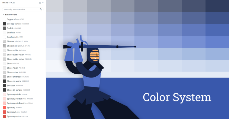
Enjoy dozens of new dynamic colors in ThemeBuilder with the added support for the new Telerik and Kendo UI Themes color system. Through centralized color management, you get a streamlined customization process. Encompassing our Default, Material, Bootstrap and Fluent themes, the new color system aligns perfectly with design system methodologies, ensuring visual consistency across your applications. Available to all ThemeBuilder users.
Learn about the new Telerik and Kendo UI Themes color system
Advanced Editing for AI Prompt Component
As part of our commitment to offering atomic customization features, you can now drill down and add detailed styling to the AI Prompt component.
Control Variables Prefix
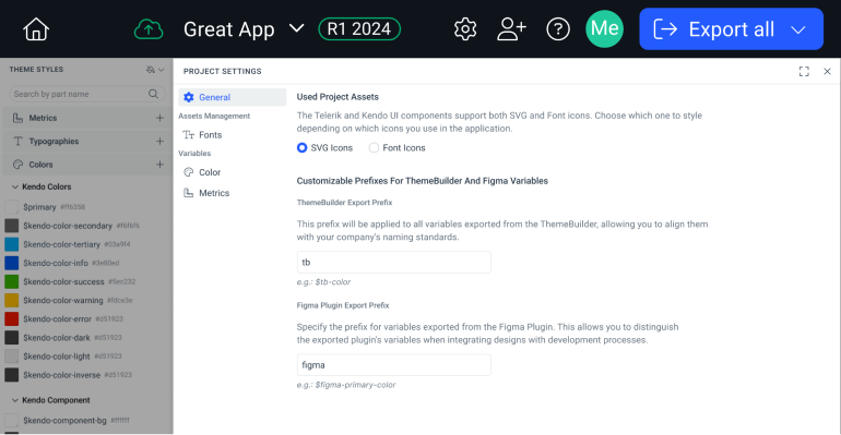
Naming can be hard—so once you have your variable naming convention set, naturally, you want to stick to it. With this new ThemeBuilder Project Settings panel feature, all users get two new settings enabling you to customize the prefixes of ThemeBuilder and Figma variables. We’ve heard your feedback: there’ll be no more manual renaming!
See the Customizing Prefixes documentation
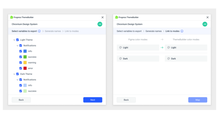
Export and Map Figma Variable Modes
Using the ThemeBuilder Plugin for Figma, you can export the new Color and Number (called Metric in ThemeBuilder) Modes to ThemeBuilder and work with them there. If you already have similar variable modes in ThemeBuilder, you can map them for seamless integration. This is in addition to the already supported ability to export and map Figma styles.
See the ThemeBuilder Figma Plugin documentation
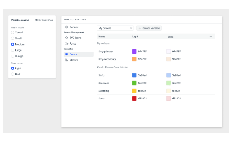
Color and Size Variable Modes
Address the needs of different users with two types of variable modes: colors and metrics. Color modes allow you to define multiple color palettes, Light and Dark for example. Metric modes allow you to create sets of size variations. In your application, you can then switch them programmatically or give the user the control to do it themselves with the click of a button.
See the ThemeBuilder Variable Modes documentation
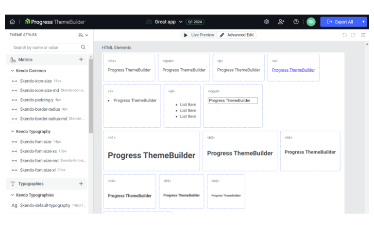
Style Generic HTML Elements
Harness the power of ThemeBuilder for the generic parts of your app that don’t use Telerik or Kendo UI components. ThemeBuilder will allow you to create style templates for the most used HTML elements such as <div>, <span>, <body>, <a>, <li>, <ul>, <p>, <h1, 2, e, etc.>, <image>, and <input>. For maximum control, you can create variants for each element just like you can for components. This not only extends the benefit of ThemeBuilder across your entire app, but ensures consistency as well.
Support for Over 500 Component-Specific Variables
For an advanced experience, customize individual components down to a granular level with access to each component’s specific Sass/CSS variables. When you drill down to the component level, you will see and be able to edit all related variables. Changing them will effect only that component. For an example, see the list of TreeView Sass Variables.
See the ThemeBuilder Component Styling Documentation
Export Only Selected Component Styles
To optimize bundle size, export only the styles for the components you select in ThemeBuilder as opposed to the entire library. This is very useful if you only use a few components as it can greatly reduce file size.
New features
What's new across all Telerik products?
See the updates feed

Next Steps
Check out the offers. Purchase an individual license for ThemeBuilder, or treat yourself to one of our bundles.
Try ThemeBuilder with dedicated technical support.