Telerik UI for Blazor
What's New
What's New HistoryPioneering Blazor Spreadsheet for Robust Excel-Like Experiences
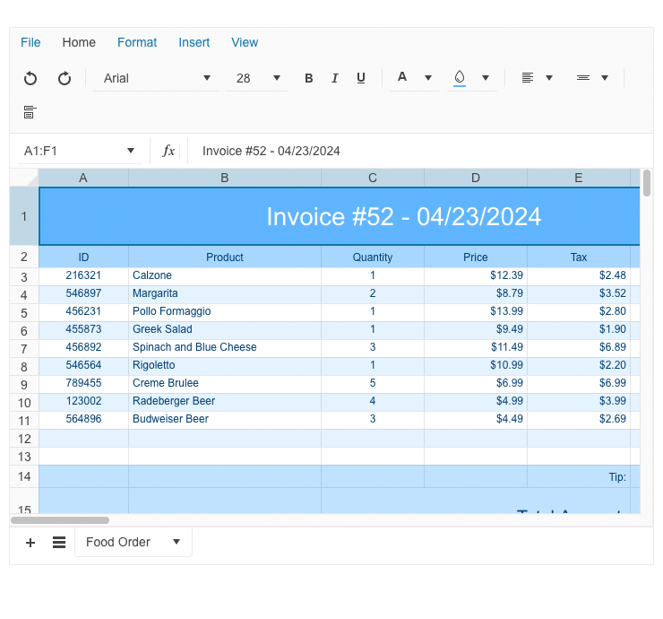
With the 2024 Q2 release, we’re introducing the first on the market UI for Blazor Spreadsheet component, thus empowering you to elevate your apps with robust Excel-like functionality. With a wide range of capabilities for data view and editing like styling, formatting, links and images support, rich formulas and functions collection – the Blazor Spreadsheet enables users to manage and manipulate data in a familiar spreadsheet-like interface.
See Telerik UI for Blazor Spreadsheet demo
Experimental Smart (AI) Components in Telerik UI for Blazor
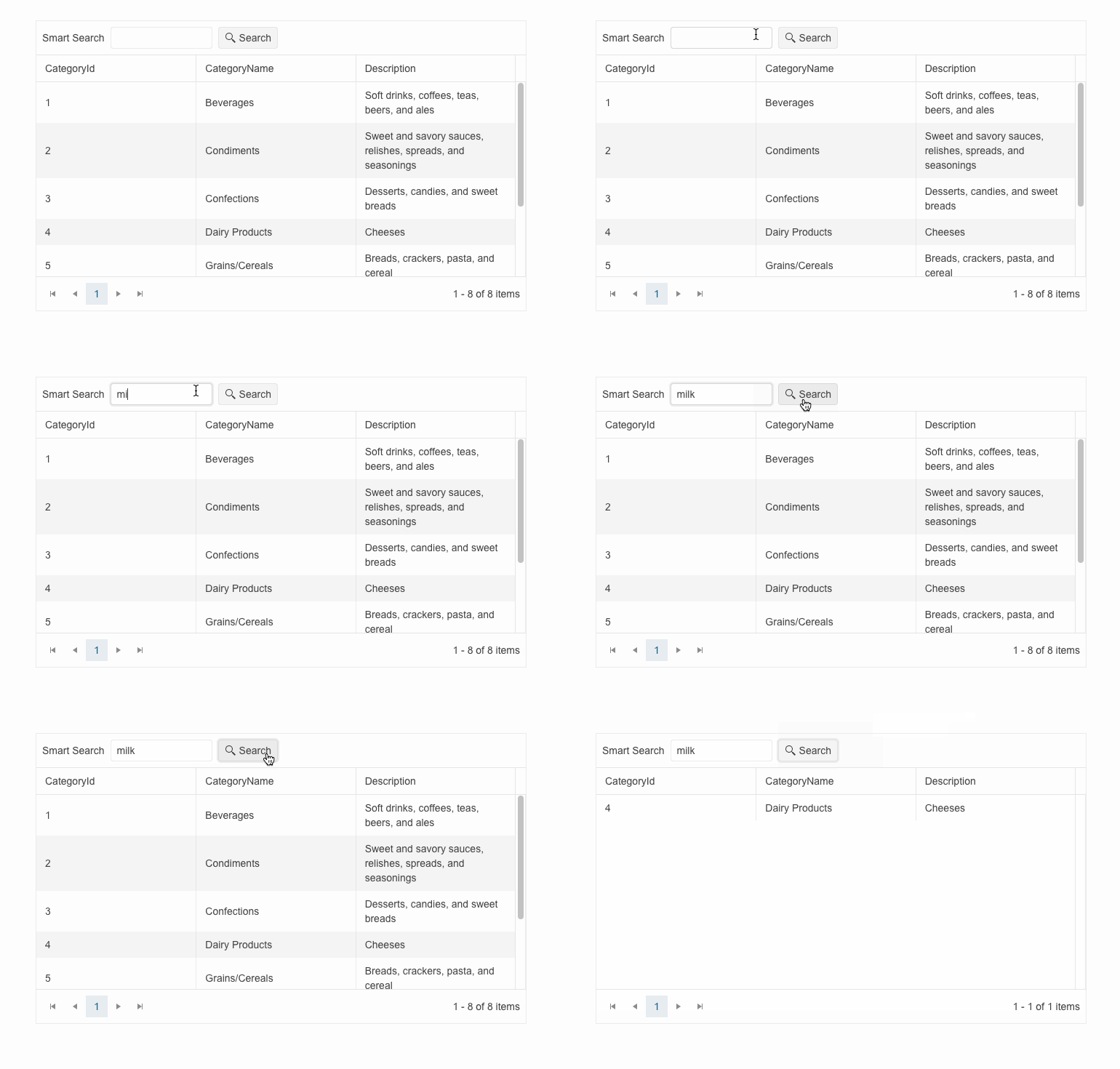
With the 2024 Q2 release, we’re introducing experimental Smart (AI) components in Telerik UI for Blazor. As a first stage we’ve crafted three ready to use, AI integration demos: Grid Smart (AI) Search, ComboBox Smart (AI) Search and PDFViewer Smart (AI) Assistant. The ComboBox and Grid search demos are relying on similarity search calculations, while PDFViewer assistant relies on the RAG (Retrieval-Augmented Generation) technique that enables you to chat with your documents and summarize, explain or answer questions based on the context of your own data.
Boosting User Interaction with Intuitive Rating Component
Being a cornerstone of users’ digital experience, user feedback supports various mechanisms, one of which is the rating system. The new Telerik UI for Blazor Rating component allows you to integrate flexible rating option, thus enabling users to share feedback and easily modify the values they've chosen.
Telerik UI for Blazor Rating covers multiple use cases and can be leveraged in e-commerce sites, review platforms and anywhere user preferences are valuable. It also supports integration scenarios with other Blazor controls like the Grid or the Form for a more coherent review submission.
See Telerik UI for Blazor Rating demo

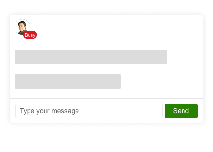
New Telerik UI for Blazor Badge to Display Additional Information
The Blazor 2024 Q2 release comes with a new Badge component that gives you an easy way to display app notifications, show statuses, short messages and more. Typically, the Badge control is used in the context of other UI elements like showing the online status of a user overlayed on their avatar.
The Telerik UI for Blazor Badge comes with a set of customization options allowing you to play with its position, theme color, size, fill and border.
See Telerik UI for Blazor Badge demo
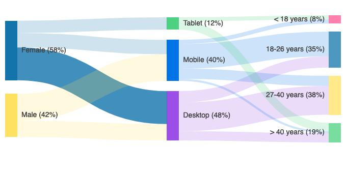
Create and Visualize Flows Between Data with the New Blazor Sankey Diagram
The brand-new Telerik UI for Blazor Sankey Chart, a.k.a. a flow diagram, enables you to easily create diagrams that visualize changing flows and their distribution between domains. The Sankey diagrams are ideal for a variety of use cases, including website traffic, budget breakdowns, energy flow, managing order priority flows in retail and more.
See Telerik UI for Blazor Sankey Chart demo
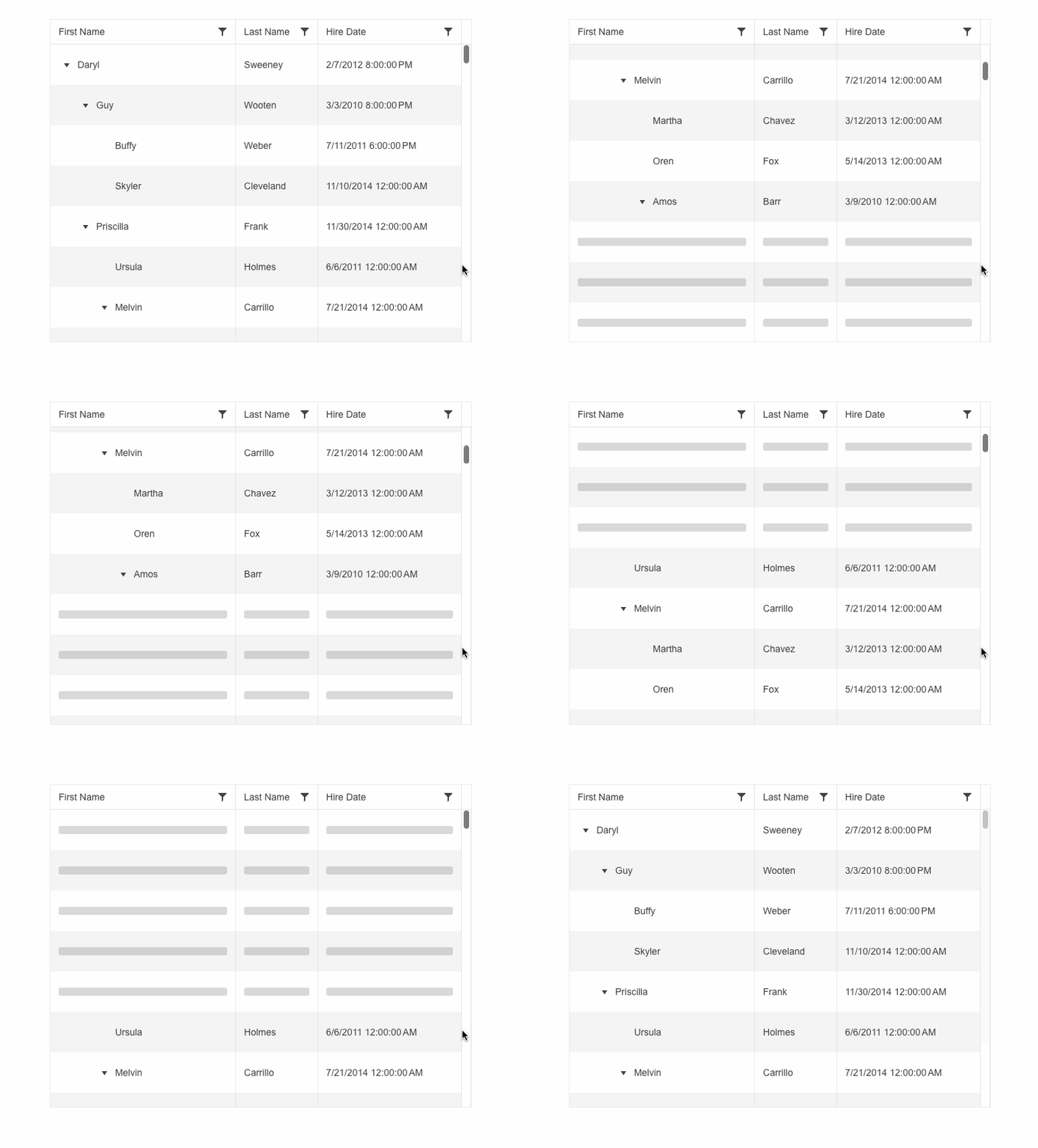
Telerik UI for Blazor TreeList Now Supports Virtual Scrolling
Optimize performance when dealing with large datasets and respond to different user preferences with the newly supported virtual scrolling in Telerik UI for Blazor TreeList.
Offering an alternative to the pager, row virtualization renders only the rows from the current page of data and swaps them as the user scrolls, instead of rendering a row for each and every item in the data source.
See the Telerik UI for Blazor TreeList virtual scrolling demo
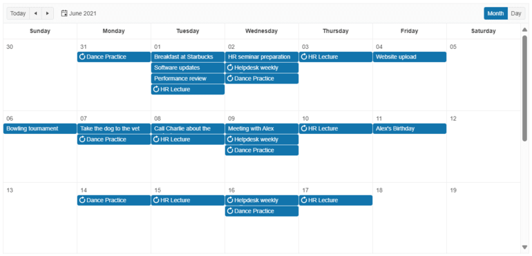
Enhanced Month View Capabilities in Telerik UI for Blazor Scheduler
Within the month view of the Telerik UI for Blazor Scheduler, one day can now display a different number of events thanks to the ItemsPerSlot parameter. The default number is two, but if more events are available for a certain date an ellipsis button provides access to the DayView so that the user can explore the details for all events on this specific day.
See the updated Telerik UI for Blazor Scheduler month view demo
Keyboard Navigation for Enhanced Accessibility in Telerik UI for Blazor ListView
Pursuing the goal to comply with accessibility standards and empower you to build inclusive UI, Telerik UI for Blazor ListView now supports Keyboard Navigation. It enables users to navigate and interact with the component’s items efficiently using the keyboard only.
Visit the Telerik UI for Blazor ListView keyboard navigation demo or check out the accessibility and security hub page for more details.

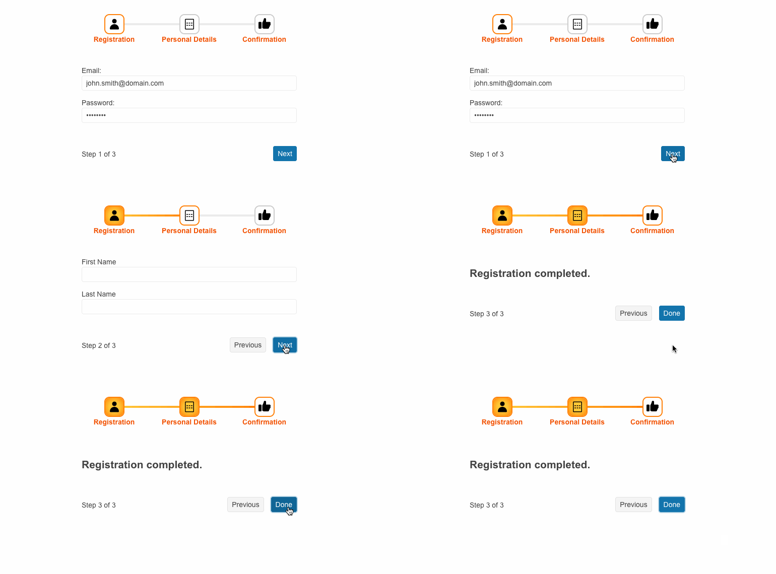
Boosting Customization with a New Stepper Template in Telerik Ui for Blazor Wizard
With this release the Telerik UI for Blazor Wizard is enhanced with a stepper template that unleashes creativity by offering multiple customization options to play around with. Through this feature, users can tailor the visual presentation and styling of step indicators and labels to suit their specific design preferences and application requirements.
See Telerik UI for Blazor Wizard stepper template demo
Constraining Telerik UI for Blazor Window Movements
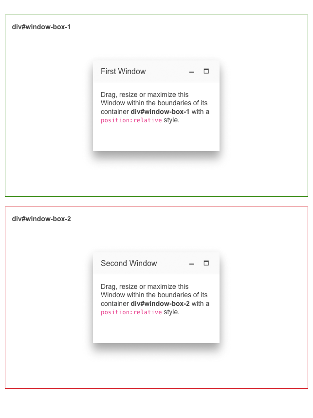
With the 2024 Q2 release, you can now drag, resize or maximize a Blazor Window within the boundaries of its container only. Though associated with the negative connotation – restriction – the constraint movement in Telerik UI for Blazor Window ensures peace of mind when building complex layouts.
See Telerik UI for Blazor Window constraint movement demo
Customizable Toolbar in Telerik UI for Blazor FileManager
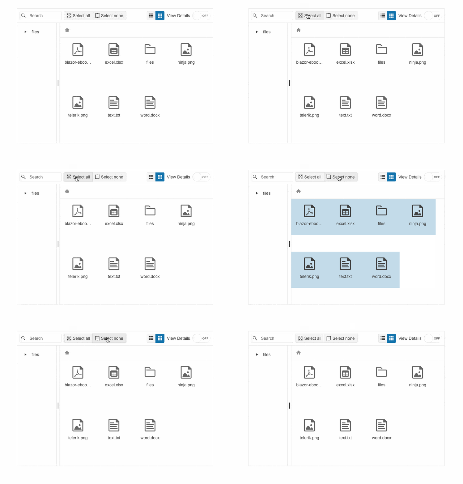
Out-of-the-box, yet customizable Toolbar is added to the Telerik UI for Blazor FileManager component. The toolbar contains several prebuild commands, including new folder, upload, sort by, search, etc. Though being 100% ready to use the FileManager toolbar leaves room for customization – you can decide which of the built-in tools to include, manage their position and add your custom tools.
See Telerik UI for Blazor FileManager toolbar demo
Show or Hide the Telerik UI for Blazor Tooltip with Specific Delay
The ability to modify the Telerik UI for Blazor Tooltip position is enhanced with an option to delay the popup showing or hiding with a customizable duration.
See the updated Telerik UI for Blazor Tooltip position demo

Templates Support in Telerik UI for Blazor Filter Component
Input filter values for filter expressions in a custom UI with the newly added support for Blazor templates in the Telerik UI for Blazor Filter control. The component’s category field uses a custom value editor through a FilterField ValueTemplate. Users now select a category name as a string, while the data is getting filtered by the respective category ID.
New Clear Fill Mode in Various Telerik UI for Blazor Components
The fill mode appearance options for multiple Telerik UI for Blazor components are enriched with a new clear fill mode, providing even more flexibility and customization. The components are Button, ButtonGroup, DropDownButton and ToggleButton.
See the updated Telerik UI for Blazor ButtonGroup appearance demo as a reference
Enriching the Custom Configuration Options of the Telerik UI for Blazor MultiSelect Filter
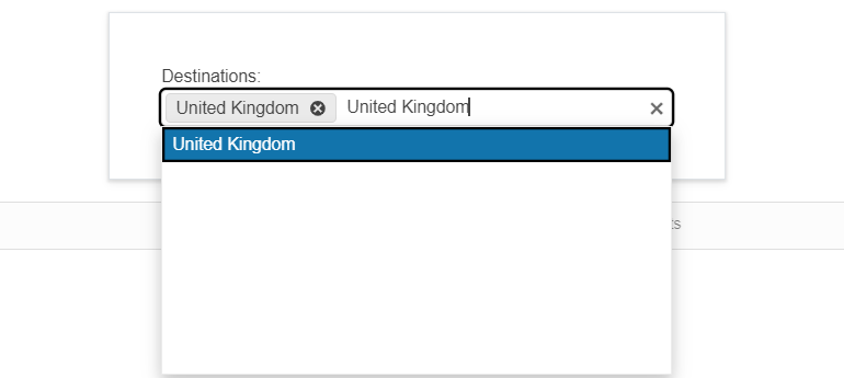
Along with the already available options to set the desired filter operator and debounce the filtering, the Blazor MultiSelect filter now supports a new custom configuration to persist the filter on selection. By default, when the user selects an item, the filter value is cleared from the input. You can now preserve the filter upon selection with a simple configuration, thus allowing users to select multiple values that match one filter criterion.
See the updated Telerik UI for Blazor MultiSelect filtering demo
New Pan and Zoom Events Added to the Telerik UI for Blazor Map
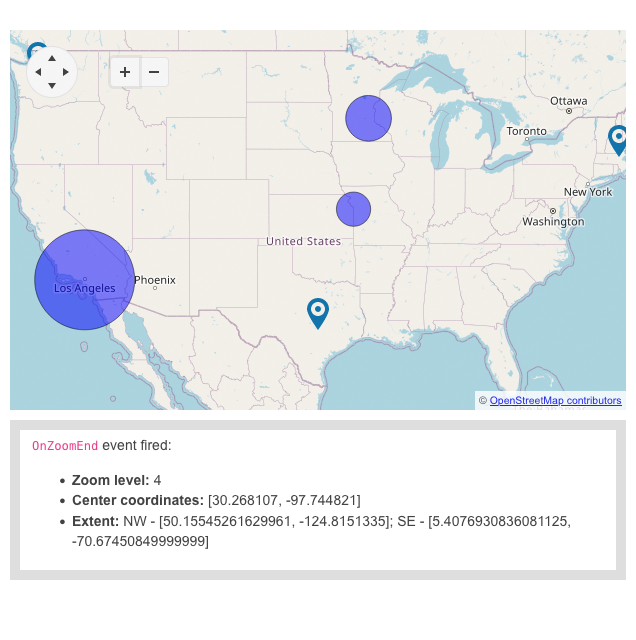
New Pan and Zoom Events Added to the Telerik UI for Blazor Map Telerik UI for Blazor Map events are enriched with new pan and zoom events that fire when interacting with the map navigation or upon clicking on the zoom in icon. The OnPanEnd event shows details such as center coordinates, and extent, while the OnZoomEnd event showcases the zoom level, too.
See the updated Telerik UI for Blazor Map events demo
Telerik UI for Blazor: Day-Zero Support for .NET 9 Latest Preview
Following the evolution of .NET 9, the Telerik UI for Blazor library now features day-zero support for .NET 9's latest preview.

Telerik UI for Blazor AI Prompt: Blending AI with UI
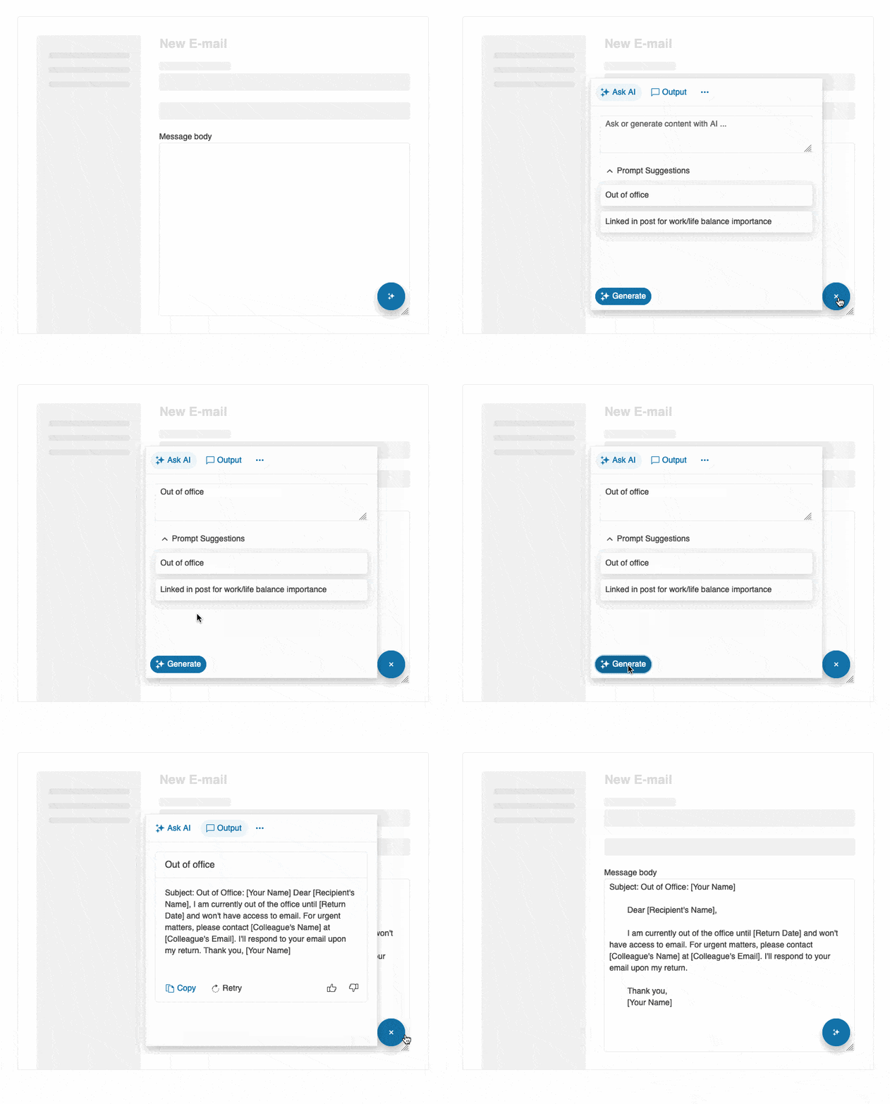
The AI Prompt allows you to align digital experiences with natural human behavior. Devised to streamline the integration of your favorite GenAI services into your Telerik UI for Blazor applications, this new component sends prompts and then maps the response.
The Telerik UI for Blazor AI Prompt is focused on providing users with a modern interface to interact with AI services, while enhancing usability for developers by offering smooth customization. It enables three predefined views to interact with: Prompt, Output and Command, each featuring specific functionality.
Effortless customization is also available. From configuring the button design to playing with the layout and footer template, you can adjust any AI Prompt feature to suit your needs.
Check out the Telerik UI for Blazor AI Prompt demo
Meet the AppBar: New Navigation Control in Telerik UI for Blazor
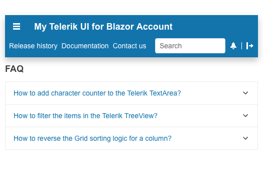
Welcome the new member in Telerik UI for Blazor Navigation family – the AppBar. Also known as Navigation Bar or NavBar, the AppBar component empowers users to effortlessly navigate through your Blazor application, while providing information and actions related to a screen.
Designed with consistency in mind, the Telerik UI for Blazor AppBar is most commonly used as the main navigation element for an app or page. It also comes equipped with convenient properties allowing you to set content, position, color, and more.
See Telerik UI for Blazor AppBar demo
Introducing Telerik UI for Blazor Popover and Popup
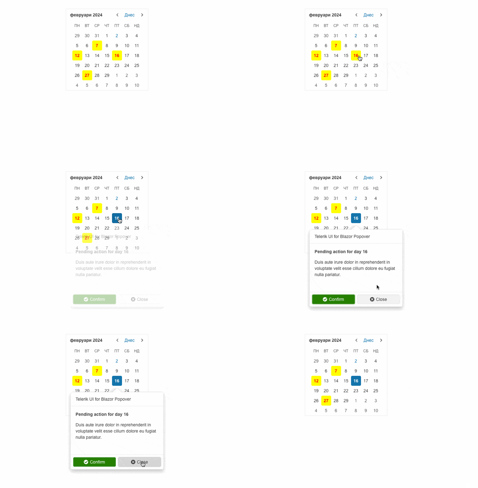
Providing additional context to users without interrupting their current workflow is possible with the new Telerik UI for Blazor Popover and Popup controls.
While Telerik UI for Blazor Popover displays additional information or options when the anchor element is hovered, clicked, or focused, the Popup appears on top of the main content in the form of a small window or dialog box and provides supplementary content or functionality.
Telerik UI for Blazor Popover can be leveraged to elevate user interaction and provide quick access to additional details or actions within an application. Telerik UI for Blazor Popup is often used as a part of more complex components that have a popup window, such as dropdowns, pickers, inputs, etc.
Both UI components can be easily customized to match the desired look and feel. Simply play with the available configuration options and see what works best for your app requirement.
Upgrading Telerik UI for Blazor Trendline Chart
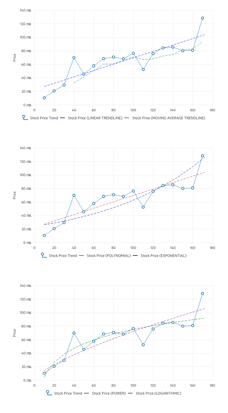
The last release of 2023 introduced a brand-new Telerik UI for Blazor chart type—the Trendline, which is used to visualize data points in a time series or sequential order.
The first release of 2024 comes with a new version of the Telerik UI for Blazor Trendline. It now supports multiple new trendline options to cover any scenario. Welcome the new Polynomial, Exponential, Power, and Logarithmic Trendline types which complement the already available Linear and Moving Average types.
See the updated Telerik UI for Blazor Trendline Chart demo
Legend Customization in Telerik UI for Blazor Charts for Consistent Apps
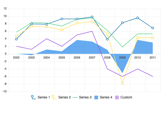
Mix and match different parameters to align the look and feel of Telerik UI for Blazor Charts with the desired outcome. Leveraging the new legend customization options, you can add text as Legend title, thus providing additional information to users. Additionally, you can modify the Legend and Legend Series type and add different colors if needed.
See Telerik UI for Blazor Charts legend customization demo
Column and Custom Column Menus in Telerik UI for Blazor Gantt Chart
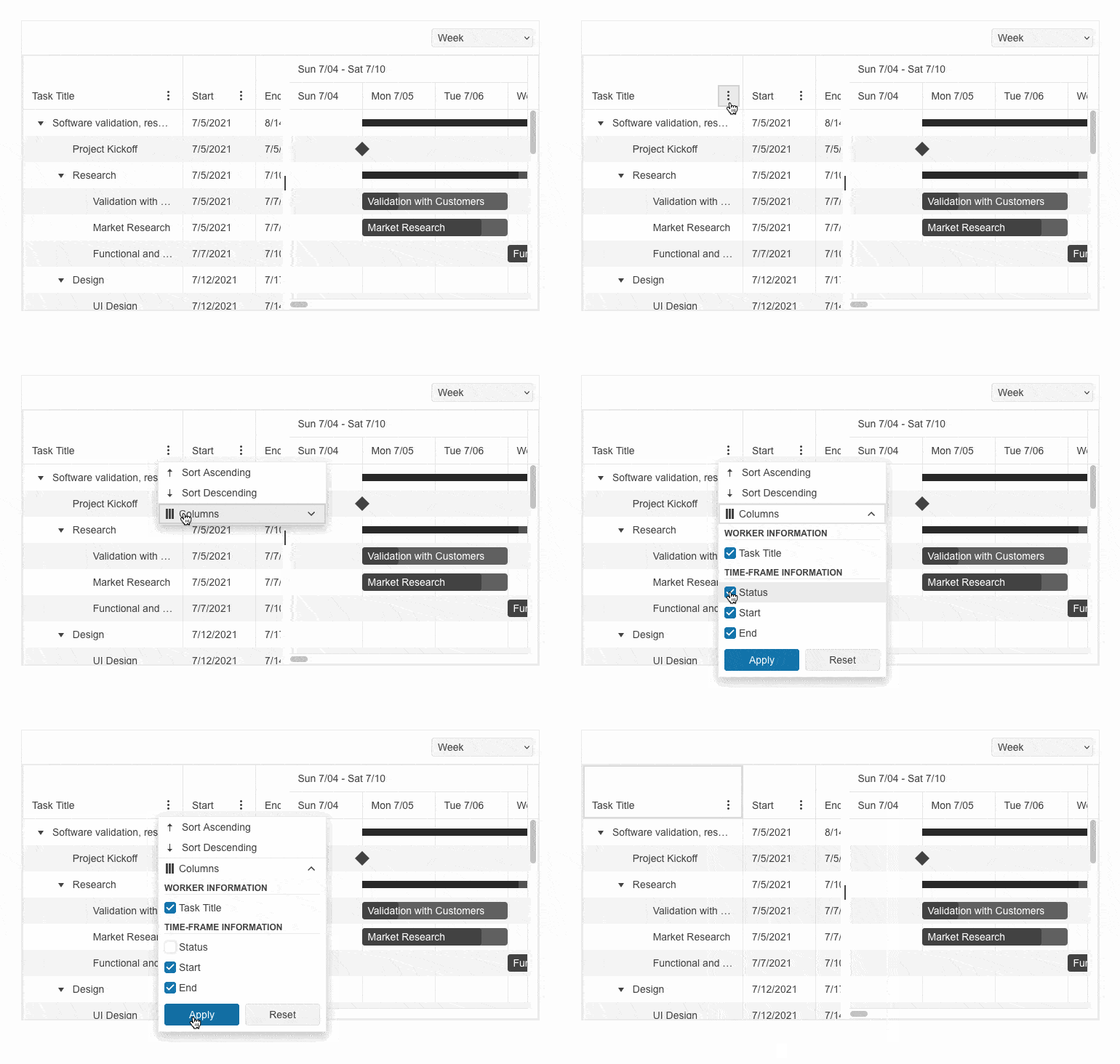
Configuring a menu for Telerik UI for Blazor Gantt columns has never been easier with the brand-new Column Menu and Custom Column Menu options. The Column Menu enables you to perform high-level customizations like sorting, filtering, and showing or hiding different columns. While the Custom Column Menu provides a column menu chooser template that enables quick and easy customization of the column list.
See Telerik UI for Blazor Gantt column menu and custom column menu demos
Keyboard Navigation in Telerik UI for Blazor Charts and Gantt Chart
Pursuing the goal to comply with accessibility standards and empower you to build inclusive UI, the Telerik UI for Blazor Charts and Gantt Chart components now support Keyboard Navigation. Additionally, these two UI controls provide extensive accessibility support and enables users with disabilities to acquire complete control over Telerik UI for Blazor Chart and Gantt chart features.
To learn more about Telerik UI for Blazor Charts accessibility and keyboard navigation check the documentation or play with the demo.
The Telerik UI for Blazor Gantt accessibility and keyboard navigation documentation is available here, while the demo can be seen here.

Telerik UI for Blazor TreeList with Column and Custom Column Menus
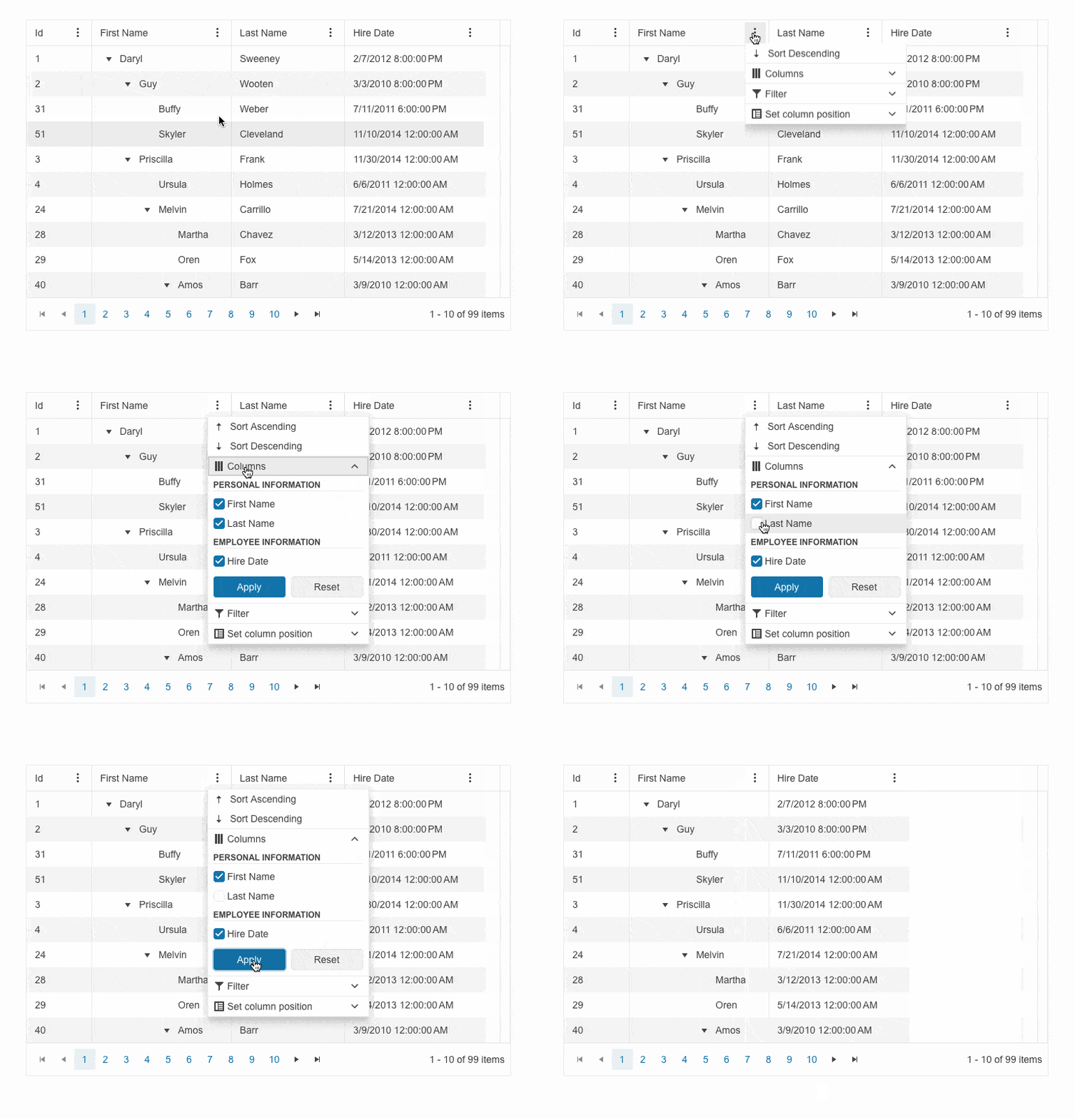
Displaying a customizable menu for Telerik UI for Blazor TreeList columns has never been easier with the brand-new Column Menu and Custom Column Menu options. The Column Menu enables you to perform high-level customizations like sorting, filtering, showing or hiding columns and freezing or unfreezing them. While the Custom Column Menu provides a column menu chooser template that enables quick and easy customization of the column list.
See Telerik UI for Blazor TreeList column menu and custom column menu demos
Multiple Components Enhanced with Prefix and Suffix Adornments
Telerik UI for Blazor AutoComplete, ComboBox, MaskedTextBox, MultiColumn ComboBox, MultiSelect, NumericTextBox, TextArea and TextBox now include options for adding custom items/ornaments as prefix and suffix adornments.
A prefix input adornment is an element placed before the user input field and is typically used to give clarity on the expected data in the input such as currency symbols or unit indicators.
A suffix input adornment is an element positioned after the user input field and usually serves to provide direct functionality for the entered data like password visibility toggles, formatting or clearing the input.
See Telerik UI for Blazor TextArea adornments demo for an example

Modify the Appearance of the ContextMenu, Drawer and Menu
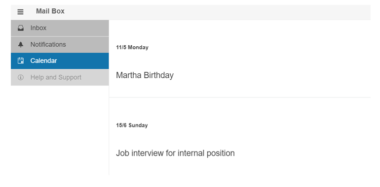
Customize the appearance of the Telerik UI for Blazor ContextMenu, Drawer and Menu controls, leveraging the new OnItemRender event. It enables you to apply conditional styling on the items based on specific criteria.
See Telerik UI for Blazor Drawer appearance demo for an example
Configure the Resizing Behavior of Telerik UI for Blazor TextArea
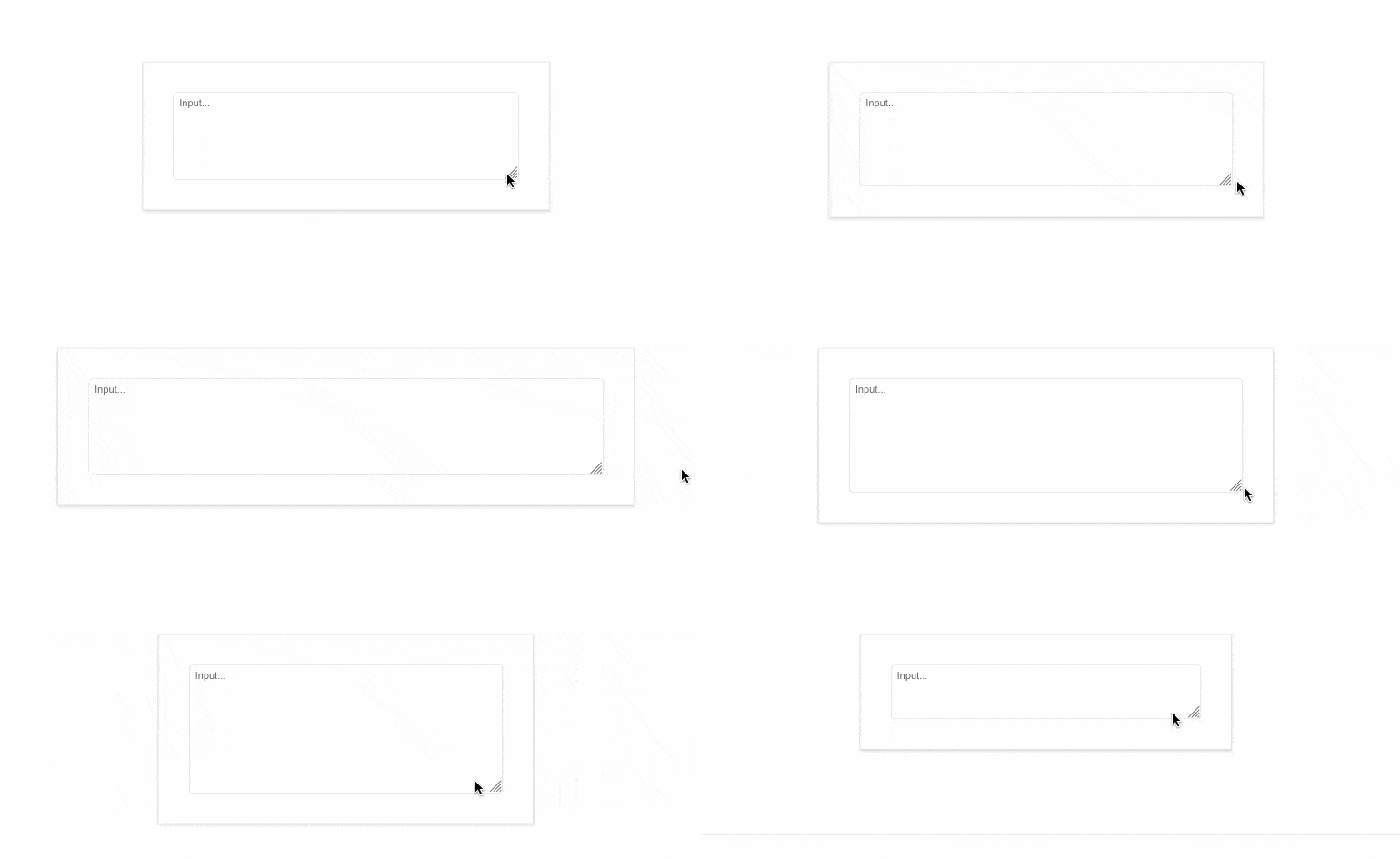
Controlling the size of the Telerik UI for Blazor TextArea has never been easier with the new ResizeMode parameter. It enables you to play with the component’s resize behavior using the available options:
- Vertical, which resizes the TextArea in vertical direction.
- Horizontal, which resizes the UI component in horizontal direction.
- Both, meaning that Blazor TextArea can be resized horizontally and vertically.
- Auto, which results in automatic vertical resize during keyboard input.
- None, which would freeze the TextArea resizing option.
See Telerik UI for Blazor TextArea resize mode demos
Customizing Telerik UI for Blazor Chip with Selectable Parameter
A brand-new selectable parameter is added to the Telerik UI for Blazor Chip component, further enhancing its appearance options. Effortlessly configure whether a specific item should be displayed as selected or not.
New Draggable Events Added to Telerik UI for Blazor TreeView
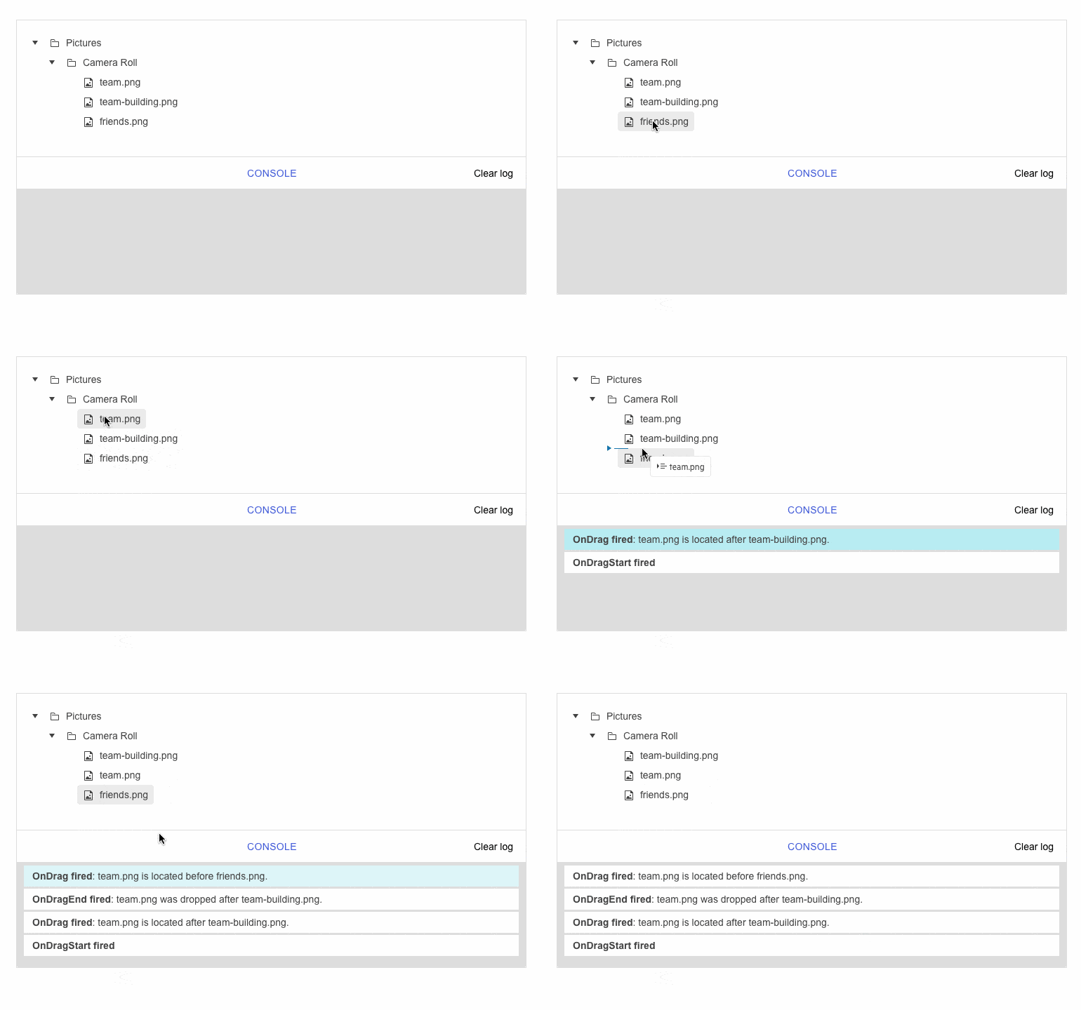
The Telerik UI for Blazor TreView is enhanced with new draggable events, triggered when leveraging the component’s drag and drop functionality.
- DragStart event – fires when the user starts dragging a node. It provides details for the dragged items and allows you to cancel the event.
- OnDrag event – fires continuously while the user is dragging a node.
- DragEnd event – fires when a drag operation is ended by releasing the mouse button.
- OnDrop event – fires when dropping a node into a new location. That allows you to manipulate the data collection based on where the user dropped the element.
See Telerik UI for Blazor TreeView draggable events demo
Elevated Consistency with Unified Rendering Across .NET Web and JavaScript
Fostering consistency across different JavaScript and .NET web frameworks even further, the 2024 Q2 release features unified rendering to meet app standardization requirements.
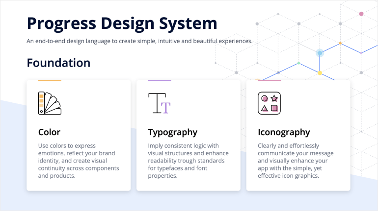
Full-Blown Design System Capabilities
Ready-to-use design system allows development teams to replicate designs to achieve consistency and exceed user expectation with modern looking apps.
Check out the dedicated Design System documentation site
Deprecating Older .NET and .NET Framework Versions
Providing cutting-edge solutions that help meet security and performance standards has been at the core of the Progress Telerik business. To maintain and expand our footprint via a modern, secure and compliant developers’ toolset, our .NET products will no longer support older .NET and .NET Framework versions.
Starting with our upcoming releases, our .NET-based products will exclusively support .NET framework versions 4.6.2 and above, as well as .NET versions 6.0 and above.
For more insights into this change, take a look at the dedicated blog post.
Multiple Document Processing Libraries (DPL) Improvements
- Font subset embedding in PDF for .NET 6+ : The PDF library now supports controlling if the whole TrueType font or only a subset of the used characters gets embedded in the resulting document. This makes the document portable and at the same time with optimal file size.
- OTF font file format support: Our PDF library now supports OpenType font format (OTF) which is widely used and combines the features of PostScript and TrueType font formats.
- New online demo application: This dedicated DPL asset exposes many common scenarios where the libraries can help along with full code snippets.
- All document processing libraries now only support .NET Framework 4.6.2 and above, and .NET 6 and above.
Telerik UI for Blazor - 2024 Q2
- Pioneering Blazor Spreadsheet for Robust Excel-Like Experiences
- Experimental Smart (AI) Components in Telerik UI for Blazor
- Boosting User Interaction with Intuitive Rating Component
- New Telerik UI for Blazor Badge to Display Additional Information
- Create and Visualize Flows Between Data with the New Blazor Sankey Diagram
- Telerik UI for Blazor TreeList Now Supports Virtual Scrolling
- Enhanced Month View Capabilities in Telerik UI for Blazor Scheduler
- Keyboard Navigation for Enhanced Accessibility in Telerik UI for Blazor ListView
- Boosting Customization with a New Stepper Template in Telerik Ui for Blazor Wizard
- Constraining Telerik UI for Blazor Window Movements
- Customizable Toolbar in Telerik UI for Blazor FileManager
- Show or Hide the Telerik UI for Blazor Tooltip with Specific Delay
- Templates Support in Telerik UI for Blazor Filter Component
- New Clear Fill Mode in Various Telerik UI for Blazor Components
- Enriching the Custom Configuration Options of the Telerik UI for Blazor MultiSelect Filter
- New Pan and Zoom Events Added to the Telerik UI for Blazor Map
- Telerik UI for Blazor: Day-Zero Support for .NET 9 Latest Preview
- Telerik UI for Blazor AI Prompt: Blending AI with UI
- Meet the AppBar: New Navigation Control in Telerik UI for Blazor
- Introducing Telerik UI for Blazor Popover and Popup
- Upgrading Telerik UI for Blazor Trendline Chart
- Legend Customization in Telerik UI for Blazor Charts for Consistent Apps
- Column and Custom Column Menus in Telerik UI for Blazor Gantt Chart
- Keyboard Navigation in Telerik UI for Blazor Charts and Gantt Chart
- Telerik UI for Blazor TreeList with Column and Custom Column Menus
- Multiple Components Enhanced with Prefix and Suffix Adornments
- Modify the Appearance of the ContextMenu, Drawer and Menu
- Configure the Resizing Behavior of Telerik UI for Blazor TextArea
- Customizing Telerik UI for Blazor Chip with Selectable Parameter
- New Draggable Events Added to Telerik UI for Blazor TreeView
- Elevated Consistency with Unified Rendering Across .NET Web and JavaScript
- Full-Blown Design System Capabilities
- Deprecating Older .NET and .NET Framework Versions
- Multiple Document Processing Libraries (DPL) Improvements
New features & Roadmap
Have a feature request?
Post your feedback via the Blazor UserVoice portal or the Public forums
What's new across all Telerik products?

Next Steps
See Telerik UI for Blazor in action and check out how much it can do out-of-the-box.
Check out the offers. Purchase an individual suite, or treat yourself to one of our bundles.
Try Telerik UI for Blazor with dedicated technical support.
