
Why Angular’s New Image Directive is Worth Knowing

The new image directive in Angular, NgOptimizedImage, makes lazy loading, preconnections and image issue warnings a snap.
The Angular developer team has finally decided to catch up the framework to the rest of the framework ecosystems. Two of the biggest ways it has done this recently is with Signals and with standalone components. The team realized it needs to compete with speed and features, or it will be left behind.
However, one of the newest features that doesn’t get often mentioned is the new image directive, NgOptimizedImage. Most people are only aware of
the img element with src, width and height—however, the HTMLImageElement has so much more.
Working with the Chrome Aurora Team, the Angular team has built something that makes using the expanded image element features easy. Only Next.js has this built in, but there are third-party packages for other frameworks:
To have good Web Core Vitals for SEO, the Largest Contentful Paint (LCP) should be no less than 2.5 seconds. Using NgOptimizedImage, the creators have managed to show an improvement in desktop performance at 75% and mobile performance at 40%. This is a big deal. If you don’t use Angular, you should be aware of all the modern features HTML has to offer.
Basic HTML5 Image Terminology
If you’re using pure HTML5, there are a few img attributes for the image tag besides the src used to display it.
SEO
width / height
The basic rendered width and height of an image. This is extremely important for SEO and helps dumb browsers display the image correctly.
alt
The “alternative fallback” content to be displayed if the image is not loaded. This is also displayed when you hover over an image. Google uses this for indexing.
Fetching
preconnect / preload
These are link tag rel values that allow your page to preload or preconnect to external sources. Preload is usually used for media.
<link rel="preconnect" href="https://some-cdn.com">
fetchPriority
Possible options being low, high or auto which tell the browser how to prioritize fetching the image.
loading
Possible options being eager or lazy, which tells the browser how to load the image. Lazy loading won’t occur until the image is in view.
<img src="hermes.jpg" fetchpriority="high" loading="eager" alt="Adorable kitty">
Sizing
srcset
This is a list of image sources for different size images with the width telling the browser how to choose the image based on different screen sizes.
sizes
You also need to take into account the resolution. This specifies which image to use based on the user’s viewport.
They should be used together like so:
<img
  srcset="elva-fairy-480w.jpg 480w, elva-fairy-800w.jpg 800w"
  sizes="(max-width: 600px) 480px,
         800px"
  src="elva-fairy-800w.jpg"
  alt="Elva dressed as a fairy" />
Optional Sources
picture / source
The picture and source tags allow your browser to choose the best source for the image if your browser supports technologies like WebP, AVIF or SVG. You can use the type attribute to set the image type, and the media attribute for responsive images this way.
<picture>
  <source type="image/webp" srcset="flower.webp">
  <source type="image/jpeg" media="(max-width: 799px)" srcset="flower-480w.jpg">
  <source type="image/jpeg" media="(min-width: 800px)" srcset="flower-800w.jpg">
  <img src="flower.jpg" alt="Flowers of sunshine">
</picture>
Now that you know the basics, let’s see how to use them automatically in Angular.
Installation
Import the class, and add it to your imports.
NgModule Version
import { NgOptimizedImage } from '@angular/common';

@NgModule({
  imports: [NgOptimizedImage],
})
class AppModule {}
Standalone Component Version
import { NgOptimizedImage } from '@angular/common';

@Component({
  standalone: true
  imports: [NgOptimizedImage],
})
class MyStandaloneComponent {}
And just change your img src attribute to use the ngSrc attribute.
<img ngSrc="https://angular.io/assets/images/logos/angular/logo-nav@2x.png">
Keep in mind that you should also usually have an alt tag and width and height tags for good practice and for SEO. That’s it!
Warnings
One of the coolest unique features of the Angular Class, is the warning it provides.
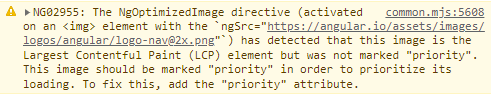
This example shows you how it detects which image is the priority image. So without having to think too much, it displays the warnings to fix various issues, including:
- Add priority if necessary
- Define width and height
- Use sizes
- Oversized images / Bad aspect ratio / Bad image density
How NgOptimizedImage Helps
In order to understand the features, you need to look at the three core aspects the module helps with.
Let’s dig in.
1. Resource Contention
By default, all images are requested at the same time “stealing bandwidth” from each other. Here is how you fix that.
Use the image directive. Now by default, all images are lazy loaded. However, as you can see from the warning above, images that are immediately shown (without having to scroll) should be set to
priority. This basically sets theloadingtoeagerand setsfetchprioritytohighfor the LCP image. This alone will knock off seconds.<img ngSrc="someimage.jpg" priority>Under the hood
<img src="someimage.jpg" loading="eager" fetchpriority="high" alt="some image">
2. Resource Load Delay
In order to prevent the browser from having to look up the DNS for externally hosted images, get that initial connection with a handshake and securely negotiate with the server, you can pre-connect to domains you know the website will eventually connect to. This prevents any delay in connecting to the images.
All images that are not priority need to be lazy loaded, and all external sources need to use preconnect. Besides loading everything at once, it preloads what it needs to and pre-connects
to the servers. This works well with Resource Contention.
3. Resource Time Delay
This is the time it actually takes to download the image, whenever you decide to download it. You may not always want the largest version of the image, as a big image could take 2 secs. All you have to do is define the sizes attribute, and
NgOptimizedImage will automatically generate the srcset for you!
However, some CDNs have even more capabilities. This directive allows you to use the provider’s optimal settings with your image including using Cloudflare, Cloudinary, ImageKit or Imgix. For example, IMGIX has an auto format flag that requests WebP or AVIF types. You could also write your own Cloud Loader.
Roadmap
- There is a developer preview for
fill, which is available now. This allows you to eliminate width/height and add styles for auto sizing. - Picture tag support
- Auto-generate
preconnectlink tags
The best practices are constantly changing. With the ngOptimizedImage directive, you no longer have to worry about keeping up with them. This is a big win for Angular users.

Jonathan Gamble
Jonathan Gamble has been an avid web programmer for more than 20 years. He has been building web applications as a hobby since he was 16 years old, and he received a post-bachelor’s in Computer Science from Oregon State. His real passions are language learning and playing rock piano, but he never gets away from coding. Read more from him at https://code.build/.
Related Posts
Comments
All articles
Topics

Latest Stories
in Your Inbox
Subscribe to be the first to get our expert-written articles and tutorials for developers!
All fields are required