# Customizing Tab Items
This article shows how to customize the appearance of the TabControl's tab items.
## Tab Orientation
The orientation of the tab items can be switched using the `TabOrientation` property of `RadTabControl`. The supported orientations are `Horizontal` and `Vertical`. The tabs are oriented horizontally by default.
#### **Setting tab orientation**
```XAML
```

## Items Size
The size and spacing of the RadTabItem elements can be modified using the `Width`, `Height`, `Margin` and `Padding` properties inherited from the `FrameworkElement` base class.
#### **Setting sizing and spacing of tab items**
```XAML
```
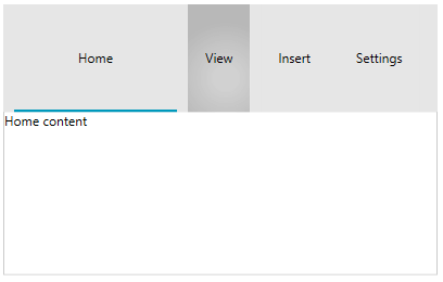
By default setting a Height of a single tab will stretch all tabs in the tabstrip. To change this behavior, set the `AllTabsEqualHeight` property of `RadTabControl` to `false`.
## Item Container Style
The RadTabItem elements can be customized using a single Style object. The Style is applied using the `ItemContainerStyle` property of `RadTabControl`.
#### **Setting ItemContainerStyle**
```XAML
```

The control also provides style selector support via the `ItemContainerStyleSelector` property of `RadTabControl`. Read how to implement a `StyleSelector` in the corresponding [MSDN article](https://docs.microsoft.com/en-us/dotnet/api/system.windows.controls.styleselector?view=netframework-4.5).
## Item Template
The template of the RadTabItems can be customized using the `ItemTemplate` property of `RadTabControl`. The property is useful in case the `ItemsSource` of the control is used (data binding scenario).
The following example shows how to setup a basic model, populate RadTabControl with data and customize the template of the tabs.
#### **Defining tab model**
```C#
public class TabInfo
{
public string Header { get; set; }
public string Content { get; set; }
}
```
#### **Populating the control with data**
```C#
public MyUserControl()
{
InitializeComponent();
this.DataContext = new BindableCollection()
{
new TabInfo() { Header = "Home", Content="Home content" },
new TabInfo() { Header = "Insert", Content="Insert content" },
new TabInfo() { Header = "Settings", Content="Settings content" }
};
}
```
#### **Setting up the ItemTemplate**
```XAML
```

The ItemTemplate is inherited by the `HeaderTemplate` property of each `RadTabItem`. The `HeaderTemplate` property can be used as an alternative of the `ItemTemplate`.
#### **Setting HeaderTemplate**
```XAML
```
The `ItemTemplate` and `HeaderTemplate` have corresponding `DataTemplateSelector` alternatives - the `ItemTemplateSelector` and `HeaderTemplateSelector` properties - that allow you to choose the `DataTemplate` based on a custom condition. Read how to implement a `DataTemplateSelector` in the corresponding [MSDN article](https://docs.microsoft.com/en-us/dotnet/api/system.windows.controls.datatemplateselector?view=netframework-4.5).
> tip The template of the selected tab content can be customized using the [ContentTemplate](https://www.telerik.com/winui/documentation/controls/radtabcontrol/appearance/customizing-selected-tab-content) property of `RadTabControl`.
## Tabstrip Background
To change the background of the area behind the tab items (the [tabstrip](https://www.telerik.com/winui/documentation/controls/radtabcontrol/visual-structure)), set the `HeaderBackground` property of `RadTabControl`.
#### **Setting HeaderBackground**
```XAML
```

## See Also
* [Visual Structure](https://www.telerik.com/winui/documentation/controls/radtabcontrol/visual-structure)
* [Customizing Items Layout](https://www.telerik.com/winui/documentation/controls/radtabcontrol/appearance/customizing-items-layout)
* [Customizing Selected Tab Content](https://www.telerik.com/winui/documentation/controls/radtabcontrol/appearance/customizing-selected-tab-content)