# Ribbon Group
Telerik **RadRibbonView** provides a simple and consistent way for building interfaces similar to the ribbon control used in Microsoft Office. The **RadRibbonView** consists of various elements, one of which is the **Ribbon Group**. This topic discusses concepts fundamental to the **Ribbon Group** at first and then goes into the usage of the **RadRibbonGroup** class and its features.
> tip Before proceeding with this tutorial, it is recommended to get familiar with the [Visual Structure](https://www.telerik.com/winui/documentation/controls/radribbonview/visual-structure) of the **RadRibbonView** control.
## Fundamentals
> tip You can access the **RadRibbonGroup** control through an alias pointing to the **Telerik.UI.Xaml.Controls** namespace: `xmlns:telerik="using:Telerik.UI.Xaml.Controls"`
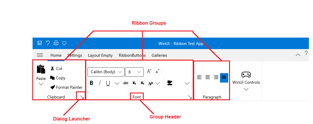
The **RadRibbonView** helps end-users to quickly find the tools and options they need in order to complete a task. Tools and options are organized in **logical groups** that are collected together under specific [tabs](https://www.telerik.com/winui/documentation/controls/radribbonview/ribbon-controls/ribbon-tab). Or in other words: the **Ribbon Group** lets you categorize the commands to be displayed for the end-users.
**Ribbon Groups** are defined into the [Ribbon Tab](https://www.telerik.com/winui/documentation/controls/radribbonview/ribbon-controls/ribbon-tab). A single **Ribbon Tab** usually contains many **Ribbon Groups** to layout its content. Each Ribbon Group may have a **Header** and a **Dialog Launcher**. The **Dialog Launcher** appears in the bottom right corner of the group.
## Adding RadRibbonGroups to the RadRibbonView Control
As it is described in the [Fundamentals](https://www.telerik.com/winui/documentation/controls/radribbonview/ribbon-controls/ribbon-group#radribbonview-ribbon-group-fundamentals) section, various user commands are organized in logical groups that are collected together under specific **RadRibbonTabs**. So the first step before declaring the **RadRibbonGroups** is to add **RadRibbonTabs** to your ribbon control. For more information about how to add ribbon tabs, take a look at the [Ribbon Tab](https://www.telerik.com/winui/documentation/controls/radribbonview/ribbon-controls/ribbon-tab) topic.
Adding **RadRibbonGroups** is done through the **RadRibbonTab**'s **Items** property. The next example shows how to add several **RadRibbonGroups** and how to set their **Header** property.
#### **Example 1: Adding RadRibbonGroups**
```XAML
```
## Adding Content to the RadRibbonGroups
You already learned how to [set](https://www.telerik.com/winui/documentation/controls/radribbonview/ribbon-controls/ribbon-group#adding-radribbongroups-to-the-radribbonview-control) the **Header** property. Now it's time to add some content to the **RadRibbonGroup**. You should do this using the **RadRibbonGroup**'s **Items** property. The next example shows you how to build the "Clipboard" **RadRibbonGroup**.
#### **Example 2: Adding Content to RadRibbonGroups**
```XAML
```
## Enabling the Dialog Launcher
Any group can have a dialog launcher button which appears in the bottom right corner of the group. By default the dialog launcher is not visible. In order to enable it you should set the **RadRibbonGroup**'s **DialogLauncherVisibility** property to **Visibility.Visible**.
#### **Example 3: Enabling DialogLauncher of the RadRibbonGroups**
```XAML
```
> tip The default value of the **RadRibbonGroup**'s **DialogLauncherVisibility** property is **Visibility.Collapsed.**
## Layout Resizing
One of the most important feature of the **RadRibbonGroup** is the **dynamic resizing**. It refers to the ability of the **RadRibbonView** to optimize its layout depending on how much space is available.
Each **RadRibbonGroup** in a **RadRibbonTab** may have four possible sizes (**Variants**):
* **Large**: This is the default size (**Variant**).
> tip The **RadRibbonGroups** assumes their **DefaultVariant** (which by default is **Large**) state whenever they can.
* **Medium**
* **Small**
* **Collapsed**
For more information about the layout resizing mechanism, please refer to the [Resizing](https://www.telerik.com/winui/documentation/controls/radribbonview/features/resizing) topic. Check out the rest of the topic which is entirely dedicated to the **RadRibbonGroup**.
## Specifying Group Variants
Each **RadRibbonGroup** in a **RadRibbonTab** may have four possible sizes (**Variants**): **Large**, **Medium**, **Small** and **Collapsed**. **Collapsed** groups always look the same - only the **Header** and an **image** are shown.
The resizing of the elements is defined per **RadRibbonTab**. The resizing behavior of the tab is defined by setting the **Variant** collection to each of its **RadRibbonGroups** and is based on **priorities**. By default, if no **priorities** are set to the **Variants** of the **RibbonGroups,** they will be resized from **right to left**. In order to customize the order by which the groups will be resized, the developer needs to specify a **Priority** for each of the **RibbonGroup** **Variants**.
For more information and explanations about the **Variants** and **Priorities**, take a look at the [Resizing](https://www.telerik.com/winui/documentation/controls/radribbonview/features/resizing) topic.
## RadRibbonGroup Properties
The **RadRibbonGroup** exposes the following properties that allow you to further customize it:
* **Variant**: A property of type **RibbonGroupVariant** that specify the current active variant.
* **DefaultVariant**: A property of type **RibbonGroupVariant** that gets or sets the default variant for that group.
* **VariantsSource**: An **`IEnumerable`** property that specify that virants source of the group
* **Icon**: A property of type **IconElement** that gets or set the icon of the group in collapsed variant.
* **SeparatorStyle**: A property of type **Style** that gets or sets the separator style.
* **DialogLauncherVisibility**: A property of type Visibility that gets or set the dialog launcher visibility.
* **DialogLauncherCommand**: An **ICommand** property that gets the command that will be executed when the command source is invoked.
* **DialogLauncherCommandParameter**: A property of type **object** that represents a user defined data value that can be passed to the command when it is executed.
* **DialogLauncherCommandTarget**: A property of type **UIElement** that gets or sets the object that the command is being executed on.
## Events
Any group can have a dialog launcher button. When you want to handle the click over this button you should attach to the **RadRibbonGroup**'s **LaunchDialog** event.
#### **Example 4: Subscribing to LaunchDialog Event**
```XAML
...
```
#### **Example 5: LaunchDialog Event Handler**
```C#
private void RadRibbonGroup_LaunchDialog(object sender, Telerik.UI.Xaml.RadRoutedEventArgs e)
{
// custom code
}
```
## See Also
* [RadRibbonGroup](https://www.telerik.com/winui/documentation/controls/radribbonview/ribbon-controls/ribbon-tab)