# Ribbon Gallery
Telerik **RadRibbonView** provides a simple and consistent way for building interfaces similar to the ribbon control used in Microsoft Office. The **RadRibbonView** may consist of various elements, one of which is the **Ribbon Gallery**. This topic discusses concepts fundamental to the **Ribbon Gallery** at first and then goes into the usage of the **RadRibbonGallery** class and its features.
> tip Before proceeding with this tutorial, it is recommended to get familiar with the [Visual Structure](https://www.telerik.com/winui/documentation/controls/radribbonview/visual-structure) of the **RadRibbonView** control.
## Fundamentals
> You can access the **RadGallery/RadRibbonGallery** control through an alias pointing to the **Telerik.UI.Xaml.Controls** namespace: `xmlns:telerik="using:Telerik.UI.Xaml.Controls"`
**Galleries** are simple, but a very powerful and flexible user interface concept. They are basically a scrollable list of items and the idea behind them is that each item shows the result of clicking it visually, rather than a static icon which points its purpose.
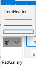
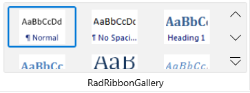
The gallery is always rendered in two ways:
#### **Figure 1: As a Popup inside a RadRibbonDropDownButton or in RadRibbonSplitButton**
#### **Figure 2: Directly into a [Ribbon Group](https://www.telerik.com/winui/documentation/controls/radribbonview/ribbon-controls/ribbon-group)**
> tip When you want to declare a ribbon gallery inside a [RadRibbonDropDownButton](https://www.telerik.com/winui/documentation/controls/radribbonview/ribbon-buttons/dropdown-button)/[RadRibbonSplitButton](https://www.telerik.com/winui/documentation/controls/radribbonview/ribbon-buttons/split-button) use the **RadGallery** class.
> tip When you want to declare a ribbon gallery directly into a [Ribbon Group](https://www.telerik.com/winui/documentation/controls/radribbonview/ribbon-controls/ribbon-group) use the **RadRibbonGallery** class.
The **RadRibbonGallery** is a special type of gallery (it derives from **RadGallery** class), that is designed to be hosted directly in a **RadRibbonControl**. The difference here is that the viewport is constrained to the size of the ribbon itself.
## RadGallery and RadRibbonGallery Properies
### RadGallery
* **ItemHeight**: A property of type double that gets or sets the height of the gallery items.
* **ItemWidth**: A property of type double that gets or sets the width of the gallery items.
* **ViewportWidth**: A property of type double that gets or sets the width of the viewport.
### RadRibbonGallery
* **PopupContent**: A property of type **object** that gets or sets the content to be shown when the Gallery popup is opened.
* **IsOpen**: A **boolean** property that gets or sets if the popup content is open or not.
* **CompressedThreshold**: An **enumeration** property of type **CollapseThreshold** the gets or sets the compressed threshold.
* **Icon**: A property of type **object** that gets or sets icon of the gallery.
* **PopupLaunchButtonVisibility**: A property of type **Visibility** that gets or sets visibility of the popup launch button.
* **IsCompressed**: A **boolean** property that gets a value indicating whether this instance is compressed.
* **PopupMenuItems**: A collection property that gets or sets the popup menu items.
* **PopupViewportWidth**: A property of type **double** that gets or sets the width of the popup viewport.
* **Title**: A property of type **string** that gets or sets the title of the gallery.
* **MoreButtonTitle**: A property of type **string** that gets or sets the title of the MoreButton.
* **UpDownButtonTitle**: A property of type **string** that gets or sets the UpDownButton title.
* **PopupViewportHeight**: A property of type **double** that gets or sets the height of the popup.
## Adding Ribbon Galleries to a RadRibbonView Control
Ribbon gallery can be always rendered in two ways - inside a [RadRibbonDropDownButton](https://www.telerik.com/winui/documentation/controls/radribbonview/ribbon-buttons/dropdown-button)/[RadRibbonSplitButton](https://www.telerik.com/winui/documentation/controls/radribbonview/ribbon-buttons/split-button) or directly into a [Ribbon Group](https://www.telerik.com/winui/documentation/controls/radribbonview/ribbon-controls/ribbon-group).
### Adding RadGallery Inside a RadRibbonDropDownButton/RadRibbonSplitButton
When you want to declare a **Ribbon Gallery** as popup inside a [RadRibbonDropDownButton](https://www.telerik.com/winui/documentation/controls/radribbonview/ribbon-buttons/dropdown-button)/[RadRibbonSplitButton](https://www.telerik.com/winui/documentation/controls/radribbonview/ribbon-buttons/split-button), you should use the **RadGallery** class. The next example demonstrates how to do that.
#### **Example 1: Adding RadGallery**
```XAML
```
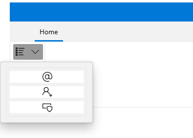
Note that when you use the **RadGallery**, you should specify the **ViewportWidth** and **Height** properties. These two properties control the horizontal and vertical size of the content's viewport. On the other hand, the size of the items themselves is controlled by the **ItemWidth** and **ItemHeight** properties. The result from the example is shown on the next two snapshots.
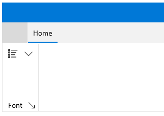
When you press the popup launch button, the gallery is shown:
### Adding RadRibbonGallery Directly Into a Ribbon Group
When you want to declare a **Ribbon Gallery** directly into a [Ribbon Group](https://www.telerik.com/winui/documentation/controls/radribbonview/ribbon-controls/ribbon-group), you should use the **RadRibbonGallery** class. Consider again the previous example, add an additional **RadRibbonGroup** and declare a **RadRibbonGallery** like in the example below.
#### **Example 2: Adding RadGallery**
```XAML
```
> tip While the items are hosted in the ribbon, you could **page up/down** smoothly using the buttons beside the gallery.
## Adding Additional Content to RadGallery
The **RadGallery** allows you to place in the popup additional menu options regarding the gallery. For that purpose you could use the **ListView** control.
The next code snippet demonstrates how to add additional menu items.
#### **Example 3: Adding Content to RadGallery**
```XAML
```
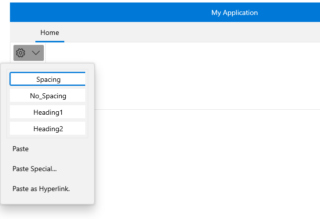
## Adding Additional Content to the RadRibbonGallery
You could also associate additional menu options with the **RadRibbonGallery** popup. In contrast to the **RadGallery** class, here the **RadRibbonGallery** exposes a special property for that purpose: **PopupMenuItems**.
In the next example several **RadMenuItem** objects are added to the **RadRibbonGallery**'s **PopupMenuItems** collection.
#### **Example 4: Adding Content to RadRibbonGallery**
```XAML
```
## Group RadRibbonGalleryItems
You can visually group the **RadRibbonGallery** items when the gallery is in open state. You can do that by defining some of the **RadRibbonGalleryItems** as headers through the **IsHeader** bool property.
However, in order to properly display header items in the **RadRibbonGallery**, you need to change its default **ItemsPanel** to a **RibbonGalleryPanel**:
> You can access the **RibbonGalleryPanel** control through an alias pointing to the **Telerik.UI.Xaml.Controls** namespace: `xmlns:telerikRibbonViewPrimitives="using:Telerik.UI.Xaml.Controls.RibbonView.Primitives"`
#### **Example 5: Group RadRibbonGalleryItems**
```XAML
```
## Setting RadRibbonGallery's PopupLaunchButtonVisibility
The **RadRibbonGallery** class allows you to set the visibility of the launch popup button. The next example shows you how to set the **RadRibbonGallery**'s **PopupLaunchButtonVisibility** property to **Visibility.Collapsed**.
#### **Example 6: Setting PopupLaunchButtonVisibility Property**
```XAML
...
```
## Events
The **RadGallery** class exposes two events: **ActivatePreview** and **DeactivatePreview**.
* **ActivatePreview**: This event is raised when the mouse cursor is over the gallery item.
* **DeactivatePreview**: This event is raised when the mouse cursor leaves the gallery item.
> tip Since the **RadRibbonGallery** inherits the **RadGallery** class, you can handle the **ActivatePreview** and **DeactivatePreview** events in the **RadRibbonGallery** control as well.
For a full list of the exposed by the **RadRibbonView** events, take a look at the [Events - Overview](https://www.telerik.com/winui/documentation/controls/radribbonview/events-overview) topic.
## See Also
* [Selection](https://www.telerik.com/winui/documentation/controls/radribbonview/features/selection)
* [Resizing](https://www.telerik.com/winui/documentation/controls/radribbonview/features/resizing)
* [Minimization](https://www.telerik.com/winui/documentation/controls/radribbonview/features/minimization)