# Ribbon Backstage
Telerik **RadRibbonView** provides a simple and consistent way for building interfaces similar to the ribbon control used in Microsoft Office. The new **Ribbon** **Backstage** control allows you to achieve a more native Office look and feel of your application.
> tip Before proceeding with this tutorial, it is recommended to get familiar with the [Visual Structure](https://www.telerik.com/winui/documentation/controls/radribbonview/visual-structure) of the **RadRibbonView** control.
## Fundamentals
> You can access the **RadRibbonBackstage** control through an alias pointing to the **Telerik.UI.Xaml.Controls** namespace: `xmlns:telerik="using:Telerik.UI.Xaml.Controls"`
The **RibbonBackstage** appears when a user **clicks** the **Application Button**. It can be used to display controls or perform actions on the entire document, like **Save**, **Print** and **Send**. The **RibbonBackstage** can also provide a list of recent documents, access to application options for changing user settings and preferences, and application exit.
By default the **Backstage** isn't opened. In order to control its state you can set the **RadRibbonView**'s **IsBackstageOpen** property.
#### **Example 1: Set the IsBackstageOpen property**
```XAML
...
```
## Adding RadRibbonBackstage and RadRibbonBackstageItems to the RadRibbonView
In order to add a backstage to your **RadRibbonView** control you need to set the **RadRibbonView**'s **Backstage** property. The next several code-snippets show you how to do that in XAML, as well as in the code-behind.
#### **Example 2: Declaring RadRibbonBackstage in XAML**
```XAML
```
#### **Example 3: Declaring RadRibbonBackstage in code-behind**
```C#
public MyUserControl()
{
this.InitializeComponent();
this.radRibbonView.Backstage = new RadRibbonBackstage();
}
```
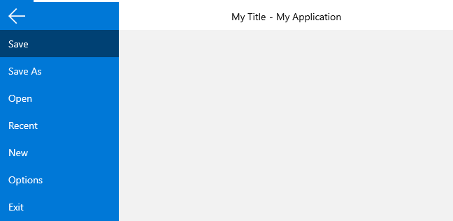
Now we can go ahead and add some items to the backstage menu.
#### **Example 4: Adding RadRibbonBackstageItems**
```XAML
```
#### **Figure 1: RadRibbonBackstage appearance**
## RadRibbonBackstageItem Properties
The **RadBackstageItem** exposes the following properties that allow you to further customize it:
* **IsSelectable**: Specifies whether an item can be selected. If you set this property to **False**, the item will behave like a **Button**.
> If the **BackstageItem** **IsSelectable** property is set to **False**, you will be able to take advantage of the **Click()** event of the item, as well as its **Command** property.
* **IsDefault**: Specifies whether the item should be selected when the **Backstage** is opened.
> Please note that if you set the **IsDefault** property of multiple **BackstageItems** to **True**, the last one marked as default will be selected.
* **IsGroupSeparator**: Specifies whether an item is a group separator. Such items are used as a heading in order to differentiate a logical group of **BackstageItems**.
* **Icon**: A property of type **IconElement** that gets or sets **BackstageItem** icon.
* **ShowWindowTitleInContent**: A property of type **bool** that gets or sets a value indicating whether the **WindowTitle** will be shown in the Content of the backstage item.
* **CloseOnClick**: Specifies whether the **Backstage** will be closed when the item is clicked.
> If the **BackstageItem** is not selectable the **CloseOnClick** property is set to **True** by default. However, if the item is selectable, then the **CloseOnClick** property won't affect its behavior.
## See Also
* [Selection](https://www.telerik.com/winui/documentation/controls/radribbonview/features/selection)
* [Resizing](https://www.telerik.com/winui/documentation/controls/radribbonview/features/resizing)
* [Minimization](https://www.telerik.com/winui/documentation/controls/radribbonview/features/minimization)