# Ribbon RadioButton

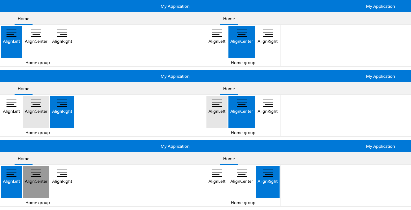
The **RadRibbonRadioButton** represents an extension of the **Microsoft.UI.Xaml.Controls.RadioButton**. It provides an easier interaction with the **RadRibbonView** control. What is special about the **RadRibbonRadioButton** is that it has two states: checked and unchecked. To switch between these states just click on it. Adding several **RadRibbonRadioButtons** to a **RadRibbonGroup** allows you to have only one checked at a time.

> Note that once the button has been checked, it stays in the checked state unless another radio button in the same **RadRibbonGroup** is clicked. If the button is used alone, it can be unchecked after it has been selected once.

**Example 1** demonstrates how we can declare RadRibbonRadioButton in XAML.

> You can access the **RadRibbonRadioButton** control through an alias pointing to the **Telerik.UI.Xaml.Controls** namespace: `xmlns:telerik="using:Telerik.UI.Xaml.Controls"`

#### **Example 1: Declare RibbonRadioButton**

```XAML
<telerik:RadRibbonView>
	<telerik:RadRibbonTab Header="Home">
		<telerik:RadRibbonGroup Header="Home group"  >
			<telerik:RadRibbonGroup.Variants>
				<ribbonView:GroupVariant Variant="Small"/>
				<ribbonView:GroupVariant Variant="Medium"/>
				<ribbonView:GroupVariant Variant="Large"/>
			</telerik:RadRibbonGroup.Variants>
			<telerik:RadRibbonRadioButton CollapseToSmall="WhenGroupIsSmall"
									CollapseToMedium="WhenGroupIsMedium"
									IsAutoSize="True" 
									Size="Large" 
									Text="AlignLeft" >
						<telerik:RadRibbonRadioButton.SmallIcon>
							<SymbolIcon Symbol="AlignLeft"/>
				</telerik:RadRibbonRadioButton.SmallIcon>
						<telerik:RadRibbonRadioButton.LargeIcon>
							<SymbolIcon Symbol="AlignLeft"/>
				</telerik:RadRibbonRadioButton.LargeIcon>
			</telerik:RadRibbonRadioButton>
		</telerik:RadRibbonGroup>
	</telerik:RadRibbonTab>
</telerik:RadRibbonView> 
```

> tip As all buttons in the RadRibbonView's set slightly expose the same functionality, take a look at the [Overview](https://www.telerik.com/winui/documentation/controls/radribbonview/ribbon-buttons/overview) topic.

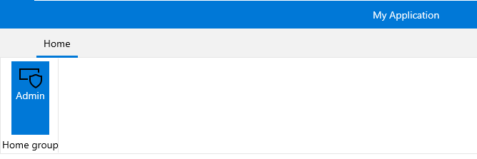
This button has its initial size set to **Large** and its text label set to **"Admin"**. As the **IsAutoSize** property is set to **True**, the button will change its size depending on the **RadRibbonGroup's** size.
![WinUI RadRibbonView ](https://www.telerik.com/winui/documentation/assets/d267cfc49a2aaebd2294e8520961a9d8/ribbonview_buttons_radiobutton.png)

Here is an example of a **RadRibbonGroup** that contains two **RadRibbonRadioButtons**.

#### **Example 2: Create RibbonGroup with two RibbonRadioButtons**

```XAML
<telerik:RadRibbonView>
	<telerik:RadRibbonTab Header="Home">
		<telerik:RadRibbonGroup Header="Home group"  >
			<telerik:RadRibbonGroup.Variants>
				<ribbonView:GroupVariant Variant="Small"/>
				<ribbonView:GroupVariant Variant="Medium"/>
				<ribbonView:GroupVariant Variant="Large"/>
			</telerik:RadRibbonGroup.Variants>
			<telerik:RadRibbonRadioButton CollapseToSmall="WhenGroupIsSmall"
									CollapseToMedium="WhenGroupIsMedium"
									IsAutoSize="True" 
									Size="Large" 
									Text="AlignLeft" >
						<telerik:RadRibbonRadioButton.SmallIcon>
							<SymbolIcon Symbol="AlignLeft"/>
				</telerik:RadRibbonRadioButton.SmallIcon>
						<telerik:RadRibbonRadioButton.LargeIcon>
							<SymbolIcon Symbol="AlignLeft"/>
				</telerik:RadRibbonRadioButton.LargeIcon>
			</telerik:RadRibbonRadioButton>
			<telerik:RadRibbonRadioButton CollapseToSmall="WhenGroupIsSmall"
							CollapseToMedium="WhenGroupIsMedium"
							IsAutoSize="True" 
							Size="Large" 
							Text="AlignCenter" >
				<telerik:RadRibbonRadioButton.SmallIcon>
					<SymbolIcon Symbol="AlignCenter"/>
				</telerik:RadRibbonRadioButton.SmallIcon>
				<telerik:RadRibbonRadioButton.LargeIcon>
					<SymbolIcon Symbol="AlignCenter"/>
				</telerik:RadRibbonRadioButton.LargeIcon>
			</telerik:RadRibbonRadioButton>
			<telerik:RadRibbonRadioButton CollapseToSmall="WhenGroupIsSmall"
							CollapseToMedium="WhenGroupIsMedium"
							IsAutoSize="True" 
							Size="Large" 
							Text="AlignRight" >
				<telerik:RadRibbonRadioButton.SmallIcon>
					<SymbolIcon Symbol="AlignRight"/>
				</telerik:RadRibbonRadioButton.SmallIcon>
				<telerik:RadRibbonRadioButton.LargeIcon>
					<SymbolIcon Symbol="AlignRight"/>
				</telerik:RadRibbonRadioButton.LargeIcon>
			</telerik:RadRibbonRadioButton>
		</telerik:RadRibbonGroup>
	</telerik:RadRibbonTab>
</telerik:RadRibbonView>
```

![WinUI RadRibbonView ](https://www.telerik.com/winui/documentation/assets/440035fccc73cafc57686876453a56fc/ribbonview_buttons_radiobuttonsgroup.gif)

## Handling Changes in the Button's Checked State

Besides the **Click** event, the **RadRibbonRadioButton** control exposes two additional events - **Checked** and **Unchecked.** They are meant to notify for changes in the checked state of the radio button.

#### **Example 2: Subscribe to Checked/UnChecked event of the RadRibbonRadioButton**

```XAML
<telerik:RadRibbonRadioButton Checked="RadRibbonRadioButton_Checked"
							  Unchecked="RadRibbonRadioButton_Unchecked" />
```

#### **Example 3: Checked/UnChecked event handler**

```C#
private void RadRibbonRadioButton_Checked(object sender, RoutedEventArgs e)
{
}
private void RadRibbonRadioButton_Unchecked(object sender, RoutedEventArgs e)
{
}
```

## See Also

* [RadRibbonToggleButton](https://www.telerik.com/winui/documentation/controls/radribbonview/ribbon-buttons/toggle-button)