# Ribbon DropDownButton

The **RadRibbonDropDownButton** represents an extension of the **RadDropDownButton**. It provides an easier interaction with the **RadRibbonView** control. What is special about the **RadRibbonDropDownButton** is that upon activation it can display a flyout area. Content of any kind can be nested inside the flyout area.

> You can access the **RadRibbonDropDownButton** control through an alias pointing to the **Telerik.UI.Xaml.Controls** namespace: `xmlns:telerik="using:Telerik.UI.Xaml.Controls"`

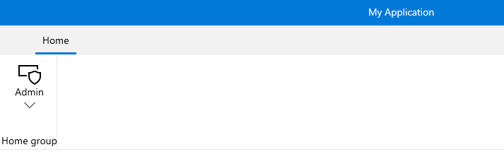
Here is a sample definition of a **RadRibbonDropDownButton** without having any drop down content defined:

#### **Example 1: Simple definition of RibbonDropDownButton**

```XAML
<telerik:RadRibbonView>
	<telerik:RadRibbonTab Header="Home">
		<telerik:RadRibbonGroup Header="Home group"  >
			<telerik:RadRibbonGroup.Variants>
				<ribbonView:GroupVariant Variant="Small"/>
				<ribbonView:GroupVariant Variant="Medium"/>
				<ribbonView:GroupVariant Variant="Large"/>
			</telerik:RadRibbonGroup.Variants>
			<telerik:RadRibbonDropDownButton CollapseToSmall="WhenGroupIsSmall"
								CollapseToMedium="WhenGroupIsMedium"
								IsAutoSize="True" 
								Size="Large" 
								Text="Admin" >
				<telerik:RadRibbonDropDownButton.SmallIcon>
					<SymbolIcon Symbol="Admin"/>
				</telerik:RadRibbonDropDownButton.SmallIcon>
				<telerik:RadRibbonDropDownButton.LargeIcon>
					<SymbolIcon Symbol="Admin"/>
				</telerik:RadRibbonDropDownButton.LargeIcon>
			</telerik:RadRibbonDropDownButton>
		</telerik:RadRibbonGroup>
	</telerik:RadRibbonTab>
</telerik:RadRibbonView>	
```

> tip As all buttons in the RadRibbonView's set slightly expose the same functionality, take a look at the [Overview](https://www.telerik.com/winui/documentation/controls/radribbonview/ribbon-buttons/overview) topic.
![WinUI RadRibbonView ](https://www.telerik.com/winui/documentation/assets/0503920d0e74280ea09ff2e0460bf06a/ribbonview_buttons_dropdownbutton.png)

## Setting the Flyout Content

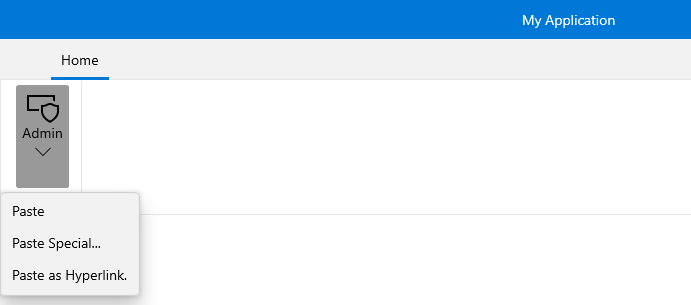
To set the popup content you have to simply set the **Flyout** property of the button. Here is an example of a **RadRibbonDropDownButton** with three menu items inside its drop down.

#### **Example 2: Setting the Flyout Content**

```XAML
<telerik:RadRibbonView>
	<telerik:RadRibbonTab Header="Home">
		<telerik:RadRibbonGroup Header="Home group"  >
			<telerik:RadRibbonGroup.Variants>
				<ribbonView:GroupVariant Variant="Small"/>
				<ribbonView:GroupVariant Variant="Medium"/>
				<ribbonView:GroupVariant Variant="Large"/>
			</telerik:RadRibbonGroup.Variants>
			<telerik:RadRibbonDropDownButton CollapseToSmall="WhenGroupIsSmall"
								CollapseToMedium="WhenGroupIsMedium"
								IsAutoSize="True" 
								Size="Large" 
								Text="Admin" >
				<telerik:RadRibbonDropDownButton.SmallIcon>
					<SymbolIcon Symbol="Admin"/>
				</telerik:RadRibbonDropDownButton.SmallIcon>
				<telerik:RadRibbonDropDownButton.LargeIcon>
					<SymbolIcon Symbol="Admin"/>
				</telerik:RadRibbonDropDownButton.LargeIcon>
				<telerik:RadRibbonDropDownButton.Flyout>
					<MenuFlyout>
						<MenuFlyoutItem Text="Paste"  />
						<MenuFlyoutItem Text="Paste Special..." />
						<MenuFlyoutItem Text="Paste as Hyperlink."  />
					</MenuFlyout>
				</telerik:RadRibbonDropDownButton.Flyout>
			</telerik:RadRibbonDropDownButton>
		</telerik:RadRibbonGroup>
	</telerik:RadRibbonTab>
</telerik:RadRibbonView>
```

![WinUI RadRibbonView ](https://www.telerik.com/winui/documentation/assets/6c35ef881db4d355b96eb8253c2bc633/ribbonview_buttons_dropdownbutton_ddcontent.png)

## See Also

* [RadRibbonSplitButton](https://www.telerik.com/winui/documentation/controls/radribbonview/ribbon-buttons/split-button)