# ToolTip Customization

By default, the **RadRadialMenu**'s tooltip displays the header content of the currently hovered menu item. There are two ways to customize the tooltip:

* On a per-item basis via the **ToolTipContent** of the **RadialMenuItem**. This will change only the content of the tooltip.
* Globally for all items in the menu using implicit **Style**.

The tooltip visibility is controlled by the **ShowToolTip** property of the **RadRadialMenu** control.

## Example of Using the ToolTipContent Property

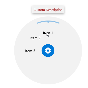
This example demonstrates how to customize the content of the tooltip using the **ToolTipContent** property.

> You can access the RadRadialMenu control through an alias pointing to the Telerik.UI.Xaml.Controls.Navigation namespace: xmlns:navigation="using:Telerik.UI.Xaml.Controls.Navigation"

#### **Example 1: Custom ToolTipContent**

```XAML
<navigation:RadRadialMenu ShowToolTip="True">
	<navigation:RadialMenuItem Header="Item 1">
		<navigation:RadialMenuItem.ToolTipContent>
			<TextBlock Text="Custom Description" FontFamily="Segoe UI Symbol" Foreground="Brown"/>
		</navigation:RadialMenuItem.ToolTipContent>
	</navigation:RadialMenuItem>
	<navigation:RadialMenuItem Header="Item 2">
		<navigation:RadialMenuItem.ToolTipContent>
			<TextBlock Text="Custom Description 2" FontFamily="Segoe UI Symbol" Foreground="Brown"/>
		</navigation:RadialMenuItem.ToolTipContent>
	</navigation:RadialMenuItem>
	<navigation:RadialMenuItem Header="Item 2">
		<navigation:RadialMenuItem.ToolTipContent>
			<TextBlock Text="Custom Description 3" FontFamily="Segoe UI Symbol" Foreground="Brown"/>
		</navigation:RadialMenuItem.ToolTipContent>
	</navigation:RadialMenuItem>
</navigation:RadRadialMenu>
```

Here is the result:

![WinUI RadRadialMenu Radial Menu-Tool Tip Content](https://www.telerik.com/winui/documentation/assets/a84a35612b3513c3db5f8d45606ccd49/radialmenu-tooltipcontent.png)

## Example of Using Implicit Style

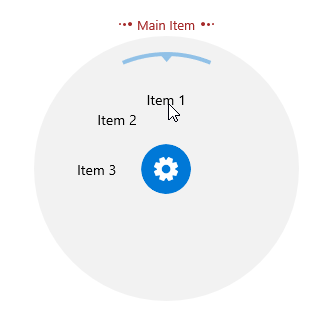
This example demonstrates how to customize the whole tooltip. In the **Resources** of the **RadRadialMenu** control you have to define an implicit style that targets the **MenuToolTip** type. You can still use the **ToolTipContent** and **Header** properties of the items if you set a **TemplateBinding** to the **Content** property in the tooltip style.

#### **Example 2: Custom ToolTip Style**

```XAML
<navigation:RadRadialMenu ShowToolTip="True">
	<navigation:RadRadialMenu.Resources>
		<Style TargetType="telerikPrimitivesMenu:MenuToolTip">
			<Setter Property="Transitions">
				<Setter.Value>
					<TransitionCollection>
						<PopupThemeTransition/>
					</TransitionCollection>
				</Setter.Value>
			</Setter>
			<Setter Property="Template">
				<Setter.Value>
					<ControlTemplate TargetType="telerikPrimitivesMenu:MenuToolTip">
						<StackPanel Orientation="Horizontal" Margin="3">
							<Ellipse Width="2" Height="2" Fill="Brown" Margin="1"/>
							<Ellipse Width="3" Height="3" Fill="Brown" Margin="1"/>
							<Ellipse Width="4" Height="4" Fill="Brown" Margin="1"/>
							<TextBlock Text="{TemplateBinding Content}" 
									   VerticalAlignment="Center" HorizontalAlignment="Center" 
									   Foreground="Brown" Margin="4,0,4,0"/>
							<Ellipse Width="4" Height="4" Fill="Brown" Margin="1"/>
							<Ellipse Width="3" Height="3" Fill="Brown" Margin="1"/>
							<Ellipse Width="2" Height="2" Fill="Brown" Margin="1"/>
						</StackPanel>
					</ControlTemplate>
				</Setter.Value>
			</Setter>
		</Style>
	</navigation:RadRadialMenu.Resources>
	<navigation:RadialMenuItem Header="Item 1" ToolTipContent="Main Item"/>
	<navigation:RadialMenuItem Header="Item 2"/>
	<navigation:RadialMenuItem Header="Item 3"/>
</navigation:RadRadialMenu>
```

Here is the result:

![WinUI RadRadialMenu Radial Menu-Tool Tip Style](https://www.telerik.com/winui/documentation/assets/c27b24521017f1c9bc9d0183bc6b4323/radialmenu-tooltipstyle.png)

## See Also

* [Properties and Configuration](https://www.telerik.com/winui/documentation/controls/radradialmenu/features/properties-and-configuration)