# Alignment

You can control the alignment of the **RadExpander** control through the **HorizontalAlignment** and **VerticalAlignment** properties.

Moreover, if you need to further customize RadExpander's **Content** alignment you can take advantage of the **HorizontalContentAlignment** and **VerticalContentAlignment** properties.

And if you want to control the alignment of the header, you can use the **HorizontalHeaderAlignment** and **VerticalHeaderAlignment** properties.

By default all these properties are set to **Stretch** so that the **RadExpander** control takes up all the available space.

> The alignment properties depend on the **ExpandDirection** of the control. Therefore before setting the alignment properties, you should carefully plan how you need to render the control depending on the available area as well as the **ExpandDirection** of the control.

#### **Example 1: Setting ExpandDirection property**

```XAML
<Grid>
	<Grid.RowDefinitions>
		<RowDefinition Height="\*" />
		<RowDefinition Height="\*" />
	</Grid.RowDefinitions>
	<Grid.ColumnDefinitions>
		<ColumnDefinition Width="\*" />
		<ColumnDefinition Width="\*" />
	</Grid.ColumnDefinitions>
	<telerik:RadExpander Grid.Row="0" Grid.Column="0" ExpandDirection="Down" Header="Down">
		<Border BorderBrush="Yellow" BorderThickness="1">
			<Ellipse Width="99" Height="99" Margin="5" Fill="Yellow" />
		</Border>
	</telerik:RadExpander>
	<telerik:RadExpander Grid.Row="0" Grid.Column="1" ExpandDirection="Up" Header="Up">
		<Border BorderBrush="Blue" BorderThickness="1">
			<Ellipse Width="99" Height="99" Margin="5" Fill="Blue" />
		</Border>
	</telerik:RadExpander>
	<telerik:RadExpander Grid.Row="1" Grid.Column="0" ExpandDirection="Right" Header="Right">
		<Border BorderBrush="Red" BorderThickness="1">
			<Ellipse Width="99" Height="99" Margin="5" Fill="Red" />
		</Border>
	</telerik:RadExpander>
	<telerik:RadExpander Grid.Row="1" Grid.Column="1" ExpandDirection="Left" Header="Left">
		<Border BorderBrush="Green" BorderThickness="1">
			<Ellipse Width="99" Height="99" Margin="5" Fill="Green" />
		</Border>
	</telerik:RadExpander>
</Grid>
```

#### Figure 1: RadExpander directions

![WinUI RadExpander RadExpander expand directions](https://www.telerik.com/winui/documentation/assets/1c016df010f4d5b362c5caccb78230dd/radexpander_features_alignment_default.png)

## HorizontalAlignment and VerticalAlignment properties

You can control the vertical and horizontal alignment of the control through the **HorizontalAlignment** and **VerticalAlignment** properties. By default both properties are set to **Stretch**.

However, if you want the control to take up only as much space as it needs, you can define the **VerticalAlignment** and **HorizontalAlignment** properties accordingly to the **ExpandDirection** of the control.

#### **Example 2: Setting HorizontalAlignment and VerticalAlignment properties**

```XAML
<Grid>
	<Grid.RowDefinitions>
		<RowDefinition Height="\*" />
		<RowDefinition Height="\*" />
	</Grid.RowDefinitions>
	<Grid.ColumnDefinitions>
		<ColumnDefinition Width="\*" />
		<ColumnDefinition Width="\*" />
	</Grid.ColumnDefinitions>
	<telerik:RadExpander Grid.Row="0" Grid.Column="0" ExpandDirection="Down" Header="Down" VerticalAlignment="Top">
		<Border BorderBrush="Yellow" BorderThickness="1">
			<Ellipse Width="99" Height="99" Margin="5" Fill="Yellow" />
		</Border>
	</telerik:RadExpander>
	<telerik:RadExpander Grid.Row="0" Grid.Column="1" ExpandDirection="Up" Header="Up" VerticalAlignment="Bottom">
		<Border BorderBrush="Blue" BorderThickness="1">
			<Ellipse Width="99" Height="99" Margin="5" Fill="Blue" />
		</Border>
	</telerik:RadExpander>
	<telerik:RadExpander Grid.Row="1" Grid.Column="0" ExpandDirection="Right" Header="Right" HorizontalAlignment="Left">
		<Border BorderBrush="Red" BorderThickness="1">
			<Ellipse Width="99" Height="99" Margin="5" Fill="Red" />
		</Border>
	</telerik:RadExpander>
	<telerik:RadExpander Grid.Row="1" Grid.Column="1" ExpandDirection="Left" Header="Left" HorizontalAlignment="Right">
		<Border BorderBrush="Green" BorderThickness="1">
			<Ellipse Width="99" Height="99" Margin="5" Fill="Green" />
		</Border>
	</telerik:RadExpander>
</Grid>
```

#### Figure 2: HorizontalAlignment and VerticalAlignment properties visual appearance

![WinUI RadExpander HorizontalAlignment and VerticalAlignment properties visual appearance](https://www.telerik.com/winui/documentation/assets/dd7eba770b15693d7ca89a9fc489c299/radexpander_features_vertical_horizontalalignment_shrink.png)

> Please note that when the **VerticalAlignment**/**HorizontalAlignment** properties match the **ExpandDirection**, the **Header** will move aside as the content is expanded.

## HorizontalContentAlignment and VerticalContentAlignment properties

Similarly, you can use the **HorizontalContentAlignment** and **VerticalContentAlignment** properties to control how the RadExpander's **Content** will be rendered.

## HorizontalHeaderAlignment and VerticalHeaderAlignment properties

You can also control how to render the RadExpander's **Header** through the **HorizontalHeaderAlignment** and **VerticalHeaderAlignment** properties.

#### **Example 4: Setting HorizontalHeaderAlignment property**

```XAML
<Grid>
	<Grid.ColumnDefinitions>
		<ColumnDefinition Width="*" />
		<ColumnDefinition Width="*" />
	</Grid.ColumnDefinitions>
	<telerik:RadExpander Grid.Column="0" ExpandDirection="Down" HorizontalHeaderAlignment="Center">
		<telerik:RadExpander.Header>
			<Border Background="LightYellow">
				<TextBlock Text="Down" FontWeight="Bold" />
			</Border>
		</telerik:RadExpander.Header>
		<Border BorderBrush="Yellow" BorderThickness="1">
			<Ellipse Width="99" Height="99" Margin="5" Fill="Yellow" />
		</Border>
	</telerik:RadExpander>
	<telerik:RadExpander Grid.Column="1" ExpandDirection="Up" HorizontalHeaderAlignment="Right">
		<telerik:RadExpander.Header>
			<Border Background="LightBlue">
				<TextBlock Text="Up" FontWeight="Bold" />
			</Border>
		</telerik:RadExpander.Header>
		<Border BorderBrush="Blue" BorderThickness="1">
			<StackPanel Orientation="Vertical">
				<Ellipse Width="99" Height="99" Margin="5" Fill="Blue" />
			</StackPanel>
		</Border>
	</telerik:RadExpander>
</Grid>
```

#### Figure 3: HorizontalHeaderAlignment with ExpandDirection set to Down and Up

![WinUI RadExpander HorizontalHeaderAlignment with ExpandDirection set to Down and Up](https://www.telerik.com/winui/documentation/assets/a1df1bccc1a71edaf246fa8a3e05b7c8/radexpander_features_alignment_horizontalheaderalignment.png)

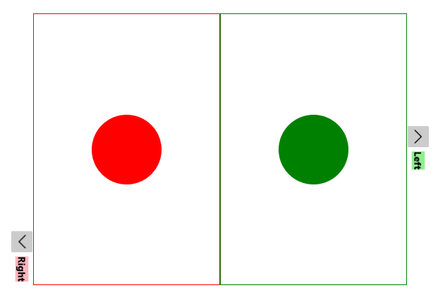
#### Figure 4: HorizontalHeaderAlignment with ExpandDirection set to Right and Left
![WinUI RadExpander HorizontalHeaderAlignment with ExpandDirection set to Right and Left](https://www.telerik.com/winui/documentation/assets/95c8bd4285cd36188ea7498269d4b789/radexpander_features_alignment_verticalheader.png)

## See Also

* [Getting Started](https://www.telerik.com/winui/documentation/controls/radexpander/getting-started)
* [Expand Direction](https://www.telerik.com/winui/documentation/controls/radexpander/features/expand-direction)
