# Input Modes
This **RadDateTimePicker** fully replaces the functionality of the **RadTimePicker** and **RadDatePicker** controls. When you use a **RadDateTimePicker** control you might want to specify that you need to use the calendar or the clock independently.
This behavior can be controlled via the **InputMode** property. The default value gives you both the calendar and the clock views. There are three input modes that correspond to these scenarios:
* **DatePicker**: With this input mode your **RadDateTimePicker** control will show only the calendar view.
* **TimePicker**: This input mode lets your **RadDateTimePicker** control show only the clock view.
* **DateTimePicker**: This input mode is the default one and will visualize both the calendar and the clock views.
> You can access the RadDateTimePicker control through an alias pointing to the Telerik.UI.Xaml.Controls.Input namespace: xmlns:input="using:Telerik.UI.Xaml.Controls.Input"
You can change the value of this property in XAML as shown in this snippet:
#### **Example 1**
```XAML
```
Here is the result:
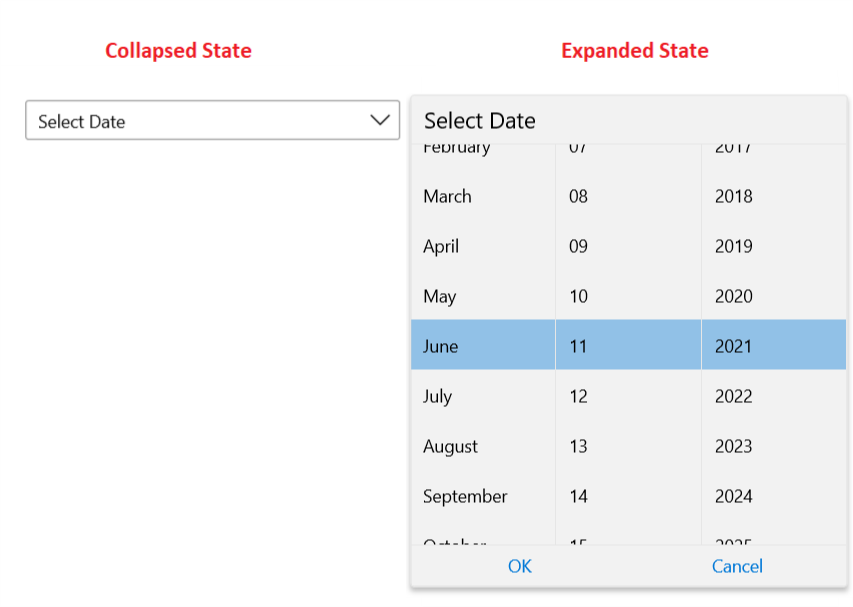
Similarly if you decide to have only the time picker you can choose the TimePicker input mode:
#### **Example 2**
```XAML
```
This leads to the following result:

## See Also
* [Overview](https://www.telerik.com/winui/documentation/controls/raddatetimepicker/overview)
* [Visual Structure](https://www.telerik.com/winui/documentation/controls/raddatetimepicker/visual-structure)