# Customizing Data Fields

The DataForm provides flexible API for customizing the UI of its data fields.

The component allows you to replace the automatically created panel with [data fields](https://www.telerik.com/winui/documentation/controls/raddataform/data-fields) and also the labels of the fields.

## Custom Style

You can customize the auto-generated data fields by using the `DataFieldStyle` property of the DataForm.

#### **Set the DataFieldStyle**

```XAML
<telerik:RadDataForm>
	<telerik:RadDataForm.DataFieldStyle>
		<Style TargetType="telerik:DataFormDataField">
			<Setter Property="Foreground" Value="#F5CC84" />
			<Setter Property="LabelTemplate">
				<Setter.Value>
					<DataTemplate>
						<TextBlock Text="{Binding}" FontWeight="Bold" FontStyle="Italic"/>
					</DataTemplate>
				</Setter.Value>
			</Setter>
		</Style>
	</telerik:RadDataForm.DataFieldStyle>
</telerik:RadDataForm>
```

**Data Fields with Custom Style**

![WinUI RadDataForm ](https://www.telerik.com/winui/documentation/assets/4cf1b35e9bc0fd499f03769c8e8984c3/dataform-appearance-customizing-data-fields-3.png)

## Custom Content

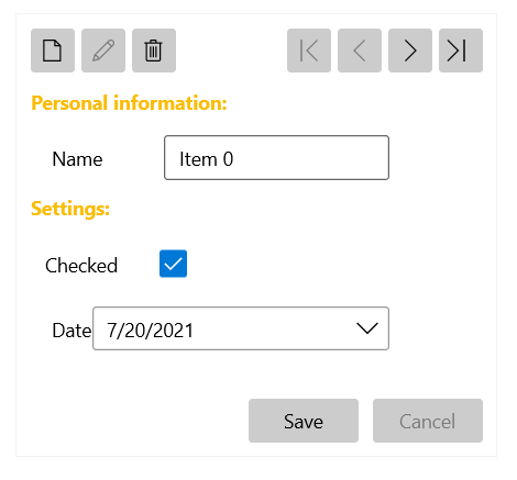
To control the UI of each DataForm page, set the `ReadOnlyTemplate` and `EditTemplate` properties. The `ReadOnlyTemplate` is used when the component is in its normal state and the `EditTemplate` is used when the current item is in edit mode.

You can also replace the content of the DataForm when adding a new item by setting the `NewItemTemplate` property in the same manner as `ReadOnlyTemplate` and `EditTemplate`.

The following example shows a possible way to use the `ReadOnlyTemplate` and `EditTemplate` properties.

#### **Set ReadOnlyTemplate and EditTemplate**

```XAML
<telerik:RadDataForm AutoGenerateFields="False">
	<telerik:RadDataForm.ReadOnlyTemplate>
		<DataTemplate>
			<StackPanel>
				<TextBlock Text="Personal information:" FontWeight="Bold" Margin="0 10 0 0" Foreground="#d1cab8"/>
				<telerik:DataFormDataField Margin="15 0 0 0" Label="Name" LabelPosition="Beside" IsReadOnly="True" DataMemberBinding="{Binding Name, Mode=TwoWay}" />
				<TextBlock Text="Settings:" FontWeight="Bold" Margin="0 10 0 0" Foreground="#d1cab8"/>
				<telerik:DataFormCheckBoxField  Margin="10 0 0 0" Label="Checked" IsReadOnly="True" LabelPosition="Beside" DataMemberBinding="{Binding IsChecked, Mode=TwoWay}" />
				<telerik:DataFormDateField Margin="15 0 0 0" Label="Date" IsReadOnly="True" LabelPosition="Beside" DataMemberBinding="{Binding Date, Mode=TwoWay}" />
			</StackPanel>
		</DataTemplate>
	</telerik:RadDataForm.ReadOnlyTemplate>
	<telerik:RadDataForm.EditTemplate>
		<DataTemplate>
			<StackPanel>
				<TextBlock Text="Personal information:" FontWeight="Bold" Margin="0 10 0 0" Foreground="#FBBC05"/>
				<telerik:DataFormDataField Margin="15 0 0 0" Label="Name" LabelPosition="Beside" DataMemberBinding="{Binding Name, Mode=TwoWay}" />
				<TextBlock Text="Settings:" FontWeight="Bold" Margin="0 10 0 0" Foreground="#FBBC05"/>
				<telerik:DataFormCheckBoxField  Margin="10 0 0 0" Label="Checked" LabelPosition="Beside" DataMemberBinding="{Binding IsChecked, Mode=TwoWay}" />
				<telerik:DataFormDateField Margin="15 0 0 0" Label="Date" LabelPosition="Beside" DataMemberBinding="{Binding Date, Mode=TwoWay}" />
			</StackPanel>
		</DataTemplate>
	</telerik:RadDataForm.EditTemplate>
</telerik:RadDataForm>
```

**DataForm with Dfined ReadOnlyTemplate and EditTemplate**
![WinUI RadDataForm ](https://www.telerik.com/winui/documentation/assets/c5775af1ab9200679dba603a4f0ee9cd/dataform-appearance-customizing-data-fields-0.png)

## Custom Labels

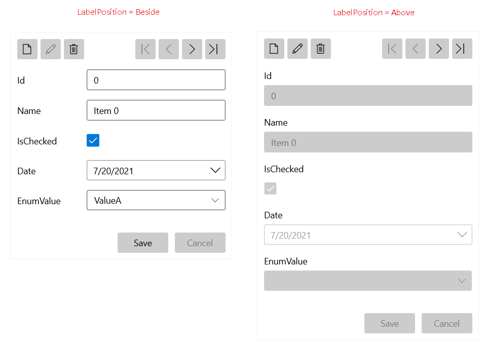
The DataForm allows you to customize the labels of its data fields. To customize all labels in the component globally, set the `LabelPosition` and `LabelStyle` properties. `LabelPosition` accepts the `Above` (default) and `Beside` values.

#### **Set the Label Position**

```XAML
<telerik:RadDataForm LabelPosition="Beside">
```

**DataForm with Defined Label Position**
![WinUI RadDataForm ](https://www.telerik.com/winui/documentation/assets/5ec01af396b73e4c42644e360eaffa7c/dataform-appearance-customizing-data-fields-1.png)

#### **Set the Label Style**

```XAML
<telerik:RadDataForm>
	<telerik:RadDataForm.LabelStyle>
		<Style TargetType="TextBlock">
			<Setter Property="Foreground" Value="Green"/>
		</Style>
	</telerik:RadDataForm.LabelStyle>
</telerik:RadDataForm>
```

To customize a specific label, set the `LabelPosition` and `LabelTemplate` properties of the corresponding `DataFormDataField`.

#### **Set the Label Template**

```XAML
<telerik:DataFormDataField>
	<telerik:DataFormDataField.LabelTemplate>
		<DataTemplate>
			<TextBlock Text="{Binding}" Foreground="Green"/>
		</DataTemplate>
	</telerik:DataFormDataField.LabelTemplate>
</telerik:DataFormDataField>
```

**DataForm with Defined Label Template**

![WinUI RadDataForm ](https://www.telerik.com/winui/documentation/assets/c50d5d80e0c2f6307e1473aa61abc34e/dataform-appearance-customizing-data-fields-2.png)

## See Also

* [Getting Started with the Telerik UI for WinUI DataForm](https://www.telerik.com/winui/documentation/controls/raddataform/getting-started)
* [Visual Structure](https://www.telerik.com/winui/documentation/controls/raddataform/visual-structure)
* [Customizing Buttons](https://www.telerik.com/winui/documentation/controls/raddataform/appearance/customizing-buttons)
