# ToolBar Commands
* [Adding a Command](https://www.telerik.com/winui/documentation/controls/radchat/toolbar-commands#adding-a-command)
* [ToolBarCommandTemplateSelector](https://www.telerik.com/winui/documentation/controls/radchat/toolbar-commands#toolbarcommandtemplateselector)
## Adding a Command
By default, the toolbar of `RadChat` will not be visible. When a `ToolBarCommand` is added to the `ToolBarCommands` collection, the `ToggleButton` for opening the toolbar will appear next to the **Send Button**. The `ToolBarCommand` element exposes the following two properties:
* `Text`: The text Content that will be set to the generated `Button`.
* `Command`: The `ICommand` that is to be executed when clicking the `Button`.
#### **Adding a ToolBarCommand to the ToolBarCommands collection**
```C#
this.chat.ToolBarCommands.Add(new ToolBarCommand() { Text = "Click", Command = new DelegateCommand(MyCommandLogic) });
```
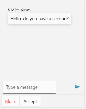
**RadChat with a ToolBarCommand added to the ToolBarCommands collection**

## ToolBarCommandTemplateSelector
RadChat supports defining custom `DataTemplate` for the elements generated in its toolbar. This is done via its `ToolBarCommandTemplateSelector` property. Its conditional logic can be implemented based on the given `ToolBarCommand`.
#### **Defining a custom DataTemplateSelector**
```C#
public class ToolBarCommandTemplateSelector : DataTemplateSelector
{
protected override DataTemplate SelectTemplateCore(object item, DependencyObject container)
{
var toolBarCommand = item as ToolBarCommand;
if (toolBarCommand.Text == "Block")
{
return ClickTemplate;
}
else
{
return this.DefaultTemplate;
}
}
public DataTemplate ClickTemplate { get; set; }
public DataTemplate DefaultTemplate { get; set; }
}
```
Define the custom DataTemplateSelector in XAML.
#### **Adding the ToolBarCommandTemplateSelector**
```XAML
```
Finally, the custom template selector can be set to the `ToolBarCommandTemplateSelector` property of RadChat.
#### **Applying the ToolBarCommandTemplateSelector**
```XAML
```
**RadChat with custom DataTemplateSelector set to the `ToolBarCommandTemplateSelector`**