# Overview

`RadLegendControl` is a stand-alone control that facilitates the reading and understanding of the displayed information in RadChart.

**RadLegendControl Visual Structure**
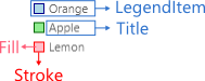
![WinUI RadChart Visual Structure Rad Legend Control](https://www.telerik.com/winui/documentation/assets/20d0d0a12c45f8989154b60c2e509a3d/visualstructureradlegendcontrol.png)

To access the **RadLegendControl**, add the following namespace: `xmlns:telerikPrimitives="using:Telerik.UI.Xaml.Controls.Primitives"`

To setup the legend control, you can use the following properties:

* `LegendProvider`—It accepts an element that implements the `ILegendInfoProvider` interface. The chart controls, like `RadCartesianChart`, implements the interface. The legend uses the provider to get its legend items.

#### **Setting the LegendProvider**

```XAML
<telerikPrimitives:RadLegendControl LegendProvider="{Binding ElementName=chartName}"/>
```

* `ItemsPanel`—The items panel used by the legend to arrange the items.

#### **Setting the ItemsPanel**

```XAML
<telerikPrimitives:RadLegendControl.ItemsPanel>
	<ItemsPanelTemplate>
		<StackPanel/>
	</ItemsPanelTemplate>
</telerikPrimitives:RadLegendControl.ItemsPanel>
```

* `ItemTemplate`—Sets the `DataTemplate` used to define the appearance of the legend items.

#### **Setting the ItemTemplate**

```XAML
<telerikPrimitives:RadLegendControl.ItemTemplate>
	<DataTemplate>
		<StackPanel Orientation="Horizontal">
			<Ellipse Fill="{Binding Fill}" Stroke="{Binding Stroke}" StrokeThickness="1" Width="10" Height="10"/>
			<TextBlock Text="{Binding Title}" Foreground="{Binding Fill}" Margin="10">
			</TextBlock>
		</StackPanel>
	</DataTemplate>
</telerikPrimitives:RadLegendControl.ItemTemplate>
```

* `LegendItems`: A collection of `LegendItem` objects that describes the visuals in the control. It can be used to manually populate the legend with items.

#### **Populating the LegendItems**

```XAML
<telerikPrimitives:RadLegendControl> 
	<telerikPrimitives:RadLegendControl.LegendItems> 
		<telerikPrimitives:LegendItem Fill="#1E98E4" Stroke="#1E98E4" Title="Dogs"/> 
		<telerikPrimitives:LegendItem Fill="#FFC500" Stroke="#FFC500" Title="Cats"/> 
		<telerikPrimitives:LegendItem Fill="#FF2A00" Stroke="#FF2A00" Title="Birds"/> 
	</telerikPrimitives:RadLegendControl.LegendItems> 
</telerikPrimitives:RadLegendControl> 
```

## Populating with LegendItems

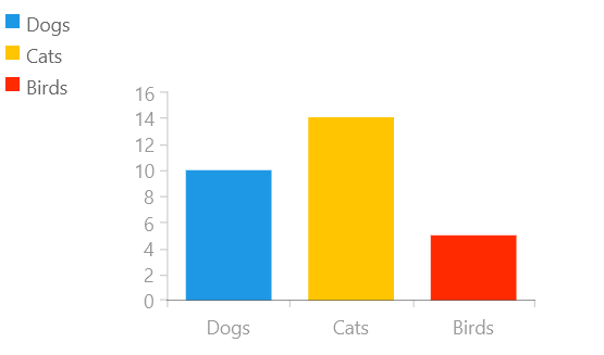
The following example shows how to add a chart and a legend next to it, where the controls are independent from one another.

#### **Defining the model and viewmodel**

```C#
public class CustomPoint
{
	public double Value { get; set; }

	public string Category { get; set; }
}

public class ViewModel
{
	public ViewModel()
	{
		this.SeriesData = new List<CustomPoint>()
		{
			new CustomPoint { Category = "Dogs", Value = 10 },
			new CustomPoint { Category = "Cats", Value = 14 },
			new CustomPoint { Category = "Birds", Value = 5 },
		};
	}

	public List<CustomPoint> SeriesData { get; set; }
}
```

#### **Defining the RadCartesianChart and RadLegendControl**

```XAML
 <Grid xmlns:telerikChart="using:Telerik.UI.Xaml.Controls.Chart"
	   xmlns:telerikPrimitives="using:Telerik.UI.Xaml.Controls.Primitives">
	<telerikChart:RadCartesianChart PaletteName="DefaultLight" Width="300" Height="200">
		<telerikChart:RadCartesianChart.DataContext>
			<local:ViewModel/>
		</telerikChart:RadCartesianChart.DataContext>
		<telerikChart:BarSeries ItemsSource="{Binding SeriesData}" PaletteMode="DataPoint">
			<telerikChart:BarSeries.HorizontalAxis>
				<telerikChart:CategoricalAxis/>
			</telerikChart:BarSeries.HorizontalAxis>
			<telerikChart:BarSeries.VerticalAxis>
				<telerikChart:LinearAxis/>
			</telerikChart:BarSeries.VerticalAxis>
			<telerikChart:BarSeries.CategoryBinding>
				<telerikChart:PropertyNameDataPointBinding PropertyName="Category"/>
			</telerikChart:BarSeries.CategoryBinding>
			<telerikChart:BarSeries.ValueBinding>
				<telerikChart:PropertyNameDataPointBinding PropertyName="Value"/>
			</telerikChart:BarSeries.ValueBinding>
		</telerikChart:BarSeries>
	</telerikChart:RadCartesianChart>

	<telerikPrimitives:RadLegendControl>
		<telerikPrimitives:RadLegendControl.LegendItems>
			<telerikPrimitives:LegendItem Fill="#1E98E4" Stroke="#1E98E4" Title="Dogs"/>
			<telerikPrimitives:LegendItem Fill="#FFC500" Stroke="#FFC500" Title="Cats"/>
			<telerikPrimitives:LegendItem Fill="#FF2A00" Stroke="#FF2A00" Title="Birds"/>
		</telerikPrimitives:RadLegendControl.LegendItems>
	</telerikPrimitives:RadLegendControl>
</Grid>
```

**Unbound RadLegendControl**

![WinUI RadChart Legend Control-Unbound Mode](https://www.telerik.com/winui/documentation/assets/22a7b290d6a34feb4ecbd941922c895d/legendcontrol-unboundmode.png)