# Customizing Appearance
Parts of the buttons from the Buttons suite can be customized using properties from the public API.
To **change the corner radius** of a Button, set its `CornerRadius` property.
#### **Changing the corner radius**
```XAML
```
**Buttons with changed corner radius**

To **hide the dropdown button part** (the arrow) that opens the `DropDownContent` of the **DropDownButton** and **SplitButton**, set their `DropDownIndicatorVisibility`.
#### **Hiding the dropdown button part**
```XAML
```
**Buttons with hidden dropdown indicator**

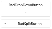
To **change the position (right by default) of the dropdown button part**, set the `DropDownButtonPosition` property of **DropDownButton** and **SplitButton**.
#### **Setting the dropdown button position**
```XAML
```
**Buttons with changed dropdown button position**
To **change the placement of the DropDownContent**, set the `DropDownPlacement` property of **DropDownButton** and **SplitButton**.
#### **Setting the dropdown placement**
```XAML
```
**SplitButton with changed dropdown placement**

To **change the size of the DropDownContent**, you can set several properties of **DropDownButton** and **SplitButton**. The size of dropdown is determined by the `DropDownWidth` and `DropDownHeight`. Additionally, you can restrict the size with the `DropDownMinHeight`, `DropDownMaxHeight`, `DropDownMinWidth` and `DropDownMaxWidth` properties.
#### **Setting the dropdown width and height**
```XAML
```
**DropDownButton with fixed dropdown size**

## See Also
* [Getting Started](https://www.telerik.com/winui/documentation/controls/radbuttons/getting-started)
* [Events](https://www.telerik.com/winui/documentation/controls/radbuttons/events)
* [Commands](https://www.telerik.com/winui/documentation/controls/radbuttons/commands)
* [DropDownButton](https://www.telerik.com/winui/documentation/controls/radbuttons/dropdown-button)
* [SplitButton](https://www.telerik.com/winui/documentation/controls/radbuttons/split-button)