# Animations

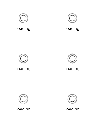
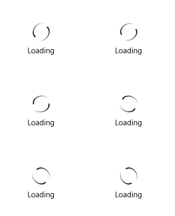
The BusyIndicator comes with a set of predefined animations and also enables you to create custom ones.

## Predefined Animations

To change the default animation of the BusyIndicator, set its `AnimationStyle` property. The `primitives` namespace in the following example points to `xmlns:primitives="using:Telerik.UI.Xaml.Controls.Primitives"`.

#### **Set the AnimationStyle**

```XAML
<primitives:RadBusyIndicator IsActive="True" AnimationStyle="AnimationStyle1"/>
```

The `AnimationStyle` property is of type enum with the same name and provides the following values:

* (Default) `AnimationStyle1`

  ![WinUI RadBusyIndicator RadBusyIndicator Animation Style 1](https://www.telerik.com/winui/documentation/assets/2ac00391c8d28101f3b3bf3d389d7143/animationstyle1.gif)

* `AnimationStyle2`

  ![WinUI RadBusyIndicator RadBusyIndicator Animation Style 2](https://www.telerik.com/winui/documentation/assets/2858c736f67793d6e4935c1d965a0f5b/animationstyle2.gif)

* `AnimationStyle3`

  ![WinUI RadBusyIndicator RadBusyIndicator Animation Style 3](https://www.telerik.com/winui/documentation/assets/4c05eafe7fddd5f6971a5bd645fc7c50/animationstyle3.gif)

* `AnimationStyle4`

  ![WinUI RadBusyIndicator RadBusyIndicator Animation Style 4](https://www.telerik.com/winui/documentation/assets/f3d65cd757e05c6cf2c66f04450a3117/animationstyle4.gif)

* `AnimationStyle5`

  ![WinUI RadBusyIndicator RadBusyIndicator Animation Style 5](https://www.telerik.com/winui/documentation/assets/7d913c35da0ff26fcfff7b88a2853d29/animationstyle5.gif)

* `AnimationStyle6`

  ![WinUI RadBusyIndicator RadBusyIndicator Animation Style 6](https://www.telerik.com/winui/documentation/assets/f1db23ef5f9a1cc53c899b32e88b455b/animationstyle6.gif)

* `AnimationStyle7`

  ![WinUI RadBusyIndicator RadBusyIndicator Animation Style 7](https://www.telerik.com/winui/documentation/assets/0139192fcc32a2a7150f2798e04b8838/animationstyle7.gif)

* `AnimationStyle8`

  ![WinUI RadBusyIndicator RadBusyIndicator Animation Style 8](https://www.telerik.com/winui/documentation/assets/28ddbf743baf43107e12e9f3b117d972/animationstyle8.gif)

* `AnimationStyle9`

  ![WinUI RadBusyIndicator RadBusyIndicator Animation Style 9](https://www.telerik.com/winui/documentation/assets/be789b4101ff828620eeef5ead38fe74/animationstyle9.gif)

## Custom Animations

To implement a custom animation:

1. Ceate a custom `ControlTemplate` for the `BusyIndicatorAnimation` control.

2. In the `ControlTemplate`, define whatever elements and animations you need.

3. Use the `IndicatorAnimationStyle` property of the `RadBusyIndicator` to apply the customized template.

To ensure that the customized `ControlTemplate` won't break the internal logic of the `BusyIndicatorAnimation` control, you will need to preserve the elements from the default template with `"PART_"` in their `x:Name` settings. Based on this statement, you have to set the `x:Name` of the root element in the template to `PART_LayoutRoot`. Make sure that the `Resources` of the panel contain a `Storyboard` with an `x:Name` set to `PART_Animation`.

The following example shows how to create a custom animation using a customized template.

#### **Create a custom animation**

```XAML
<primitives:RadBusyIndicator IsActive="True" x:Name="indicator">
	<primitives:RadBusyIndicator.IndicatorAnimationStyle>
		<Style TargetType="indicator:BusyIndicatorAnimation">
			<Setter Property="Template">
				<Setter.Value>
					<ControlTemplate>
						<Grid VerticalAlignment="Center" x:Name="PART_LayoutRoot">
							<Grid.Resources>
								<Storyboard x:Name="PART_Animation">
									<DoubleAnimation From="0" To="359" Duration="0:0:1" RepeatBehavior="Forever" Storyboard.TargetName="LoadingVisualAngleTransform" Storyboard.TargetProperty="Angle" />
								</Storyboard>
							</Grid.Resources>
							<Grid.RowDefinitions>
								<RowDefinition />
							</Grid.RowDefinitions>
							<Grid Width="45" Height="45" Grid.Row="0" x:Name="LoadingVisual" RenderTransformOrigin="0.5,0.5" HorizontalAlignment="Center">
								<Grid.RenderTransform>
									<TransformGroup>
										<RotateTransform x:Name="LoadingVisualAngleTransform" Angle="0" CenterX="0.5" CenterY="0.5" />
									</TransformGroup>
								</Grid.RenderTransform>
								<Path Stretch="Fill" Stroke="Red" StrokeThickness="5" StrokeStartLineCap="Round" Data="M1,0 A1,1,90,1,1,0,-1" />
								<Path Margin="0,-5,0,0" HorizontalAlignment="Center" VerticalAlignment="Top" Width="10" Height="15" Stretch="Fill" Fill="#00BDD2" Data="M0,-1.1 L0.1,-1 L0,-0.9" StrokeThickness="1" />
							</Grid>
						</Grid>
					</ControlTemplate>
				</Setter.Value>
			</Setter>
		</Style>
	</primitives:RadBusyIndicator.IndicatorAnimationStyle>
</primitives:RadBusyIndicator>
```

The `indicator` namespace points to `xmlns:indicators="using:Telerik.UI.Xaml.Controls.Primitives.BusyIndicator"`.

The following image shows the result.

![WinUI RadBusyIndicator RadBusyIndicator Custom Animation](https://www.telerik.com/winui/documentation/assets/7d35495347d79bd50f5273e5a63f12b1/customanimation.gif)