
Need to Style Your UI Components - Meet ThemeBuilder
Control the look and feel of your UI components to fit any brand or application styles. ThemeBuilder is here to help you style your Telerik and Kendo UI components to perfectly match your design requirements.

Save Time Theming Your Web UI Components
Reduce the time spent on styling to focus on the critical business logic of your applications. ThemeBuilder is a visual tool with almost zero learning curve that enables you to style your Telerik and Kendo UI web components without the need to write complex CSS rules.
5 Built-in Themes
Ready-to-use themes offered with Telerik and Kendo UI : Material, Bootstrap, Fluent, Default and Classic.
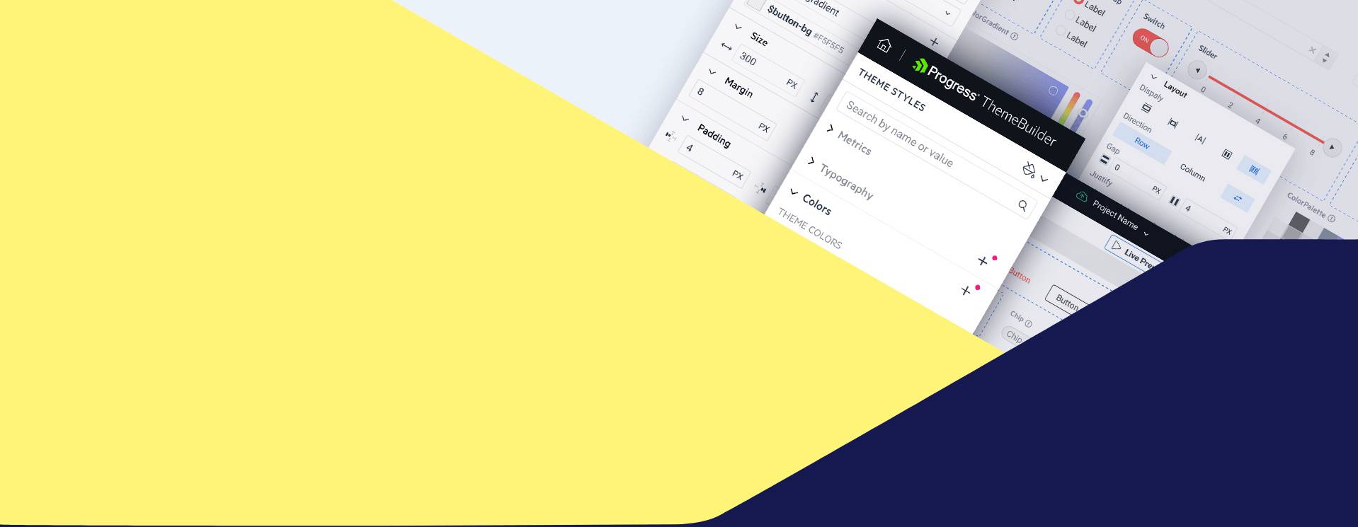
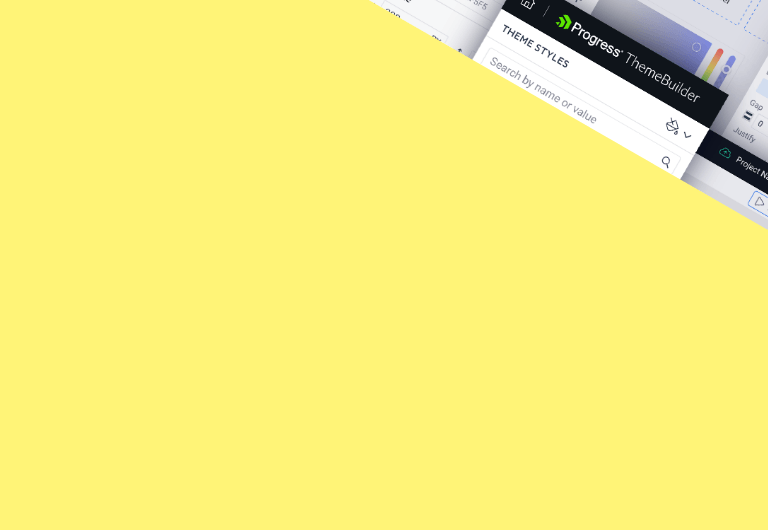
ThemeBuilder App
Style every element of your Telerik and Kendo UI components—from the high-impact primary color to the smallest visual details.

Feature-Rich UI Theming: From High-Impact to Atomic Styling
ThemeBuilder enables you to style everything from top-level elements like the primary color that applies to multiple components to atomic customizations that can style only the button text in the Data Grid.
Highlights
Custom SASS Variables
You can create multiple new SASS variables. When you need to change its style, you only need to change the variable in a single place instead of all components that use it.
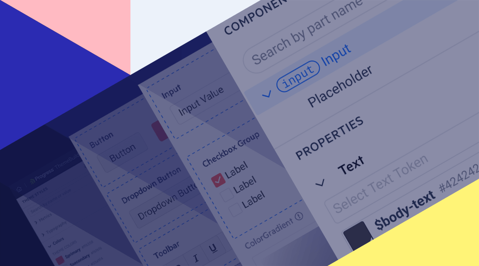
Atomic Customizations
Customize every part of the component even the smallest part of each component. That gives you complete control over the component styles.
Figma Import
Boost productivity and teamwork by incorporating SASS/CSS variables from Figma into ThemeBuilder. Import design tokens such as colors, typography, and effects.
More Features
Project Sharing
Component Variants
Color and Size Variables
Consistent Styling
SSO
Figma Variable Modes
Custom Fonts and Icons
User Access Rights
Generic HTML Styling
Get Started with Telerik and Kendo UI ThemeBuilder


Pricing
Get access to the features that your team needs to satisfy your styling requirements.

ThemeBuilder
- 1 project
- High-level SASS variable customizations
- Ready-to-use swatches for dark mode and more
ThemeBuilder Pro
- Everything in the free tier
- Detailed styling customization for each component part and state
- Adding custom SASS variables
- Sharing the projects and working together with your team
- Uploading and using custom fonts and font icons
- Manual migration support
ThemeBuilder Ultimate
- Everything in the Pro tier
- Unlimited projects
- Figma import
- Automatic migration
- Component Variants
- Multiple Projects Modes (Light and Dark Mode)
ThemeBuilder Enterprise
- Everything in the Ultimate tier
- Unlimited projects
- Access Rights
- Single Sign-On support
What’s New with ThemeBuilder

Export and Map Figma Variable Modes
Using the ThemeBuilder Plugin for Figma, you can export the new Color and Number (called Metric in ThemeBuilder) Modes to ThemeBuilder and work with them there.

Color and Size Variable Modes
Address the needs of different users with two types of variable modes: colors and metrics. Color modes allow you to define multiple color palettes, Light and Dark for example

Style Generic HTML Elements
Harness the power of ThemeBuilder for the generic parts of your app that don’t use Telerik or Kendo UI components. ThemeBuilder will allow you to create style templates for the most used HTML elements.