# Editing Telerik and Kendo Themes
For Telerik and Kendo UI-based projects, the **STYLES** pane contains predefined variables for the selected Kendo theme. In addition, you can select a number of color variations that alter the Kendo theme. These color variations are called swatches and they are unique for each Kendo theme.
* To select a color swatch, use the dedicated drop-down button in the **THEME STYLES** pane.
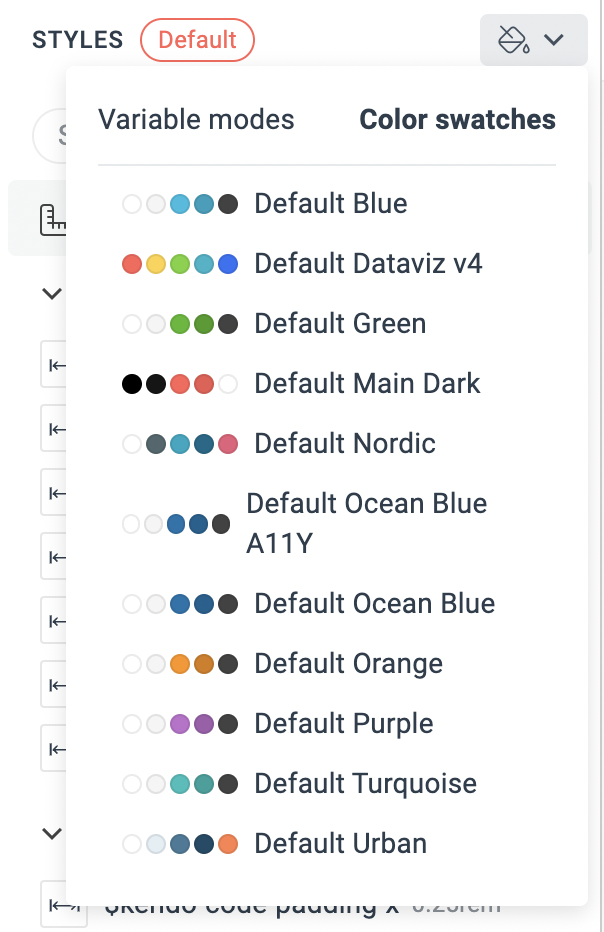 To further customize the appearance of the UI components by using the **THEME STYLES** pane:
* Add new variables by using the **+** button.
* Edit the values of the variables.
> note As each Kendo theme requires a different type, Sass or CSS, and number of predefined variables, the default variables in the **THEME STYLES** pane vary depending on the selected base theme.
> tip ThemeBuilder gives you the flexibility to use the Sass or CSS variables in the **THEME STYLES** pane to change the appearance of the UI components by [applying advanced styling strategies](https://www.telerik.com/themebuilder/documentation/building-visual-styles/apply-advanced-customizations). To enable this functionality, use the **Advanced Edit** button.
## Editing the Kendo Default, Bootstrap, and Classic Themes
The Kendo Default, Bootstrap, and Classic themes expose a number of pre-defined Sass variables that are grouped by type:
| Variable Type | Description |
| ------------- | ---------------------------------------------------------------------------------------------------------------------------------------------------------------------------------------------------------------------------------------------------------------------------------------------------------------------------------------------------------------------------------------------------------------------------------------------------------------------------------------------------------------------------------------------------------------------------------------------------------------------------------------------------------------------------------------------------------------------------------------------------------------------------------------------------------- |
| Font Families | You can add your custom font families by using the **+** button. Each theme contains several exposed Kendo font family variables |
| Metrics | You can add your custom metrics by using the **+** button. The `$kendo-border-radius` variable is included by default and allows you to change the rounding of the elements. |
| Typography | The typography Sass variables allow you to change the font and its properties, for example, `font-weight`, `font-size`, `line-height`, and `letter-spacing`. You can add multiple typography styles by using the **+** button. |
| Colors | The various color-related variables allow you to edit the colors in the visual theme. For easier navigation, the colors are grouped by type and usage, for example:
- **THEME COLORS**—lists the colors that apply to the entire theme.
- **BODY**—lists the colors that affect the styles of the HTML document body. For example, to set a custom background color for the entire document, enter a new value for the `$body-bg` property.
- **COMPONENTS**—lists the component-specific colors, for example, the color for the selected state.
- **BUTTON**—lists the colors specific to the Button component.
- **LINK**—lists the colors for the links.
- **DATAVIZ**—lists the colors used for data visualization, for example, in the Chart component.
|
## Editing the Kendo Material Theme
The Kendo Material theme exposes the following types of pre-defined Sass variables:
| Variable Type | Description |
| ------------- | ---------------------------------------------------------------------------------------------------------------------------------------------------------------------------------------------------------------------------------------------------------------------- |
| Font Families | You can add your custom font families by using the **+** button. |
| Metrics | You can add your custom metrics by using the **+** button. The `$kendo-border-radius` variable is included by default and allows you to change the rounding of the elements. |
| Typography | The typography Sass variables allow you to change the font and its properties, for example, `font-weight`, `font-size`, `line-height`, and `letter-spacing`. You can add multiple typography styles by using the **+** button. |
| Colors | The Material theme has predefined data visualization colors for the Chart component. You can add your own colors by using the **+** button. |
| Effects | The effects Sass variables allow you to add your custom values for `box-shadow`, `filter`, or `backdrop-filter` properties by using the **+** button. The Material theme has predefined `box-shadow` variables used in the Button, Card, Window, and other components. |
## Editing the Kendo Fluent Theme
The Kendo Fluent theme exposes the following types of pre-defined CSS variables:
| Variable Type | Description |
| ------------- | --------------------------------------------------------------------------------------------------------------------------------------------------------------------------------------------------------------------------------------------------------------------------------------------------------------------------------------------------------------------------------------------------- |
| Font Families | You can add your custom font families by using the **+** button. The `$kendo-font-family-sans`, `$kendo-font-family-serif`, `$kendo-font-family-sans-serif`, and `$kendo-font-family-monospace` variables are included by default |
| Metrics | You can add your custom metrics by using the **+** button. The `$kendo-border-radius` variable is included by default and allows you to change the rounding of the elements. |
| Typography | The typography CSS properties allow you to change the font and its properties, for example, `font-weight`, `font-size`, `line-height`, and `letter-spacing`. You can add multiple typography styles by using the **+** button. |
| Colors | The various color-related properties allow you to edit the colors in the visual theme. For easier navigation, the colors are grouped by type and usage, for example: - **THEME COLORS**—lists some of the theme-specific colors that aren't defined by the selected palette.
- **DATAVIZ**—lists the colors used for data visualization, for example, in the Chart component.
|
| Effects | The effects CSS variables allow you to add your custom values for `box-shadow`, `filter`, or `backdrop-filter` properties by using the **+** button. The Fluent theme has predefined `box-shadow` variables. |
> Unlike the Kendo Default, Kendo Bootstrap, and Kendo Material themes, the Kendo Fluent theme uses CSS variables to enable customization.
### Editing Blank Project Theme
When starting from scratch with a blank project, the **THEME STYLES** pane has no pre-defined variables. Create new variables by using the **+** button to foster reusability and rapid development.
Use these variables to style your custom components as any other Telerik and Kendo UI component by [applying advanced styling customizations](https://www.telerik.com/themebuilder/documentation/building-visual-styles/apply-advanced-customizations).
## Related Articles
* [Variable Types in ThemeBuilder](https://www.telerik.com/themebuilder/documentation/building-visual-styles/variable-types)
* [Applying Advanced Customizations](https://www.telerik.com/themebuilder/documentation/building-visual-styles/apply-advanced-customizations)
* [Using Custom Components](https://www.telerik.com/themebuilder/documentation/building-visual-styles/custom-components)
* [Using Your Custom Fonts in ThemeBuilder](https://www.telerik.com/themebuilder/documentation/building-visual-styles/managing-custom-fonts)