*Includes access to online technical training to speed-up your onboarding.
Everything You Need for Great WPF UI
Telerik UI for WPF control library delivers 160+ controls to meet your app requirements for data handling, performance, UX, design, accessibility, and so much more. Take a look at our featured controls.
Easily style the outlook of your applications to the needs of your project with one of the 20+ built-in themes. The themes included in the Telerik UI for WPF suite are:
Fluent
Material
Office 2016
Office 2016 Touch
Office 2013
Office 2013 (LightGray)
Office 2013 (DarkGray)
Crystal (MacOS-Inspired)
Visual Studio 2019
Visual Studio 2013
Visual Studio 2013 (Blue)
Visual Studio 2013 (Dark)
Windows 11
Windows 8
Window 8 Touch
Windows 7
Expression (Dark)
Office (Silver)
Office (Blue)
Office (Black)
Green (Light)
Green (Dark)
Vista
Transparent
Summer
Not customizable enough? Well then, take a look at the Color Theme Generator to see some of the themes in action and find the right match for your application.
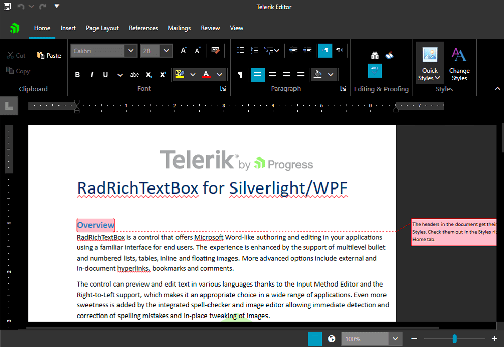
Document Processing
With the Document Processing Libraries shipped with Telerik UI for WPF you can process the most common Text, Spreadsheet, and PDF file formats within your desktop application without having Microsoft Office or other third-party libraries installed.
The components provide your application's users to create, load and modify documents in a variety of formats including:
DOCX
RTF
TXT
HTML
PDF
XLSX
CSV
Tab-delimited
Enable your application to seamlessly export and import documents or convert them from one format to another. All thanks to the intuitive and easy-to-use APIs of the Telerik Document processing libraries.
Extensive Set of Controls
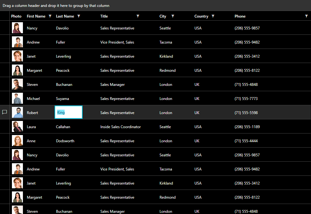
Telerik UI for WPF includes a wide range of customizable controls – from powerful data-driven controls like GridView and Chart to small UI components like Rating and Slider. The suite provides a variety of data visualization and management tools, which allow you to edit and display data based on your business requirements.
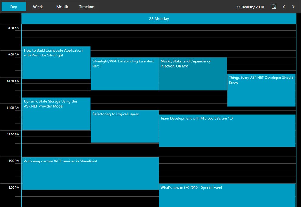
Manipulate your row data in a GridView or Spreadsheet and visualize it through PivotGrid or other charting and diagramming tools available in the suite. Discover multiple components for daily or business planning such as ScheduleView and Calendar where end-users can easily plan their day and trace their meetings and tasks. Use the GanttView control to visualize and manage any project planning data in a slick and descriptive manner.
Exceptional Performance and User Experience
Telerik UI for WPF enhances the user experience by providing you with both the UI components and data virtualization mechanism for optimal performance. With Telerik’s controls you will be to display large amounts of data with virtually no performance trade-off (ex. Virtual Grid). What you get is exceptional speed and sleek end-user experience. Here is how we do it:
Producing minimal and clean XAML
Allowing you to load only the data within the current viewport of the application
Implementing lazy loading – loading data only when it is requested
Minimizing memory usage, robust code free from memory leaks.
Intuitive API
Telerik UI for WPF has a short learning curve and is easy to use. The suite provides for:
Seamless integration with your Visual Studio Toolbox for quick drag-and-drop usage.
Feature configuration using Design-time Wizards.
Easy to learn API. The API is a close mirror of Microsoft. If you’ve worked with the WPF Framework and Microsoft’s XAML Controls, you’ll get up and running fast in Telerik UI for WPF.
MVVM Support
The ability to drag-and-drop a complex control from our toolbox, wire up a few events, receive quick functionality and move on to the next work item makes your software development easier. Those functionalities, however, do not guarantee that the software created is well structured, easily extensible and unit testable.
That’s where Model-View-ViewModel comes into play. Telerik UI for WPF fully supports MVVM, allowing you to create reliable, well-structured and easily maintainable applications.
Touch Support
Touch enable your WPF applications with no performance overhead.
The built-in touch support and the Material, Office 2016 Touch and Windows8 Touch themes make your Telerik UI for WPF powered applications run smoothly on any touch device (Microsoft Surface, Windows Phone, etc).
Additionally, the controls in the suite are also built for touch interactions and provide for additional customizations
All components in Telerik UI for WPF support Level 1 Coded UI tests and most of the controls already support Level 3 Coded UI tests, making Telerik UI Controls easily maintainable within any test-driven development process.
Support for .NET Core 3.1 Up to .NET 8
Telerik UI for WPF includes a separate set of binaries built against .NET Core 3.1 up to .NET 8 in the installers and Nuget packages. This will allow you to migrate your WPF applications built with Telerik UI for WPF to .NET Core 3.1 up to .NET 8 applications and leverage all the benefits of the framework such as: side by side deployment, performance optimizations, XAML islands and more.
Conversational UI - Modern UI for Chatbots
The Conversational UI control (aka RadChat) is a new control intended to be used with various chat bot services. Highlights of the features include:
Telerik UI for Blazor is a leading UI component library, allowing developers to elevate Blazor apps with polished, performant UI. There is now the exciting possibility that apps built with the Telerik UI for Blazor suite can also light up engaging and inclusive UI experiences on native mobile and desktop apps. The Blazor Hybrid story has a lot of potential for app modernization in the .NET ecosystem and we are here to help. Learn more.
Awards
Greatness—it’s one thing to say you have it, but it means more when others recognize it. Telerik is proud to hold the following industry awards.
You can buy Telerik UI for WPF control library individually or as a part of the DevCraft bundle. If you want to be covered for all .NET and JavaScript technologies or need a reporting, mocking or testing solution, the DevCraft bundles offers the most value for money—and
the most power.
Buy Telerik UI for WPF
Buy the most complete suite of WPF components to create enterprise-grade WPF applications with beautiful design and exceptional performance in half the time.
"Offering this new solution has had a very positive impact on customer relations. We’re constantly working to improve service to our customers, and Telerik UI controls are fueling that effort, resulting in a very favorable customer
perception"
Do you want your existing WPF apps to take advantage of all the features of .NET Core 3.0? Learn how to prepare your app today with Telerik UI for WPF.
Learn how to easily theme your WPF applications with the Fluent Theme in Telerik UI for WPF. Add transparency, acrylic effects, shadows, animations and more to modernize your app with the latest UX and UI trends.
If you are not a developer or don't have time to evaluate our product, send us your project requirements. We will evaluate your required features for you and let you know how our products fit your needs.


