# Header Styling Options
This article describes how the header can be manipulated to change the overall appearance of the control by using the styling properties.
## Introduction To Styling

The most important RadGroupBox layout styling options include the following:
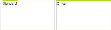
* **GroupBoxStyle**: There are two defined styles, *Standard* and *Office*. The styles are defined in **RadGroupBoxStyle** enumeration.
* **HeaderAlignment**: Header alignment options are defined in **HeaderAlignment** enumeration, *Near*, *Center*, and *Far*.
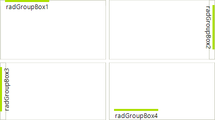
* **HeaderPosition**: Header position options are defined in **HeaderPosition** enumeration, *Top*, *Left*, *Bottom*, and *Right*.
* **HeaderMargin**: Defines the header margin.
* **FooterVisibility**: Defines the footer visibility. Its default value is *Collapsed*.
The most important **Header** and **Footer** styling options include the following ones:
* **HeaderImage**
* **FooterImage**
* **HeaderImageAlignment**
* **FooterImageAlignment**
* **HeaderText**
* **FooterText**
* **HeaderTextAlignment**
* **FooterTextAlignment**
* **HeaderTextImageRelation**
* **FooterTextImageRelation**
Please refer to [ImageAndTextLayoutPanel](https://www.telerik.com/products/winforms/documentation/telerik-presentation-framework/layout/predefined-layout-panels/imageandtextlayoutpanel) documentation section about further details of those properties.
All these properties can be set in **Visual Style Builder**. Furthermore, the control can be customized on a very fine-grained level using the *Visual Style Builder* to set any other property in the control hierarchy. Please refer to [Structure](https://www.telerik.com/products/winforms/documentation/controls/panels-and-labels/groupbox/structure) section for more details.
## Header Position
The **HeaderPosition** can be set to *Top*, *Right*, *Bottom*, and *Left*:
## Header Alignment
**HeaderAlignment** takes *Near*, *Center*, and \*Far \*values:
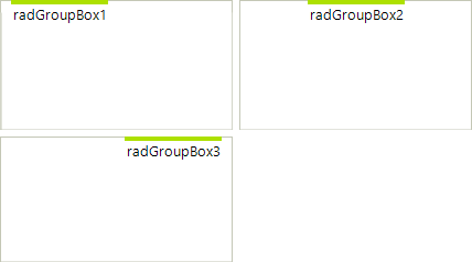
> note **HeaderAlignment** is not taken into consideration when the **GroupBoxStyle** is set to *Office*. In this case the header occupies the whole width or height of the control. You may use **HeaderTextAlignment** and **HeaderImageAlignment** properties in this case.
## Group Box Style
There are two styles - \*Standard \*and *Office*:
## Footer Visibility
Footer can be *Visible, Collapsed, and Hidden:*
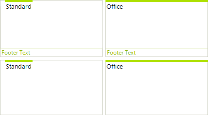
Note: The default value is *Collapsed*.
## Header and Footer Images
The text and image relation can be set with the familiar properties: *HeaderImageAndTextRelation*, *HeaderImageAlignment*, and *HeaderTextAlignment*:
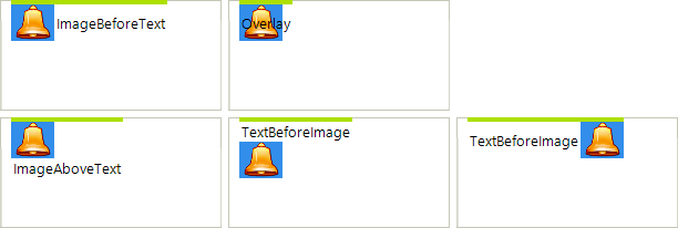
There are corresponding footer properties.
## See Also
* [Structure](https://www.telerik.com/products/winforms/documentation/controls/panels-and-labels/groupbox/structure)
* [Accessing and Customizing Elements](https://www.telerik.com/products/winforms/documentation/controls/panels-and-labels/groupbox/customizing-appearance/accessing-and-customizing-elements)
* [Themes](https://www.telerik.com/products/winforms/documentation/controls/panels-and-labels/groupbox/customizing-appearance/accessing-and-customizing-elements)